


Sneak Peek #2: New Blog Look
Well I’ve already shared with you all a little sneak peek of the new look of the blog and the transition to switching over to Effortless Style.
Today I have another little sneak peek you see the new blog is going to have a lot more resources for my lovely readers aka all of you. One of the new additions is a resource guide. It’s my little black book of vendor favorites. You’ll be able to access to my list of go-to’s for wallpaper, paint, artwork, fabric, lighting, furniture, accessories, window treatments and floor coverings. I hope the guide will be helpful to all of you who love decor, but can’t hire a decorator.
So I did a little photo shoot to add the perfect eye candy element to that page!
Look #1:

Look #2:

Look #3:
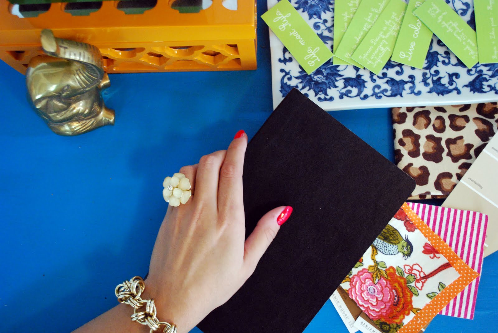
What’s your favorite jewelry combo? I can’t pick just one!
Leave a Reply
get inspired with our own home tour
ON THE BLOG


My living room is one of the rooms that evolved drastically from when we first moved one. Originally I painted the walls chocolate brown and did accents of white, blue and orange. That lasted maybe 2 years.

Our dining room sat empty for months. Okay maybe it was empty for just a handful of weeks and then we couldn’t take it anymore and put in a folding table and plastic outdoor chairs, but in my mind that was still empty.

On the main floor of our house we have a Florida room. Being that it’s a Florida room it is a considered a 3 season room, because there is no heat in the room. The previous owners used it as an indoor patio with outdoor furniture and it looked like this when we moved in.


Look #2, for sure. Or maybe I should say hands down… I like the repetition of the blue and orange in the picture, and your hand position looks the most natural.
A mix of all three – the background from 2, gold bracelet added from 1 and the white ring from 3. Also, what if you had a little bit of text on the notebook? A cute one word saying, or maybe a picture of a high heel (outlined in white)? Congrats on the new look!
look number one! i like a little more leapord in this one too!
I like the last one. The bracelet in #2 gets a bit lost. The jewelry in the last seems to be a bit more restrained and classic.
LOVE the jewelry combo from #1, but wish your hand was turned more like #2, so we could see that fab orange ring!
As much as I love the bracelet in #2 I am going to have to go with #1.
I like the jewelry of 3, pose of 2 and background of 1. in 2, theres already some blue and orange. I love the ring and gold in 3.
Thanks for the helps guys! I have a bunch of different shots with each one so I have some hand options to pick from.
I'm having the graphic designer put copy on the black book so don't worry it won't remain blank,
🙂
number 2, without a doubt!
number 2, without a doubt!
Number 2!
I like # 1 because its a full shot and get to see all the pretty details
I am LOVING look two!
#1
I like the two bracelets and the pulled back shot.
Look #2 – LOVE!!!
I love the ring in look #3 and the bracelet in look #2. That would be my fav. combo
I like # 1 but the hand looks kinda strained…I think the hand in # 3 looks more natural. Imho
Number 2 reminds me the most of you and your style! The photo is also staged the best out of the three. Looking forward to seeing the new site!
Hmmm — I say #2 — but I love the orange ring/turquoise bracelet combo!
love love love look #2! 🙂
Love, love, love number 3!
Number 2 all the way
Look #2, but maybe #3 with the orange ring? Beautiful pics!
I love look number 2. I love a orange/blue color combo — it really pops! 🙂
#1 is my favorite…can't wait to see the new blog! Genius idea about including a resource guide!
Loving number 2!! I love orange and blue (may be because I'm a huge Auburn fan) but it really pops.
#3 is just perfect
#1 is my favorite. Not too much but gives a good story!
Look 2!
I love look #1! It looks the most polished yet natural.
Guess I'm an odd one out, but I love #3 the most – as far as jewelry is concerned.
love #3 I like the hand position
Love #1, but like many other people mentioned the hand position in 2 looks better. Did you just happen to have all this stuff laying around, and then jewelry to match? That's impressive!
# 2!!! Love the blue and orange combo, epecially with all of the other colors and patterns. Fun!
where is that leopard fabric from? it's delish. #2 i think.
#2!!
Suzanne
Number 1 definitely
#2 No doubt. I think the lucite braclet (even though I love it!) causes a wierd reflection in #1.
I'll follow you whatever your name 🙂
I love the orange flower & turquoise bangle – but let's face it on those glamorous hands they all look fabulous…
Katie
Thanks for all the help!
You can imagine how hard it was to hold the book and have it look right. Look 1 was at the very beginning hence the the not great hand pose.
Once I got to Look 3 the last one I finally figured out a way to hold it.
I liked the look of two bangles, but most of my bracelets are large bangles so it's hard to place them on the tabletop. It was quite a process, but I love the way they looked.
Look 2 was actually my least favorite, but if you guys love it then perhaps it's the winner. I can't make a decision for anything so I sent it to Carolynn (web designer) and told her to pick!
Hana,
That leopard fabric is my absolute favorite. It's the perfect scale and color and price (It was only $10 a yard) I bought it at Joanns a while back and they haven't gotten it back in stock for months. So sad. I only have one tiny square left.
I like the 1st one best!
Number one… 🙂 great pics !
http://www.madebygirl.com
madebygirl.blogspot.com
#2 is my fave!!!!!!! I love the bright aqua bangle!!
#3 for me, but they are all cute. Love the little elephant.
xo,
cristin
Number 2!
Number 2…Camila, I am so excited for you!!!
I like #1 best – the gold bracelette combo with the ring look best and I love the leopard!
I like number 2. It's the one that *Pops* the most and just overall seems more fun 🙂
I like them all and each jewelry combo is beautiful, but I like #1 the best because it shows the most of your design inspiration and resources…but honestly, I don't think you can go wrong with any of them!!!
Number 2! But I think having the gold elephant and whatever that orange box is a little closer to your hand will make it a perfectly styled picture – love the colors!
i love look #1 and i can't wait to see your new blog unveiled!
I like #1- and PS, you are the BIGGEST TEASE EVER!!
I love #2! It looks fabulous!
Jess
http://www.ourlifeinhisgrace.tumblr.com
uno. fo sho.
number1 for sho! cant wait ! hugs!
Number 2 is perfection!
number 2! The complimentary colors (blue and orange) pop each other and make the other color appear even brighter. So bold and fun!
i love them all but number one is my fav. especially because i can gaze at that awesome gold bracelet!! where is that from? let me in on the goods! 😉
I love #2. The colors match so well with the rest of the picture.
Look number 1 🙂
Look #2!
#2 has the best colors & position of the hand, a little less dead space in the cobalt blue area & it'd be perfect.
#2 is my favorite
Look #1 jewelry is best, but it's not my favorite shot/hand position. Very cool!
first one for sure!
Number two all the way. Best composition by far.
#2! But they all look great.
As a photo art director by trade, I would pick number two all the way. Best composition by far.
Look 1- no question!
#3!
#2 all the way!
Thanks for all the help!
I think I'm going to try and do another little photo shoot with option 1 and then see which I like better.
I love the bracelet in option 1. It was actually a thrift store and I get a million compliments on it. Every time someone asks where it's from.
🙂
Number 1!
Definitely #2!!
gotta go with 2! Looking good lady!
I loved #2 because of the color and size of the jewelry.
Can't wait to see the final work.
I like the jewelry in look 3 but the layout of look one…
All so fabulous (very kate spade-esque!) but I think #2 is my favorite! 🙂
I love #2 :0)
mp
http://www.thepinkandblueblog.com/
Look two is delicious
I love look #1, but I'd have to say look #2. Such a hard choice~ they're all so gorgeous!
I like the composition of #2, but I still like your current drawing with the little doggie!
I LOVE number 1! It catches my eye every time!
good luck with the new endeavors!
cheers!
k
The first one!!! SOOOO gorgeous
Look #1 is totally a winner.
I love look #3! Totally classic.
#3 (hands in 1 and 2 weren't my favorite, and jewelry in 3 is slightly more understated which is always nice).