
Country Fresh
Last night I was relaxing at home and since I had no new magazines to look at I decided to revisit an old favorite of mine. One day a couple of years ago in a desperate attempt to get my hands on more decor magazines I headed out to Borders and grabbed a handful of titles that I had never read before. Enter Canadian House and Home July 2007 issue. I was in love. I wanted to move up North and get to buy all these fab goodies in my new amazing home.
Ok so that idea didn’t stick, but my love for the magazine did. I don’t always get around to purchasing every copy, because it’s a bit expensive for this New Yorker, but I cherish the issues I have.
A home that is described in the mag as Manhattan meets New England really made me oh and ah and I wanted to share it with you.
Enter the living room of Stephan Howard and Mario Cote who are partners not only in life, but in their company, Flik and Company Interiors as well.
I love their mix and match of antiques and modern elements. The vintage school house chairs that flank the harvest coffee table look right at home with the more modern cow-hide chair with black and silver accents.
Next is a shot of their hallway that opens up to their studio:
Going back to the more New England aspect of their home they knew that collections were a key part of rustic interiors. The dress forms add sculptural elements to the home and the peeks of steel go back to the modern feel of the home.
Now we enter the heart of home. The kitchen: 
The kitchen was brand new when they moved in, but they still wanted to add a few of their own touches. The had a custom made island built out of reclaimed wood and added a modern pop with the industrial stools. To balance that with a touch of country they added Apothecary jars as well.
Again their love for a mix of modern and country took place in the dining nock. The rustic round table was paired with modern white chairs. The also used vintage grocery store lettering that the purchased for artwork. The work originally spelled MEAT, but they toned it down and left it as simply EAT.
Final room on the tour is the couples reading room:
They added a window seat, because their home overlooks a book and their pup loves relaxing in their with them. Again they incorporated their mix of modern and country with the bamboo blinds and striped furniture sitting along side their chrome end table, with a Lucite lamp. (Sorry I cut off the lamp)
I loved entering this couples home. I always say that my style touches on modern style with a mix of cottage/country style. I love little pops of modern and having it combined with homey accents that make me feel right at home with a little bit of stylish edge.
Related
Leave a Reply Cancel reply
get inspired with our own home tour
ON THE BLOG
My living room is one of the rooms that evolved drastically from when we first moved one. Originally I painted the walls chocolate brown and did accents of white, blue and orange. That lasted maybe 2 years.
Our dining room sat empty for months. Okay maybe it was empty for just a handful of weeks and then we couldn’t take it anymore and put in a folding table and plastic outdoor chairs, but in my mind that was still empty.
On the main floor of our house we have a Florida room. Being that it’s a Florida room it is a considered a 3 season room, because there is no heat in the room. The previous owners used it as an indoor patio with outdoor furniture and it looked like this when we moved in.
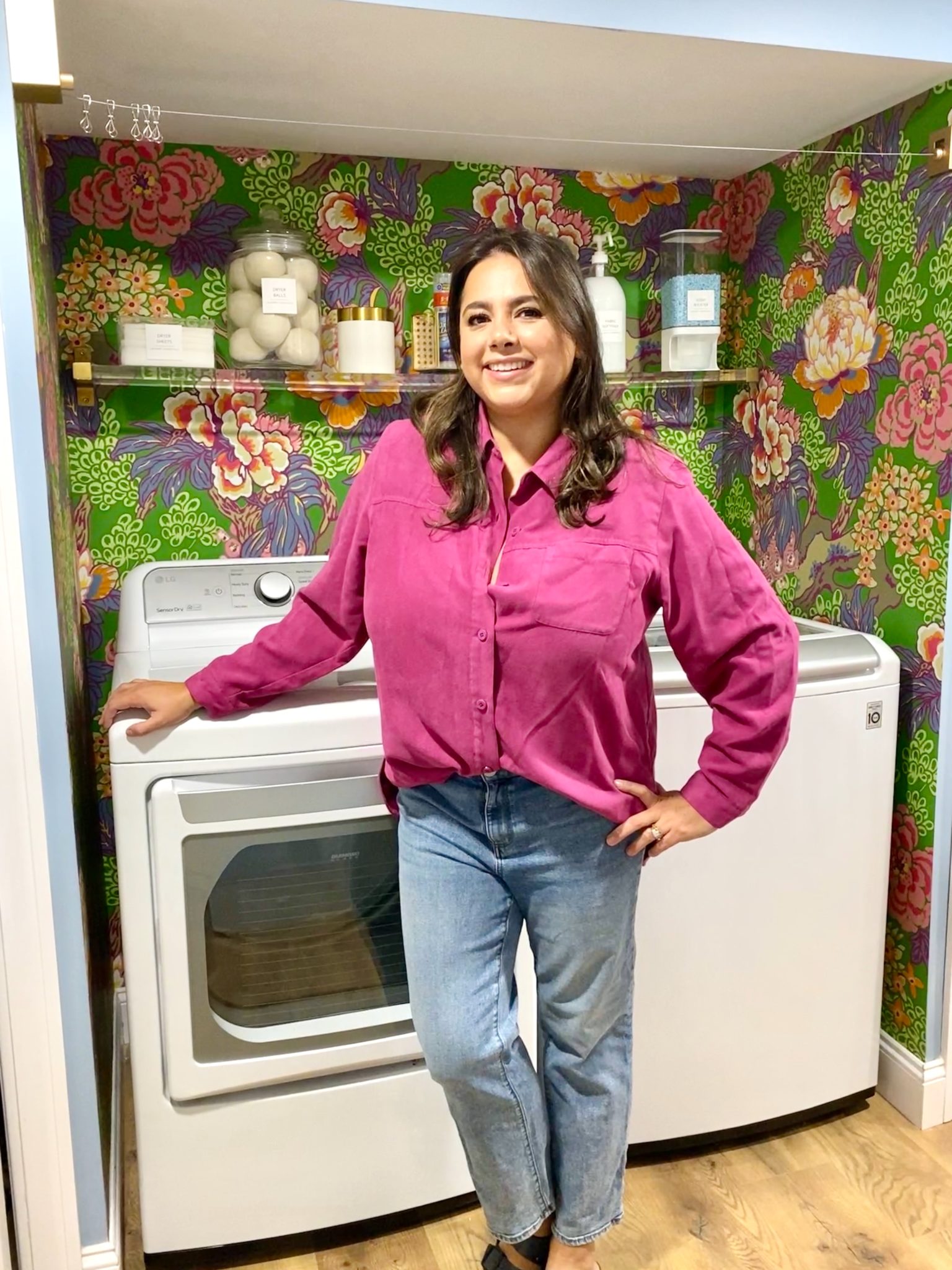
In our new home, the basement was completely unfinished. It was literally one of those dark spaces that you see in horror movies and are terrified of getting locked into. However, with the square footage in this house, I knew I needed to make the basement another workable and liveable floor of the house instead […]
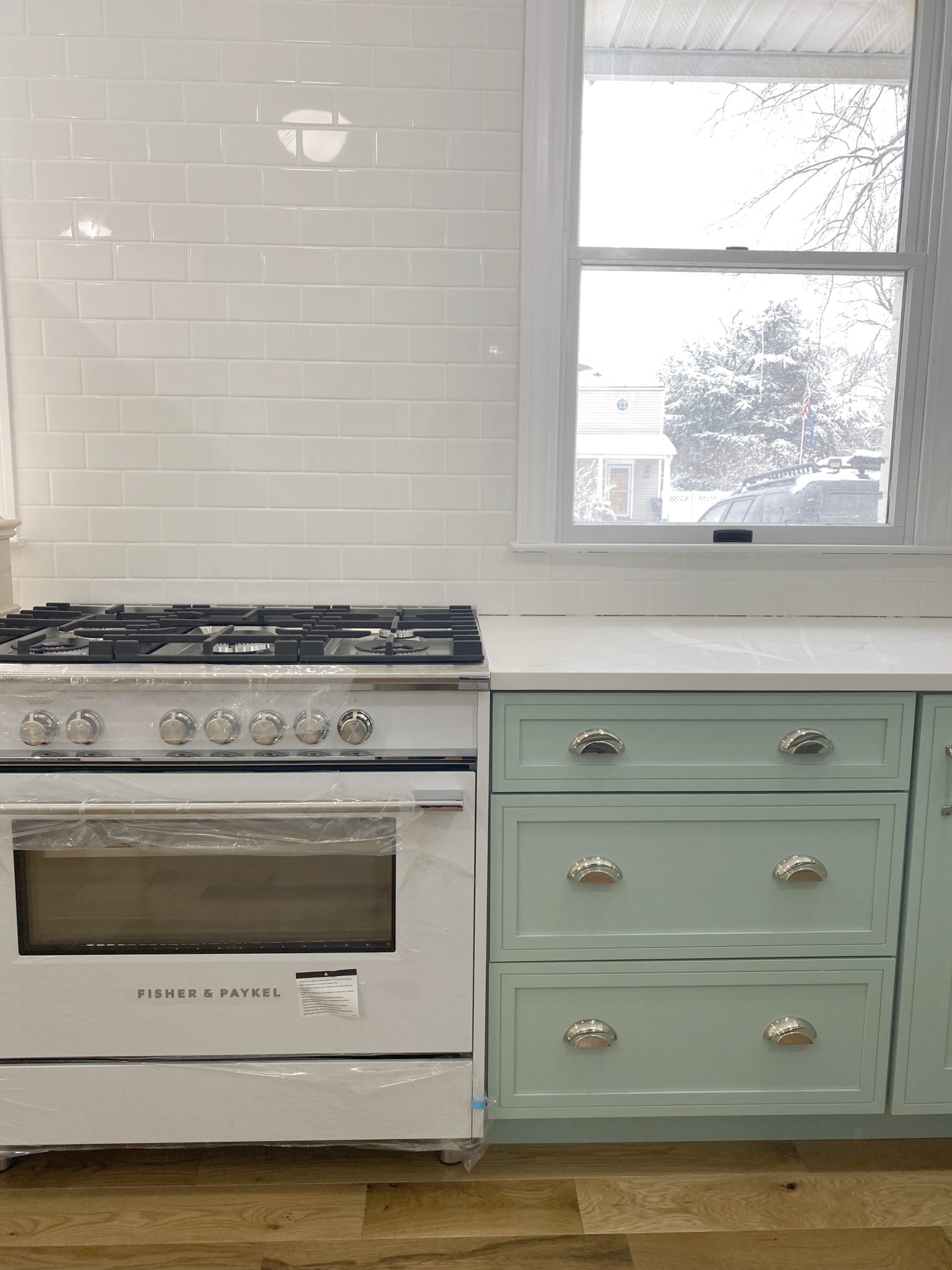
What to look for when it comes to picking out kitchen appliances: Leave room in your budget for appliances. When it comes to kitchen renovations everyone knows that the cabinetry and the labor of demoing and installing cabinetry is going to eat a lot of your budget. However, the second most expensive part of a […]
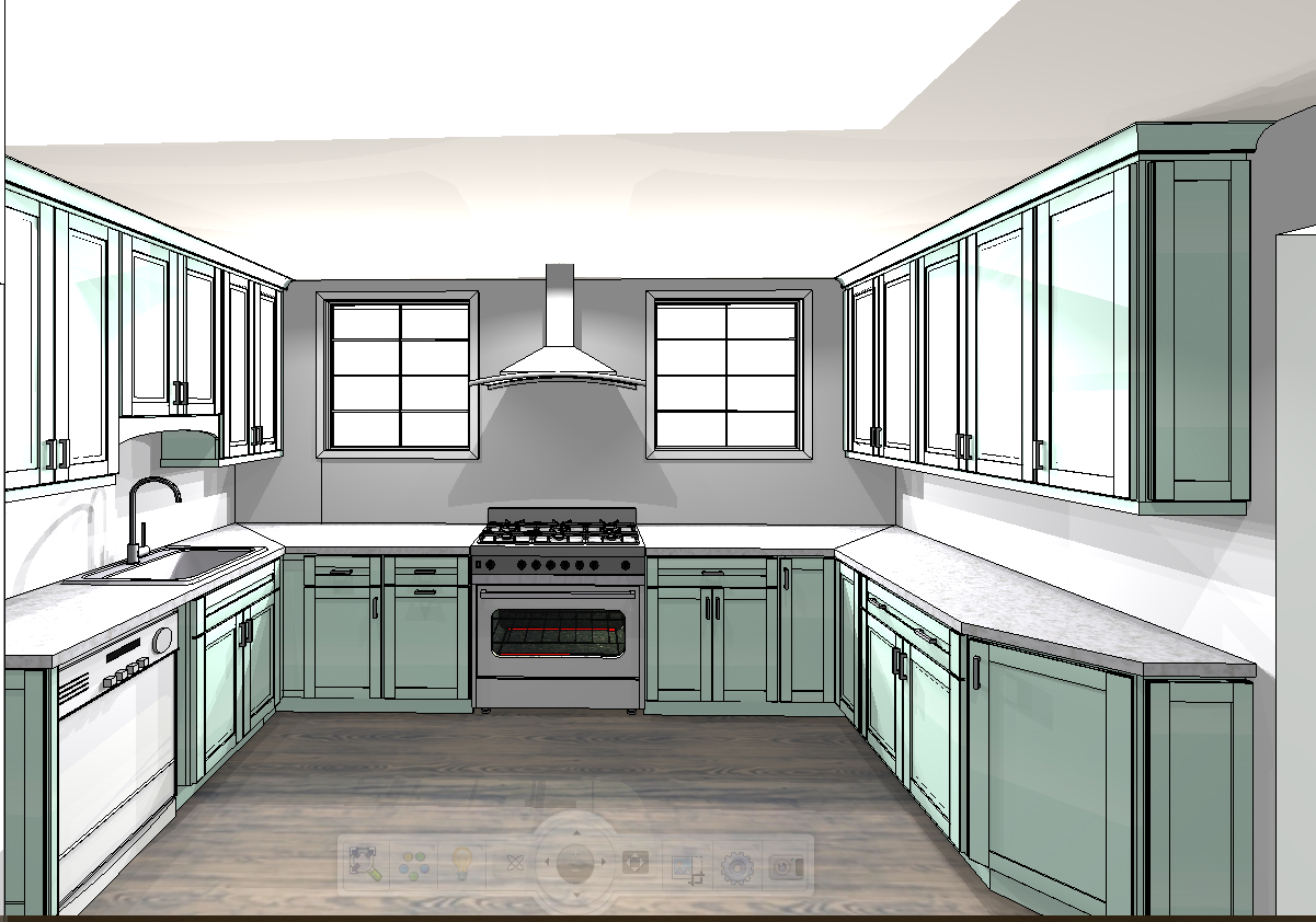
I don’t think I’m alone in thinking that designing a kitchen is an overwhelming undertaking. I’m an interior designer and even I find it stressful to iron out all of those details. So, when it comes time to design a kitchen I always like to partner with a kitchen designer to make sure I’m remembering […]



I love this!
aw, i love it..esp the pup on the window seat!
LOVE- especially the reading room!!!
xoxo
This is exactly why I should have kept all my old design magazines! Everything looks so fresh again after you haven’t seen it for a while.
Beautiful images.
Love all of this. These pics make me look around my house and sigh. One day.
Have a great Easter weekend!
Hugs,
Liz
Oh, I am oooing and aaang too! That is such a beautiful house and that kitchen is just drop dead gorgeous. Happy Easter!
Gorgeous house!
Quite honestly, I could move right in. I’ll take the dog, too.
I have a feeling I’ll be referring back to these photos…thanks for sharing!