
Do we love it? Dentil Cut Valances
Leave a Reply
get inspired with our own home tour
ON THE BLOG
My living room is one of the rooms that evolved drastically from when we first moved one. Originally I painted the walls chocolate brown and did accents of white, blue and orange. That lasted maybe 2 years.
Our dining room sat empty for months. Okay maybe it was empty for just a handful of weeks and then we couldn’t take it anymore and put in a folding table and plastic outdoor chairs, but in my mind that was still empty.
On the main floor of our house we have a Florida room. Being that it’s a Florida room it is a considered a 3 season room, because there is no heat in the room. The previous owners used it as an indoor patio with outdoor furniture and it looked like this when we moved in.
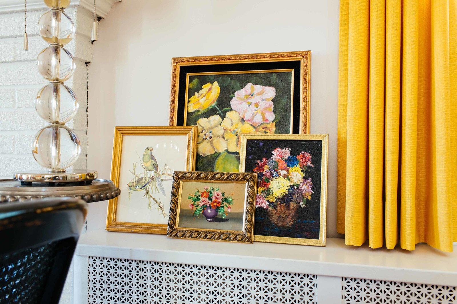


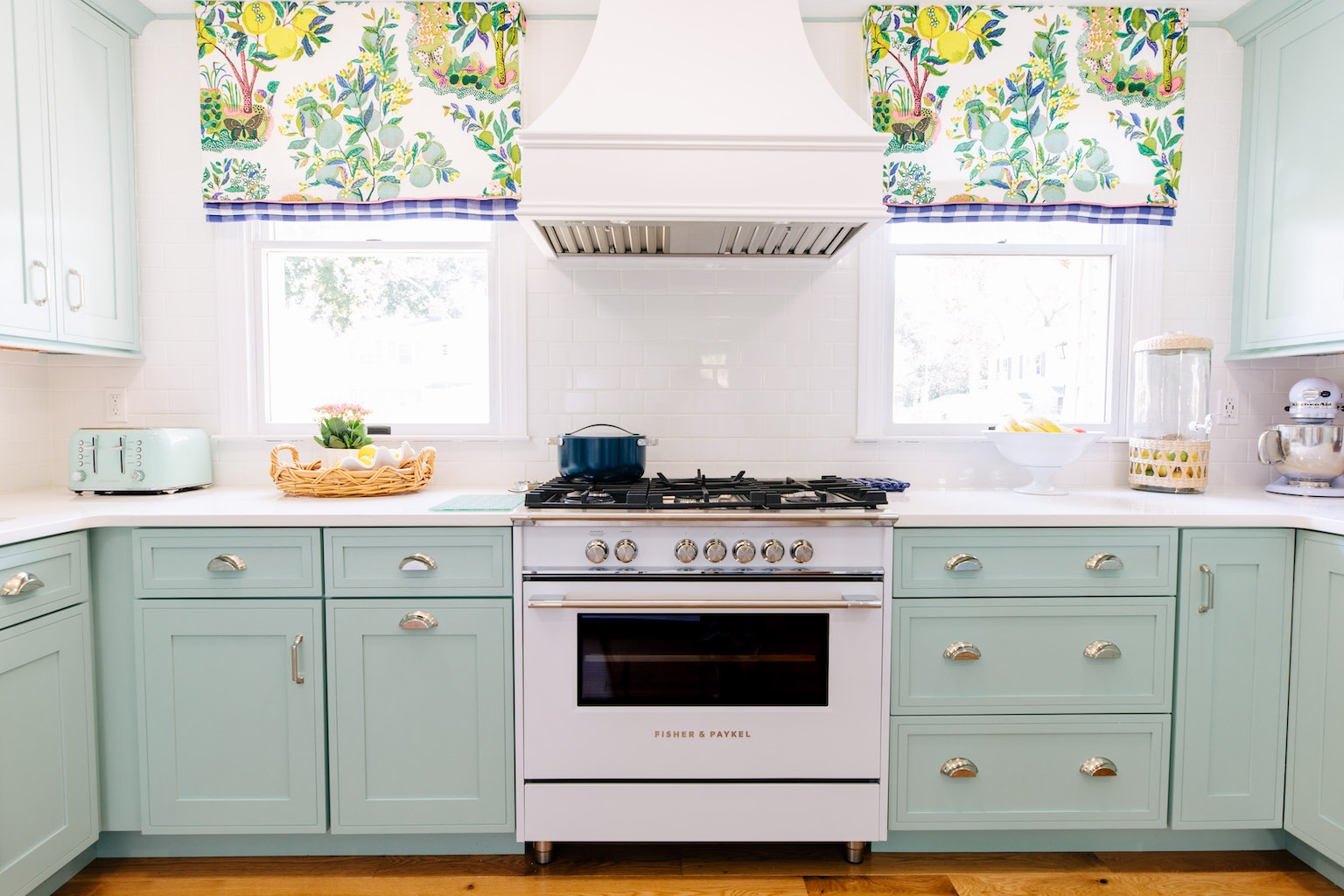
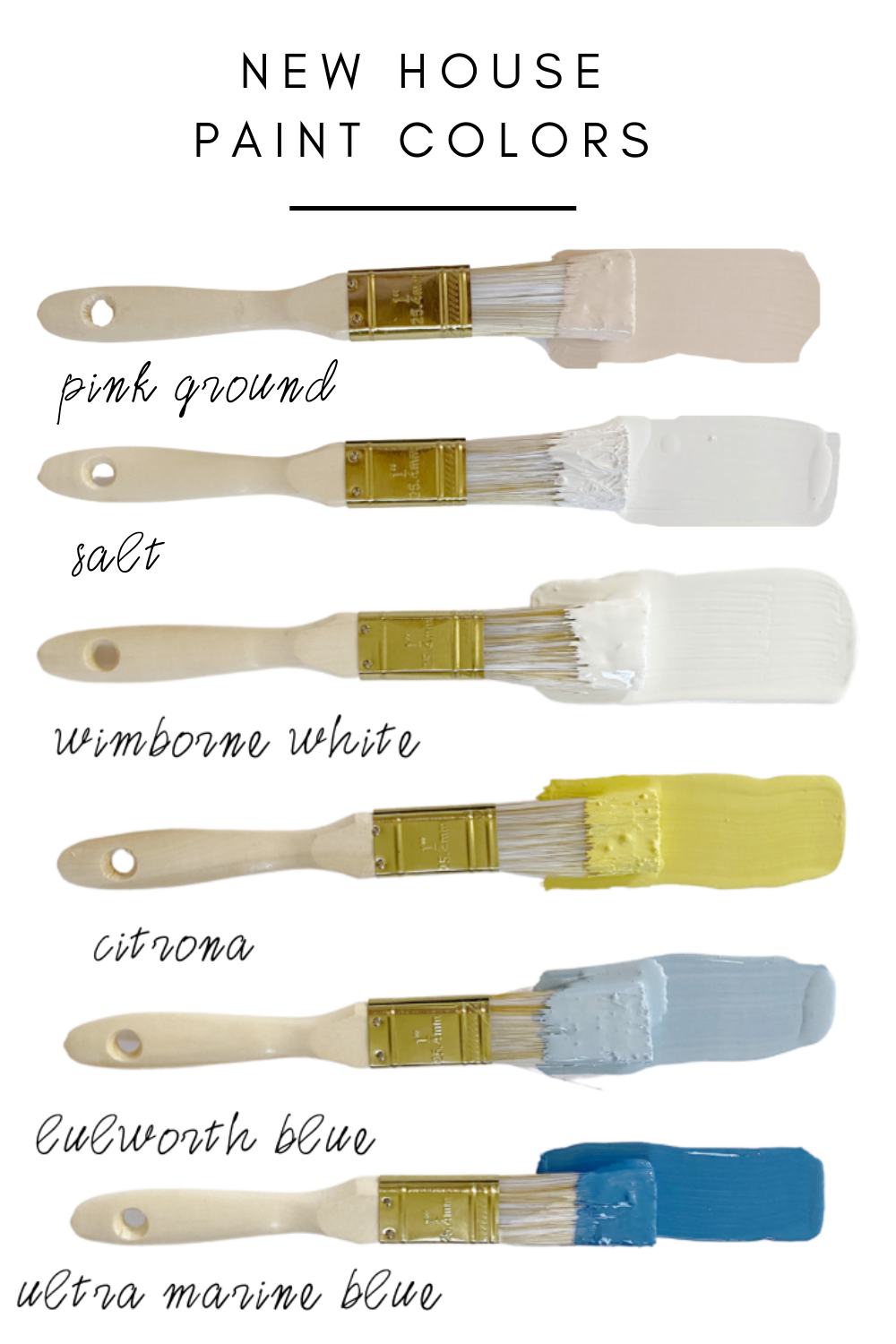


Love it! In the right space, a dentil valance is the perfect way to add a little visual interest and a great pop of color.
I love it!
Love it – I think it adds a bit of a tailored look to the room and makes it a bit more modern!
I really love it!! I might just steal this look for a future room!
I loved them but wasn't sure I could sew them well enough for my own curtains so I did a minnie version for my dogs bed here http://timmythewienerdog.blogspot.com/search?updated-max=2010-08-24T09%3A29%3A00-05%3A00&max-results=7&reverse-paginate=true
I wanna try in my son's room but after doing the minnie version I realized how tedious it is.
LOve this post. The valances are gorgeous, and they would like just as beautiful anywhere else in the house.
Havea nice day.
Teresa
Very glam!
yaa, we love it! I'm especially loving it in kids rooms
Love them! Dentil is such a classic motif that I think can be used anywhere. Just take a look at all the classic architecture from the greeks and romans. I love the idea of doing it on a valance!
eh, leave it. I'm not really a fan. They aren't horrible, but I wouldn't search out one. It reminds me of something that should belong on the edge of a Disney castle.
I think they look cute in kids rooms – in adult rooms it looks like a hotel and not a bedroom
And dija know that 'dentil' comes from dentin…as in teeth. I guess they look like gapped out teeth.
I think they look nice on outside overhangs. I'm sure it could look good in a bedroom if it's done right.
They are nice, however, I wouldn't put one in my home. Not my thing at all, too "polished". However, love the last image, very glamorous.
Yeah, Not a "valance" kinda girl. Just me though. It feels dated to me.
The dentil shape is a classic design that can be found in moldings in traditional homes and has been around for hundreds of years. I would use this design in a lovely formal dining room or living area as well as a bedroom. Depending on the fabric and trim it can appear very formal or playful and whimsical.
i've noticed them a lot too lately! i'm not usually a lover of valances b/c they look pretty formal to me, but this one i love!
Yes, I do love it!!
absolutely love it and would love to try something like this in my bedroom!
These are very pretty, and I haven't given them much thought before. I say thumbs up!
Love it! Such a classic look.
Yes! Love it. I just had an awning done for my back door and had this trim applied. I wasn't in need of a valance, so I just did the next best thing!
Love them!
I love it on the valances but not so much on crown molding
me too!!! so funny i was gonna blog about this! great minds! and i love btw!!!
Just came across this photo from House Beautiful and immediately thought of your post. Looks like it might be a guest bedroom?
http://www.housebeautiful.com/decorating/beautiful-designer-bedrooms
xx
LOVE them!
This weekend I was at the Juliska warehouse sale in CT and thought of you when I saw the dentil cut awnings on the shop. I just blogged about my experience and posted dentil photos for you.
I LOVE dentil valances! So much more interesting than plain old drapes.