
Colorful Memo Boards
Leave a Reply
get inspired with our own home tour
ON THE BLOG
My living room is one of the rooms that evolved drastically from when we first moved one. Originally I painted the walls chocolate brown and did accents of white, blue and orange. That lasted maybe 2 years.
Our dining room sat empty for months. Okay maybe it was empty for just a handful of weeks and then we couldn’t take it anymore and put in a folding table and plastic outdoor chairs, but in my mind that was still empty.
On the main floor of our house we have a Florida room. Being that it’s a Florida room it is a considered a 3 season room, because there is no heat in the room. The previous owners used it as an indoor patio with outdoor furniture and it looked like this when we moved in.



go for bold, i will def match your beautiful room!
With THREE blank cork boards, I'd pull the three top colors you love and use one on each board. I wouldn't necessarily go solid color, but maybe something that has a texture/subtle pattern — maybe a herringbone or linen or something… Then you could use a neutral ribbon or frame.
Can't wait to see what you choose!
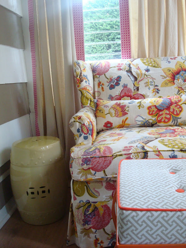
Go bright! And where did you get the fabric on the ottoman? It's fantastic!
def bright!
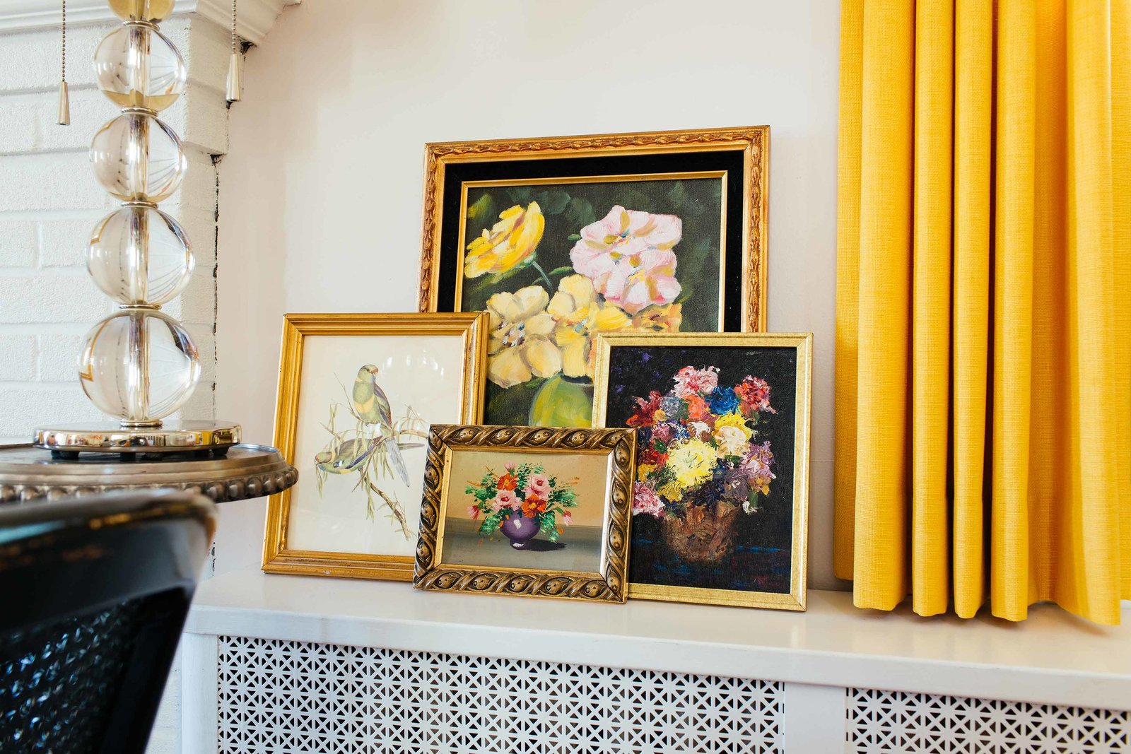
and um, i want the wall paper in the kate spade ad. le sigh.
Go with your instinct – and remember, its not like you have to live with it forever. My instinct says color and I'm guessing yours does too 🙂
the color! no question.
bright, bold, beautiful!
Color! I love orange, but I am kind of feeling yellow with that fabric you have. Either one would be fab though!
What if you did a neutral color, but added an orange bias tape border?
Your office is fabulous – loved the sneak peak. I have to vote for color…can't wait to see what you choose!
Color, go bright and bold! I just purchased that exact fabric for 2 little chairs in my master, so happy to see it on another piece, thanks for the visual!
I have two in my office that I plan to paint in a light, muted gold metallic paint. That way I get something more interesting but still fairly neutral!
Love this and love your blog!
Cheers-
Suz
http://welltodoyou.blogspot.com/
Orange, Orange, ORANGE!!!
Go for orange…it is an inspiration board, right? Loving the peak of your space!
My natural instinct is to say that it is a little overwhelming to have a bright color AND lots of papers on a corkboard…However, with three of them, maybe do one a bright orange and the other two more subtle, but coordinating fabrics!
Can't wait to see what you decide!
Bold! Go bold I say! It isn't like the boards are true furniture pieces, so when you get tired of them swap out the fabric.
I agree with Annie, because I think the individual color boards will help you focus on your dreams!
xoxo
Karena
Art by Karena
I vote for a bright and bold burlap or grass cloth.
pve
Go with orange! It's such a hot color right now and easy to change if you get tired of it.
First of al -love,love,LOVE the fabric on the armchair! I was also floored by the first photo from Kate Spade, my sister has the exact same chest of drawers!
Seriously love that ottoman! If I were you I would go with a neutral color for the boards-white or off white. Then I would frame the boards and paint the frames orange, green or yellow (all 3 the same).That way you get the best of both worlds-a neutral surface to allow your inspiration shots to shine and that shot of color that speaks to your personality. I love reading your blog and I am sure whatever you decide will look great!
i love it all! go for the bold!
Camila – I like Kendra's idea. Maybe something inspired by that gorgeous ottoman in your picture? A neutral pattern and then trimmed in some amazing bold colors? Can't wait to see what you do – I'm sure it will be fantastic!
Loretta
I just did a lovely chair in this fabric! Love it and your blog…
love that picture you posted by kate spade. definitely need a colored cork board… my vote is orange!!