Effortless Style Interiors
Ah the day has finally come it looks like my professional site is finished ( ok not fully finished, but enough is done to show it off!)
For those of you that have been with me from the very beginning you will know it’s been a long journey. I started getting my business in order right when I first started my design program and I was able to complete the course and take on clients before the site was finalized. I started my business in interior design in NYC area.
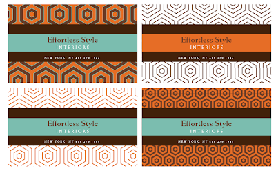
I had originally started with this color combo:
 {I still actually really love this color combo, but at the moment it seemed too trendy and I didn’t want my site to look “over” after a year}
So I went back to the drawing board and went for a more “fun” look:
Loved this color combo, loved the zebra, but had a really hard time translating it to a site. My fun colors were a bit overwhelming in large doses and they fighting with my project photo’s so eventually after trying to make it work a million and one times it just had to go.
After that try I was at a loss. I didn’t know what I wanted anymore. I wanted the site to reflect me and be up to date yet classic and fun yet professional. Seems easy to achieve, but it was hard. I think I was a bit lost in the beginning, because I wasn’t exactly sure how to classify my design style and it was only after people making comments while visiting my home that I realized I was traditional in a lot of my decorating (shocking to me at the moment) with injections of modern & vintage.
I had originally seen my color & pattern loving less as more of Jonathan Adler type decorator, but in looking around my home I did realize that I loved classic elements (traditional) with a twist ( modern & vintage) and without a new color combo came to life.
Navy was my nod to traditional design and my neutral color.
Orange was a reflection of me. It’s my favorite color.
Green made the feel a touch preppy/new traditionalist, which I love and fun.
In this proof the green wasn’t bright enough:

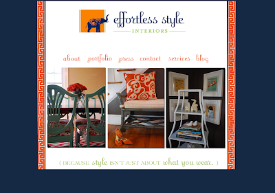
Eventually we got it got it right:
The addition of my logo with the nod to my love of elephants just completed the look!
Now I know you are all dying for photo’s of my house and my portfolio page still looks like this:
Don’t fret they are coming. My photographer is off traveling and will back into town in Mid-Nov. So they are coming!
In the meantime head on over to Effortless Style and familiarize yourself with my new home. The blog will shortly be moving over there as well.
Blog design by Front Porch Studio, Logo design by i design.
Related
Leave a Reply Cancel reply
get inspired with our own home tour
ON THE BLOG
My living room is one of the rooms that evolved drastically from when we first moved one. Originally I painted the walls chocolate brown and did accents of white, blue and orange. That lasted maybe 2 years.
Our dining room sat empty for months. Okay maybe it was empty for just a handful of weeks and then we couldn’t take it anymore and put in a folding table and plastic outdoor chairs, but in my mind that was still empty.
On the main floor of our house we have a Florida room. Being that it’s a Florida room it is a considered a 3 season room, because there is no heat in the room. The previous owners used it as an indoor patio with outdoor furniture and it looked like this when we moved in.
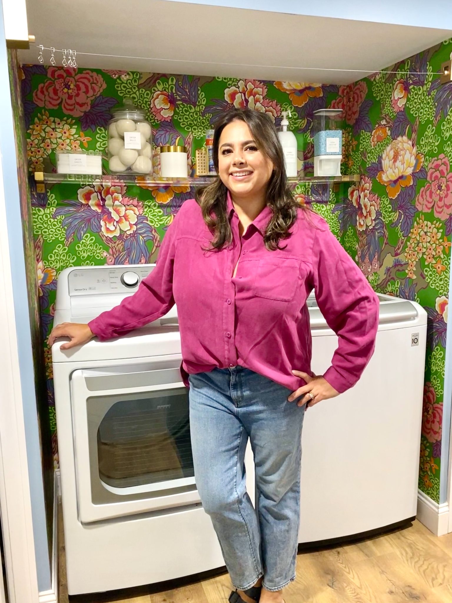
In our new home, the basement was completely unfinished. It was literally one of those dark spaces that you see in horror movies and are terrified of getting locked into. However, with the square footage in this house, I knew I needed to make the basement another workable and liveable floor of the house instead […]
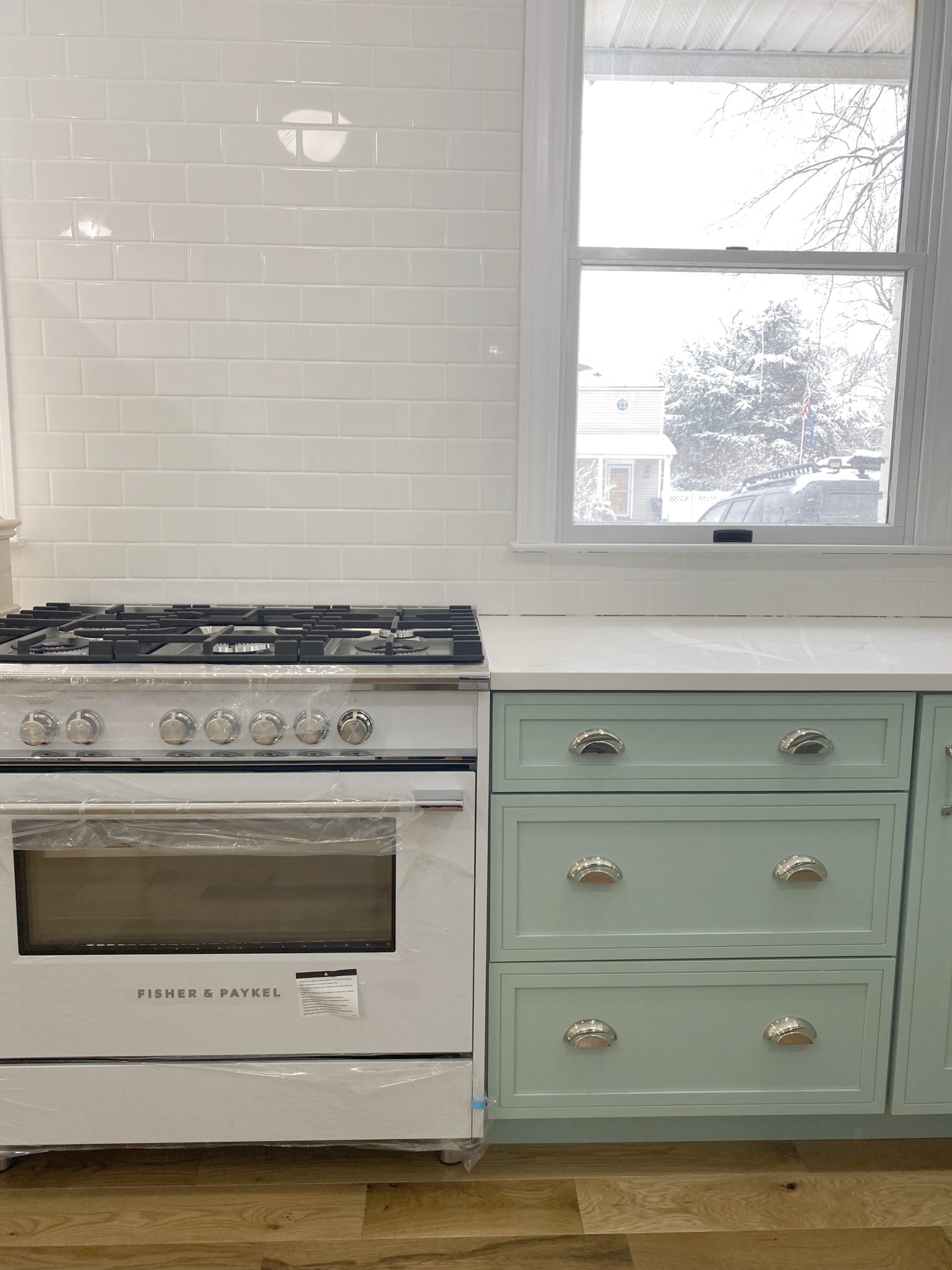
What to look for when it comes to picking out kitchen appliances: Leave room in your budget for appliances. When it comes to kitchen renovations everyone knows that the cabinetry and the labor of demoing and installing cabinetry is going to eat a lot of your budget. However, the second most expensive part of a […]
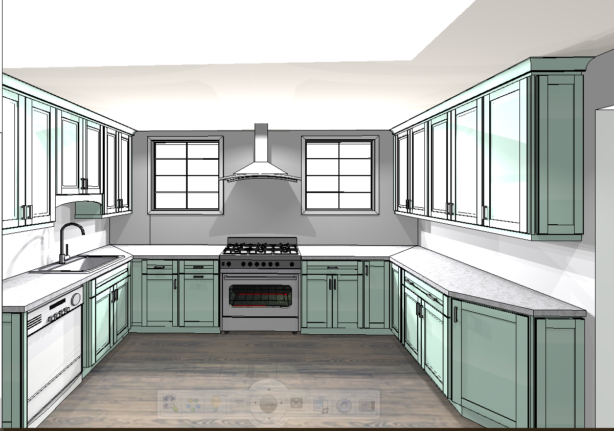
I don’t think I’m alone in thinking that designing a kitchen is an overwhelming undertaking. I’m an interior designer and even I find it stressful to iron out all of those details. So, when it comes time to design a kitchen I always like to partner with a kitchen designer to make sure I’m remembering […]
