
Look for Less: Lonny Bedroom
I really like the idea of having a weekly schedule where I know exactly what I’m going to post about everyday. In hopes of trying to make a schedule happen I’ve been thinking of weekly features I can do. We already have the weekend recap on Mondays, Pattern Play on Thursday and IN HER SHOES on Friday.
My Wednesday feature idea is look for less. I will pick out a popular room from a magazine, designer portfolio, tv or movie, etc and recreate it for you on a budget. If you have any suggestions on a room you want to see featured please email me at camila@effortless-style.com.
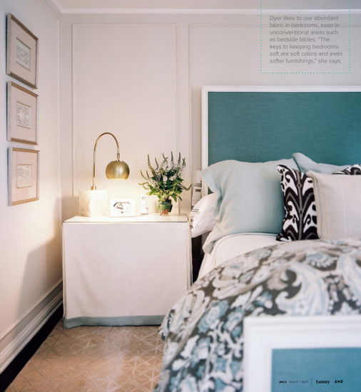
Today’s room was designed by Jennifer Dyer and featured in this month’s Lonny.
The most talked about room in her spread is her master bedroom:
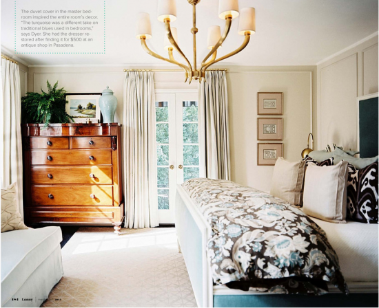
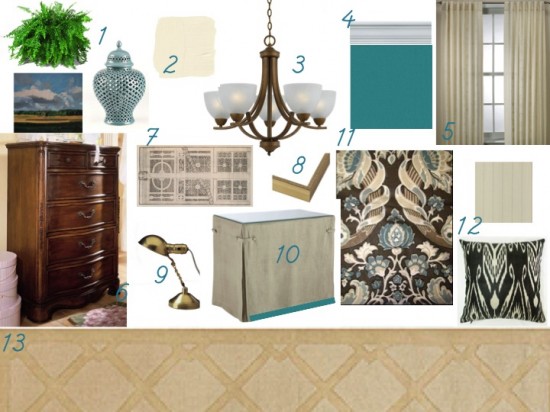
Here is how I would recreate the look on a budget:
1. Accessories: To recreate the look on top of the wooden chest all you need to do is a pick up a fern at your local Home Depot, a ginger jar at your local HomeGoods and a landscape watercolor by Paintbox. This particular painting is $60, but most of the ones available on his etsy store are $45.
2. Wall color: For a neutral base on the walls I would go with my of my favorite Benjamin Moore colors, Swiss Coffee. You can recreate the picture frame moulding all throughout the room on a budget by simply painting it out in a light shade.
3. Chandelier: My budget pick is this version from Overstock for only $96. It already comes in gold, but to step it up a notch I would probably spray paint a metallic gold.
4. Since we are on budget we can’t have the same exact bed, but we can recreate the look with a headboard. Using my instructions for my DIY Homasote Board you can use this fabric for the background and then trim it out in crown moulding from your local Home Depot.
5. These window panels start at $19 and go to $34 per panel. Not bad for ready made panels.
6. Now to get a wooden chest like the one in the featured room can be pretty pricey. Even in my budget friendly version it happens to be the most expensive thing in my round up. You can easily search your local thrift stores and craigslist to find a more budget friendly option.
7. My best type of artwork for a budget friendly room is FREE! I knew from looking at the artwork in the room that the trio of frames featured garden plans. A quick virtual trip to the NYPL digital gallery and found pages and pages. Print some out at home.
8. Place them in these ornate silver frames.
9. The original nightstand lamp is a stunner from Arteriors Home that comes in high $300s. Not budget friendly. My version doesn’t have a marble base, but it comes in at $109.
10. Creating the nightstands would be an easy DIY project. Bryn has a great post about how to tackle it on your own.
11. The showstopper in the room has to be the bedding. To recreate the comforter use the same fabric(only $20 a yard) and have a duvet cover made for you. Your local tailor or dry cleaner can tackle this task on a budget.
12. Toss Pillows: Ikat toss pillows for only $30. For my striped fabric I searched the apparel fabric section and found the perfect one for only $8 a yard.
13. Ah Overstock I have a love/hate relationship with you. The rug I have featured is now sold out. Boo! But they do have something similar available here.
Whew! All done. So, how do you like the idea of a new feature like this? What room do you want to see tackled next week?
Related
Leave a Reply Cancel reply
get inspired with our own home tour
ON THE BLOG
My living room is one of the rooms that evolved drastically from when we first moved one. Originally I painted the walls chocolate brown and did accents of white, blue and orange. That lasted maybe 2 years.
Our dining room sat empty for months. Okay maybe it was empty for just a handful of weeks and then we couldn’t take it anymore and put in a folding table and plastic outdoor chairs, but in my mind that was still empty.
On the main floor of our house we have a Florida room. Being that it’s a Florida room it is a considered a 3 season room, because there is no heat in the room. The previous owners used it as an indoor patio with outdoor furniture and it looked like this when we moved in.
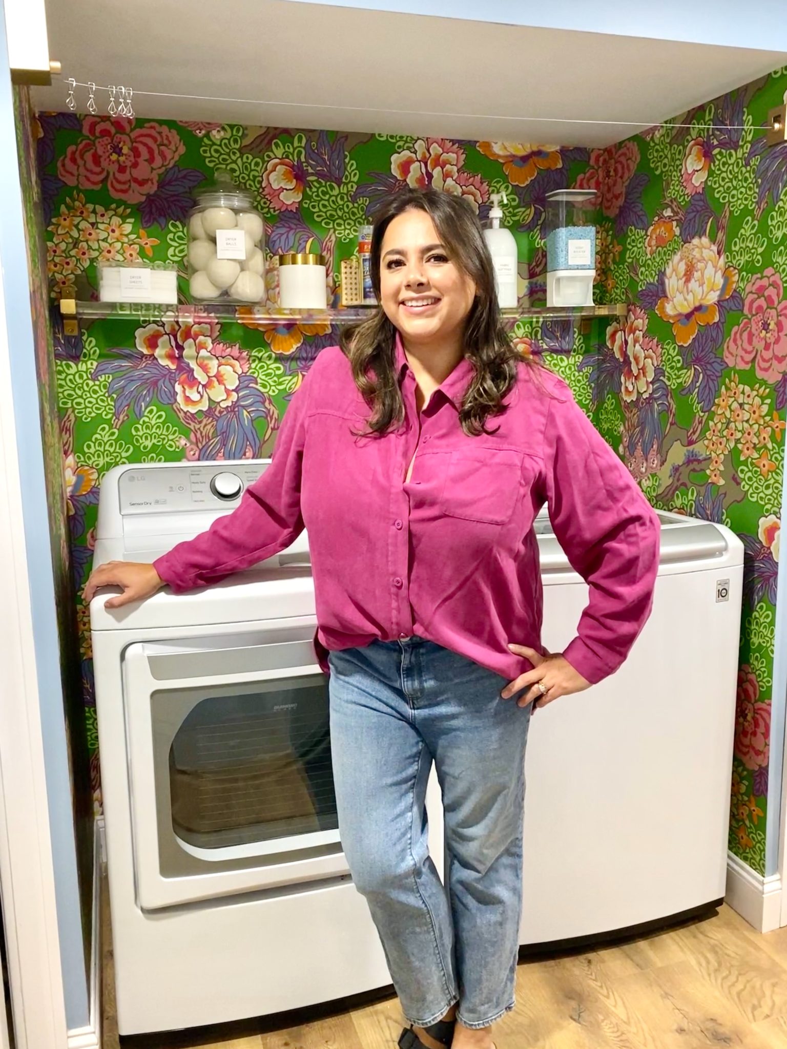
In our new home, the basement was completely unfinished. It was literally one of those dark spaces that you see in horror movies and are terrified of getting locked into. However, with the square footage in this house, I knew I needed to make the basement another workable and liveable floor of the house instead […]
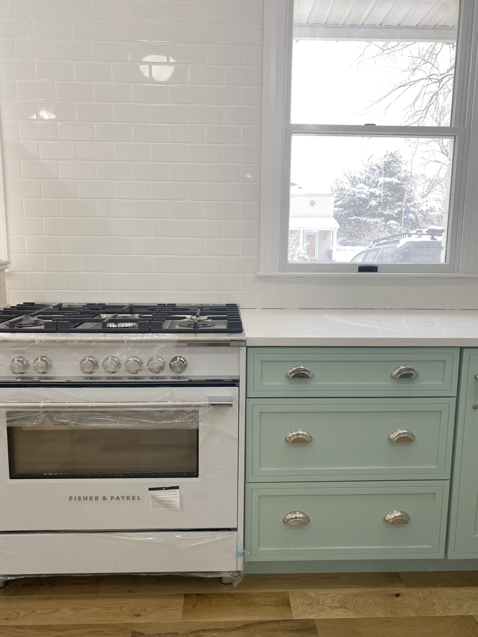
What to look for when it comes to picking out kitchen appliances: Leave room in your budget for appliances. When it comes to kitchen renovations everyone knows that the cabinetry and the labor of demoing and installing cabinetry is going to eat a lot of your budget. However, the second most expensive part of a […]
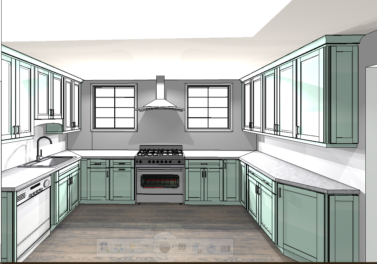
I don’t think I’m alone in thinking that designing a kitchen is an overwhelming undertaking. I’m an interior designer and even I find it stressful to iron out all of those details. So, when it comes time to design a kitchen I always like to partner with a kitchen designer to make sure I’m remembering […]


I loved that bedroom! Fun new feature, Camila!
What a great idea for a series! I found your blog via fabulous K and I’m so glad that I did. So many great ideas of how to get a sophisticated look for less on this post!
I love this feature idea!! Bring on the look-for-less! I’m contemplating working on a skirted table for an ugly bookshelf I have, so thanks for the think to Bryn’s tutorial!
I love this feature! It is always nice to see things on a budget!!
As a SAHM, I’m always looking to decorate on a nearly non-existent budget, so I love this idea for a series! I love the way you’ve broken that room down into affordable options. Thanks for sharing.
Such a great idea for a weekly feature! And I love the idea of printing out (free!) art form the NYPL. I’m off to print some for my place.
Love this feature and the bedroom. It is fun to see how beautiful design can be created for less. Nice job!
Love it!! Great feature!
I love this look for less post idea!!!! Keep doing them! They are great!!
ummm yes, yes & yes!! LOVE it all!!
I used to buy Apartment Therapy magazine for this very feature. High-Low, Look for less, a real favorite. Thank you so much!
I am with everyone else, I love this new feature of yours. Well done on the getting the look for less. I just love this room, and yours as well.
Very clever makeover. This is sure to be super popular! Loads of time for you to put together though. Great idea and good luck. Lynn
Love that turquoise colour!
I love this idea for a series. And you totally nailed recreated that room for less! So fun!
I love this feature! You have the best ideas – genius!!!!
I love that room! You did an awesome job recreating the look. I’m looking forward to this being a regular feature.
love, love this post!
I searched the fabric and nothing comes up! Could you give me an alternative? Love this, thank you!