
Leave a Reply
get inspired with our own home tour
ON THE BLOG
My living room is one of the rooms that evolved drastically from when we first moved one. Originally I painted the walls chocolate brown and did accents of white, blue and orange. That lasted maybe 2 years.
Our dining room sat empty for months. Okay maybe it was empty for just a handful of weeks and then we couldn’t take it anymore and put in a folding table and plastic outdoor chairs, but in my mind that was still empty.
On the main floor of our house we have a Florida room. Being that it’s a Florida room it is a considered a 3 season room, because there is no heat in the room. The previous owners used it as an indoor patio with outdoor furniture and it looked like this when we moved in.

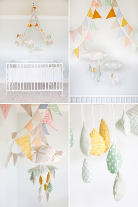
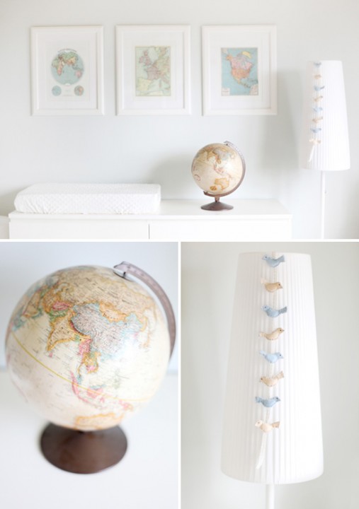
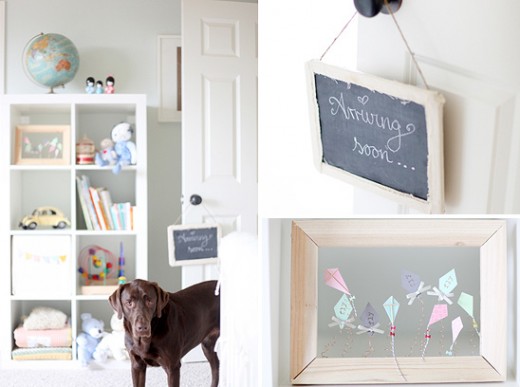


I love how white ad bright it is! And the framed atlas pages!
I am doing a giveaway for a vintage tin plate that I hung in my son’s room…it could work in a nursery too, I think! Drop by!
http://8foot6.blogspot.com/2011/10/another-parisian-giveaway.html
Although I love bright colors, this nursery is just splendid. I love it!
What a wonderful serene room. I love it! However, it may be a little too bright for inducing newborns to sleep….where’s the shades?
that bunting is the best part- it is soooo friggin adorable!
I love the serenity of this room. The bunting has to be my fave too.
Oh, I can’t decide. I am obsessed! I need to try that bunting out on my sisters nursery. Thanks for making my project list longer…
What a unique spin on the bunting trend, love it.
I’m looking for a great antique map for my nursery… no luck so far, but I have to admit I haven’t been really searching that hard. Hm
my husband would love this nursery…so clean, fresh and minimalist! i love the maps best!