
Weekend Recap: Client Nursery Reveal
Hi All,
Hope you all had a lovely weekend. We had a great weekend, but I must say the best part of my weekend was late Sunday when I got an email from one of my clients sharing professional pictures she had taken of the nursery I designed in her apartment. My client, Bee is a mom and blogger so we’ve always had lots to chat about during out design meetings and installs. We’ve worked on a bunch of rooms in her room so this is just a taste of what we’ve accomplished. Bee was actually the original lady behind Wedding Bee (she sold it to eharmony a couple of years back) and recently just started an amazing new parenting blog called, Hello Bee. It’s currently invitation only so make sure you head on over and request an invite.
So without further ado a peek of the nursery:
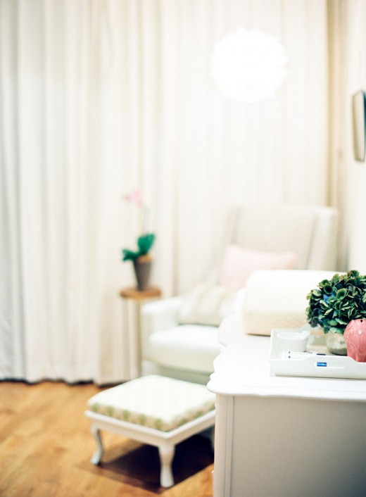
This room is teeny tiny (approximately 8′ x 12′) so we had to be really selective with what into the space. It also was the only room in the house with access to the backyard, which meant an unattractive door along the back door.
To remedy the door situation we lined the entire back wall with these curtain panels from JcPenneys.
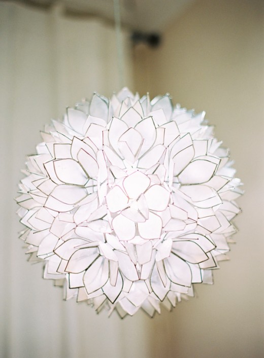
Above the glider we added some mood lighting with my favorite capiz pendant. No need to hard wire it as it simply plugs into the wall. In order to make it more baby friendly we added a dimmer. I thought the dimmer would be complicated, but it literally plugged into the plug from the light and took seconds.
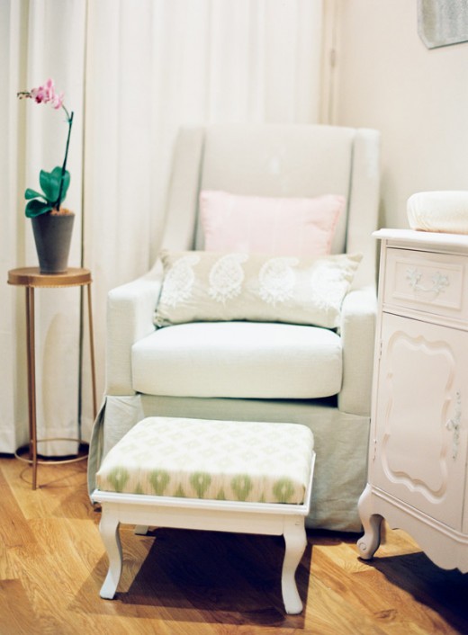
To get the most out of our space we went with one of the slimmest gliders we could find by Jennifer Delonge. Bee is on the petite size and her feet couldn’t touch the ground with this glider, but I found the perfect solution in a thrift store. The vintage foot stool got a coat of white paint, new foam and covered in ikat fabric.
In keeping with our petite and slim theme we went with a vintage dresser instead of something new. Vintage pieces not only have character, but most times they have a much smaller foot print than modern furniture pieces. It got a facelift with a coat of Italian Villa by Behr.
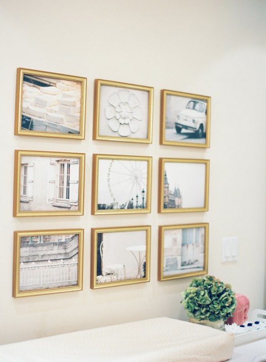
We were inspired by many all white nursery so we went with a lot of creams, whites, pale pinks in our design to get the look we wanted. One of my favorite parts of the room is the artwork above the dresser:
Little Brown Pen came to the rescue with her set of 9 White collection Paris Prints. She has a variety of collections in different color stories and picking up a set of 9 equals an instant gallery wall. Frames were purchased from my favorite source for inexpensive frames, Frames USA that I discussed earlier in this post.
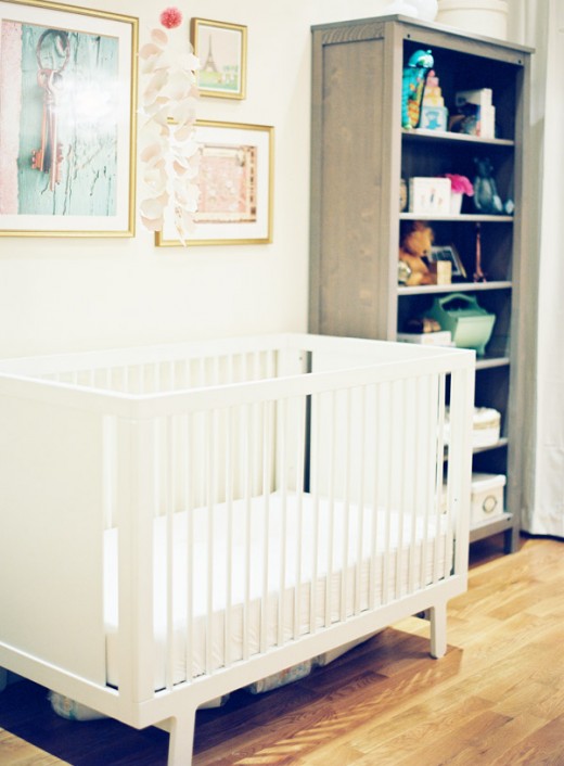
Opposite the dresser we have the crib area. This area is not complete yet. You see this nursery was originally Bee’s son and while we were working on her home she found out she was expecting and the room then became the new baby’s nursery.
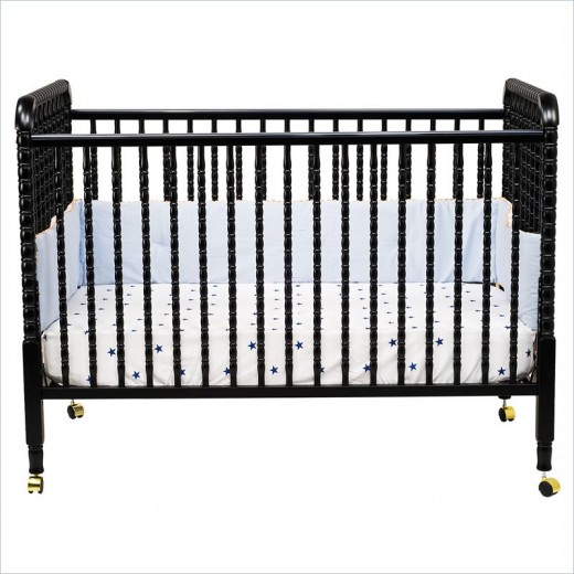
With all of the light tones in the room I really wanted something with contrast so in a little bit that white crib will be switched out with this baby.
New crib that will grace the wall pictured above:
{Jenny Lind crib in Espresso}
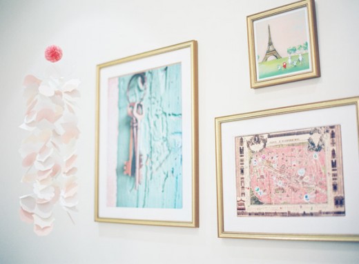
Close up of the artwork above the crib:
Part of the over all look for the space was a Parisian feel. So along with the 9 prints of Paris above the gallery wall we added some more colorful pieces above the crib.
Illustrated Paris Map
We are in Paris Bunny print
Keys to the French Winery
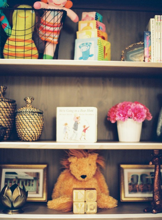
Close up of some of the sweet items in the bookcase:
{One of my favorite items are the glided letter blocks that spell out LOVE from Cabin 7.}
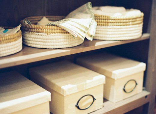
{Another obsession is the new collection of KVARNVIK storage boxes at IKEA. They comes in this cream shade and dark blue and have a great grasscloth style texture to them. Plus they come in a variety of sizes.}
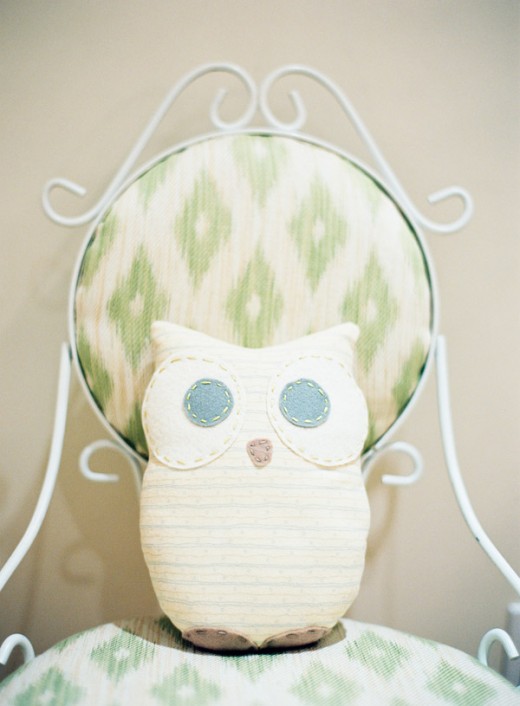
Finishing touch: We had a teeny bit of free wall space to the left of the chair. Again a vintage find was our solution to getting the most of the space. We purchased a wire scroll chair on ebay and then simply recovered it with more of our green ikat fabric.
So pretty if I do say so myself. 
If you are a mom or soon to be mom you must remember to head over to Hello Bee and request your invite! I’ll see you there.
All of the stunning pictures were taken by the talented Jen Huang.
Related
Leave a Reply Cancel reply
get inspired with our own home tour
ON THE BLOG
My living room is one of the rooms that evolved drastically from when we first moved one. Originally I painted the walls chocolate brown and did accents of white, blue and orange. That lasted maybe 2 years.
Our dining room sat empty for months. Okay maybe it was empty for just a handful of weeks and then we couldn’t take it anymore and put in a folding table and plastic outdoor chairs, but in my mind that was still empty.
On the main floor of our house we have a Florida room. Being that it’s a Florida room it is a considered a 3 season room, because there is no heat in the room. The previous owners used it as an indoor patio with outdoor furniture and it looked like this when we moved in.
In our new home, the basement was completely unfinished. It was literally one of those dark spaces that you see in horror movies and are terrified of getting locked into. However, with the square footage in this house, I knew I needed to make the basement another workable and liveable floor of the house instead […]
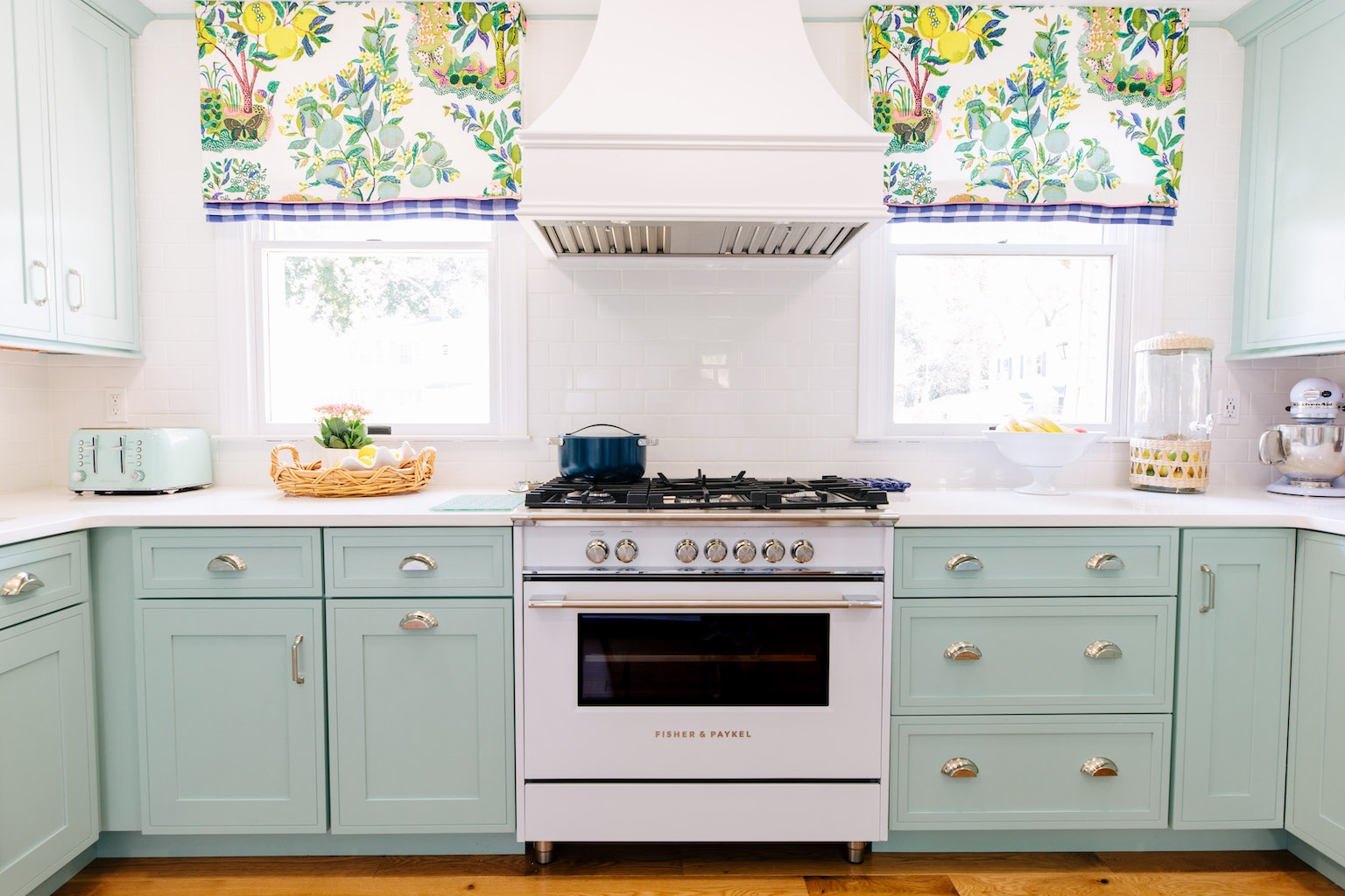
What to look for when it comes to picking out kitchen appliances: Leave room in your budget for appliances. When it comes to kitchen renovations everyone knows that the cabinetry and the labor of demoing and installing cabinetry is going to eat a lot of your budget. However, the second most expensive part of a […]
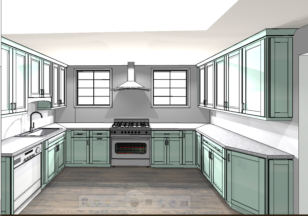
I don’t think I’m alone in thinking that designing a kitchen is an overwhelming undertaking. I’m an interior designer and even I find it stressful to iron out all of those details. So, when it comes time to design a kitchen I always like to partner with a kitchen designer to make sure I’m remembering […]
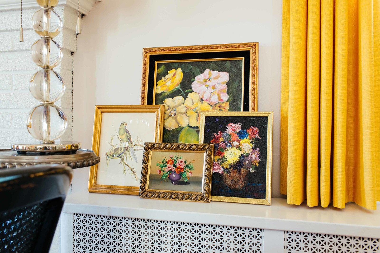


So, SO sweet – heading over to the artwork site to see if any of the color combos will work in my client’s nursery – we’re still in a pinch for artwork!
The nursery is stunning. What a beautiful space for a baby!
It looks great! I love those Paris photos and the vintage furniture. So sweet and lovely. xo
The art work is so cool and unusual. I love it in the space. Nurseries don’t have to be so ordinary. Great space.
Wow, love the way it turned out! So soothing and light and airy!
what a beautiful space! I LOVE that glider and the ikat fabric you chose- really pretty!
Yummy! I love it all!
Such a good nursery! One of the best I have ever seen.
Very pretty!
It turned out beautifully. The perfect serene place for baby.
I love those frames! Can you tell me which style you went with?
Oh wow! What a cool use of the photos.
Really looks great!
So happy you approve Nichole! I adore the prints. I love the type of paper they are printed on.
We have a big paper fetish around here. It’s one of the things we love the most, and the texture really works with the textures in Paris.
So happy you blogged about it. Thanks!
I absolutely beautiful! So serene! Wow. I love how it isn’t themey or has the typical fare, simply stunning:)
It’s gorgeous- so serene!! I loved using Wedding Bee when I was planning my wedding and I’m so happy to see that Bee has some babies now!
Lve it c!!! Its sweet and gorgeous!! Xoxoxoxoo
Oh my gosh this is insanity gorgeous. Fabulous, fabulous job!
Beautiful and Gorgeous photography!! Janell
gorgeous. feels like you read my mind – i’m planning my nursery now and 2 things on my list are a black jenny lind crib and a gallery wall of metallic gold frames!
I love the picture frames. I’m designing our little girls nursery right now. What color are the frames and which type? I headed on on over to frameUSA but wanted to see which ones you went with. Thank you so much! The room is beautiful!!
Gorgeous all around! Really loving that ikat fabric – where did you find it? xo
Hi Abby,
It was a random find at a $1, $3, $5 a yard fabric shop that is near me. It didn’t have any details. Sorry!
C