
Mini me: Global Glam Style Plan
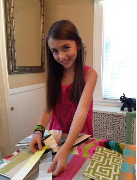
Time for edition 2 of mini me decorating. As you probably remember I took one of my former clients, Julia to the Duralee showroom with me and we had some fun picking out some fabric combos to use as inspiration for pre-teen/teen girls bedrooms.
Two weeks ago we tackled a colorful and playful style plan and this week we are tackling a global glam look.
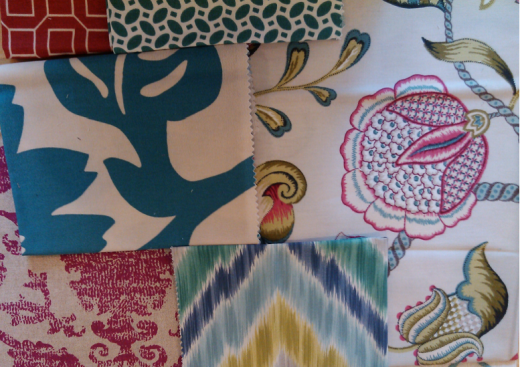
Here are the fabrics we were working with:
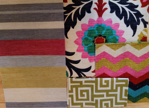
Multi Stripe in Bittersweet
Moorish Pattern
Mulit Colored Chevron
Greek Key
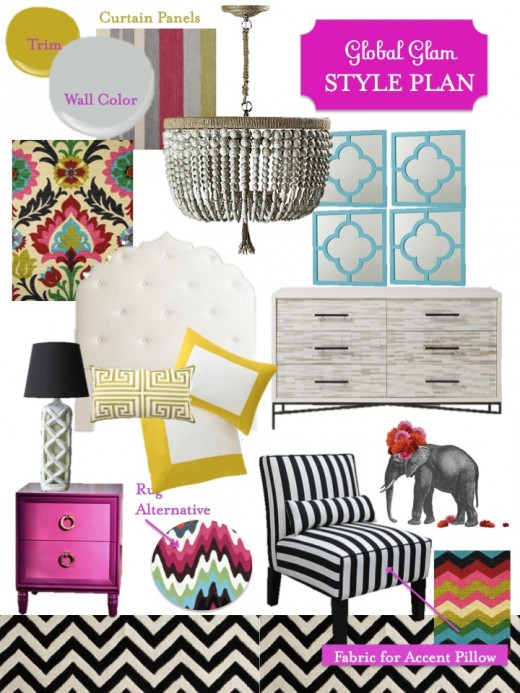
Here is what we did with it:
Walls/Trim: We picked Calla Lily 139-2 for the walls. Don’t forgot that design is all about the details. We decided to paint our doors and trim with Zanzibar Retreat. All of the colors are by Mythic.
Windows: We went with the youthful yet sophisticated striped fabric for the long curtain panels.
Floors: Since we wanted a global feel for the space we decided to go with a chevron pattern for the rug. Chevrons are often seen on Moroccan tile so using this pattern helped get our global look. If you wanted a bit more color I would go with this flamestitch zig-zag.
Lighting: The Malibu chandelier is the perfect edition for our space. It’s a perfect marriage of our global glam look. Plus it’s grown up enough and neutral enough that it will grow with our pre-teen/teen client.
Get Dressed: This dresser by West Elm is perfection. The wood tiled front adds another touch of global to our room, but the tops and sides are lacquered which adds to our glam part of the design equation. There is a lot going on in the space with our fabrics and colors so it was best to keep the area above the dresser clean. One of the best ways to do that, but still have some interest is to go with mirrors in a set of multiples. These have the added bonus of a simple pattern and they are a great pop of color.
Bed Time: For our bed area we decided to go all out with a unique headboard in a Moorish pattern. It’s available via Calico Corner, but could also be recreated in a less intricate way with a DIY project. Remember when we built and upholstered our own bed!I would have it covered in the Moorish pattern fabric. To make our bed I knew right away we needed to use the new modern border duvet set by Dwell Studio. I’m obsessed with it in the citron color and think it works just perfectly with the addition of this greek key pillow.You could also use the greek key fabric and make your own pillow. For our nightstand area one of my favorites is this little number from The New Traditionalists.It’s a bit pricey so you can get a similar look by revamping a thrift store find with similar lines and new ring pulls. I think every room needs a vintage piece and the perfect one for this space is this bamboo number with a black lampshade.
Reading Nook: Ah who doesn’t love a great stripe especially when it’s black and white. This chair would be a perfect place to play on your ipad or read an actual book! Top it off with our last fabric used as an accent pillow. Since there is no other artwork in the space I would go big with the elephant print and order it in the 30″ x 40″ size and center it above the reading nook.
So, do you have a favorite part of the style plan? I love it all of it and Julia agrees! Of course if you twisted my arm and made me pick I’m practically drooling over that over sized elephant print! I so “need” it.
Need design help? Effortless Style offers style plans for all rooms and budgets. Contact me, camila@effortless-style.com if you want to get started.
Next week we will be sharing our style plan for updated pretty in pink:
Happy Friday!
Related
Leave a Reply Cancel reply
get inspired with our own home tour
ON THE BLOG
My living room is one of the rooms that evolved drastically from when we first moved one. Originally I painted the walls chocolate brown and did accents of white, blue and orange. That lasted maybe 2 years.
Our dining room sat empty for months. Okay maybe it was empty for just a handful of weeks and then we couldn’t take it anymore and put in a folding table and plastic outdoor chairs, but in my mind that was still empty.
On the main floor of our house we have a Florida room. Being that it’s a Florida room it is a considered a 3 season room, because there is no heat in the room. The previous owners used it as an indoor patio with outdoor furniture and it looked like this when we moved in.
In our new home, the basement was completely unfinished. It was literally one of those dark spaces that you see in horror movies and are terrified of getting locked into. However, with the square footage in this house, I knew I needed to make the basement another workable and liveable floor of the house instead […]
What to look for when it comes to picking out kitchen appliances: Leave room in your budget for appliances. When it comes to kitchen renovations everyone knows that the cabinetry and the labor of demoing and installing cabinetry is going to eat a lot of your budget. However, the second most expensive part of a […]
I don’t think I’m alone in thinking that designing a kitchen is an overwhelming undertaking. I’m an interior designer and even I find it stressful to iron out all of those details. So, when it comes time to design a kitchen I always like to partner with a kitchen designer to make sure I’m remembering […]


I love this series–it’s so sweet! Looking forward to next week’s! Happy Friday!
This is such a sweet series! She has a great eye for her age! I can’t decide what part is my favorite- I think I like it all!
love the patterns and textures!! those mirrors are great, too!