
Masculine Nursery via Home Decorators
Baby #2 is quickly approaching his due date. During this time with Hudson I was busy planning the finishing touches in his nursery. For this baby though they will be sharing a room since we only have 2 bedrooms in our house. This means no new nursery plans.
Of course a girl can dream and I’ve been sketching away ideas of what I would do with baby #2’s nursery if I had the extra room. For Hudson I went happy and colorful, but for some reason this time around I’m leaning more towards masculine design. I was sourcing rugs on Home Decorators and realized they had a bunch of goodies that could essential hold everything to design a nursery in one place. Challenge accepted and I got to work on a design plan!
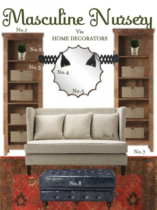
Here is what I came up with:
No.1: Loved the reclaimed wood look of these Holbrook bookcases.
No.2 & No.3: I would fill the bookcases with a boxwood topiary or two and baskets to help hide the mess.
No.4: Adore these accordion wall lamps and their $99 price tag! I would actually install them on the sides of the bookcase and hide the cables inside the bookcase.
No.5: Even a little gentleman needs some glam in his space. Enter this beautiful mirror.
No.6: I’m not a big fan of gliders in a nursery. I tend to make an accent chair in the parents master bedroom a glider and then use a settee in the nursery. The settee is a larger and helps provide a comfy sitting area for story time, playing, etc. Plus Hudson never liked to glide so I would always sit the settee in his room for feedings.
No.7: Ah the rug that started this all. Isn’t it a beauty? In love with the pattern and the burnt orange color in it. It’s not only soft, but busy enough that it would hide a spill or two.
No.8: Love the use of an ottoman with a settee. It provides additional seating plus a cozy place to rest your feet. Using it in blue leather adds a little something off in the space, which I think helps it look more real. Love the addition of blue in the room.
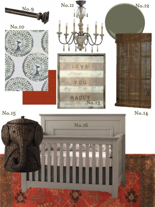
No.9: These black/gold drapery rodsadd a great touch of glam yet vintage look to the space.
No.10: Of course the designer in me had to step away from Home Decorators for a moment to pick out fabric for custom window treatments. Dying to use this peacock fabric from Tilton Fenwickand back it with a pop of orange.
No.11: I hate rooms that are all Belgium design. They are so popular at market that I just tired of it rather quickly. I do enjoy a little dose of it, which is where this chandelier works it’s way into the plan.
No.12: For the walls I wanted a shade of green that was dark, but not too dark. The perfect hue? Galapagos Green from Benjamin Moore.
No.13: Super sweet artwork that was made for a nursery.
No.14: I love pairing window panels with bamboo shades.
No.15: I had to use some sort of elephant in the space.
No.16: Did you know they sold cribs? Love this crib for the new gentleman in my life.
Whew! Typically as a designer I shop around a lot and never just stick to one store/vendor. It actually was a bit easier than I thought it would be and I had fun putting this plan together. One thing you will always tend to see missing from nurseries are traditional changing tables. I find that you never really use them. I have not used Hudson’s changing station once. I just always changed him on our bed, floor, or sofa.
Related
Leave a Reply Cancel reply
get inspired with our own home tour
ON THE BLOG
My living room is one of the rooms that evolved drastically from when we first moved one. Originally I painted the walls chocolate brown and did accents of white, blue and orange. That lasted maybe 2 years.
Our dining room sat empty for months. Okay maybe it was empty for just a handful of weeks and then we couldn’t take it anymore and put in a folding table and plastic outdoor chairs, but in my mind that was still empty.
On the main floor of our house we have a Florida room. Being that it’s a Florida room it is a considered a 3 season room, because there is no heat in the room. The previous owners used it as an indoor patio with outdoor furniture and it looked like this when we moved in.
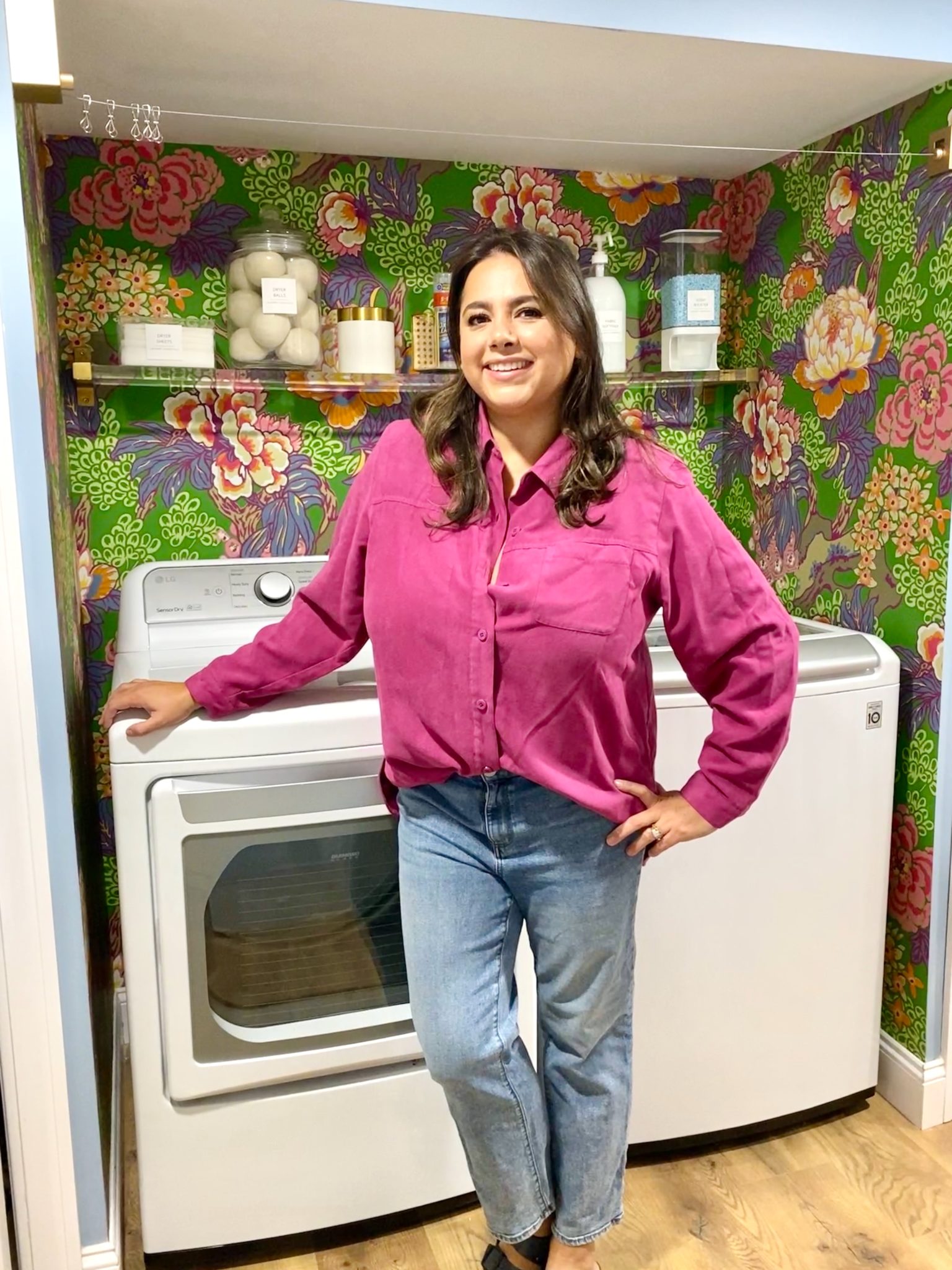
In our new home, the basement was completely unfinished. It was literally one of those dark spaces that you see in horror movies and are terrified of getting locked into. However, with the square footage in this house, I knew I needed to make the basement another workable and liveable floor of the house instead […]
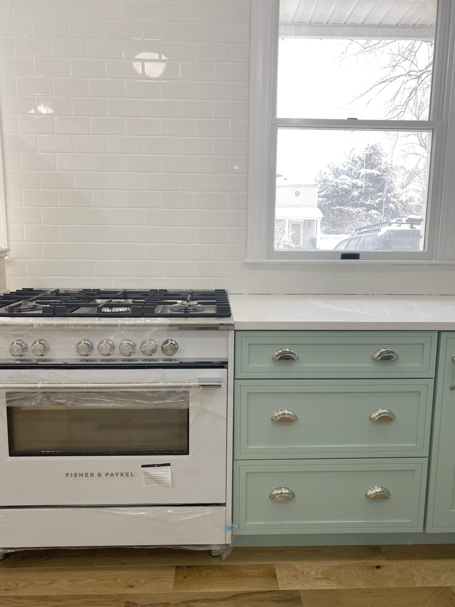
What to look for when it comes to picking out kitchen appliances: Leave room in your budget for appliances. When it comes to kitchen renovations everyone knows that the cabinetry and the labor of demoing and installing cabinetry is going to eat a lot of your budget. However, the second most expensive part of a […]
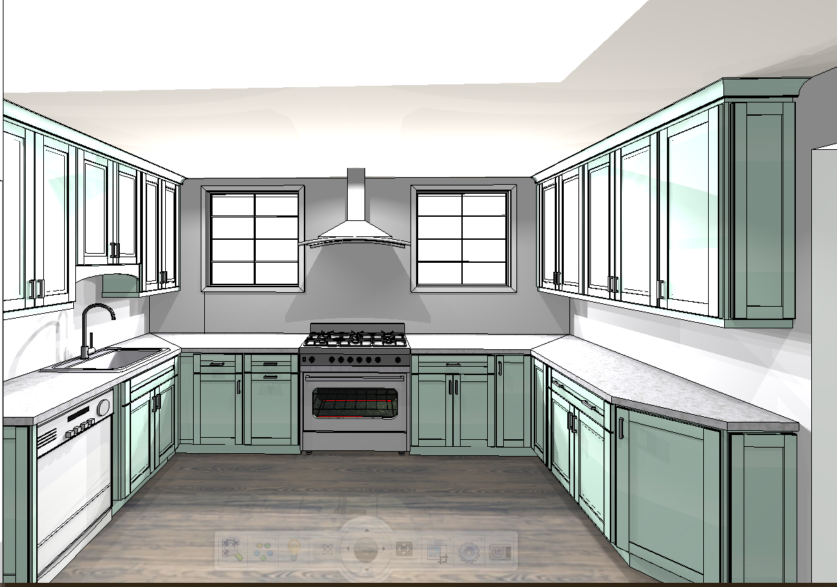
I don’t think I’m alone in thinking that designing a kitchen is an overwhelming undertaking. I’m an interior designer and even I find it stressful to iron out all of those details. So, when it comes time to design a kitchen I always like to partner with a kitchen designer to make sure I’m remembering […]


You’ve done a beautiful job pulling together a handsome and sophisticated space!