Home Tour: Kitchen
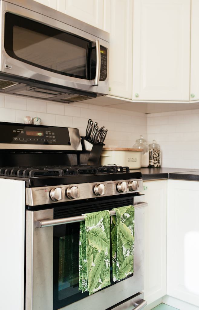
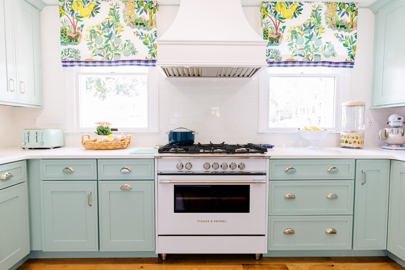
I wish I had before photos of our kitchen. Let’s just say that for most it was not the selling point of the house. In our eyes it was perfect, because it was so dated that it needed to be redone. There were no if’s, ands or butts about it. It had dated wood toned cabinets, a chambers stove and mustard yellow tile 3/4 way up the wall and vinyl laminate on the floors.
We worked on it right away before we even moved in. Jon and his dad did it all themselves. I remember running over one night when we thought that since the rest of the main floor had wood there had to be a chance that under the vinyl laminate there was wood! We ran over and low and behold we were right! It wasn’t in the best condition, but instead of making that a negative it just gave me the go ahead to paint them and not feel bad about it.
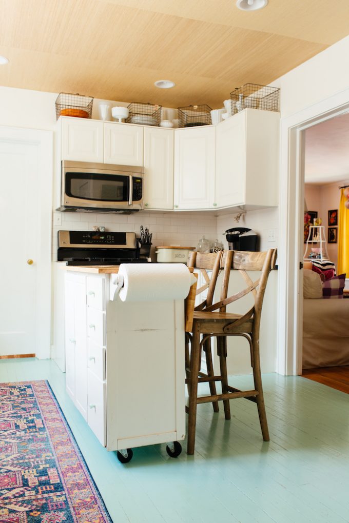
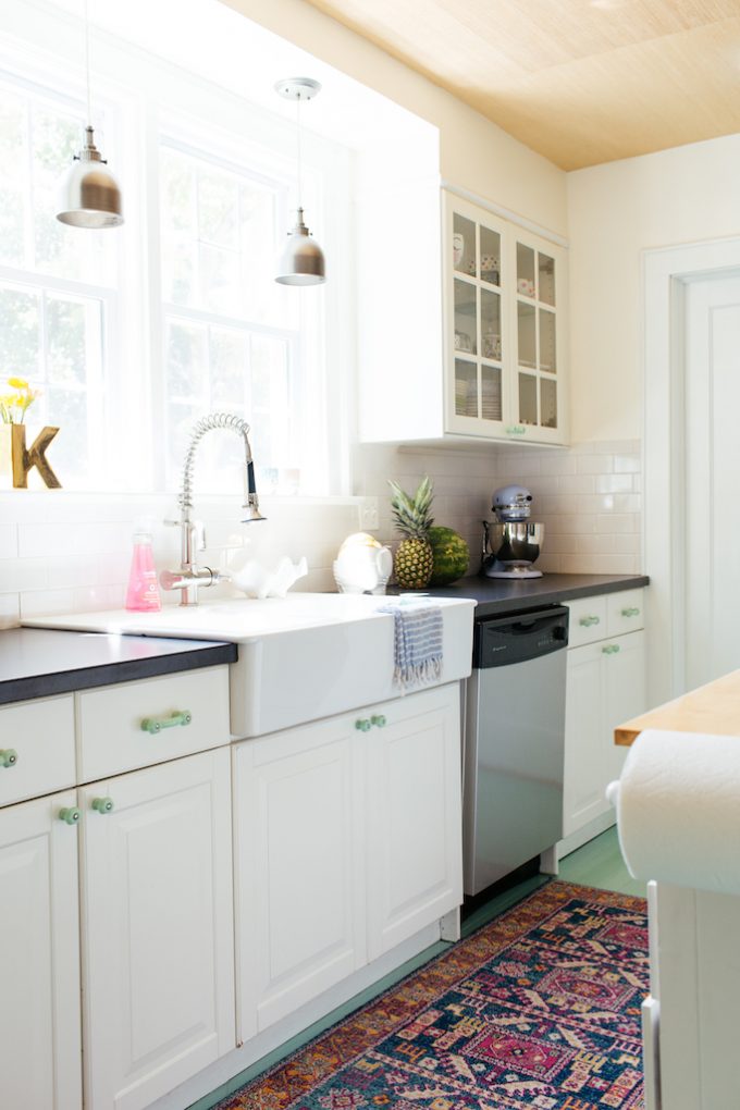
We had fun in this space and it pretty much remained as is from it’s initial re-design. I knew immediately I wanted something bright and airy. So we went with Ikea for our cabinets. We loved them. It made re-doing the kitchen more affordable, which was nice since we needed new appliances as well.
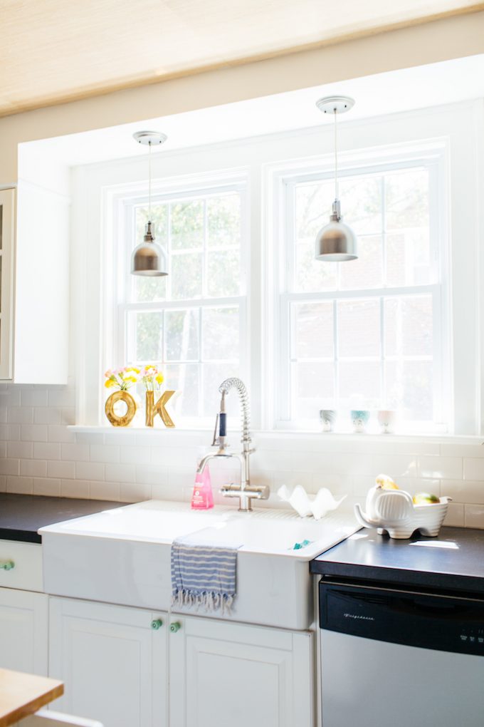
Another must have on my list for the new kitchen look was a farm sink. I will forever love them and would love to have one in any future kitchens. It’s just so nice to have the double sink and the white porcelain never stained or chipped on us.
One of the updates we made after the initial remodel was adding grasscloth to the ceiling. The ceiling is the 5th wall that is typical forgotten in design, but I always love showing it a little love. I loved having a little texture up their and it paired nicely with our almost white paint called, Glass of milk by Martha Stewart.
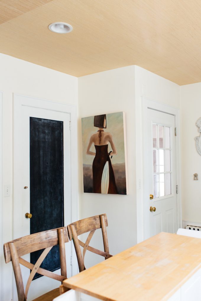
We also have 5 doors in the kitchen. One that leads to the basement, one that leads to the florida room/office, one that leads to the dining room, one that leads to the living room and one that leads to the powder room. I actually love having the kitchen closed off to every other room. It’s nice to hide the cooking mess when company is over. We painted one of the doors with chalkboard and it was originally for us to write out shopping lists, but once we had kids it quickly became their favorite hang out. I was able to cook so many meals without my mini chef’s for the exchange of a piece of chalk.
We went with classic subway tile for the backsplash surround and while I love it I do wish I had gone with a darker grout color. Jon liked it all white and I wanted gray, but marriage is a compromise so I left it go, but if I could change one thing that would be it.
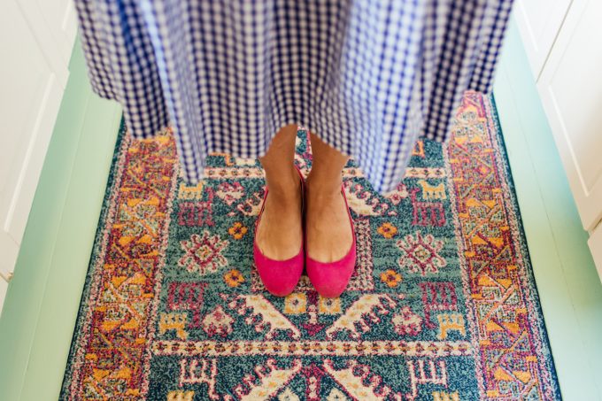
One of my favorite little design details is all of the jade hardware that picked up the painted jade green floors perfectly.
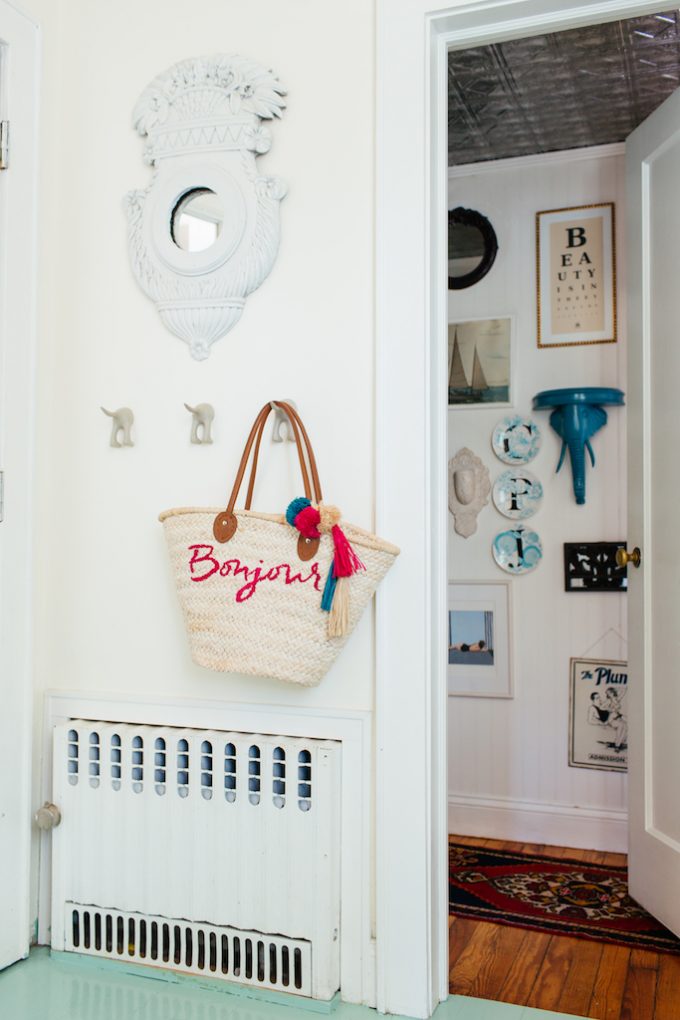
Here you can catch a little peek into our powder room. It was a pretty nondescript room and we added some character by adding bead board from floor to ceiling and then applying tin tiles to the ceiling. Add to that a massive gallery wall with pieces that we collected thru the years and it really gave the little bathroom some life.
Hope you enjoyed a little peek into our home and it has helped give you some tips on how to be adventurous with color and pattern in your space!
Amazing photographs from Erin Kestenbaum.
Related
Leave a Reply Cancel reply
get inspired with our own home tour
ON THE BLOG
My living room is one of the rooms that evolved drastically from when we first moved one. Originally I painted the walls chocolate brown and did accents of white, blue and orange. That lasted maybe 2 years.
Our dining room sat empty for months. Okay maybe it was empty for just a handful of weeks and then we couldn’t take it anymore and put in a folding table and plastic outdoor chairs, but in my mind that was still empty.
On the main floor of our house we have a Florida room. Being that it’s a Florida room it is a considered a 3 season room, because there is no heat in the room. The previous owners used it as an indoor patio with outdoor furniture and it looked like this when we moved in.
In our new home, the basement was completely unfinished. It was literally one of those dark spaces that you see in horror movies and are terrified of getting locked into. However, with the square footage in this house, I knew I needed to make the basement another workable and liveable floor of the house instead […]
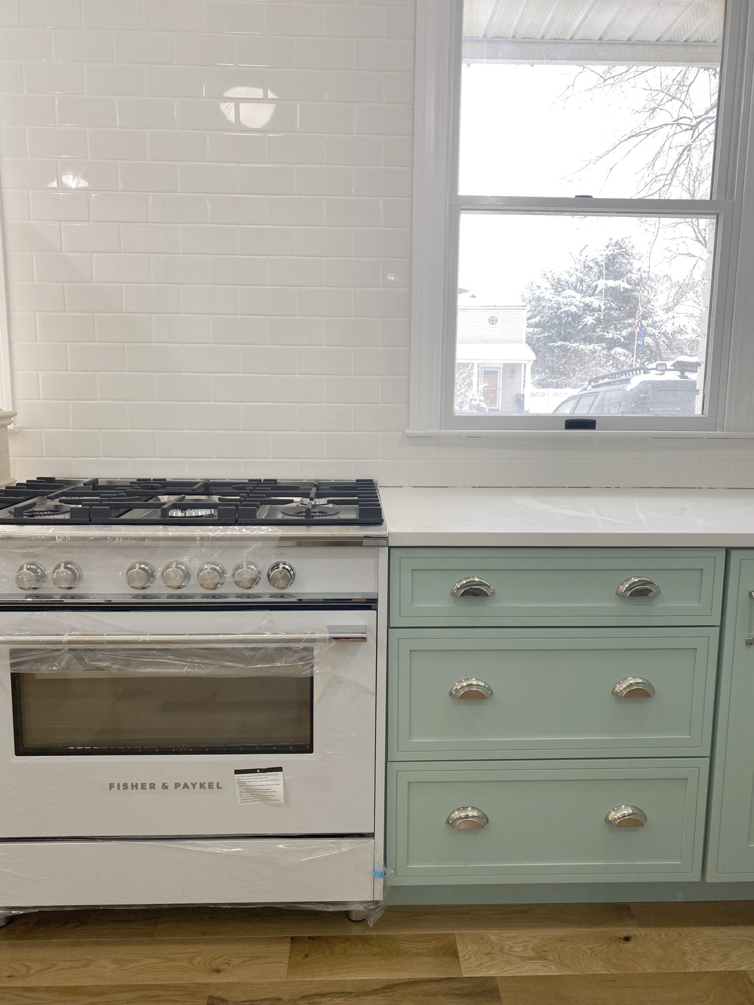
What to look for when it comes to picking out kitchen appliances: Leave room in your budget for appliances. When it comes to kitchen renovations everyone knows that the cabinetry and the labor of demoing and installing cabinetry is going to eat a lot of your budget. However, the second most expensive part of a […]
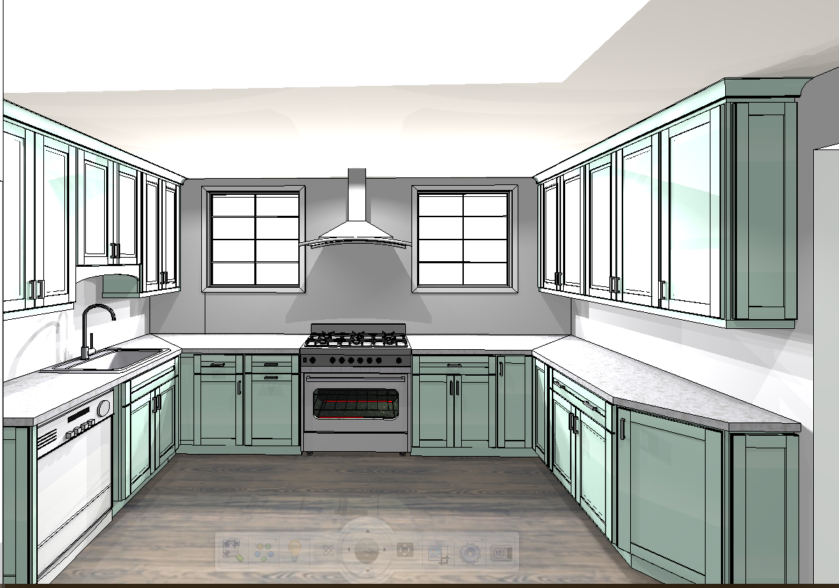
I don’t think I’m alone in thinking that designing a kitchen is an overwhelming undertaking. I’m an interior designer and even I find it stressful to iron out all of those details. So, when it comes time to design a kitchen I always like to partner with a kitchen designer to make sure I’m remembering […]
