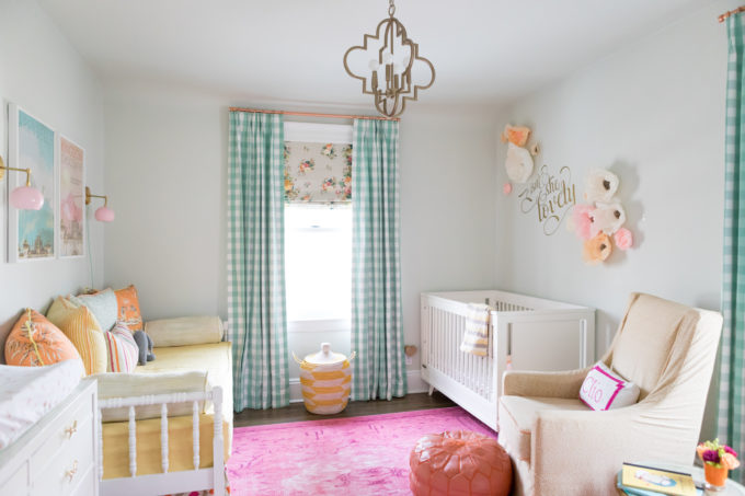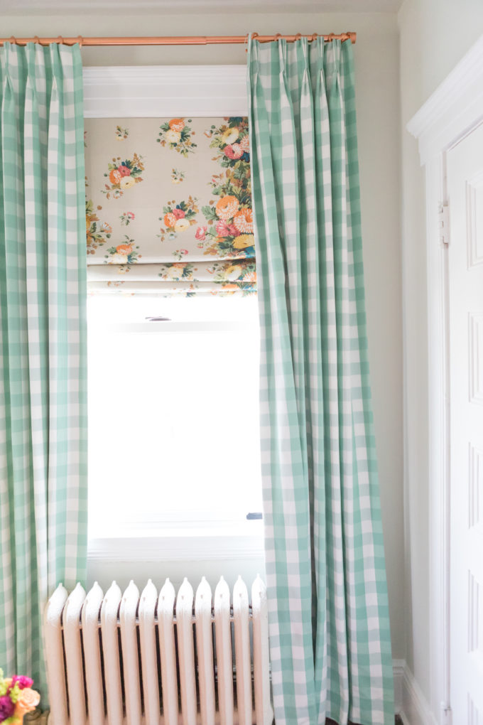
I have been meaning to share these photos for over a year now! Luckily good design is timeless and this beauty is still going strong and looks as lovely as ever! Designing nurseries is one of my favorite things to do! I find that it’s a space where people are more open to using color and whimsy, which is everything I love in all design. When I design nurseries I like to make it a space that can grow with the baby and doesn’t need to be switched up after a couple of years. I don’t go trendy at all. It’s timeless all the way! With this nursery I took what some might call, old fashioned floral chintz and paired with a preppy gingham. Blended together the space looks chic and feminine and I threw in a couple edgy pieces to mix it up.
Isn’t it pretty! It belongs to my sweetest little friend, Clio! Clio’s mom is one of my best friends who completely trusts me with her home. I had a vision and she totally let me go with it!
This floral chintz fabric was my jumping up point! It’s always nice to have an inspiration piece that you can pull colors from for the rest of the space.
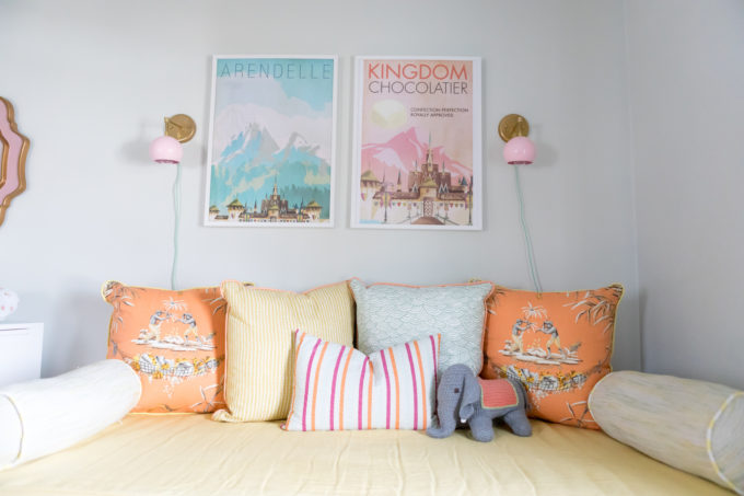
While the space is Clio’s 90 percent of the time when they have a visitor it is also used as a guest room. So, we needed to make space for a daybed. I love daybeds in nurseries. It’s a cozy perch to read a book with your baby, can be used as a guest room space if needed and can used as a big girl bed when the time comes!
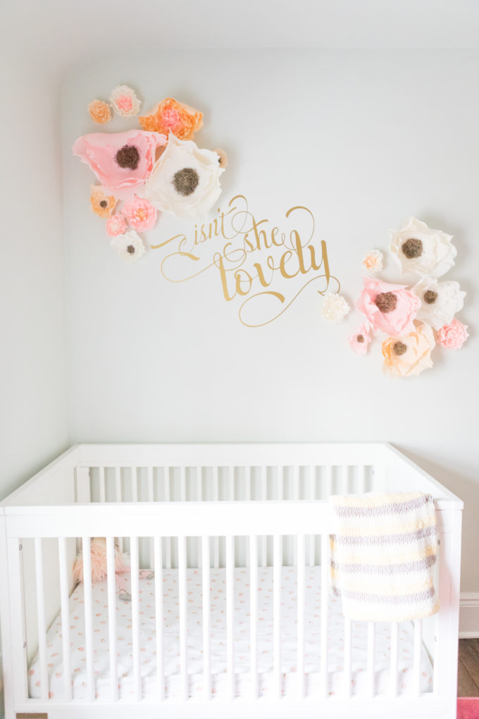
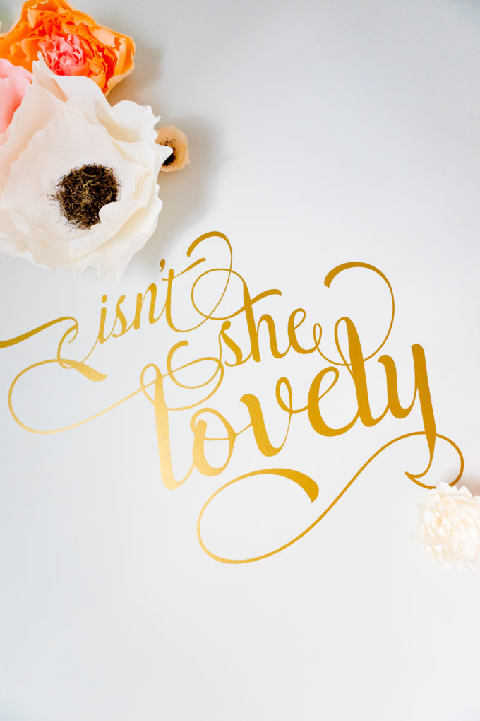
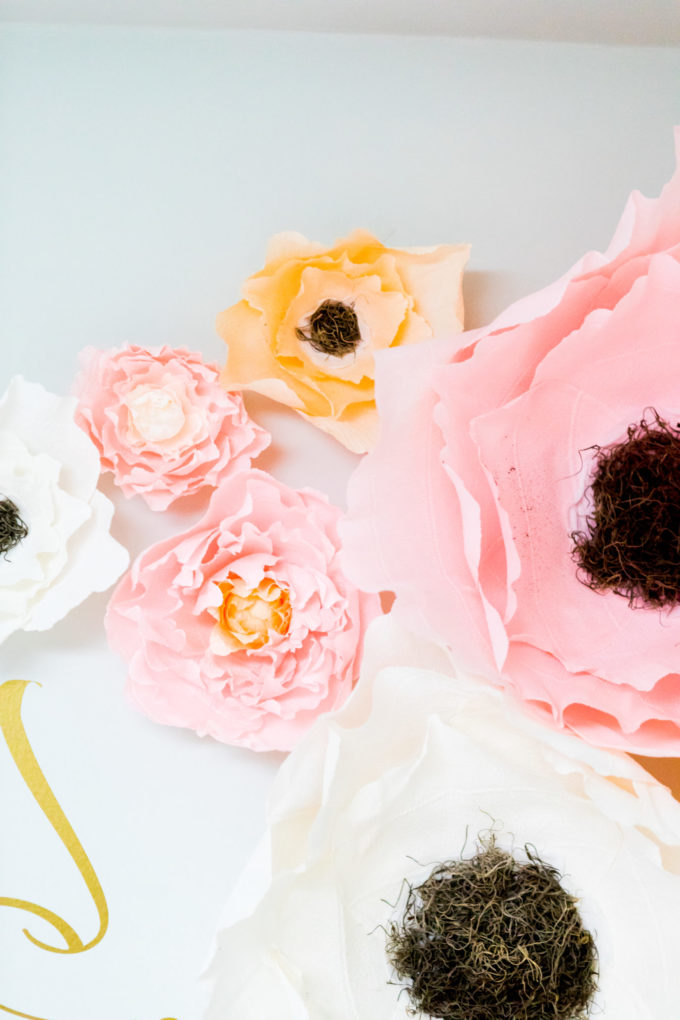
Opposite the daybed is the crib. People are always nervous about putting anything to heavy in the artwork realm above a crib. A good solution here is a wall decal. I don’t love wall decal’s, but when they are done right it can be amazing. It’s important to pay attention to the font. A chic font equals a chic decal. I like the idea of mixing it with something else so, it all makes more of an impact. In this case we went with handmade floral flowers! They are super light so, no harm will come to your little one if they happen to fall in the crib.
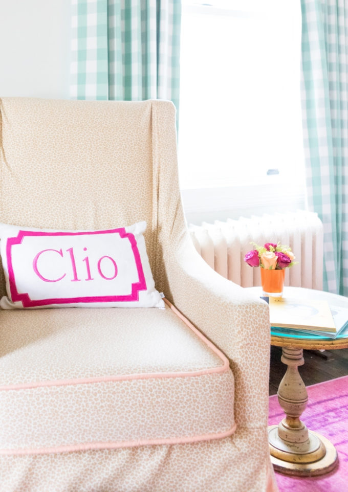
Every nursery needs a glider. We re-used the glider from the first baby and made it work in our space by making a slipcover for it.
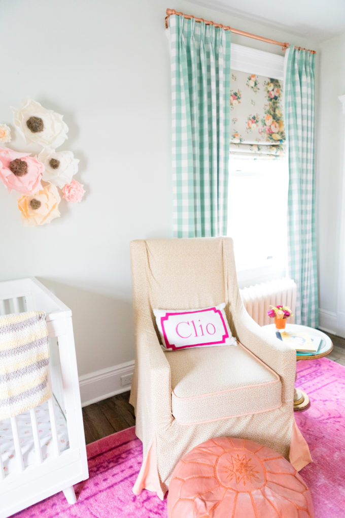
I had a little fun with the slipcover and had it done in a leopard! It’s not your traditional leopard color, but it’s still animal print. I added peach fabric for the piping and the inside of the pleating. Isn’t that so much nicer than having it all done in the same fabric.
Close up:
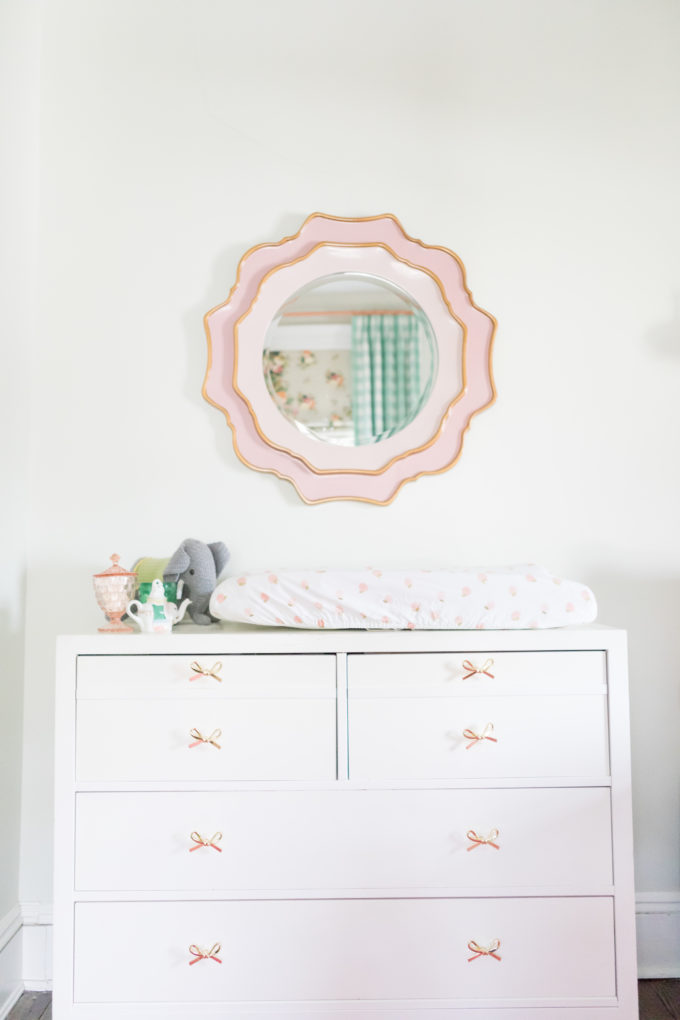
The changing table/dresser area got a pretty mirror that reminded me of a flower which worked perfectly in this space.
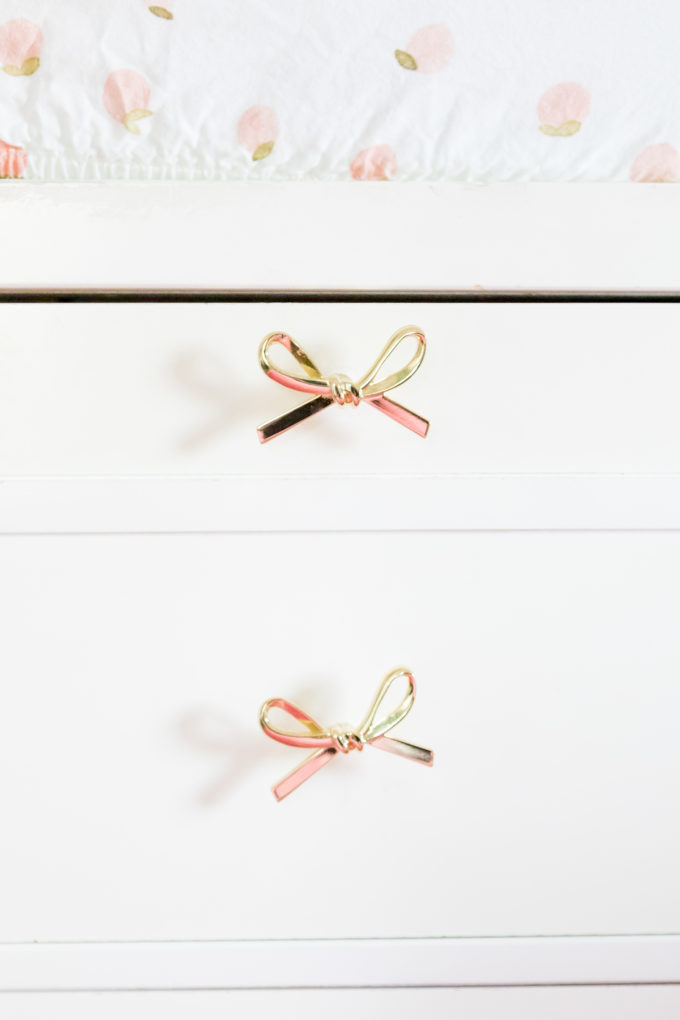
The hardware got switched out for these gold bow pulls.
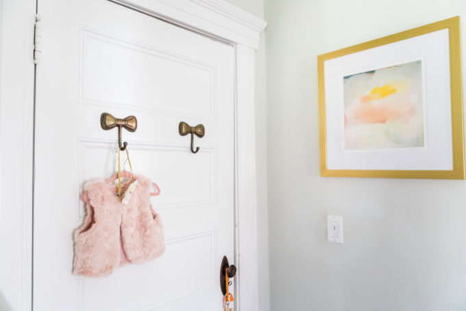
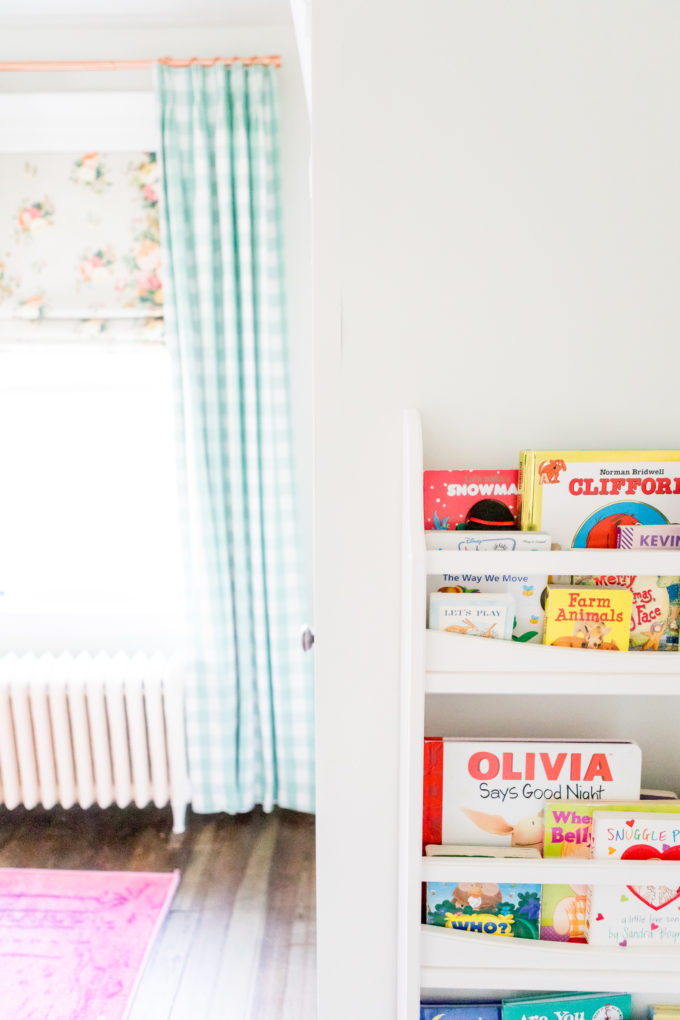
We took advantage of the door area and made it’s own little moment with artwork, vintage hooks, and an area for books.
Opposite side of door:
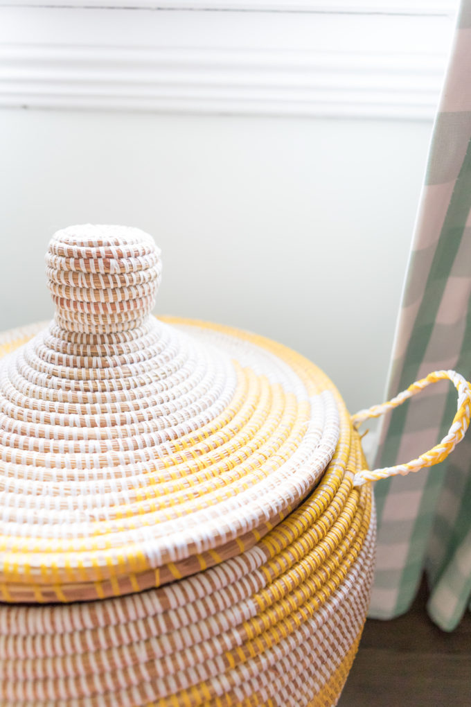
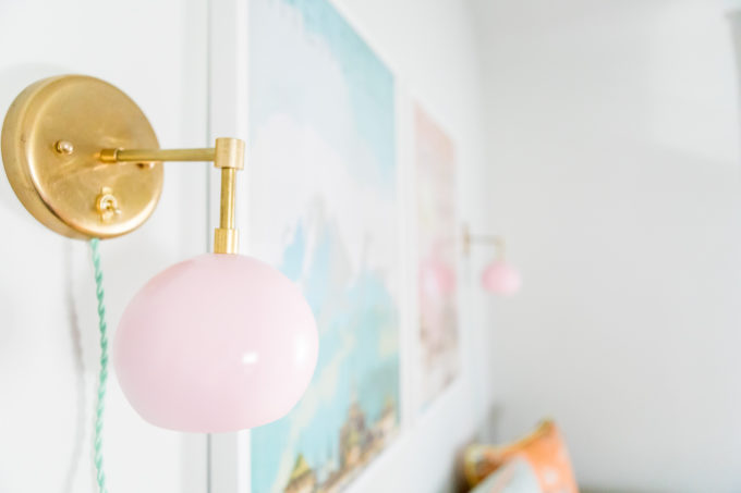
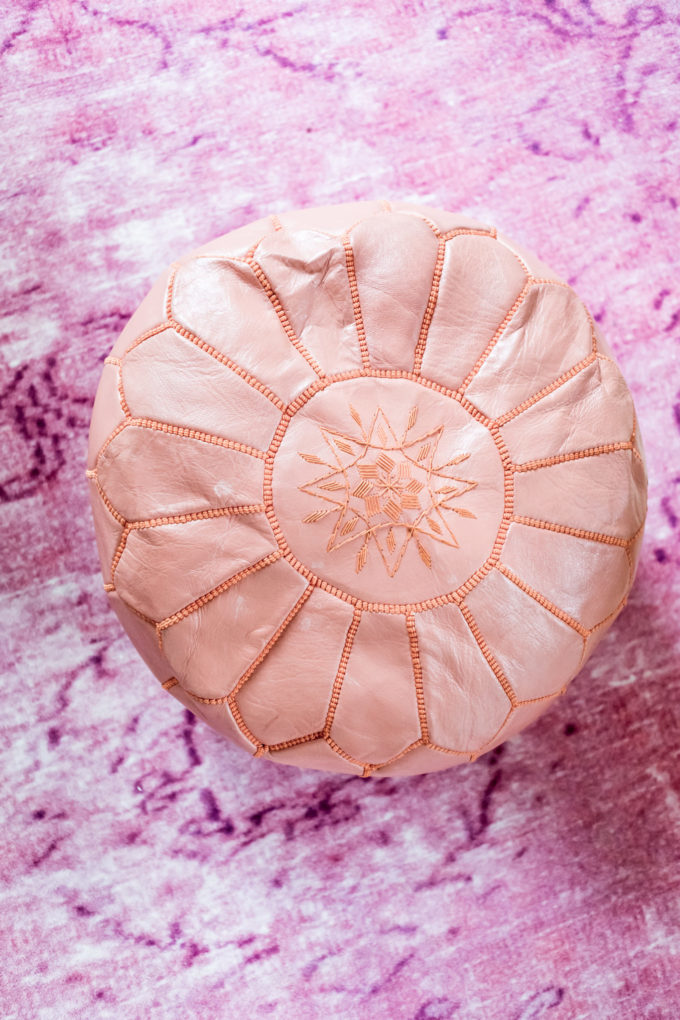
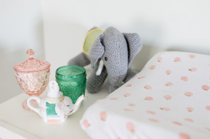
Little details throughout the space:
Is it not the prettiest nursery! Not to toot my own horn, but I think it’s so classic yet whimsical and I love how there are baby elements in it, but there are many more elements that will grow with the little lady that calls this room her own.
Beautiful photography by Seaweed & Diamonds
Related
Leave a Reply Cancel reply
get inspired with our own home tour
ON THE BLOG
My living room is one of the rooms that evolved drastically from when we first moved one. Originally I painted the walls chocolate brown and did accents of white, blue and orange. That lasted maybe 2 years.
Our dining room sat empty for months. Okay maybe it was empty for just a handful of weeks and then we couldn’t take it anymore and put in a folding table and plastic outdoor chairs, but in my mind that was still empty.
On the main floor of our house we have a Florida room. Being that it’s a Florida room it is a considered a 3 season room, because there is no heat in the room. The previous owners used it as an indoor patio with outdoor furniture and it looked like this when we moved in.
In our new home, the basement was completely unfinished. It was literally one of those dark spaces that you see in horror movies and are terrified of getting locked into. However, with the square footage in this house, I knew I needed to make the basement another workable and liveable floor of the house instead […]
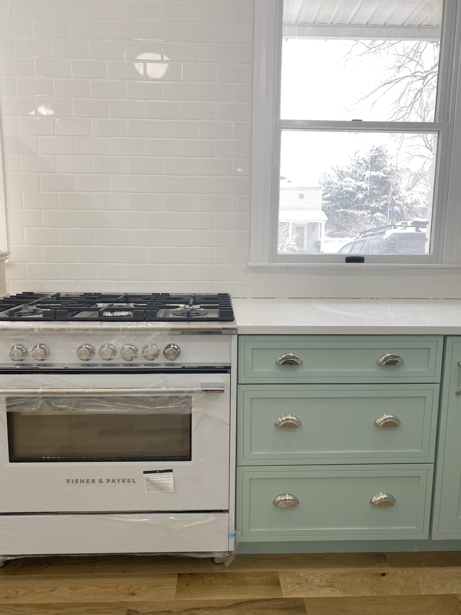
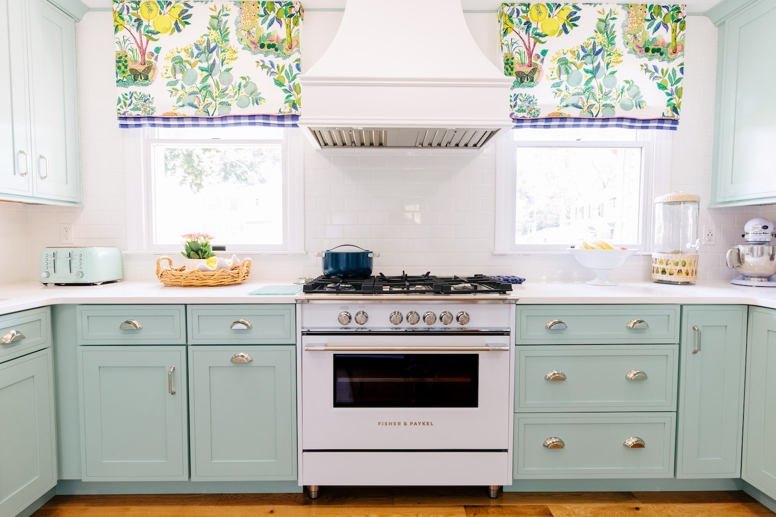
What to look for when it comes to picking out kitchen appliances: Leave room in your budget for appliances. When it comes to kitchen renovations everyone knows that the cabinetry and the labor of demoing and installing cabinetry is going to eat a lot of your budget. However, the second most expensive part of a […]
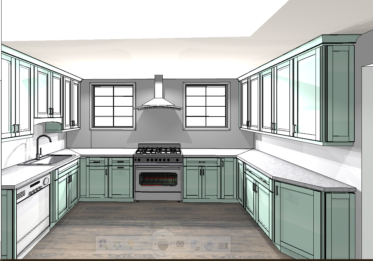
I don’t think I’m alone in thinking that designing a kitchen is an overwhelming undertaking. I’m an interior designer and even I find it stressful to iron out all of those details. So, when it comes time to design a kitchen I always like to partner with a kitchen designer to make sure I’m remembering […]
