It takes a village: New Website!
I have been blogging since 2008! That’s a whole lot of time and in that time I started off on blogspot with a blog header that I designed. It was short lived and quickly updated when I found an artist to help me with a sketch for the header. Isn’t it crazy that back in the day that’s all that mattered. Your blog header! Nothing else was designed.
Since that time I have had my blog redesigned many times, moved over to wordpress at the end of 2010 and added a full website with all of my interior design projects and services. Each web designer came with it’s own set of hiccups. If you have ever tried to design a site then you know that they can disappear on you or overpromise and under commit. I also tend to have the magic of picking a web designer that then goes into a totally different career. What does that mean for me? Well, I can’t make any changes because they can’t help and then whatever new person I find wants to start from scratch and not just make the little change I want. It’s been a headache. I really enjoyed my last website design because it felt the most like me. The blog was super pretty, but the main part of the website just wasn’t doing anything for me business wise. I knew it needed to be a better client experience but the thought of having to start over again was exhausting.
That’s where Megan from Megan Martin Creative comes into play. I had been following her on instagram for awhile and she was in the process of launching a mystery project a couple of months ago. I was on her mailing list and received an email when she launched the project which were her website template designs for Showit! In the past I had done a ton of research on sites like Showit and Squarespace and what I really liked about Showit was that my blog back end would stay on WordPress. I already knew how to use WordPress and was really comfortable with it and didn’t want to learn a new platform for the blog. So, I decided to treat myself and purchased her Buns Up template that was actually designed as a mock up for an interior designer. This meant that it already had everything I needed where I needed it. Not only do you get the template but you get a whole bunch of video tutorials showing you how to make the site yours aka how to add your photos, copy, change colors or fonts! It even includes videos on how to design your opt in landing pages. So much good information. I was so excited, but then life got in the way and I just let the template sit there in my in box. It was driving me nuts, but I honestly didn’t have the headspace to tackle doing it.
So, I went into a Showit User group on Facebook and made my plea! I wanted someone well-versed in Showit that could go in and input all of photos, copy and basically make sure everything looked perfect. I kid you not when I say I found an angel to work with. Her name is Lauren and her business is Lauren Rich Creative and she is way cooler than me. Seriously! She is a fellow momma of two littles and has the coolest hairstyle ever. She totally understood what I wanted help with and has gone above and beyond helping me. It has been a team effort with her keeping me on track with the copy, photos I need to provide and then her going in and make it all work and super pretty. We kept the template layout the same, but switched up everything else. It was a lot of copy! Lauren was constantly there providing support and her expertise. If I stumped her with a question it never phased her. She would simply respond that she was researching it on her end and reaching out to Showit for confirmation. If she was going to be gone for an afternoon or a weekend she would always let me know that she was on it and had received my email, but she was just going to be away from her computer for a little. Constant communication!!!!
In the past I have literally had designers go AWOL for weeks at a time so, the communication and respect for my time was amazing. I literally feel like she is part of the Effortless Style team and I will be hiring her out every time I want to make an addition to the site. If you are in need of branding, illustrations, design for a website on Squarespace or Showit I highly recommend her!
One of the main components of the new site was new photography! I needed someone that was good with photographing people and interiors. It’s not an easy feat! They are different animals and it’s hard to find someone that can do both. I reached out to my friend Samantha from Seaweed & Diamonds and Samanatha B Studios not only is she skilled in shooting boudoir and weddings, but she helps business owners with their branded photography. It’s so important to not only look good in the photos on your website, but much sure they represent your brand. Plus being a boudoir photographer as well she knew all of the good angles to make to get the best shot!
The last key to this puzzle is my friend, Kristen from Kristen Poissant, which is a design studio that works in helping clients with strategic branding, cohesive visuals, beautiful web design along with any other design elements you might need like packaging, business cards and beyond. She has this amazing way of helping you figure out exactly what you want to get our of your business and giving you a game plan that helps you along the way. I’m lucky enough to call her a friend so, when I was in the process of getting everything done for the website I was able to get Kristen to help me with some branding elements for my site and help me with styling during the studio photoshoot! She is also just an incredible cheerleader and helped keep me calm during the photoshoot!
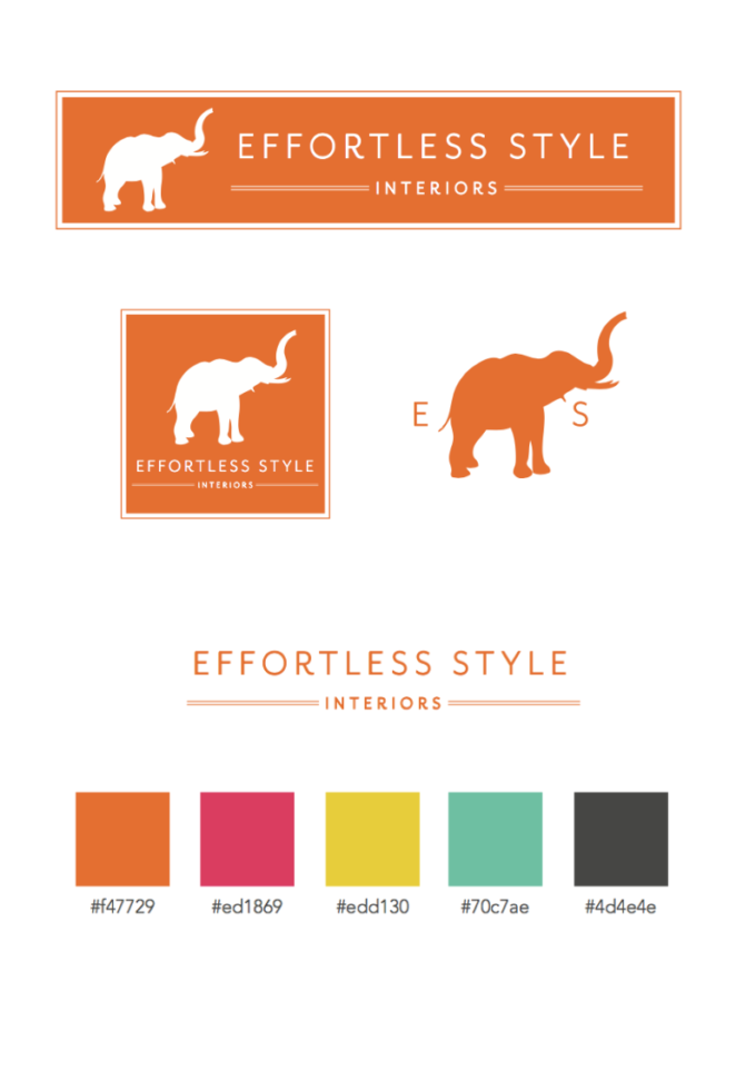
Here is a peek at the branding work she did for my brand:
We are still tweaking a couple of things, but for the most part everything is finished and all of the pages should be working! Go ahead and play around on the blog and then head over to the main site and check out the portfolio and our design services plus some fun free printable artwork and get my free, How to style a console guide!
I hope you all enjoy! So much blood, sweat and tears went into it!
Related
Leave a Reply Cancel reply
get inspired with our own home tour
ON THE BLOG
My living room is one of the rooms that evolved drastically from when we first moved one. Originally I painted the walls chocolate brown and did accents of white, blue and orange. That lasted maybe 2 years.
Our dining room sat empty for months. Okay maybe it was empty for just a handful of weeks and then we couldn’t take it anymore and put in a folding table and plastic outdoor chairs, but in my mind that was still empty.
On the main floor of our house we have a Florida room. Being that it’s a Florida room it is a considered a 3 season room, because there is no heat in the room. The previous owners used it as an indoor patio with outdoor furniture and it looked like this when we moved in.
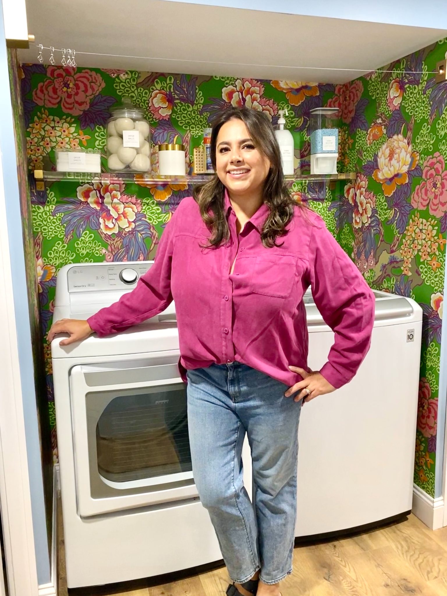
In our new home, the basement was completely unfinished. It was literally one of those dark spaces that you see in horror movies and are terrified of getting locked into. However, with the square footage in this house, I knew I needed to make the basement another workable and liveable floor of the house instead […]
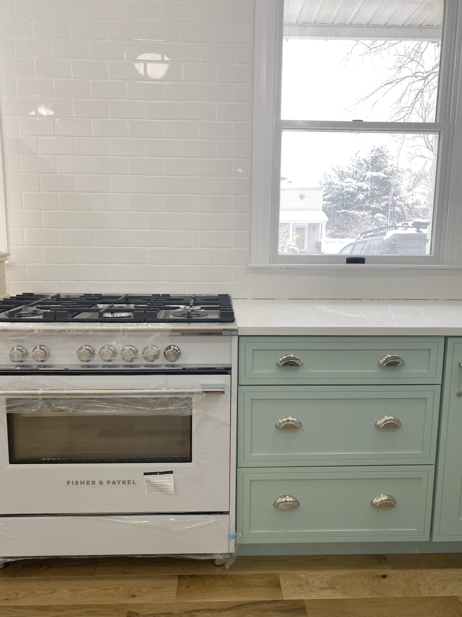
What to look for when it comes to picking out kitchen appliances: Leave room in your budget for appliances. When it comes to kitchen renovations everyone knows that the cabinetry and the labor of demoing and installing cabinetry is going to eat a lot of your budget. However, the second most expensive part of a […]
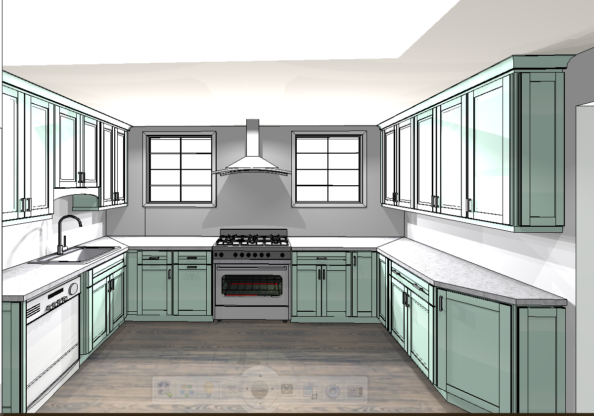
I don’t think I’m alone in thinking that designing a kitchen is an overwhelming undertaking. I’m an interior designer and even I find it stressful to iron out all of those details. So, when it comes time to design a kitchen I always like to partner with a kitchen designer to make sure I’m remembering […]
