Dinosaur Nursery Design Plan
Nurseries are one of my favorite things to design. They are just so joyful and the guest of honor doesn’t have an opinion on anything. I kid, but seriously sometimes it’s tough when kids input what they like or let’s face it don’t like. With babies, you just have to make parents happy and that is a lot easier. I know some designers don’t love nurseries or kids’ rooms because they can get a bit theme-oriented and you don’t want your room design to look like a bed in a bag set. I totally get that. However, nurseries and kids’ rooms typically need a jumping-off point so why not use the theme your client has in mind and expand on it. Both my sister-in-law and my sister are due with babies this coming Fall. We are all so excited! My sister is having another little boy and he will be sharing a room with Sebastian until they move. Fingers crossed they move close to us. I keep trying to show them all of the fun things around us! Jon’s sister is due a month before my sister and she actually bought a house around the block from us. No need to convince them they will be close by! Now, they want to be surprised so we have no idea on gender, but everyone is certain it’s a girl. When we were talking about nursery designs with them Jon’s sister, Jenn mentioned that her hubby Mike liked the idea of dinosaurs if it was a boy. Jon and I both jumped out and said why can’t it be dinosaurs if it’s a girl! It totally can be! Dinosaurs can easily work for a gender-neutral nursery design plan. Jenn loved the idea of going with a dinosaur theme with either gender so, here is my take on what that would be like!
Now, we are probably expecting this plan to be color-filled, but my sister-in-law loves neutrals! Her favorite color is black! So, I added some color that would work nicely in a nursery, but I kept things pretty tame color-wise and played up patterns and textures in this space!
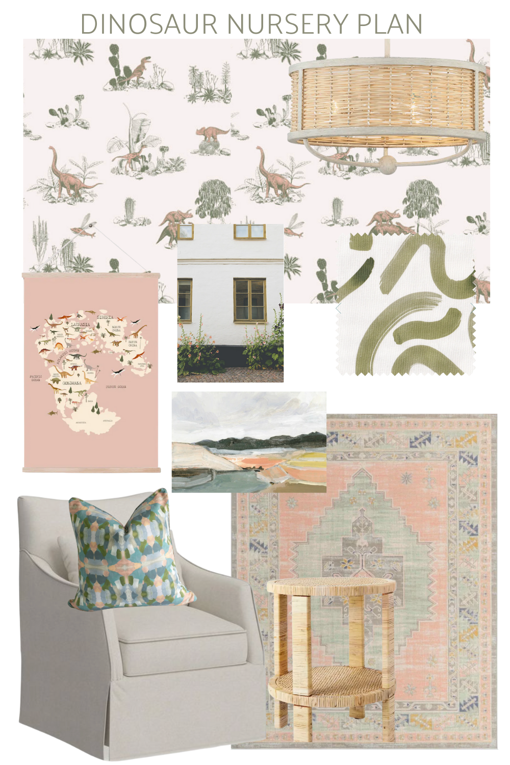
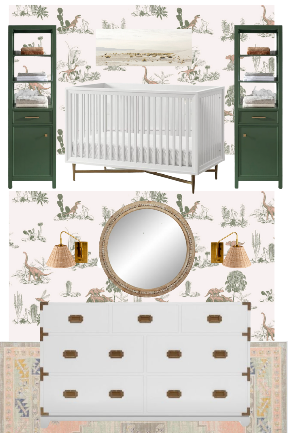
Every room needs a jumping-off point and for this nursery it was this awesome dinosaur wallpaper. It reminds me of a toile and I love it! The colorway is pink and green, but the pink doesn’t lean super pink so in my eyes it’s good for both genders. They also have a yellow and green colorway, which I’m equally obsessed with and could easily be swapped into this design plan.
For the lighting, I wanted something with a wow factor and some texture! I loved the scale and warmth of this lighting fixture.
When it came to the window treatments I was originally leaning towards something clean and classic like this roman shade, but then I remembered this awesome patterned fabric from Pepper Home!!! I love the green and I love the movement in the pattern. Perfection!
Artwork wise I went to my favorite source for budget friendly artwork, Juniper Print Shop! You can now order prints, but the option to just get a digital download is still there! I love Hollyhocks a photograph of a building in Copenhagen that has all of the colors in the wallpaper! I paired that with the abstract landscape French Port, which added in some blue tones. Then I found this adorable Dinosaur map, because it is a kids space. It comes in this pretty blush, but also a lovely mint and some neutral colors.
People go back and forth on whether or not a glider is needed in a nursery. I’m team glider or swivel chair even though I didn’t have one in the boy’s nursery. I actually had it in our bedroom and then I had a settee for reading and snuggles in their nursery! I like a chair that doesn’t scream nursery and can be moved around to another room eventually. I really like the lines on this chair but please note it is on the narrow side and it doesn’t have a slipcover it just looks like it does.
Remember design is all about the layers let’s add this pillow on top of the chair and then for a cozy underfoot area let’s add this rug that ties it all together!
Let’s not forget a table for your pump, bottles, or books!
Now, when Jenn was living in her Brooklyn apartment it was short on space and she did something I recommend clients do…she ordered kids’ furniture for her bedroom. The sizes on their dressers and nightstands are a lot friendlier for NYC apartments. Now that she is moving into a house she has room for bigger pieces so the nursery will be getting her old dresser and she ordered the coordinating crib!
For the crib, I love having some sort of artwork to finish the space. This piece called White Sands by Juniper Studio will look so pretty in a nursery! Make sure you secure all artwork properly above a crib and if you like add museum putty to the corners to make sure it really won’t move.
I love the idea of either flanking the crib or the dresser with something to give it a built-in sort of vibe. I always search for bathroom cabinets when I’m looking for them in nurseries. They tend to be more petite and scale-wise fit nicely in nurseries. Isn’t this cabinet perfect for this space! I always recommend adding wall anchors to secure cabinets to the walls in nurseries and kid spaces.
For the dresser area, I would finish off the space with this white washed round mirror that has the cutest little round balls going all around. Then I would flank that with a pair of these brass woven scones. I love the brass/gold detailing on it that plays nicely with all of the hardware in the space. The woven shades help add another layer of texture to make this nursery extra cozy! The top of the dresser will remain clear so that you have room to add your changing pad, diapers, wipes, etc.
So, what do you think? I dino (don’t) about you, but I think it’s adorable!
Related
Leave a Reply Cancel reply
get inspired with our own home tour
ON THE BLOG
My living room is one of the rooms that evolved drastically from when we first moved one. Originally I painted the walls chocolate brown and did accents of white, blue and orange. That lasted maybe 2 years.
Our dining room sat empty for months. Okay maybe it was empty for just a handful of weeks and then we couldn’t take it anymore and put in a folding table and plastic outdoor chairs, but in my mind that was still empty.
On the main floor of our house we have a Florida room. Being that it’s a Florida room it is a considered a 3 season room, because there is no heat in the room. The previous owners used it as an indoor patio with outdoor furniture and it looked like this when we moved in.
In our new home, the basement was completely unfinished. It was literally one of those dark spaces that you see in horror movies and are terrified of getting locked into. However, with the square footage in this house, I knew I needed to make the basement another workable and liveable floor of the house instead […]
What to look for when it comes to picking out kitchen appliances: Leave room in your budget for appliances. When it comes to kitchen renovations everyone knows that the cabinetry and the labor of demoing and installing cabinetry is going to eat a lot of your budget. However, the second most expensive part of a […]
I don’t think I’m alone in thinking that designing a kitchen is an overwhelming undertaking. I’m an interior designer and even I find it stressful to iron out all of those details. So, when it comes time to design a kitchen I always like to partner with a kitchen designer to make sure I’m remembering […]

Add this to one of my favorite “designer nursery” plans ever. All I need to do is get pregnant. This should be on HGTV or SOMETHING!
Thank you so much!
I LOVE IT