
Must Haves For The Perfect Entry Way Area
The dream has always been to have a foyer. You know a massive sort of pass-through area in the front of my house where I could put a round table right in the middle and make this big statement when you walk in. Here in NY, foyers like that are hard to come by. My price point is not in the area where I could have such a thing, so I have always had to make do with a little area of the wall by the front door that I turn into my perfect entryway area. I think everyone needs an area like this in their home. It’s a great space to start showcasing the style of your home and it will provide you with much-needed storage. Here are my must-haves for the perfect entryway area!
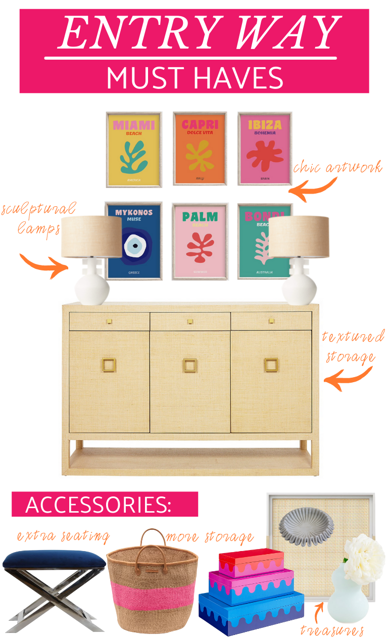
For me, the main must-have that you need for an entryway area is a console of some sort. You can use a parson table, chest of drawers, or my personal favorite, a sideboard. I love this sideboard because it has a ton of storage. You can use the top drawers to store keys, mail, dog leashes, etc. An area for things that you need when you are running out the door. The bigger cabinet area can house accessories you use on your way out the door things like gloves, hats, umbrellas, etc. I also love this piece because it’s wrapped in grasscloth which adds a really nice texture element to the space.
The next must-have is something to fill the vertical space above the sideboard. A mirror is always good because it’s less commitment than artwork and a place to check yourself out when you are heading out the door. Personally, I always love an opportunity to add more artwork, so in this design plan, I’m featuring these awesome Assouline travel book cover prints! Aren’t they pretty! Love the pop of colors! Plus a set of 3 is only $10.99 for a printable versus the $95 for the actual travel books.
Now when it comes to the last piece of the puzzle, I think adding a lamp is a must-have. In this design plan, the symmetry of the artwork makes me want to balance it with a pair of lamps. But many times an entryway area might not be large enough to warrant a nice-sized piece of furniture and if it was a more petite piece of furniture then using just one lamp is perfectly good.
People may take this look and call it a day, but for me, design is all about the details and the layers so this is where the accessories come in! If you have room to the left or right of the sideboard I would add an x bench to use a perch for putting your shoes on. It’s also good to move around for extra seating. If you don’t have enough room for an x-bench I love the idea of a stylish tote that is the perfect place to store some kids’ toys!
You can keep the top of the sideboard uncluttered but I do think it’s nice to have a couple of little things. Don’t these Jonathan Adler stacked boxes look like they were made for this artwork! Place it in between those lamps and you are in business! If you want to just use one lamp then you can flank the stacked boxes on the opposite end of the console. In the middle area, you can add a tray and add a little vase for fresh flowers and something whimsical like this amazing ruffled marble bowl.
So, what do you think of my must-haves? Am I missing anything?
Related
Leave a Reply Cancel reply
get inspired with our own home tour
ON THE BLOG
My living room is one of the rooms that evolved drastically from when we first moved one. Originally I painted the walls chocolate brown and did accents of white, blue and orange. That lasted maybe 2 years.
Our dining room sat empty for months. Okay maybe it was empty for just a handful of weeks and then we couldn’t take it anymore and put in a folding table and plastic outdoor chairs, but in my mind that was still empty.
On the main floor of our house we have a Florida room. Being that it’s a Florida room it is a considered a 3 season room, because there is no heat in the room. The previous owners used it as an indoor patio with outdoor furniture and it looked like this when we moved in.
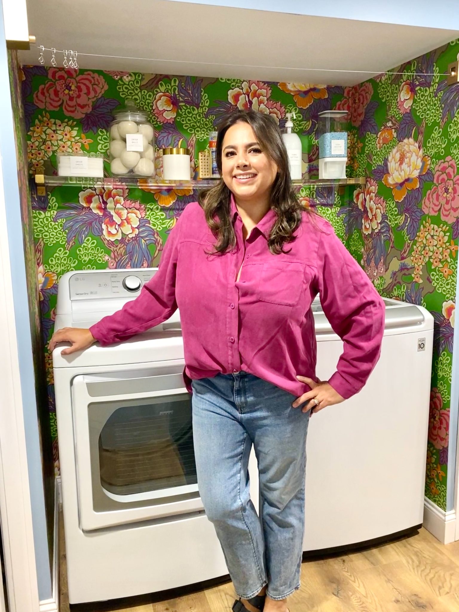
In our new home, the basement was completely unfinished. It was literally one of those dark spaces that you see in horror movies and are terrified of getting locked into. However, with the square footage in this house, I knew I needed to make the basement another workable and liveable floor of the house instead […]
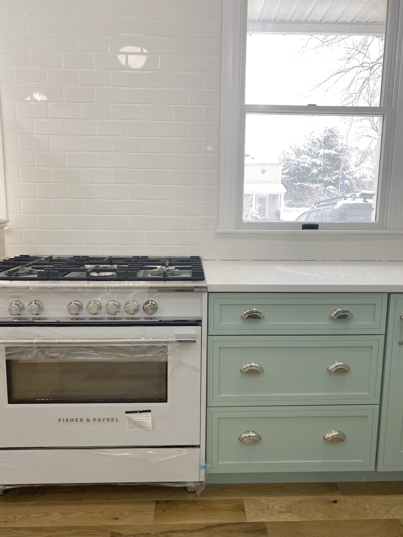
What to look for when it comes to picking out kitchen appliances: Leave room in your budget for appliances. When it comes to kitchen renovations everyone knows that the cabinetry and the labor of demoing and installing cabinetry is going to eat a lot of your budget. However, the second most expensive part of a […]
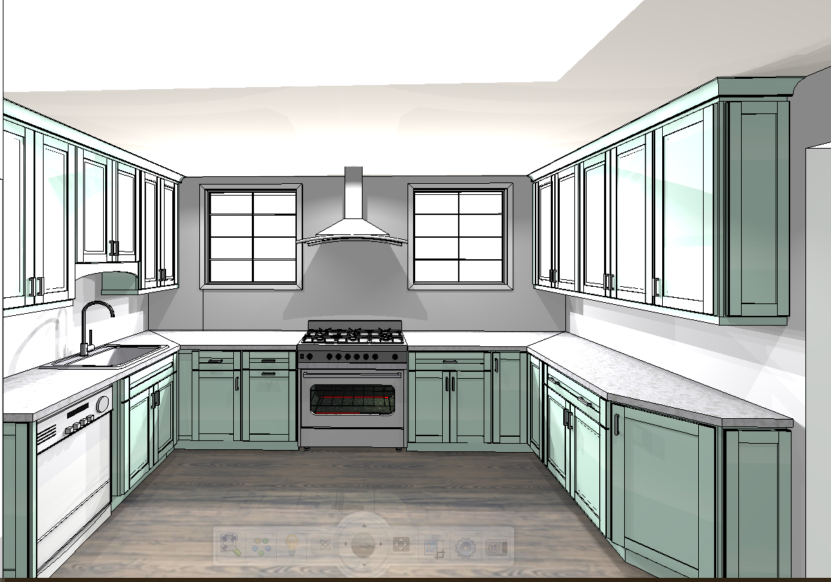
I don’t think I’m alone in thinking that designing a kitchen is an overwhelming undertaking. I’m an interior designer and even I find it stressful to iron out all of those details. So, when it comes time to design a kitchen I always like to partner with a kitchen designer to make sure I’m remembering […]
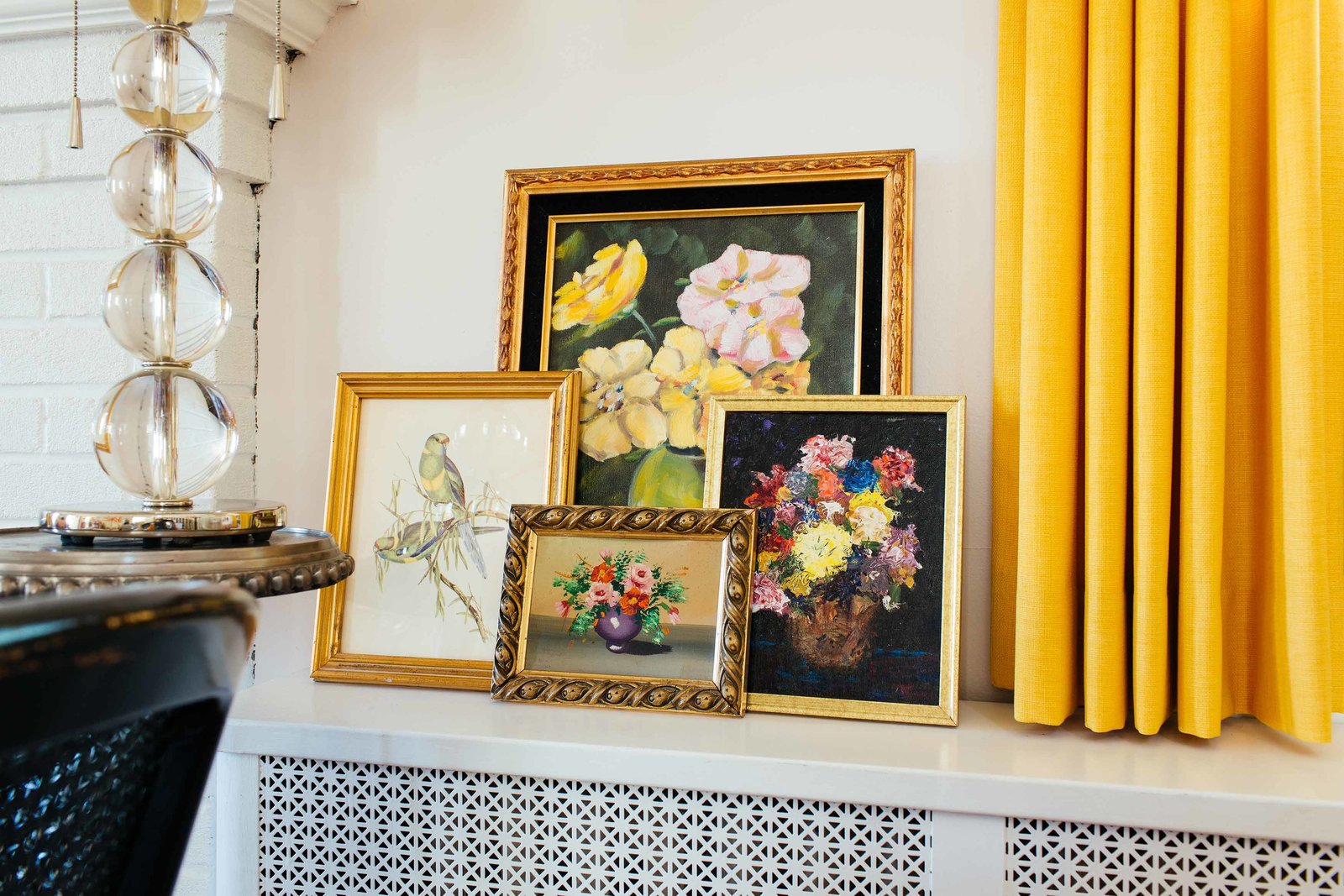


Your choices are gorgeous, Camila. I, too, dream of a foyer with room for a round table topped with a large vase of fresh flowers. However, I’m in a little condo with a hallway for an entryway. There is no room for a chest, sadly. I added a shelf to the wall and placed a bone box, a plant and a bowl for keys on it. My wellies are underneath the shelf with an umbrella holder from Ballard Designs beside them. I have a gallery wall above the shelf and a nice, bright runner. Some day, I’ll have a true foyer, but that shel has made me very happy for now.
I love it! I have had to make do as well and in our new house there is really no room for anything! Ah! One day my center hall colonial dreams will come true!