
From Sold to Home: Kitchen Reveal
The time has come to finally share our new kitchen reveal. For those of you that have been with us from the beginning, we bought a house right before the pandemic hit. It was a total gut job from top to bottom. We started our demo and then the world shut down. Enter the delays on everything and anything. It wasn’t ideal but we finally moved in a couple of months ago and it truly feels like our home. We were very specific about what we wanted in our home. So many people take a fixer-upper and completely knock it down and start over. We didn’t want to do that. Our home was built in the 1940s and even that was too new for us. We wanted something old with character and separate rooms! A new build was not something we envisioned.
So, we set out to leave the bones of the house intact and get to work adding our special touches to it. With our love of older homes, our kitchens have never been huge. This time around nothing was different. I was just happy to have a separate kitchen and not an open floor plan. With a smaller footprint, you really need to make every inch count. While I love designing homes for clients and love kitchens my specialty is not kitchens. I can design the overall look of the cabinetry, select appliances, and make all of the finishing touches on hardware, lighting, fixtures, and backsplash but the nitty gritty details are best for a kitchen designer. This is why I decided to work with a Lowes kitchen designer named Michael. Michael really helped me figure out what I really wanted from my vision. He has designed thousands of kitchens and knows what makes sense and works and what just looks really pretty but doesn’t really provide much function. He was a godsend when it came to designing my kitchen with the Diamond line by Masterbrand available exclusively thru Lowes. Now a beautiful kitchen is not complete without beautiful appliances! Every outfit needs jewelry, right? I was able to partner with PC Richards and son to get the most stunning pieces by Fisher Paykel to finish up the kitchen. I think you are going to agree that is the most beautiful pairing. Everyone that steps into our home is in awe of our kitchen. It’s something they have never seen done before but they immediately love it!
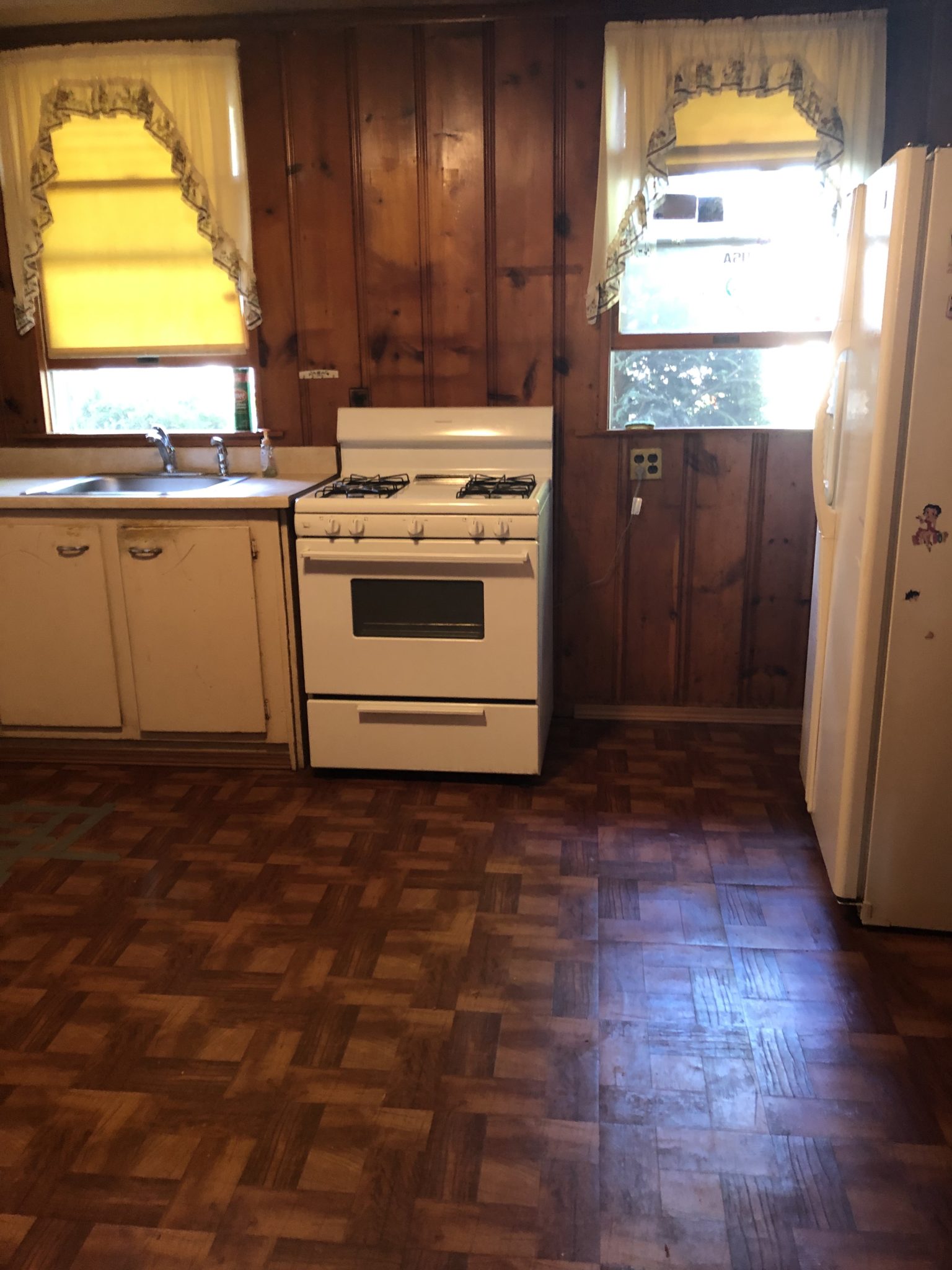
Now let’s remember what we were working with beforehand:
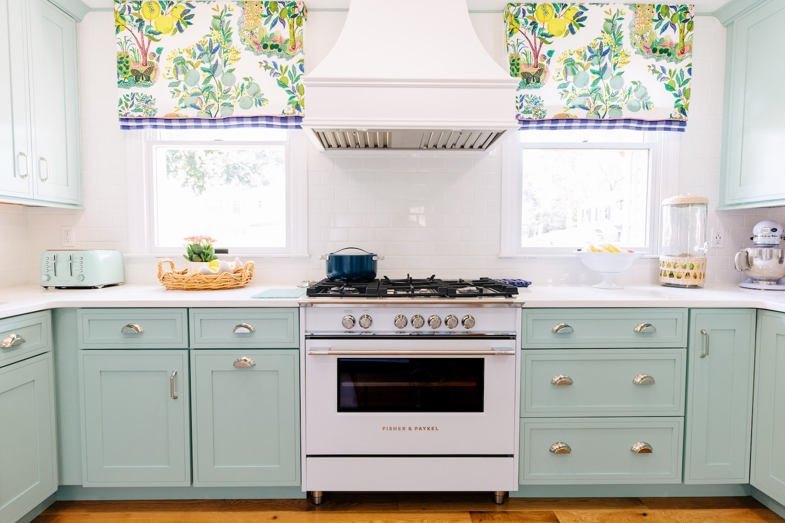
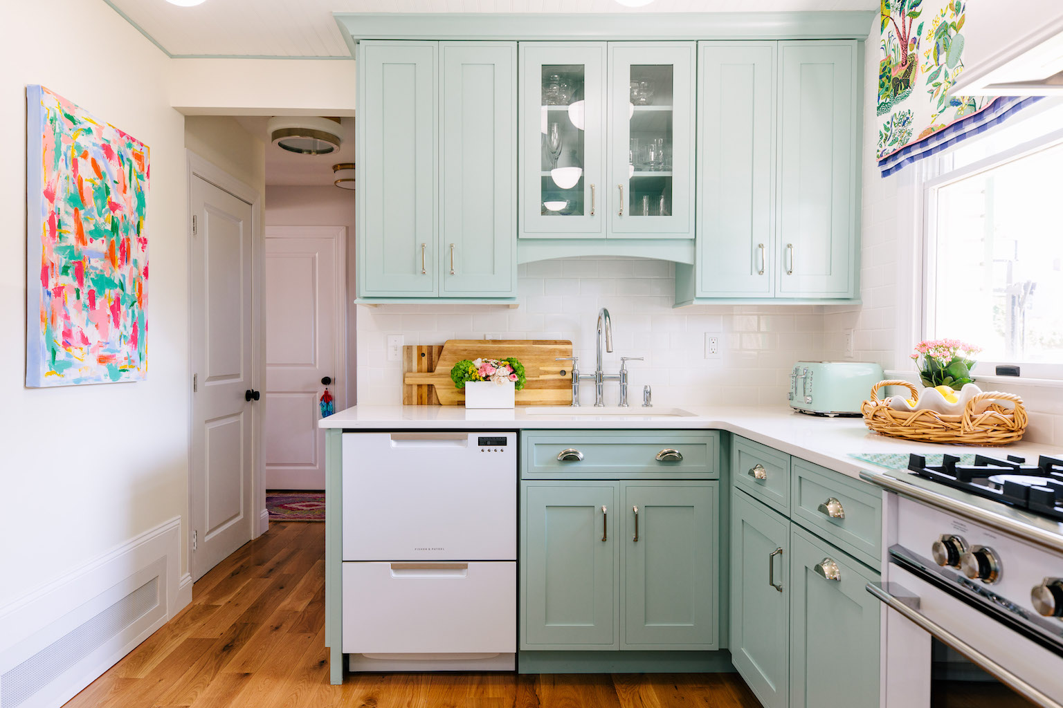
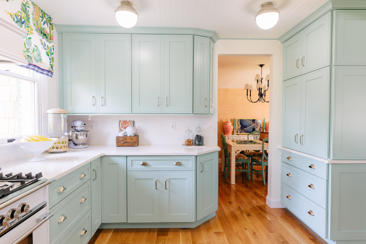
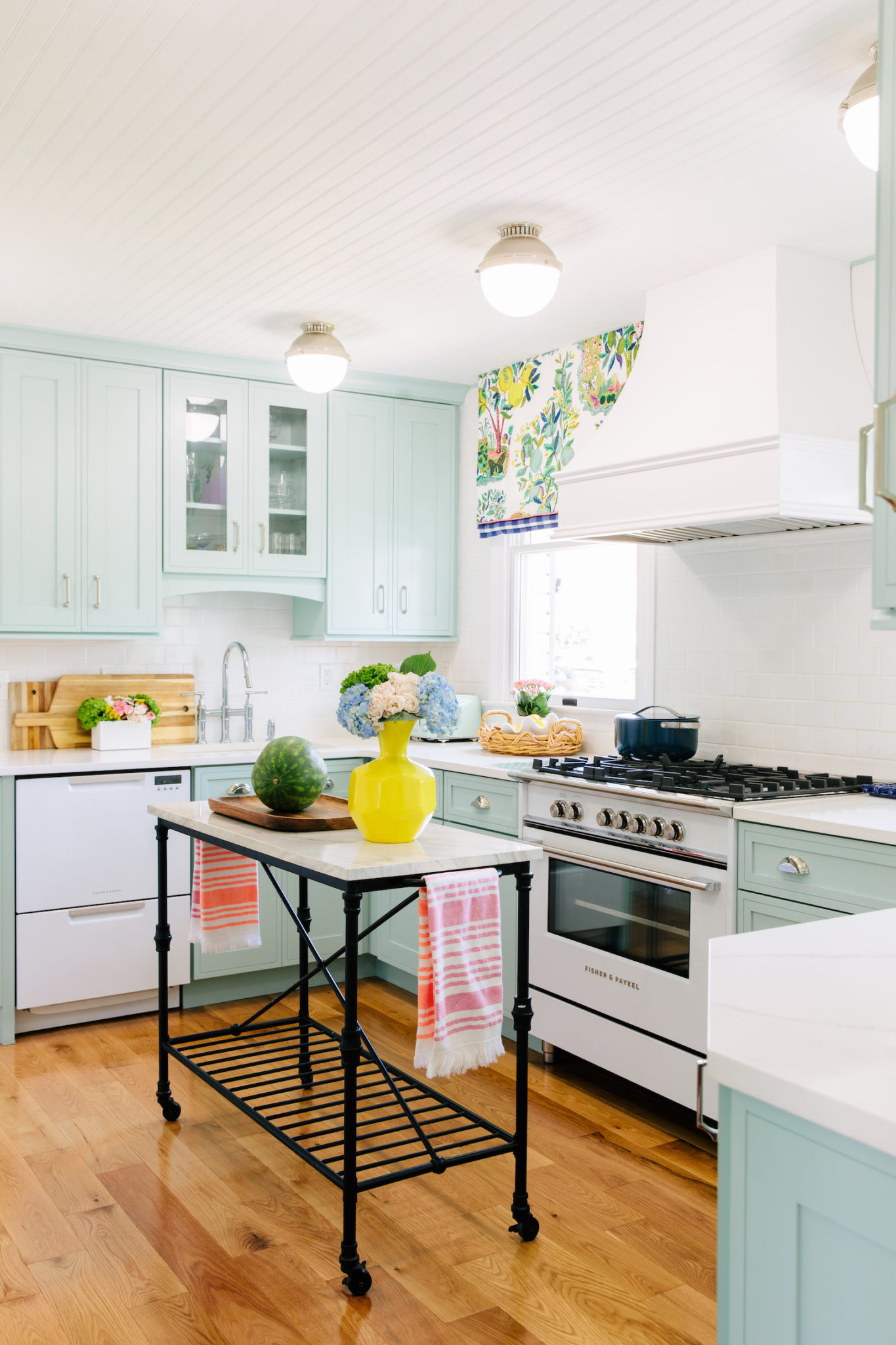
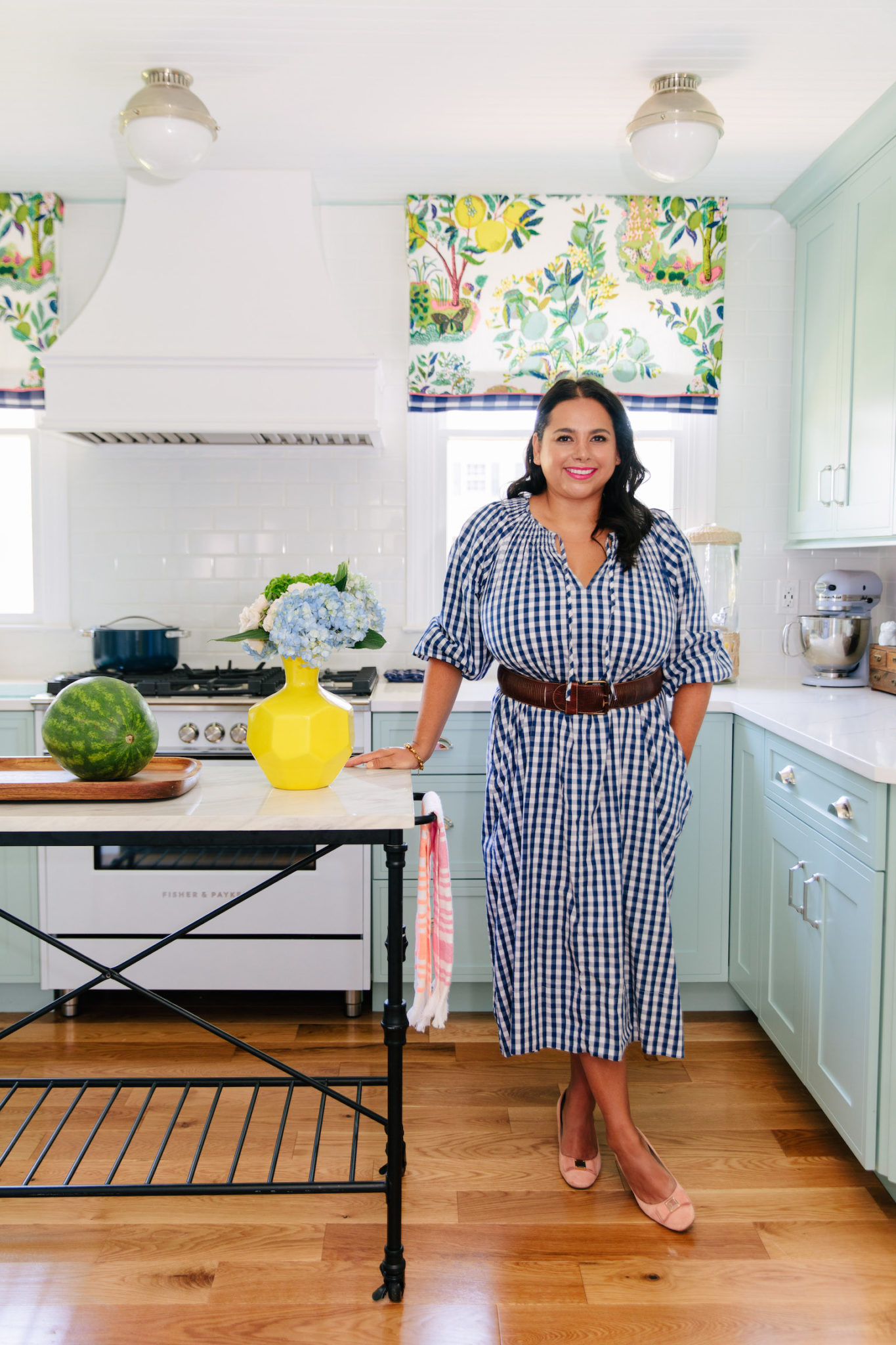
Ta da!
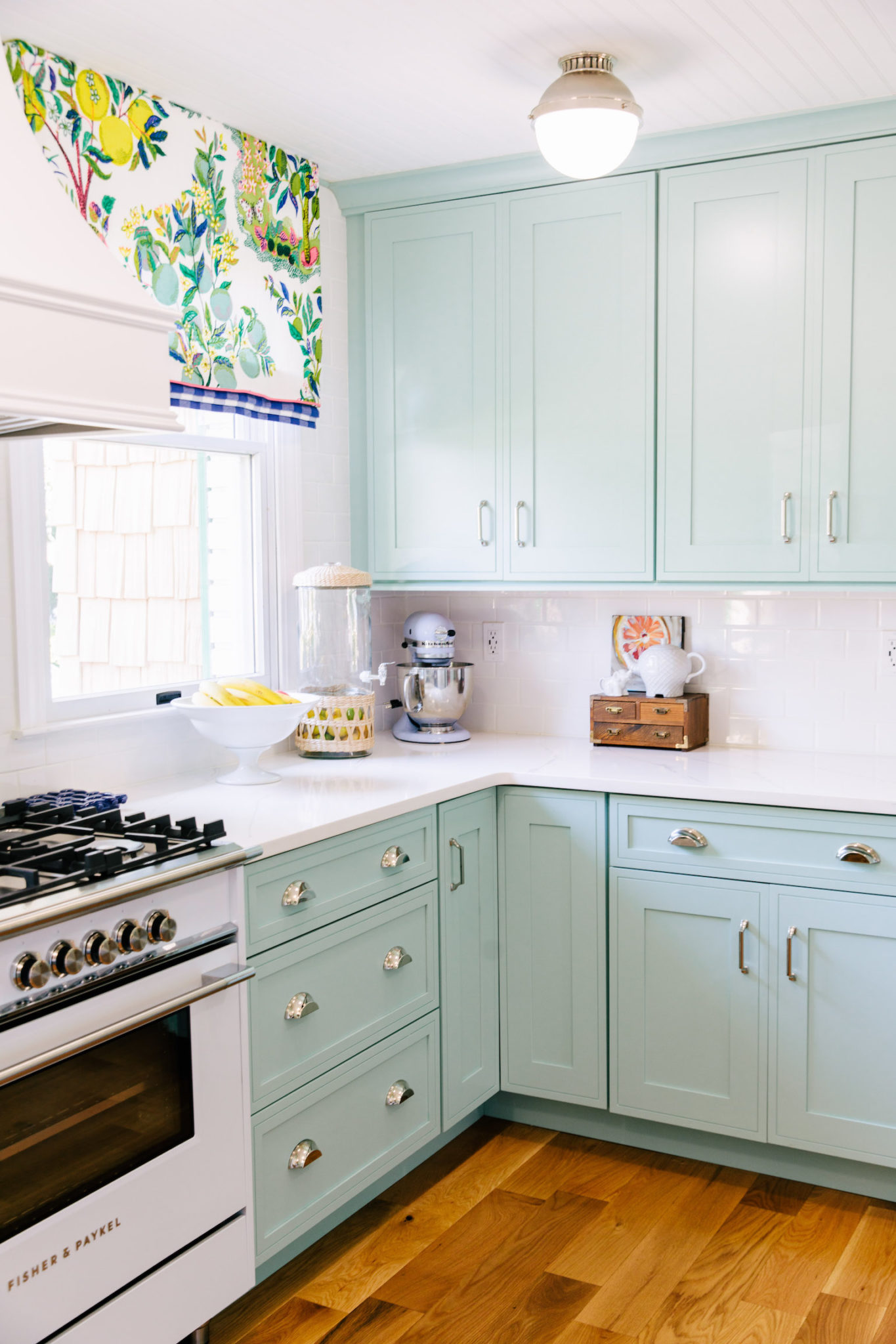
What a difference! This was the easiest room for me to design in the house. I knew immediately what I wanted to do to make it feel like my family and be a happy and functional space for us.
Remember this view:
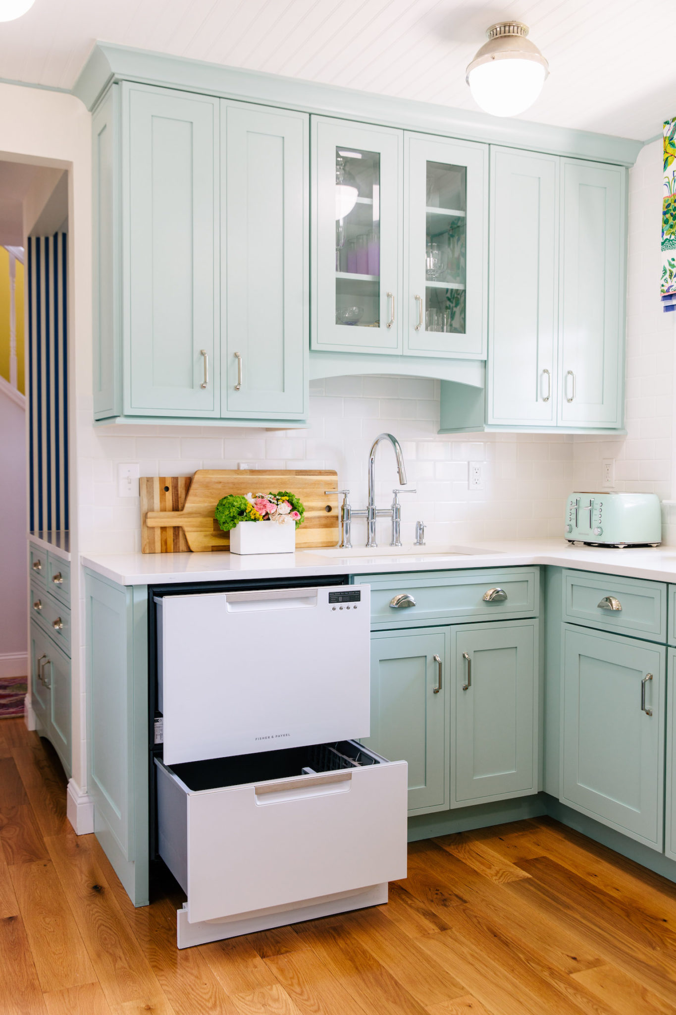
It’s now this view:
We really wanted to center the stove on the window wall which meant having to move the sink. I wasn’t thrilled with the idea of not having a window above the sink because it was something I was always used to but I’m happy to report that the switch has not been a big deal. I don’t even notice it. It’s now the perfect area for rinsing my dishes and popping them into our new Fisher Paykel Double Drawer Dishwasher. We are a family of 4 so it’s nice to just use the top part when it’s only us for dinner. It’s easy to load and so nice on my back to not always have to bend down. Do we use the bottom drawer as well? Yes, when we are cooking a lot or having people over then both get run, but for the most part, we just use the top.
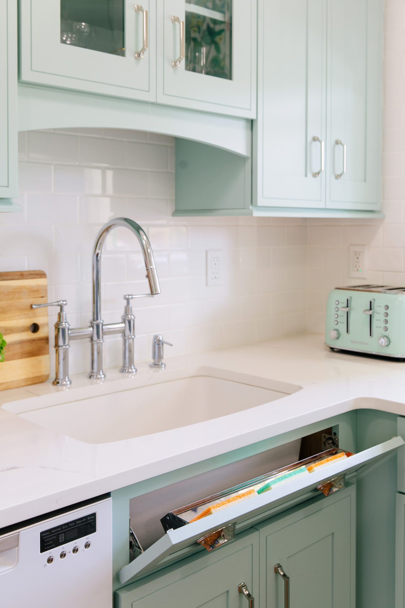
I also really enjoy the stainless steel tilt out insert from Diamond it’s a great place to store my sponges and help keep my countertops clutter free.
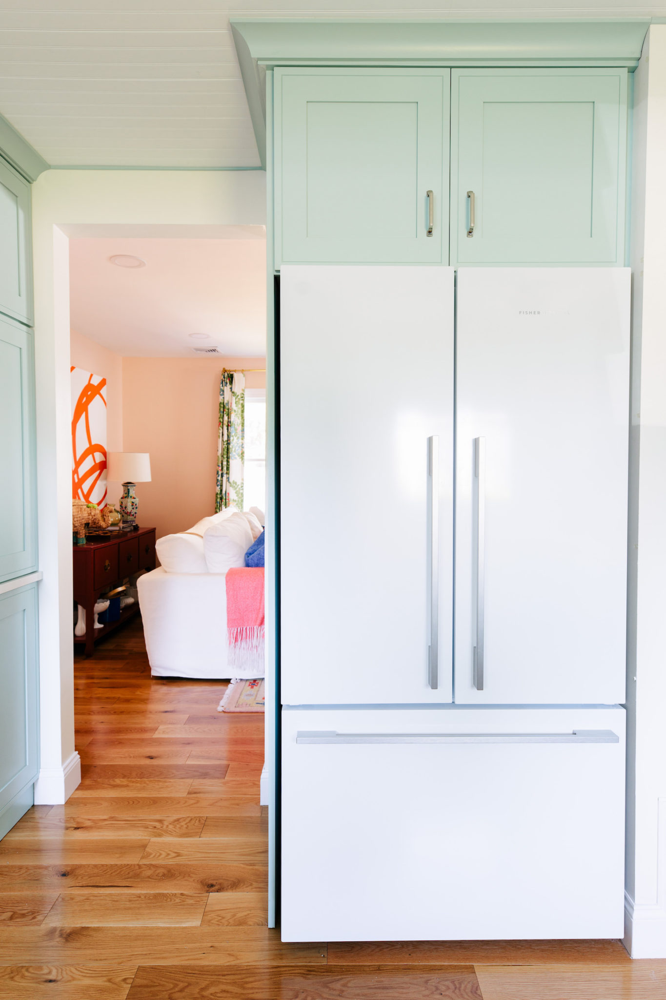
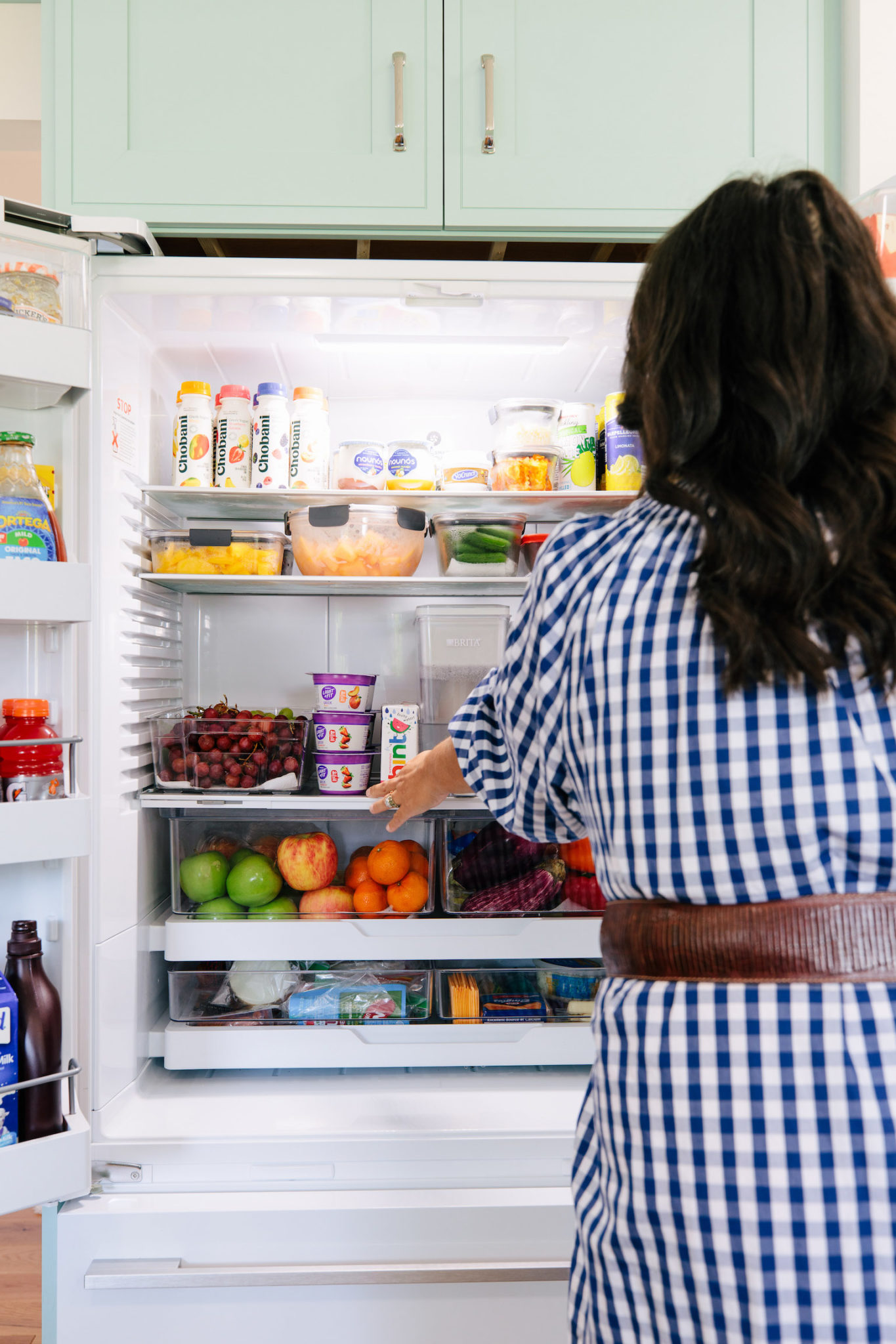
Moving along to the next wall we have our refrigerator. We went with a Fisher Paykel Counter Depth French Door Refrigerator. Since it’s counter depth it’s flush with the cabinetry and looks built-in. We didn’t go with paneled appliances because it just felt like too much with a small kitchen. I wanted white appliances to help break things up visually and add some contrast. It’s a kitchen, it’s totally fine to have appliances that look like appliances.
It has a lot of storage and I have been loving to organize it and make it easy for the kids to grab a snack. Is it always this organized? Not always, but I do a pretty good of keeping it looking as close to this as possible.
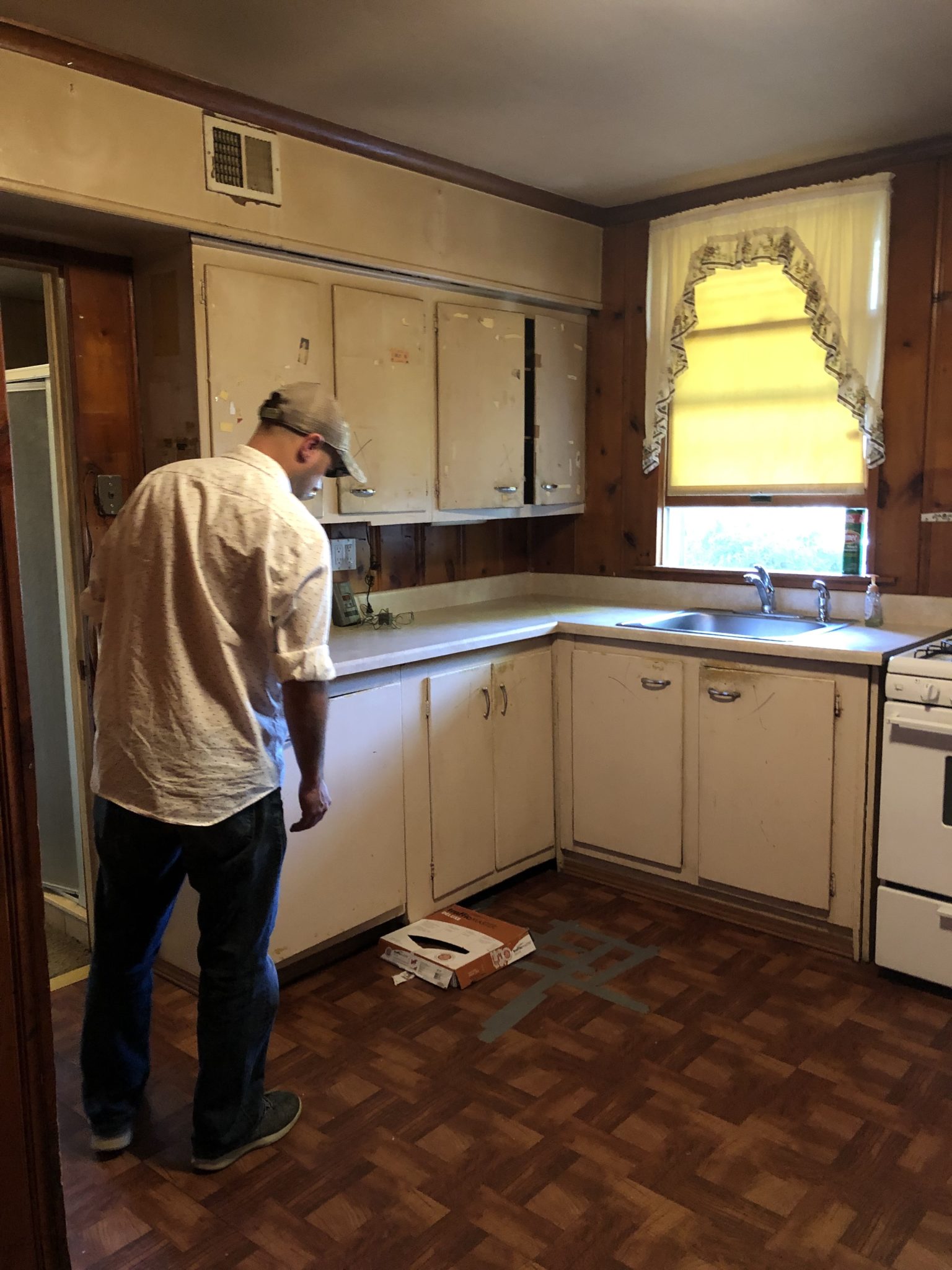
Moving along to the other side of the kitchen. This is the before:
Now it looks like this:
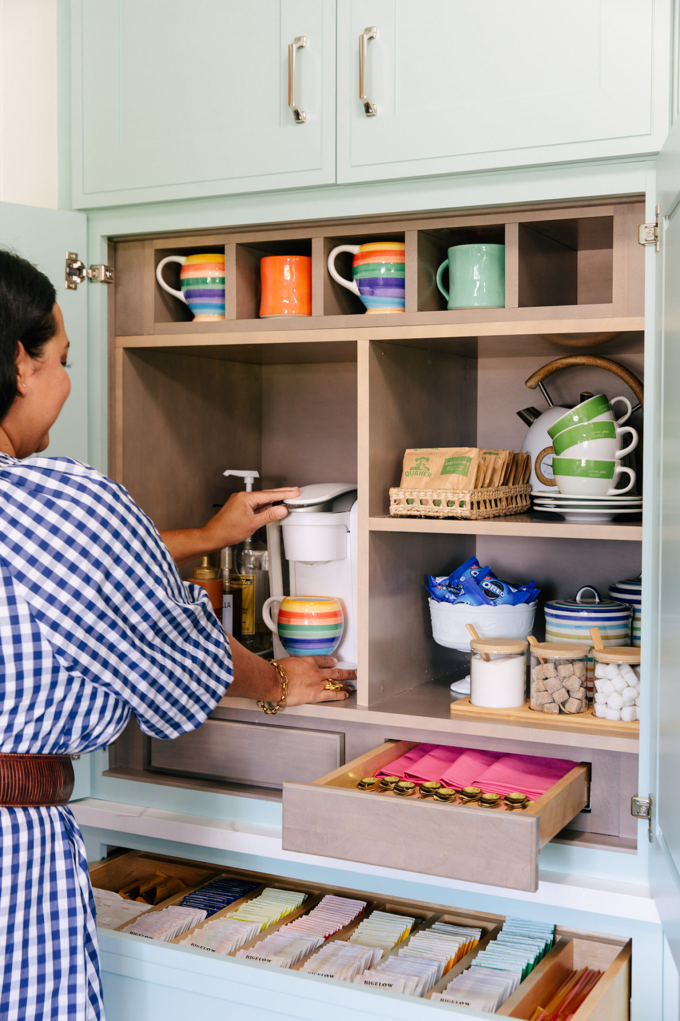
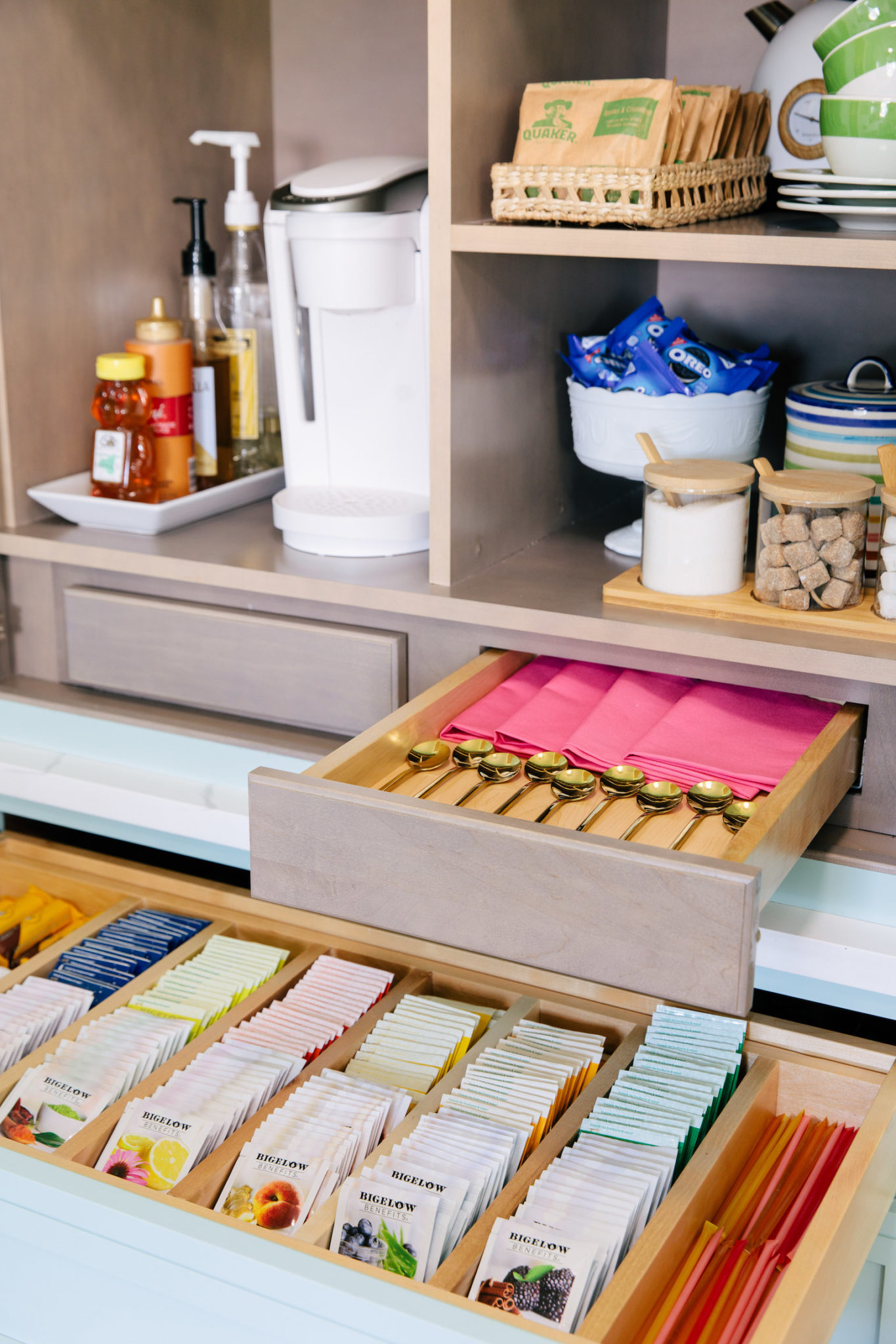
We got rid of the door and made it a passageway instead. Then in the corner nook, we added the cabinetry of my dreams! Look at that beauty! I love the pull-out drawers and the decorating paneling on the side. We went with the Amelia door front because I loved the lines of it and it gives you the look of inset cabinetry without the price tag. Now the very best part of this cabinetry is the hidden coffee bar!
It has an area for mugs, sections for my coffee machine, tea supplies plus so much more!
The bottom area has a three drawer base with an insert in the top drawer for every tea imaginable.
Now let’s keep moving along to the last wall in the kitchen.
The after:
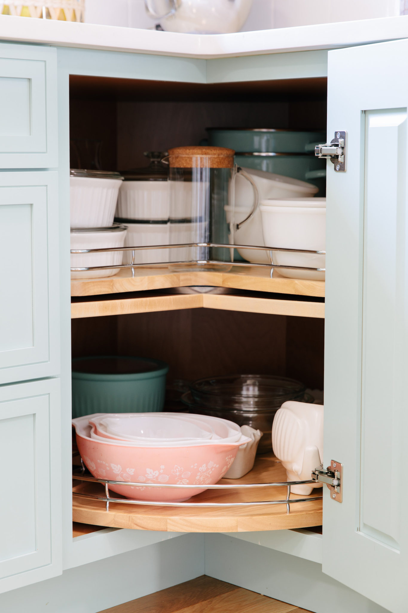
Some of my favorite organizational pieces are in this corner. First up is the lazy susan insert in the corner cabinet.
It houses all of my serving dishes and platters along with all of my mixing bowls. I love collecting vintage pyrex and this is the best home for them.
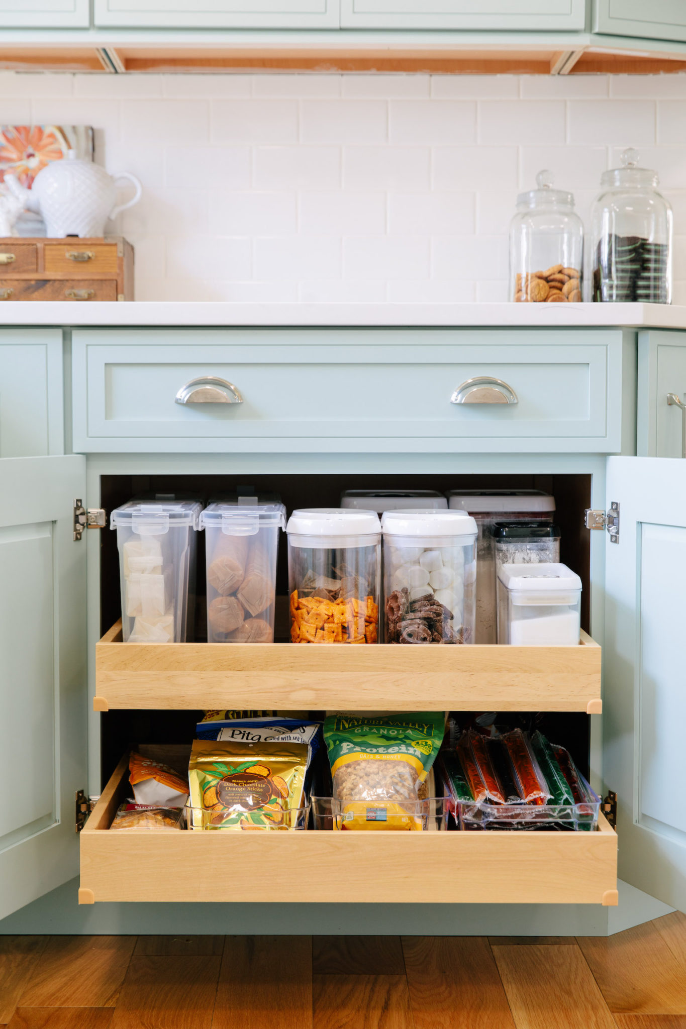
I also have these amazing roll trays which I have filled with canisters for a more uniform look. It houses my crackers, cookies, and baking supplies.
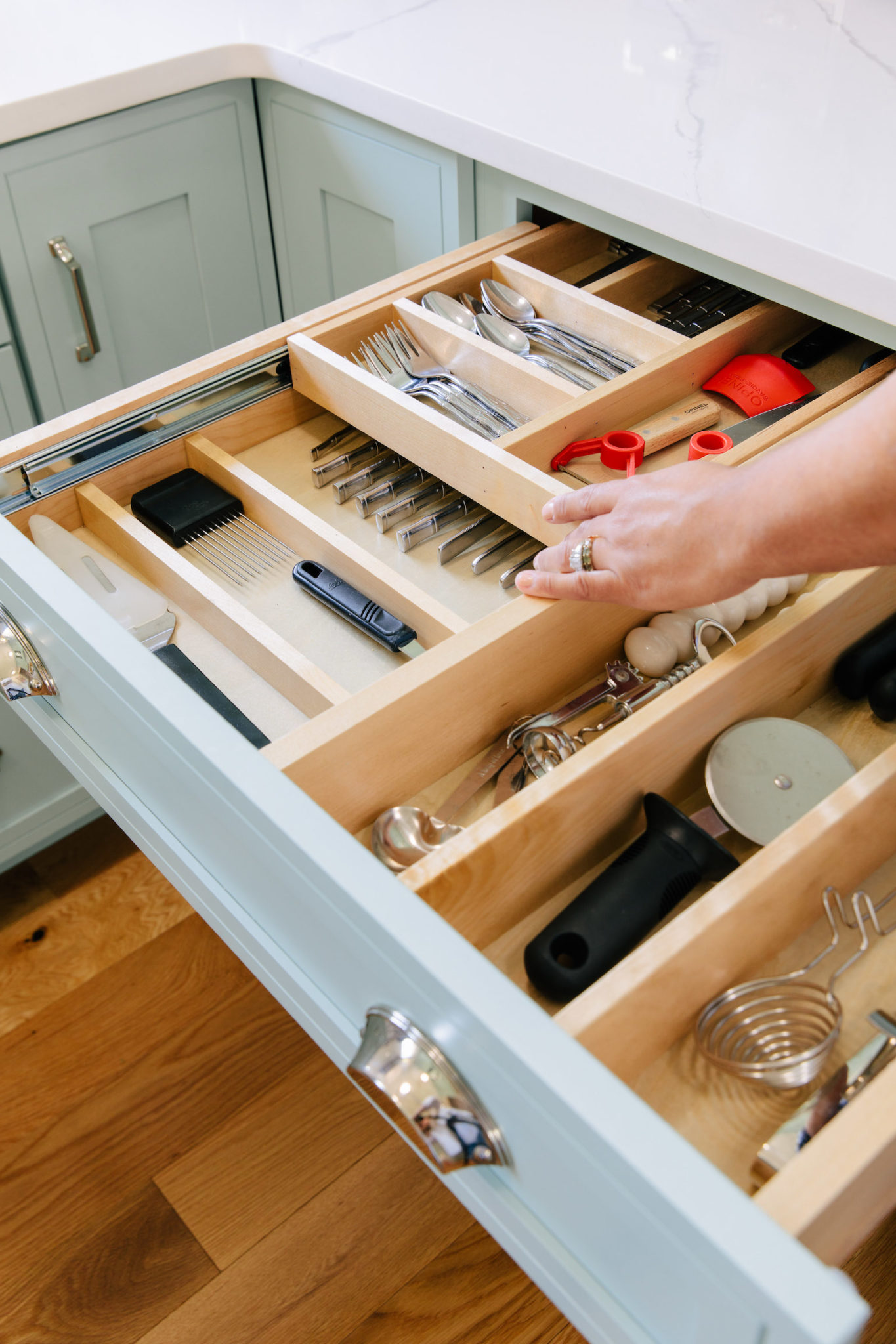
The top drawer houses all of my cutlery. My organizational skills are out of control with all of the compartments!
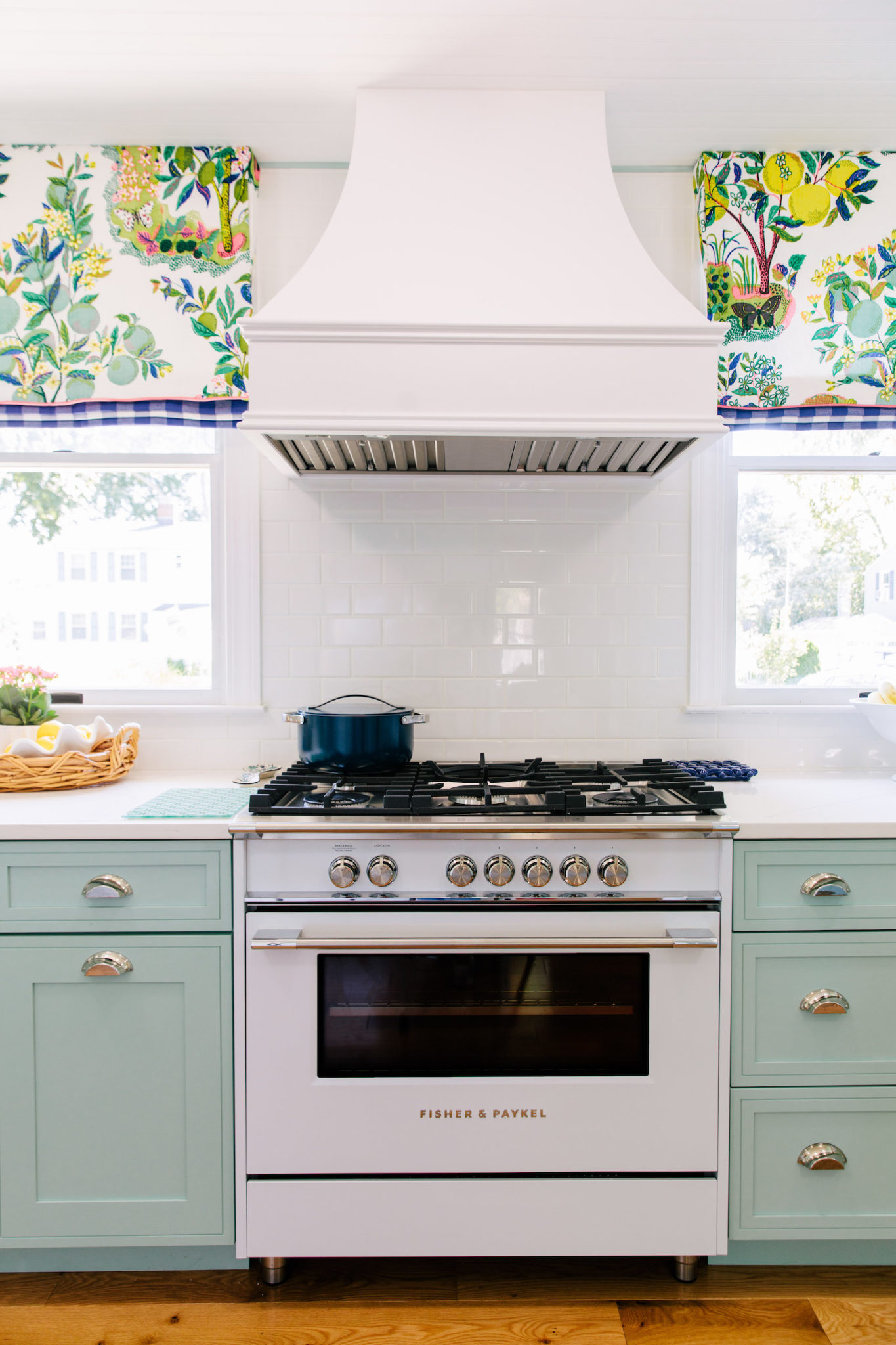
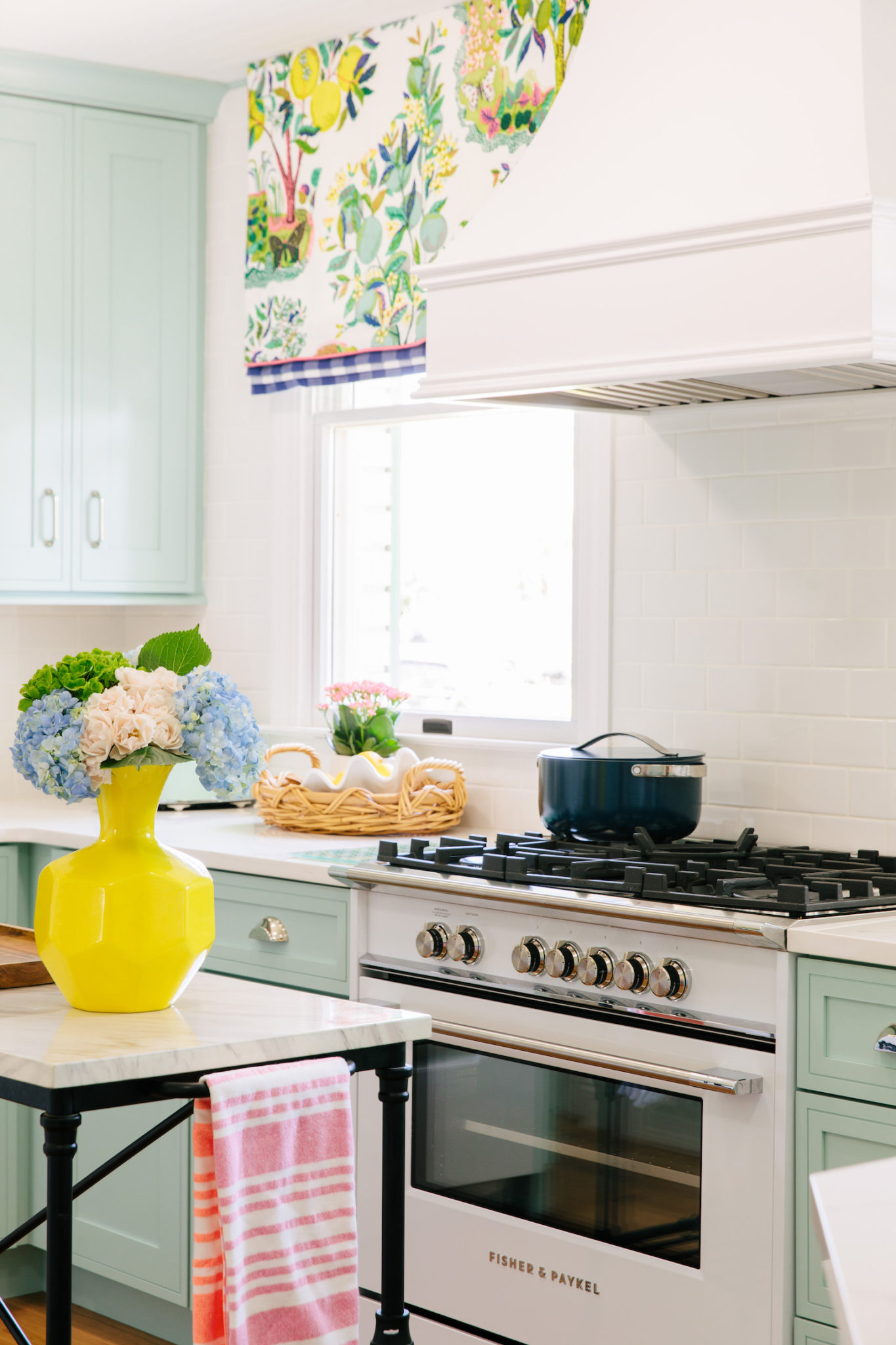
Moving along on the tour we are going back to the main kitchen wall. It’s our focal point featuring our stunning Fisher Paykel 36″ 6 burner range and hood!
It is my husband’s pride and joy. I was a bit apprehensive when Jon wanted to take up precious real estate with a 36″ range instead of a standard 30″ but he was right. It makes a huge difference!
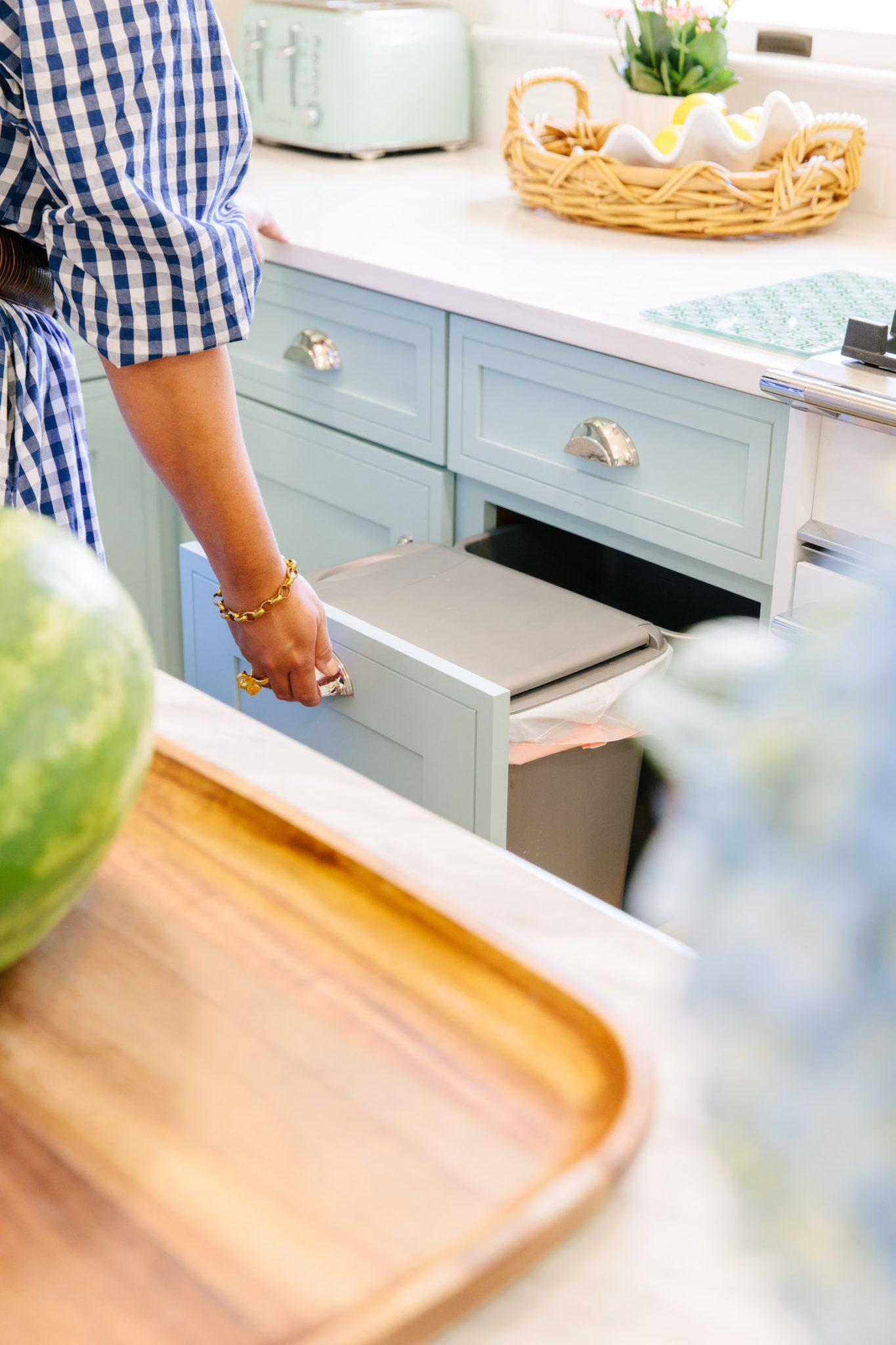
To the left of the stove, we have our garage cans! You wouldn’t think someone would get so excited about garbage, but I love having it in a cabinet and not having a separate can in the kitchen. Our pull-out drawer has two garage bins in it. So we have one for trash and one for recycling.
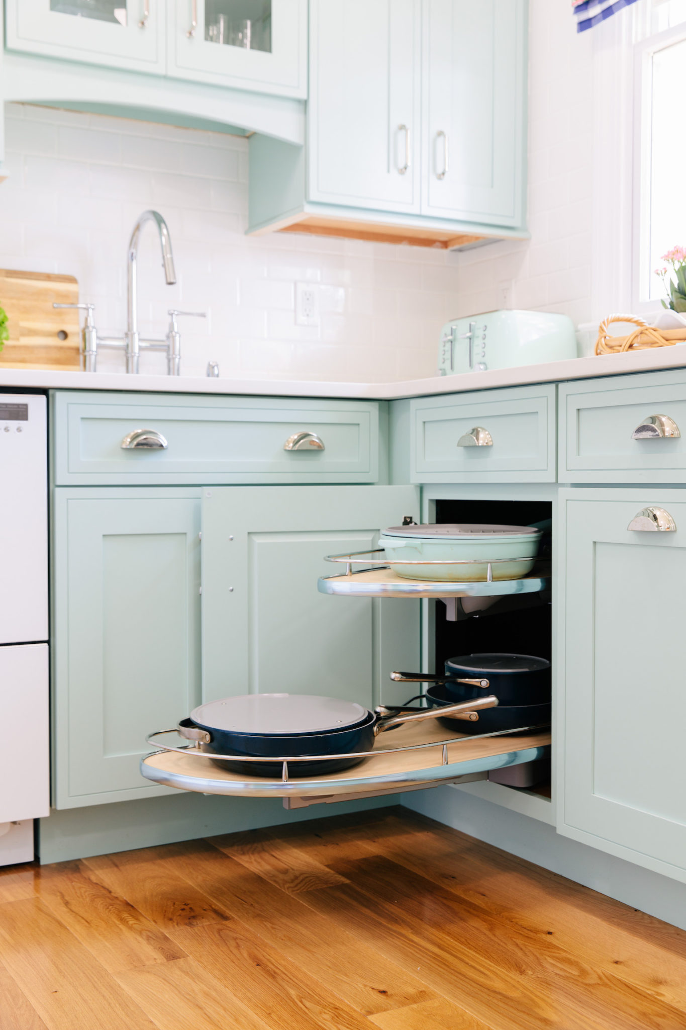
The last base cabinet is another corner piece and it houses a curved pull-out for all of my pots and pans. It’s a dream. No one trying to grab them out of a bottom cabinet where it’s a precarious balancing act and moving one item means the rest falling like dominoes.
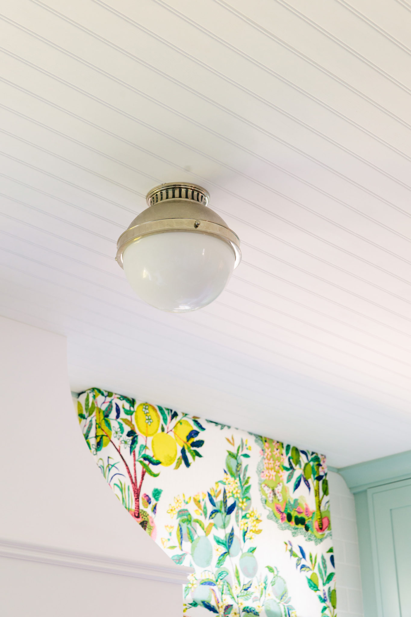
Don’t forget to look up when you are designing a space. Midway through the kitchen remodel I came to Jon and told him I would love to add beadboard to the ceiling and if it was possible. That sweet man of mine said yes even though it was adding more work. Then I decided you know what, I don’t want high hats in here how about some gorgeous lighting to make it a moment instead? Again he said yes! How amazing did it turn out! I love how the polished nickel finish on the light fixture matches the beautiful polished nickel hardware.
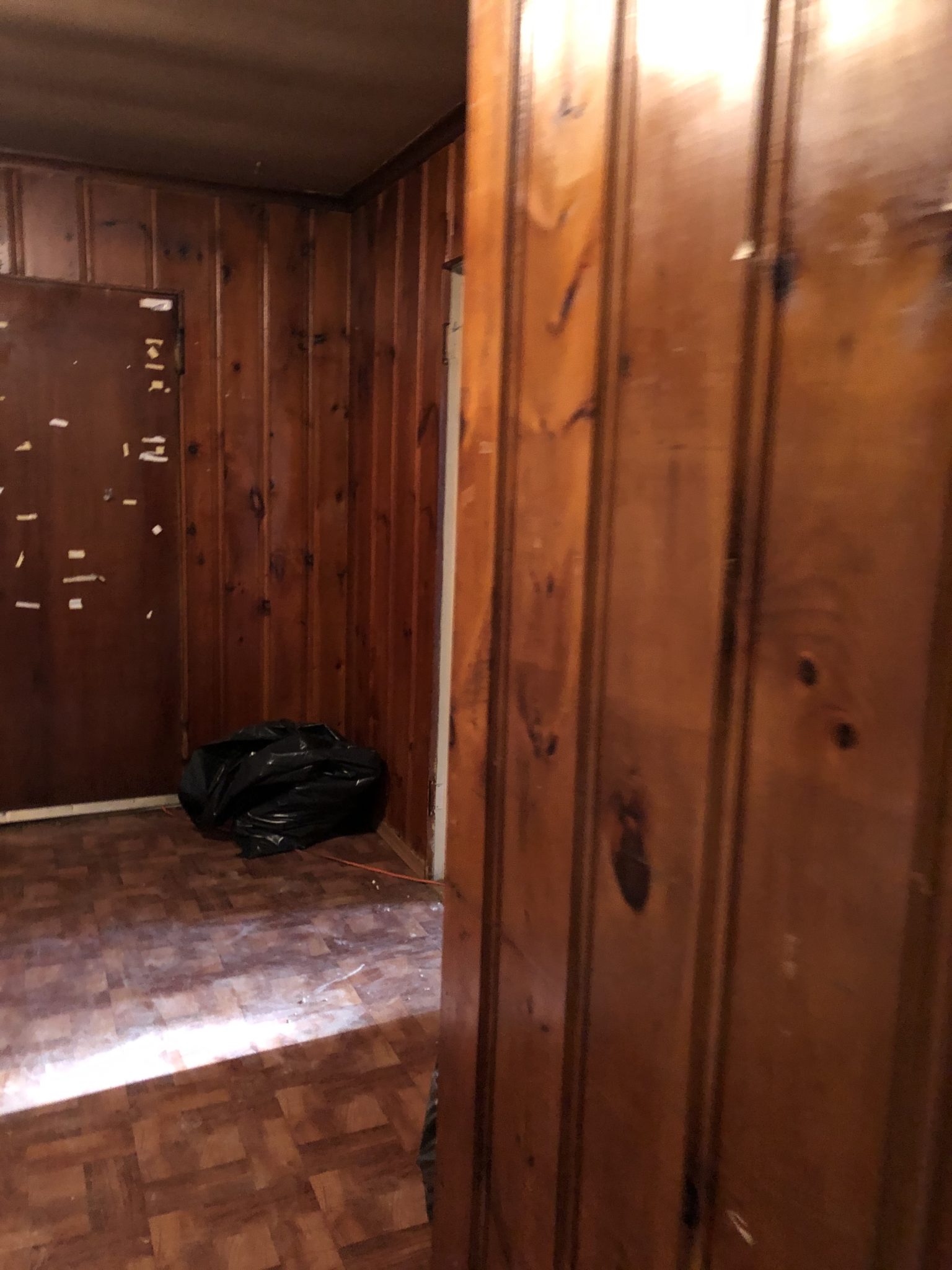
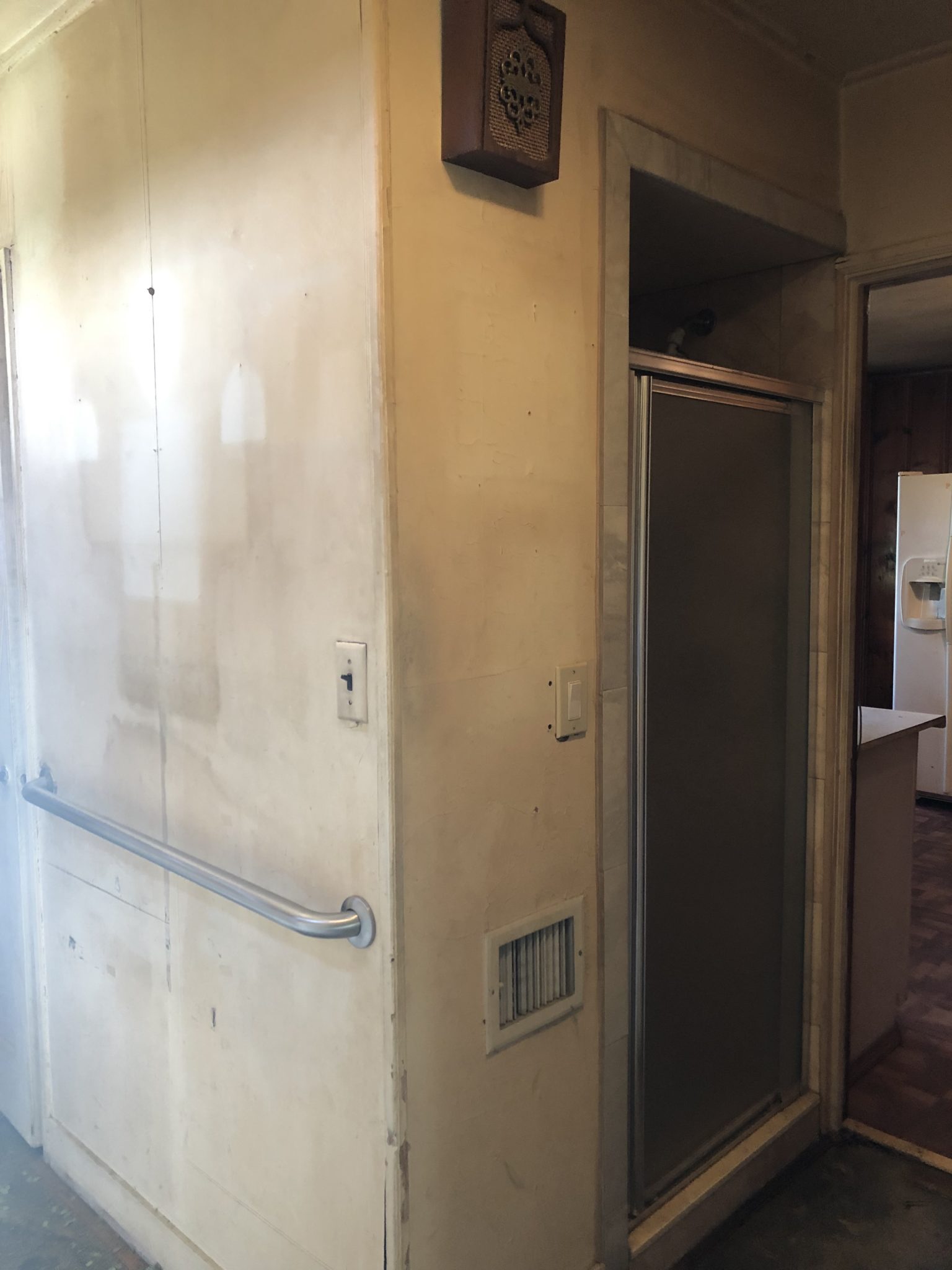
Now the last piece of the kitchen is actually at the entrance of the kitchen. The previous homeowner was handicapped and elderly. The main floor of the house became her living space because she couldn’t go up the stairs which meant the closet that leads into the kitchen was turned into a walk-in shower. Yup, just a shower door in the hallway.
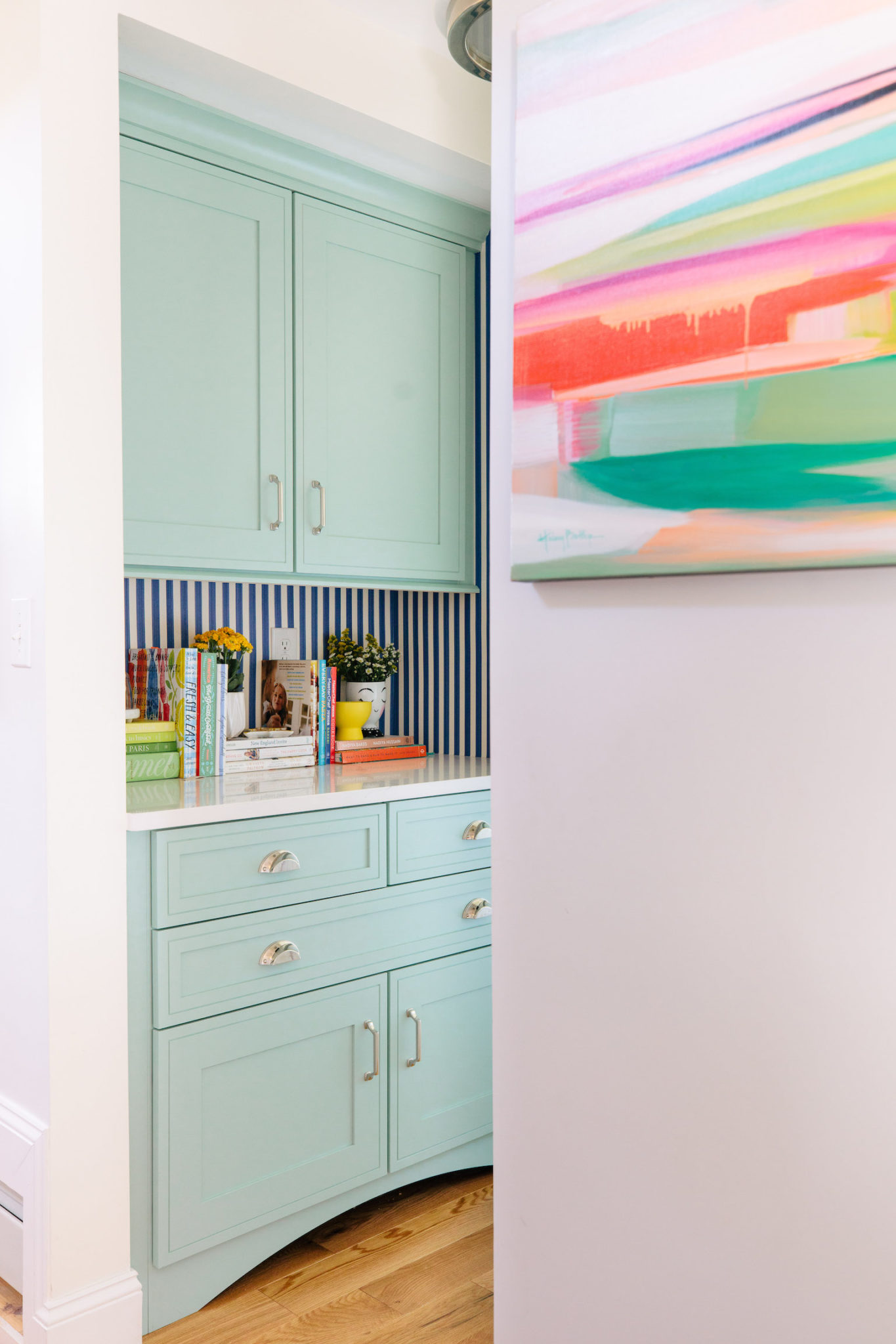
Now, most people would be scared of this weird hallway shower but I was intrigued by the area and knew it had potential. Some contractors recommended closing off the wall and adding a shower to the powder room that is directly behind the shower, but I didn’t think I would really use a shower in that powder room because of its the small footprint. I wanted to take the shower and plumbing away completely and make a butler’s pantry! It was something I always wanted in my dream home and now I was going to be able to get it.
Isn’t it cute? We love it! The upper cabinets are used as a pantry area, the countertop area has all of our cookbooks and then bottom cabinets are my kids favorite! 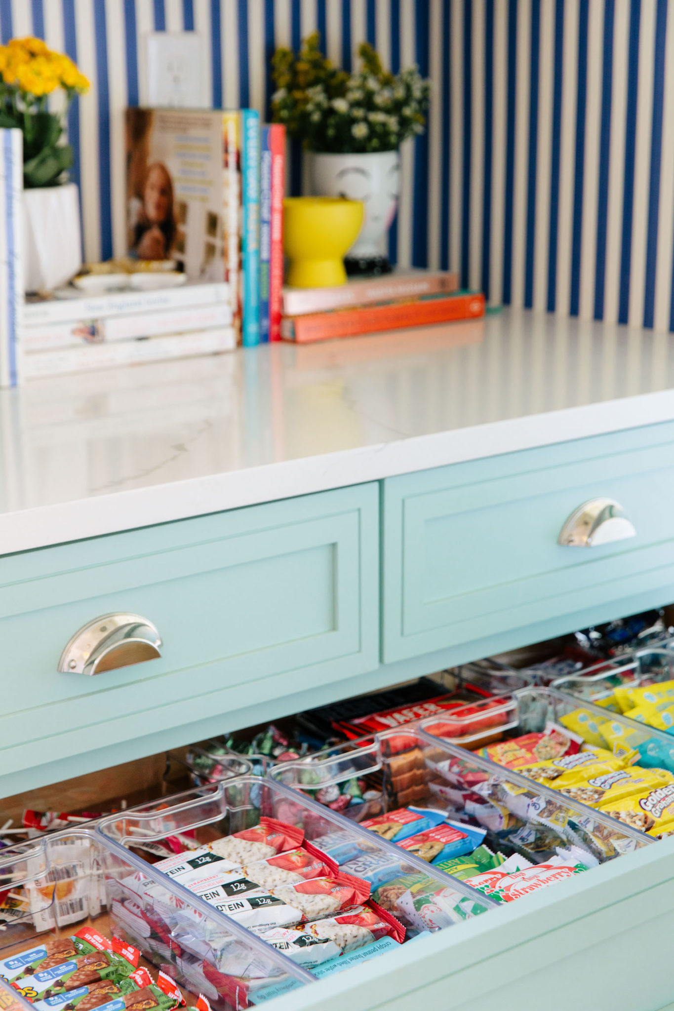
So, was it worth the wait? I hope so! We are all in love with the final product!
Stay tuned for more reveals to come! We are still dealing with some delays to have rooms officially finished but we are almost there!
Related
Closet Turned Kitchenette Reveal!In "Adventure Refresh"
From House to Home: The Kitchen Renovation PlanIn "fromsoldtohome"
Light it up!In "great buy"
Leave a Reply Cancel reply
get inspired with our own home tour
ON THE BLOG
My living room is one of the rooms that evolved drastically from when we first moved one. Originally I painted the walls chocolate brown and did accents of white, blue and orange. That lasted maybe 2 years.
Our dining room sat empty for months. Okay maybe it was empty for just a handful of weeks and then we couldn’t take it anymore and put in a folding table and plastic outdoor chairs, but in my mind that was still empty.
On the main floor of our house we have a Florida room. Being that it’s a Florida room it is a considered a 3 season room, because there is no heat in the room. The previous owners used it as an indoor patio with outdoor furniture and it looked like this when we moved in.
In our new home, the basement was completely unfinished. It was literally one of those dark spaces that you see in horror movies and are terrified of getting locked into. However, with the square footage in this house, I knew I needed to make the basement another workable and liveable floor of the house instead […]
What to look for when it comes to picking out kitchen appliances: Leave room in your budget for appliances. When it comes to kitchen renovations everyone knows that the cabinetry and the labor of demoing and installing cabinetry is going to eat a lot of your budget. However, the second most expensive part of a […]
I don’t think I’m alone in thinking that designing a kitchen is an overwhelming undertaking. I’m an interior designer and even I find it stressful to iron out all of those details. So, when it comes time to design a kitchen I always like to partner with a kitchen designer to make sure I’m remembering […]





The kitchen looks amazing! I love all of the pull out drawers, so much more practical than cupboards on the bottom.
It’s beautiful!
I love what you did with the kitchen space! What an awesome outcome!
This is STUNNING! I couldn’t adore it more. Every single detail is perfection. It is fun and inviting and REAL. Fantastic job.