
Favorites from Trad Home Mag!
Leave a Reply
get inspired with our own home tour
ON THE BLOG
My living room is one of the rooms that evolved drastically from when we first moved one. Originally I painted the walls chocolate brown and did accents of white, blue and orange. That lasted maybe 2 years.
Our dining room sat empty for months. Okay maybe it was empty for just a handful of weeks and then we couldn’t take it anymore and put in a folding table and plastic outdoor chairs, but in my mind that was still empty.
On the main floor of our house we have a Florida room. Being that it’s a Florida room it is a considered a 3 season room, because there is no heat in the room. The previous owners used it as an indoor patio with outdoor furniture and it looked like this when we moved in.

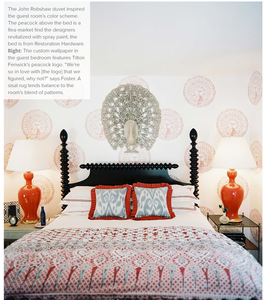

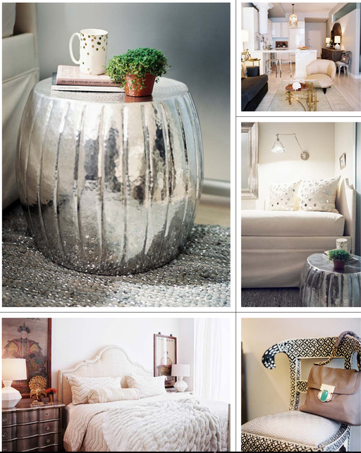



I can not get enough of this mag…so packed with gorgeous. Have a great time at the party- so exciting!!!
The peacocks caught my eye too since I have 2 of them
Chic Modern Vintage
Thanks for the intro to all these great designers…………can’t wait to check out their portfolio’s. Lovely pics.
PS: I linked to your great Lilly post yesterday…………….LOVED those preppy inspiration boards.
Oh thank you. Off to check it out.
Beautiful stuff. And I’m having the same problem picking out a living room rug!
It’s it horrible. I know I’m going to end up with a blah beige rug, because everything I love is way out of my price range!
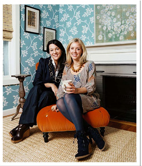
I spent most of the morning today pouring over each page and soaked in all the beauty of the Tilton Fenwick spread–probably my favorite. Perhaps I’ll be checking out Traditional Home more often now…
I agree the ladies behind Tilton Fenwick are my favorites too! I will have to meet them tomorrow night.
I just posted on TRADHome this morning. And do you know what I loved about your post? (Besides the wonderful images) You used completely different photos and it just goes to show you that this new online mag is one to watch. I sincerely loved what I saw! Roxanne
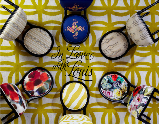
Ohh definitely share picts of the party. I loved the chair feature and it only made my craving for a Louis chair that much worse.
I really, really, really want Louis chairs covered in turquoise velvet for my dining room!! OH, also I’m in love with blues and reds of any shade. That bedroom is making me swoon. My mom gets Traditional Home and, so I wait to steal hers. I need to get my hands on this issue soon!
The latest issue of Traditional Home was also really good. You totally need to steal it from your mom.
That peacock wallpaper is fantastic… subtle and pretty. Loving that whole room,actually. Looking forward to curling up tonight and checking out the whole thing!
Oh- and agree with you about Swan Lake. I was dying to do my clients dining room in the black version, but they weren’t feeling it. Oh well, another time hopefully!
Oh I know. I can’t get anyone to go for it either. I love it.
Trad is rad! Love all your choices of their choice. Just one teensy thing: No more black kitchen or bathrooms.
xo xo
I agree. I painted over my black bathroom a couple of months. After 3 years of living with it I was so tired of seeing it everywhere so it had to go.
I have yet to make it all the way through as well. The yellow dress on the cover had me at hello!
I thought Tilton Fenwick project was cute but it looks like that is their first project since they have only been open for 8 months. Personal faborite by far was Sara Gilbane Interiors- seems like she was the only one who used color?! Her firm definitely has the biggest portfolio. I see a future Markham Roberts! Too much black for my taste through out the issue. Two Michaels project was pretty as well. Loved the built-in window seat.
All good points. I think I was just personal drawn to Tilton Fenwick purely for the peacocks. Sometimes it just takes one thing for me. I had no clue it was only 8 months. I wonder how they got noticed at TradHome?
Sorry we didn’t get to meet at the party! Thanks for including our peacock room on your blog! Anne and Suysel