
So tell me what you want…
Leave a Reply
get inspired with our own home tour
ON THE BLOG
My living room is one of the rooms that evolved drastically from when we first moved one. Originally I painted the walls chocolate brown and did accents of white, blue and orange. That lasted maybe 2 years.
Our dining room sat empty for months. Okay maybe it was empty for just a handful of weeks and then we couldn’t take it anymore and put in a folding table and plastic outdoor chairs, but in my mind that was still empty.
On the main floor of our house we have a Florida room. Being that it’s a Florida room it is a considered a 3 season room, because there is no heat in the room. The previous owners used it as an indoor patio with outdoor furniture and it looked like this when we moved in.

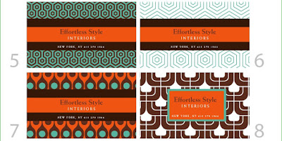



I like 2, 3, and 10 best with #3 being my favorite. They all look great!
Um…they’re all gorgeous!? Tough decision…I think I like #3, and 6 because the background doesn’t detract from your business name, yet still has style.
Wow, those look great, you cannot go wrong. My favorites were #3 and #10. I need to get a graphic designer ASAP. Can’t wait to see what you decide!
I’m voting for option #2. Classic palette.
WOW! She really did one heck of a job. They look awesome.
My favorites (in no order) are: 3, 4, 5, and 10. Can’t wait to see the end results!
I like the background in no 6 and the box with your company info in no 8
They all look great though, you can’t go wrong!
My vote’s for 3 – just seems classic…
woah. these are all unbelievably amazing. i would be thrilled to have any of them. personally, i am always drawn to something with more color; therefore, i like #1, 7, and 8 the best.
i think i like 9 the best because it’s really easy to read and the background provides a nice contrast that isn’t too distracting from the main focus. I like the layering in that the brown is in the back and is the Title font.
I think they all look good – but if one stood out more I’d have to say no. 8 . it seemed to have a funky retro feel to it that appealed to me personally. I hope you get on ok in your final decision! Good luck! x
Ok, I vote #9. It’s pretty, but your eye (well, at least MY eye) was drawn the the name and information, so that wasn’t lost in the design.
But they are all nice.
10. I think that the rest are busy. Great colours thought!
Oh this is so hard. I wish you had started with your top 3. I like so many. But I’m just going to go out on a limb and say number 5. Love it. You can’t go wrong with which ever you pick.
#2, hands down. There are all so lovely though!!
iomoi has some great ready to go calling cards if you want to take a look.
also, ladies, my boyfriend is a graphic designer ready for the pimping out. he’s gearing up to make my business cards and new logo for my blog and i’m sure he would love nothing more than a gaggle of girls interested in is freelancing talent
xo robin
3,4 and 10
nice job!
At first I liked # 9 then changed my mind to #2 then read the comments…. I could change my mind again!
I do like the chocolate brown. Best of luck.
Kristen
Hey there!! How exciting to have another step in the process to be completed! I love love LOVE #10, with #2 & #3 coming in second.
Are you going to tell us all which one you pick?
Hi Everyone,
Thanks for all the help and opinions. Keep them coming.
I still don’t know which one I’m picking. I want to see if I get anymore advice and then I will make my decision and post the winner.
I was leaning towards 8, 10.
hmm decisions…
My votes are for 3, 6 and 10.
TWO or Ten!!
I love #3. Can’t wait to see what you pick! They are all great!
Love your post name: High-Heeled Foot in the Door – lovely! I say #2. It’s chic, and sophisticated, and I love the color combination. It’s delicate and bold all at the same time, and I say go for it! Love the blog, thanks for stopping by – I’ll be back often, and of course, you’re welcome anytime!
Those are all totally fab, and if I only had your business card to go by, I’d assume you have great style! I love 1,4,5,10. 10 being my favorite. Hands down. Love your blog!!
xx
Kara
WOW. All so amazing. I'm really late for this vote!! But I vote for #2. I know how you feel about orange & I think the card is really fun & stylish yet still simple & I think that goes with effortless style. They're all beautiful but this one feels the most "effortless" to me.
xoxo
haha, you were looking for help to make a decision?! they’re so great, we all disagree! I vote for #2. I like that it’s mostly neutral (classic) with a punch of orange–the ‘in’ color for 2009!
Can’t wait to see what you decide.
# 3 is just perfect!
#3 is my number one choice with #10 a close second.
sweet options!
I love #7 but your name on orange kind of blends with all the other orange. #9 is so beautiful! I think that’s my fave.
okay…if I tell you this it will cross this one off of your list…but I have to tell you that #9’s background is starting to remind me of those eyeballs on the new Geico commercials..sorry if that was a fave. I think #3 and #10 are my favorites
I like 8 & 9 – love all your choices, I agree it is SO hard to choose for yourself!
3, 8 and 9 get my vote!
I plan to be a ‘loyal reader’…can I still throw in my two cents?
If so, I love 5 and 8. The colors and the graphic nature of the design are phenomenal.
Good luck choosing!
I like #2 and #7 but using the box w/your name from #8. What a great start for your business.