
DIY: Cheap & Chic Artwork
Ok I swear this is the last time I will write about the Chelsea apartment project. Unless you all twist my arm and want me to answer more questions! 🙂
In addition to yesterday’s DIY project I also received a lot of emails asking me where I purchased the large vintage subway artwork that was hung up in the living room.
Now to answer the question of where I purchased them leads to a DIY project, because I made them using a handful of things
I loved the idea of using vintage maps or postcards for part of the artwork in the room. Only problem was that I had seen them at Brooklyn Flea, which is only on the weekends and due to my time crunch not an option.
So I had to come up a back up plan!
One of my favorite shops in Manhattan that can lead to many hours of ohhing and ahhing is Kate Paperie. With a quick couple of links I was on their site searching their gift wrapping paper and found my solution.
Not only does Cavallini come out with beautiful calendars, but they also have gift wrapping paper, which is what I used. They were only $4.50 and if you join their mailing list you get 20% off your 1st purchase!
First thoughts were to then use mod podge and wrap them around canvas, but the canvas at my local craft store were a bit too pricey so I went with foam board instead! The week I went those two boards were onsale for $3!
Since my wrapping paper come looking brand new it didn’t give me that desired vintage effect. Heading down into our shop I found some left over wood stain and got to work.
The wood stain I had laying around was a dark walnut shade. Since it looked a little too dark I simply dipped my paper towel in a little water first and then dipped it in stain. Then it’s up to decide how much or little antiquing you want to do with them.
I wanted them to look like they had been dragged through the NYC subway lines so I went to town with the stain!
I then let it dry. Next step was applying it to the foam board. If you have spray adhesive you can use that. I had wallpaper paste laying around so I used that instead.
< p>I then brushed glue all over the backside of the paper and simply applied it to the foam board. The plus of using wallpaper paste is that you are easily able to left it right off the paper and adjust it as many times as you like.
I then smoothed out all the bubbles and let it set!
My foam board was a bit larger than the paper so once it was dry I needed to trim the excess off with an exacto knife.
Because you are using foam board and not canvas you may find that your board will curve a bit and not lay flat after having the paper applied to it. To fix that problem we simply tacked nails into all 4 corners. Not only did the nails help in attaching it to the wall, but it made the board nice and flat!
You are then finished! Here is a reminder of the finished product and a full view of the living room area!
The project was super easy and came in at around $10 !
Author’s note: I just wanted to let everyone know that I’m still having computer issues! My laptop died last week and still hasn’t decided if it wants to wake up again. In the meantime I’ve been using my Mom’s laptop, but there seems to be something wrong with it, because it keeps freezing. Hmm maybe technology is mad at me or something?
This has made working, blogging, commenting, responding to emails super difficult these last two weeks. So sorry if I’m behind on responding to you or if you haven’t received any blog comments from me! Commenting on blogs is one of my favorite things to do! I’m so sad that all my computer issues have made that a rare occasion these last couple of days. I hope to be back in action super soon!
Hope you all understand!
xoxo,
Camila
Related
Leave a Reply Cancel reply
get inspired with our own home tour
ON THE BLOG
My living room is one of the rooms that evolved drastically from when we first moved one. Originally I painted the walls chocolate brown and did accents of white, blue and orange. That lasted maybe 2 years.
Our dining room sat empty for months. Okay maybe it was empty for just a handful of weeks and then we couldn’t take it anymore and put in a folding table and plastic outdoor chairs, but in my mind that was still empty.
On the main floor of our house we have a Florida room. Being that it’s a Florida room it is a considered a 3 season room, because there is no heat in the room. The previous owners used it as an indoor patio with outdoor furniture and it looked like this when we moved in.
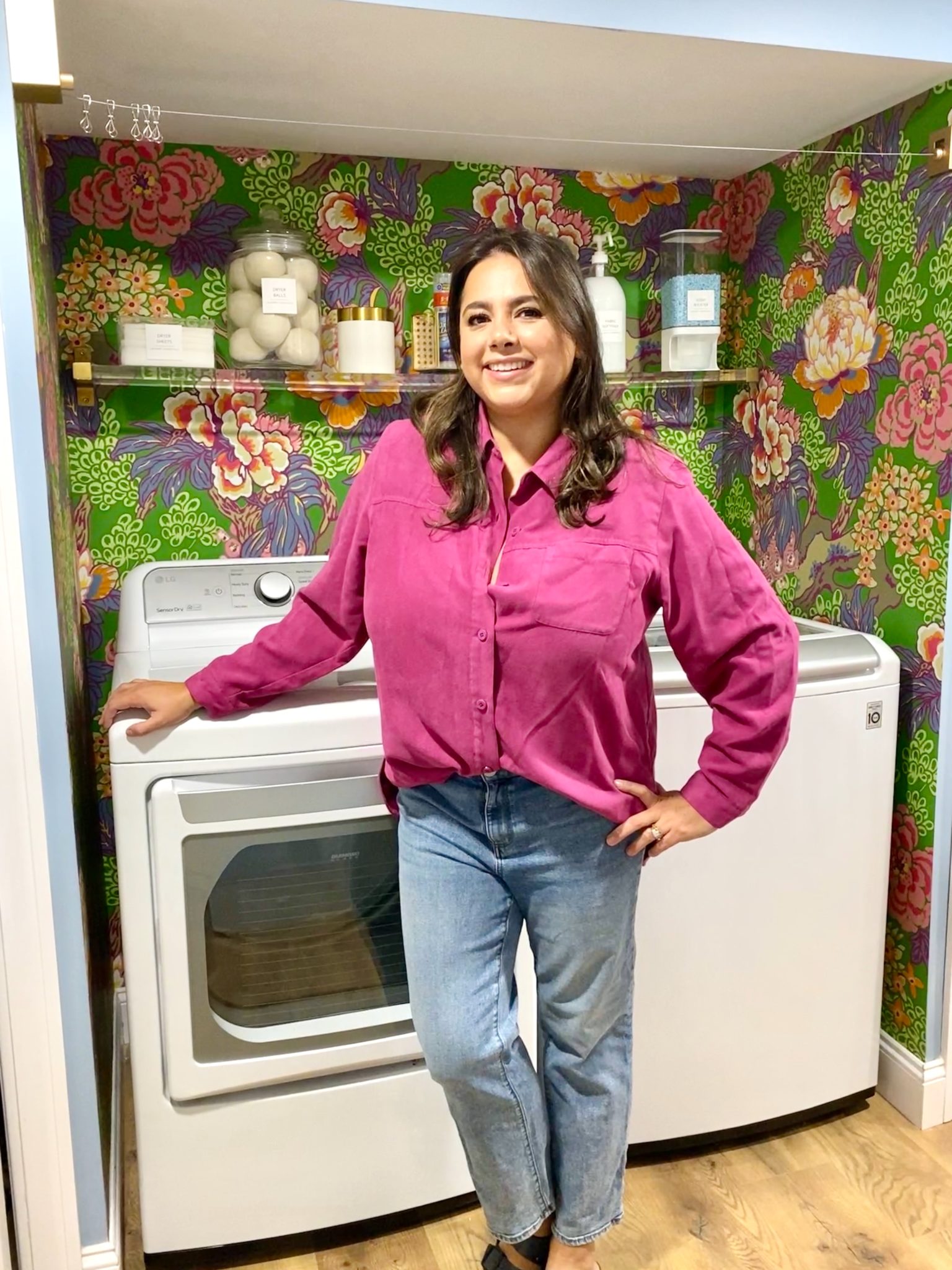
In our new home, the basement was completely unfinished. It was literally one of those dark spaces that you see in horror movies and are terrified of getting locked into. However, with the square footage in this house, I knew I needed to make the basement another workable and liveable floor of the house instead […]
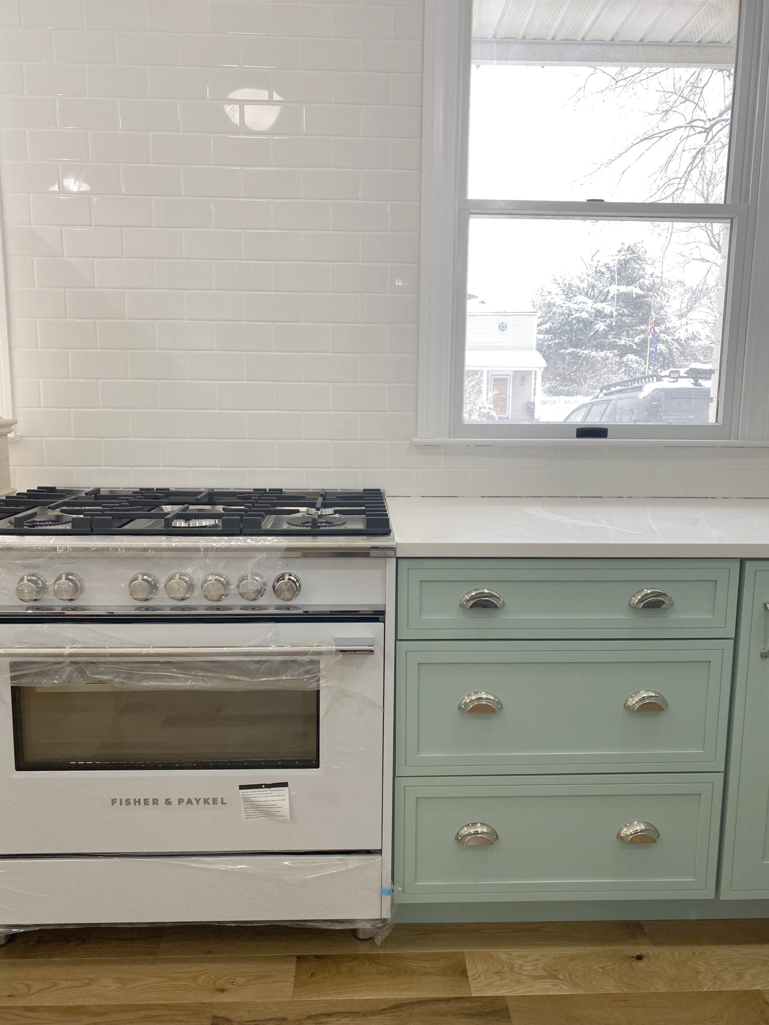
What to look for when it comes to picking out kitchen appliances: Leave room in your budget for appliances. When it comes to kitchen renovations everyone knows that the cabinetry and the labor of demoing and installing cabinetry is going to eat a lot of your budget. However, the second most expensive part of a […]
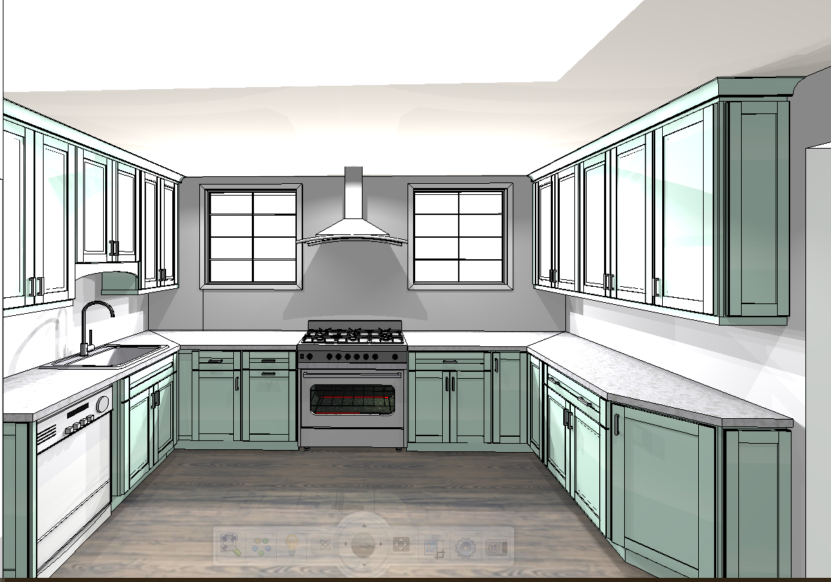
I don’t think I’m alone in thinking that designing a kitchen is an overwhelming undertaking. I’m an interior designer and even I find it stressful to iron out all of those details. So, when it comes time to design a kitchen I always like to partner with a kitchen designer to make sure I’m remembering […]



Such a great project for next to nothing- I love it!!
Definitely love the vintage map look. I'm saving this one in my files!! And COME BACK SOON!
Clever, you! Take Care!!
Great idea! There are so many gorgeous gift wrap options available now that would work beautifully as art.
Glad you all like them! Don't worry I'm not going anywhere! My computer issues are just making things over here run at a snails pace and I feel horrible about it!
you blow me away!! I've seen that paper at Kate's Paperie and ALMOST bought it so many times. awesome project!
That is such a great idea! They look so much more expensive than $10! That would be a great addition my house!
That is a totally awesome project. Love your DIYs!
So cool!
Very nice! I really love the color green on the walls in these pictures. I just found your blog and it's great!
what a great idea!!!
i have to say that it cracked me up that all the pics were of you and your pretty little hands and then suddenly jon's hairy arm pops in there and i was like "camila?!!" you need to shave!! 😉 😉 hahah j/k
too funny.. but sich a great idea on the maps… i have some wallpaper maps lying around and might have to try this!!!! thank you!!!
xoxoxo
Ha ha Lauren. You have me dying over here. My mom and Jon were my models for this project so that I could take the pictures!
Awesome project! Paper is such a great medium – and so cheap.
Great way to have art work. Thanks for sharing.It is so helpful that you showed the project step by step.
love the idea of maps as art. colorful and educational:)
Such a great idea, Camila!!! Love the outside-the-box thinking!! Cheap but chic!
I think I just said 'chic' bc I just saw your tweet about the Jonathan Adler Warehouse sale. 🙂
I'm SOOOO jealous! Next year we'll go together. As long as you don't mind me dragging along a few kids…
hugs,
j
Great tutorial!
Enjoy! I can't wait to hear all of the details! 🙂
Roeshel
Sorry you're having tech problems. I hope it gets sorted out soon.
I have that New York map hanging in my studio. 🙂
What an amazing idea. Those would be so fabulous in a study!
Perfect!! I framed Cavalinni calendar "prints" and everyone thinks they're vintage lithos. 🙂 Love the map wrap…and it's so great that you went the extra step by "aging" it! Great, great idea.
great room! i hope that i'm not annoying in asking this, because you probably already posted it, but where did you get the brown/white pillows? they are so cute!!!
Awesome!!
I love this! The foam board is such a great idea! Thanks so much for sharing, I'll be linking.