
Weekend Recap: Curb Appeal
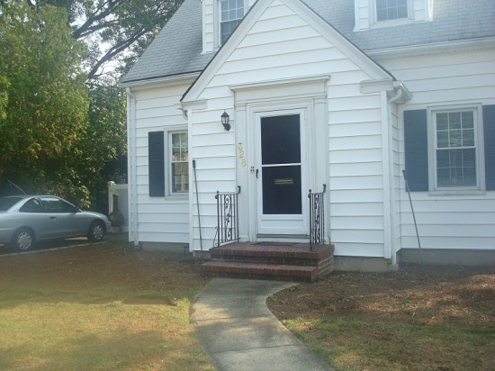
When we first moved into our house the front looked like this:
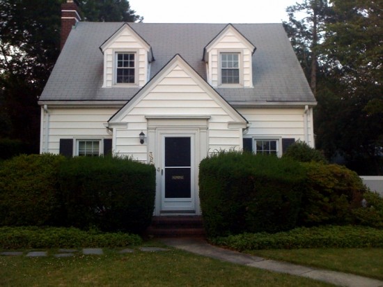
Our teeny little cottage was being over taken by greenery!
Then last year for my birthday I returned an ipad I was given as a gift by my family and used the funds to have the bushes removed. Now that’s dedication to design.
We were left for with a clean slate and for the past year it’s stayed in that condition. At first we weren’t sure what to do, then we decided on a front porch, but couldn’t get around all of the red tape the village provided with permits and plans, then winter came and went and finally it’s the summer and we decided a couple of weeks ago to do a large paver stoop and not have to deal with permits.
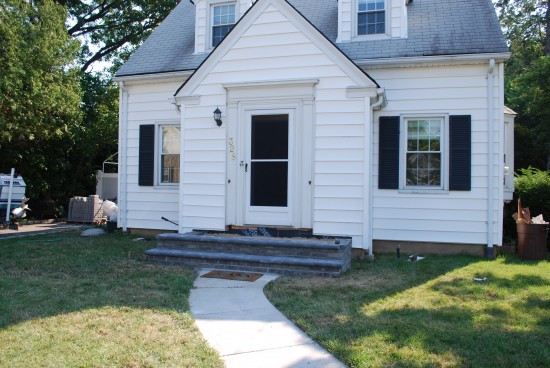
We are big DIY’ers, but lately we’ve been so busy that we would rather outsource some projects to professionals and give ourselves a little breather room. This weekend the stoop project got started and will be finished today:
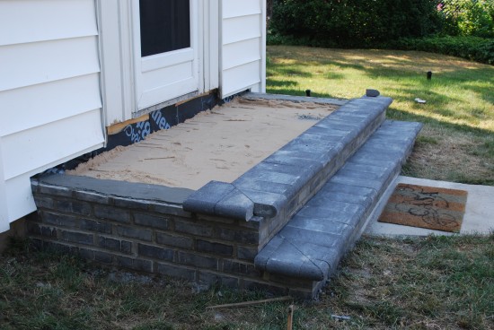
Of course no project is ever easy and even though we didn’t want to be involved with the labor poor Jon ended up having to work on it all of Saturday when we discovered that the huge section of wood at the base of the door had termite damage and needed to be fixed. Even with that hiccup though the project was able to continue and should be wrapped up today.
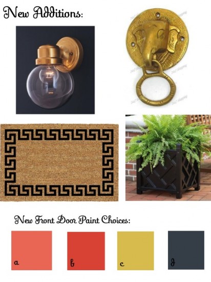
Since we have a new stoop I thought the rest of the entry way needed a little face lift as well and the following items have been ordered and are currently on their way here!
-The existing door has all brass hardware. Switching it out would be expensive and while I searched for techniques on how to paint over the brass or use a rub on finish to switch it out to silver in the end I decided to just embrace it and go with it. Enter my new brass elephant knocker.
-We’ll also be switching out the old school outdoor light, but this chic brass numberfor only $15.17!
-It’s time for a new grown up outdoor mat. The one that was there before hand looks like it cost about $5 and it showed. When Jon requested a new one I knew it was in bad shape. Enter my new greek key find.
-We made the stoop a bit larger than before because we wanted to put planters/urns on the sides of the door. I had never sourced them out before and was shocked at how expensive they could be. I finally found an option that fit the design style I liked and was actually on the cheaper end of all of my finds. Chippendale planters available in both black or white on my list to be ordered. Not sure what color to go with. What would you do?
-Lastly the front door needs a new coat of paint. It was originally white and then last year I painted it black. I love/loved the black, but think it’s time for a change. I’m toying with the following colors:
a. Cool Lava by Behr – coral has been on my mind for months now.
b. Fiery Red by Behr – don’t love the name, but it’s my favorite thus far. It’s this great red/orange shade.
c. California Dreaming by Behr – find a great chartreuse shade is hard, but I really love this recent find.
d. Wrought Iron by Martha Stewart – it’s a great dark blue almost black shade. I love mixing black and blue it makes for a chic color combo.
Jon is leaning towards C and frankly I’m kinda obsessed with all of them. Help!
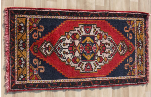
The inside entry way mat looks like this:
Related
Leave a Reply Cancel reply
get inspired with our own home tour
ON THE BLOG
My living room is one of the rooms that evolved drastically from when we first moved one. Originally I painted the walls chocolate brown and did accents of white, blue and orange. That lasted maybe 2 years.
Our dining room sat empty for months. Okay maybe it was empty for just a handful of weeks and then we couldn’t take it anymore and put in a folding table and plastic outdoor chairs, but in my mind that was still empty.
On the main floor of our house we have a Florida room. Being that it’s a Florida room it is a considered a 3 season room, because there is no heat in the room. The previous owners used it as an indoor patio with outdoor furniture and it looked like this when we moved in.
In our new home, the basement was completely unfinished. It was literally one of those dark spaces that you see in horror movies and are terrified of getting locked into. However, with the square footage in this house, I knew I needed to make the basement another workable and liveable floor of the house instead […]
What to look for when it comes to picking out kitchen appliances: Leave room in your budget for appliances. When it comes to kitchen renovations everyone knows that the cabinetry and the labor of demoing and installing cabinetry is going to eat a lot of your budget. However, the second most expensive part of a […]
I don’t think I’m alone in thinking that designing a kitchen is an overwhelming undertaking. I’m an interior designer and even I find it stressful to iron out all of those details. So, when it comes time to design a kitchen I always like to partner with a kitchen designer to make sure I’m remembering […]


I like option B the Fiery Red because it is the most vibrant and will pop with the black planters in front. Not to mention a great flow to your entry runner inside.
P.S. I’m in love with the elephant knocker…I have a slight obsession with small elephants
I think B would be fabulous and C a close second! Both would look accent a black planter with greenery. B would also go well with the brass hardware. Your door would definitely have
pop, and look fantastic! You need to paint the screen door as well. Then paint the transom around the door the same colour as the shutters.
Can’t wait to see what you do. Love the knocker BTW!
I like C for a door on white house too; although D and then B quickly follow (and would look good with that awesome knocker). The house looks amazing without the bushes.
A big vote for B! that would look adorable!
It’s looking great already! I think the black planters would stand out against the white of the house but still allow your plants to shine. I like your paint color C, but I don’t think it will work as well with all the brass you’ve picked out. I think Fiery Red would work the best – contrast with your siding, the planters, the shutters, and the brass, plus it looks like it ties in with the rug in your foyer. Good luck, and definitely keep us updated!
I agree. I love c, but dealing with brass is an issue. Most of the brass on the door is really weathered and matte everything except the mailbox opening and the house letters! I’m loving b as well. Just wish it had a better name.
I love it all! I can’t wait to see it come together. I love paint B and the black planters — I think the combo will looks updated and classic. Good luck and I will stay tuned!
Love, love what you’re doing!! That elephant knocker is so perfect for you; wow!! The light fixture is great, too. The expanded stoop looks so much nicer and more welcoming with the extra width and removal of the railings! You are completely inspiring me to add a few more touches (mainly a different light fixture to our entry).
As for voting…
I vote for black for the planters. Adds contrast to the white house behind it and won’t show dirt/grime as much. I feel like the white ones would be dirty as soon as you planted in it, and would be hard to keep clean. If you get white, I vote for painting them in color d.
For the door, my personal favorite is b. I think for an outside door, the bolder, the better!! I love it. C is also nice, though, and would still add punch/contrast. From reading your blog, b seems more like you.
Have fun and can’t wait to see the final results!!
C! C! With the knocker and the brass-embrace the yellow would be beautifully bold. B is pretty, but it’s more common and expected. And if you had some sort of yellow flowers somewhere? Yellow would give it double-take status :). Love the sweetness of this home!
Did you really purchase the doorknocker from India? I have been hestitant about purchasing from out of the country. Could you let us know if it arrived in a decent state and time? Enjoy your blog every day!
It really is coming from India. Will let you know how it goes. The rug is coming from Turkey and it has already shipped!
I vote A or B…Blue and black makes me twitch a little, I don’t know why. And I feel like the chartreuse with the brass, at least from that teensy swatch, I dont know. But I am loving a little pink or red action!
I don’t want to make you twitch Bailey. I’m leaning towards B.
Your house looks a lot like ones we have here in Jersey! Here’s my opinion:
coral: will look too dated too fast.
red: great choice. Happy & uplifting every day when you come home.
chartreuse: everyone looks bad in front of this color, so no front door family shots for you!
black/blue – too dark – would look just like the before picture. I always say, if you’re going to paint – make it noticeable!
Great job so far – can’t wait to see the finished pictures!
Thanks for all of the help.
I think I’m leaning towards B. It’s not red, but it’s not orange so it’s a happy middle ground me.
I love the idea of navy and black together, but that’s just me and I’m pretty certain I’m the only one that would notice the difference.
Camila- I like California Dreaming by Behr, but all are so pretty! This little house is so happy you found it.
Loretta
I love what you’re doing to your exterior!! And, I love all your door colors, but I’m learning towards ‘D’! I think the brass will pop and when I saw your entry way rug, it was a no brainer!!
What a fun project- I love how the larger stoop is looking. Oh and for the front door color, I do love the navy but with black shutters not sure I love both together. So in that case I have to go with A or B- the bright colors are so you and would look great with the brass hardware and black shutters
I love the first paint color for the door. The black planters would be perfect against the white house. When thinking of the door color, consider what types of plants and colors you may want to put in the planters. The first color may allow for various shades of pink to red, while the darker red may not look so great with pink plants.
hi i recently found your blog, subscribed and am loving it, especially your before and afters.
my biz is exterior facelifts and landscaping and love your home. i would go for the red and definitely in a high gloss. red can be carried over in flowers in the planter. now you did not ask for this opinion but being bossy (says my sister!) i would have chosen black for a light fixture and go large, 2-3 times larger than what is there……really! ps; house could use window boxes too!
i wrote a guest post on tobi fairley’s blog all about this topic if you want to take a look. chose a sad little house and gave it three different looks with the how to at tobifairley.com/blog, posted 7/10
well TMI about me, great to have found you and can’t wait to watch all your progress’
best!
debra
tough decisions, but I love black shudders with a red door, so classic and timeless!! its looking really good, camila!
In my opinion the best planter colors tie in shutter/ roof colors elsewhere on the house to help visually ground the entryway so my vote is for black. Also might want to check craigs list for some options.
I choose C with the black planters!
I love the light fixture you chose – in fact so much so I think I’m going to purchase two of them to replace ours- but when I checked the link, it didn’t say they were specifically for exterior use. Any concern about using them outside?
I like D! I think blue is the best mix with the brass. And definitely black for the planters! I like when they look heavy and grounded.
My door is a redish/orangey color called Sangria by Benjamin Moore so I love that option too!
I love brass! I think fiery red would look excellent, and really make a statement on your house. And I really think you need the black planters, they will shine next to the brass accents. I’m getting ready to do our front door, too, thanks for the inspiration!
I vote A for the front door and black for the planters. I am not normally a fan of coral, but I think it would amazing against all the white and the pops of black.
I vote B! With black planters. It’s going to look fantastic. How I wish we owned so I could do the same – the simplest cosmetic changes can make such a difference!
Go with the coral! It is perfect for your house! We did the fiery red two years ago and I am so tired of it. I am really limited by planter colors, mat colors etc. Seems like any kind of house numbers look just so-so.
Our neighbors across the street went for the coral door and it is so pretty and welcoming. Now I CAN’T do the coral, well…because; it would be like taking their great idea!
Yes, that is TRUE dedication, but I’m sure you don’t regret taking the bushes out!
I actually like “b” the best. They are all fantastic options, but I like the contrast and how it ties into the rug when you come in. Also, when your front door is open and inside the house, it would look good against the rug.
I love your “little brass number” so much I may buy it for myself! Can’t wait to see how it all comes together.
Abby
Already it’s looking so much better! Can’t wait to see the final reveal.
WOW! I painted my bedroom in Cool Lava!!! It’s a great color and I loved it so much. But it turned out to be a bit much for a bedroom, but for a door it would be awesome!!
Ooh, decisions, decisions. I like a red door, but I’d opt for a much darker red myself. I like a door to recede a bit; let the hardware and planters/plants say “look at me.” I’d like to hear what kind of plantings you are considering to replace the monster shrubs you removed.
The coral would look divine against the white house with black shutters and black planters. I’m kind of partial to coral because I painted my front door this color 3 years ago and I am still loving it. It is such a happy color! A pic of my door is in the following post:
http://mindingthemanor.blogspot.com/2011/06/i-have-no-excuse.html
That door knoker is just darling! so cute.
I think you can’t go wrong with A or B for the door color, punchy and happy! Take a look at Restoration Hardware for planters, I just spec’d some for a client that were on sale and they look amazing. If you need plant ideas feel free to let me know! *Amy
Your house is so cute! I am a fairly new reader of your blog and I love it! I love the brass door knocker and the front porch light that you chose. I like choice B and C for your front door. I can’t wait to see your after pics!
Great start! Looks so much better already! I love the look you’ve got planned. I think all of the door color options would look great. I would go with something other than white for the planters so that they contrast against the house. If you don’t like black, you could always spray paint them a different color!