Colorful Beach Restaurant Design Plan
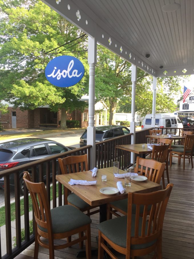
Over the weekend we went to a new restaurant on Shelter Island called, Isola. It’s an Italian restaurant that my sister is law’s boyfriend opened it this summer. Try saying that three times fast. During the Spring they were working on revamping it from the look of the previous restaurant. It’s now bright white and airy, but of course after I visited it the wheels started turning over how I would add some finishing touches to it! What can I say? A decorator is never off the clock.
I really loved their signage and logo. The font was really pretty and I loved the cobalt blue.
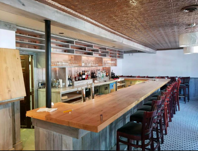
Here is their bar area:
Totally good bones and looks great as is, but if I got my hands on the place I would play up on the cobalt color a bit. It’s also located on an island so, I like the idea of adding some nautical touches without screaming beach town.
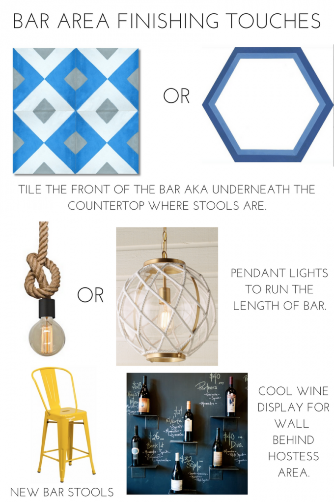
I was looking for inspiration and started looking at restaurants from the Amalfi Coast since it’s an Italian restaurant. Many of them had beautifully patterned ceramic tile. I wanted to do my own take on that look and loved these tile options. The diamond pattern is my personal favorite, because the bold blue picks up the bold trim in the rest of the space. For a tamer option the hexagon option is just as pretty and adds interest to a space that tends to be forgotten.
I love the idea of pairing yellow with the bright blue. I would swap out the bar stools for these yellow tolix style bar height stools.
To add more interest above the bar area I would add a grouping of pendants. The wide knotted pendants would look great and add a little industrial meets nautical vibe to the space. Another option is the white rope globe pendant, which again adds a nautical touch, but is more glam and chic.
The main dining area is full of bright white walls and warm wood tones in the tables and chairs.
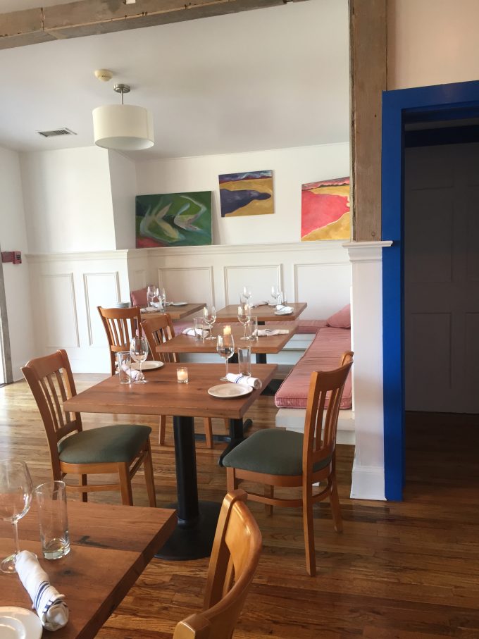
I would of course add a bit more color to finish it off.
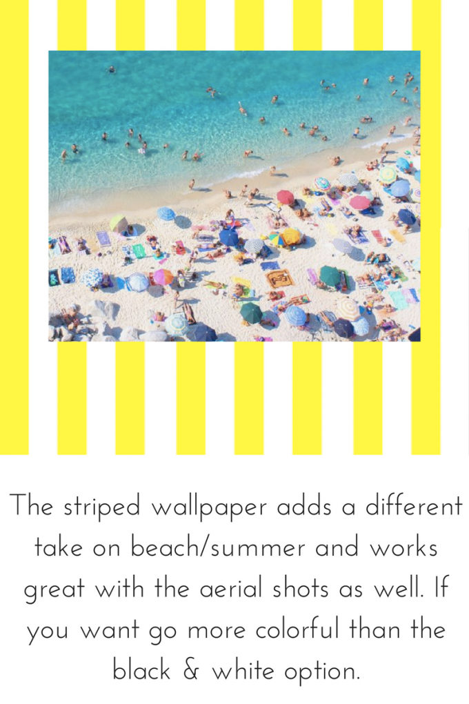
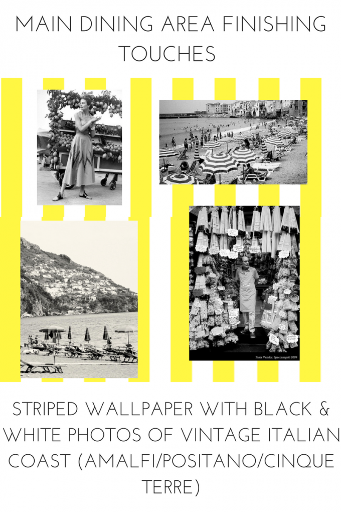
I love the idea of wallpapering above the wainscoting with a yellow and white striped wallpaper. It’s a fun yet classic look and totally works for a beach town.
Now one way to tackle the artwork would be to frame beautiful colorful aerial shots of the Italian coast.
Love these aerial shots by Tutto Bene Shop. They have a lot of stunning options and the largest size, 24″ x 36″ is only $60!
If that’s too much color for you then I like the idea of framing vintage black and white photos from Italy.
In a quick google search I found some great vintage photos you could have printed and also found the beautiful Amalfi coast print on Etsy.
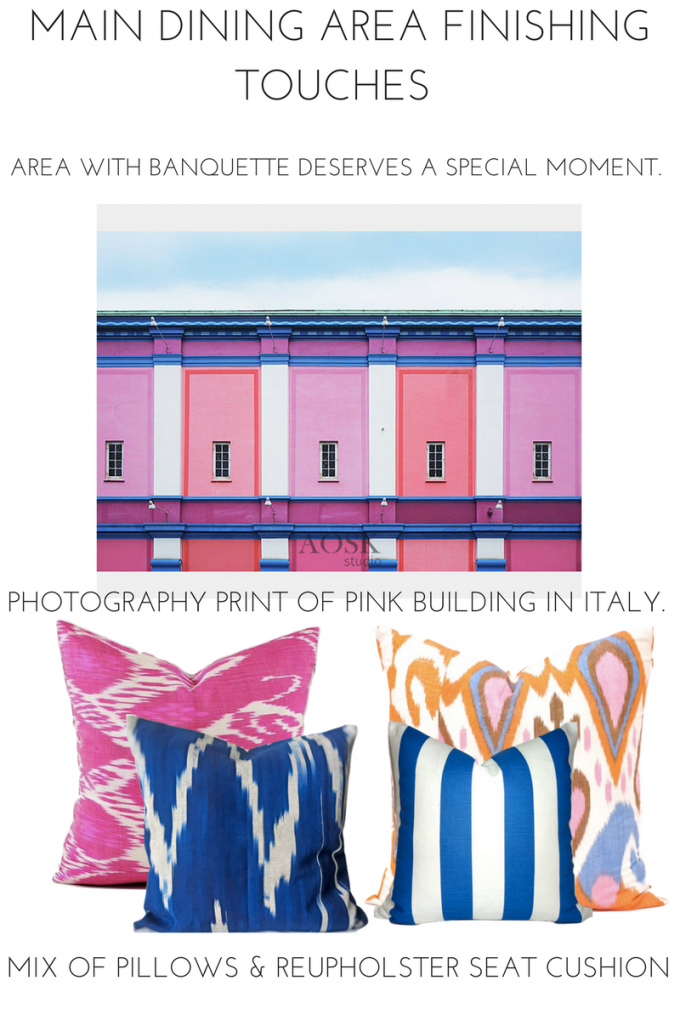
Since I’m always on team color I would go with the colorful striped wallpaper and colorful artwork. There is a corner that deserves some special attention. I would dress up a plain banquette area like this:
I’m pretty obsessed with this pink building photograph. It’s an instant download for less than $10 and the files can be enlarged up to 28″ x 40″. The banquette area is in a corner so opposite this piece I would use photograph of another Italian building.
Then the banquette cushion would be dressed up with an array of pillows.
Hot pink ikat pillow, cobalt ikat pillow,cobalt blue and white striped pillow and orange, pink and blue ikat pillow.
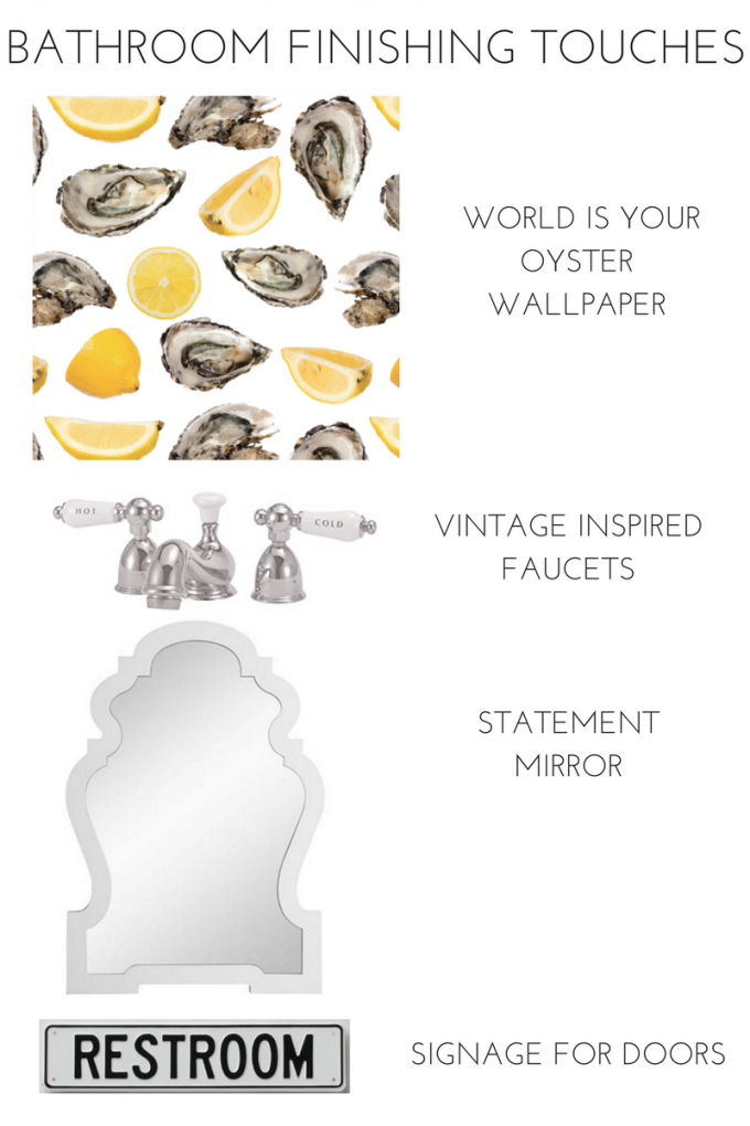
There was also two small restrooms that I would of course zhush up!
Love a cheeky wallpaper like the World is your oyster by Katie Kime. It’s currently 40% off, which is exciting! Since it’s a small space you don’t need to do much. A chic mirror, vintage inspired faucet set and an enamel restroom sign and you are ready to go!
Whew all that after just one little visit. Now who is going to let me design a commercial space!
Related
Leave a Reply Cancel reply
get inspired with our own home tour
ON THE BLOG
My living room is one of the rooms that evolved drastically from when we first moved one. Originally I painted the walls chocolate brown and did accents of white, blue and orange. That lasted maybe 2 years.
Our dining room sat empty for months. Okay maybe it was empty for just a handful of weeks and then we couldn’t take it anymore and put in a folding table and plastic outdoor chairs, but in my mind that was still empty.
On the main floor of our house we have a Florida room. Being that it’s a Florida room it is a considered a 3 season room, because there is no heat in the room. The previous owners used it as an indoor patio with outdoor furniture and it looked like this when we moved in.
In our new home, the basement was completely unfinished. It was literally one of those dark spaces that you see in horror movies and are terrified of getting locked into. However, with the square footage in this house, I knew I needed to make the basement another workable and liveable floor of the house instead […]
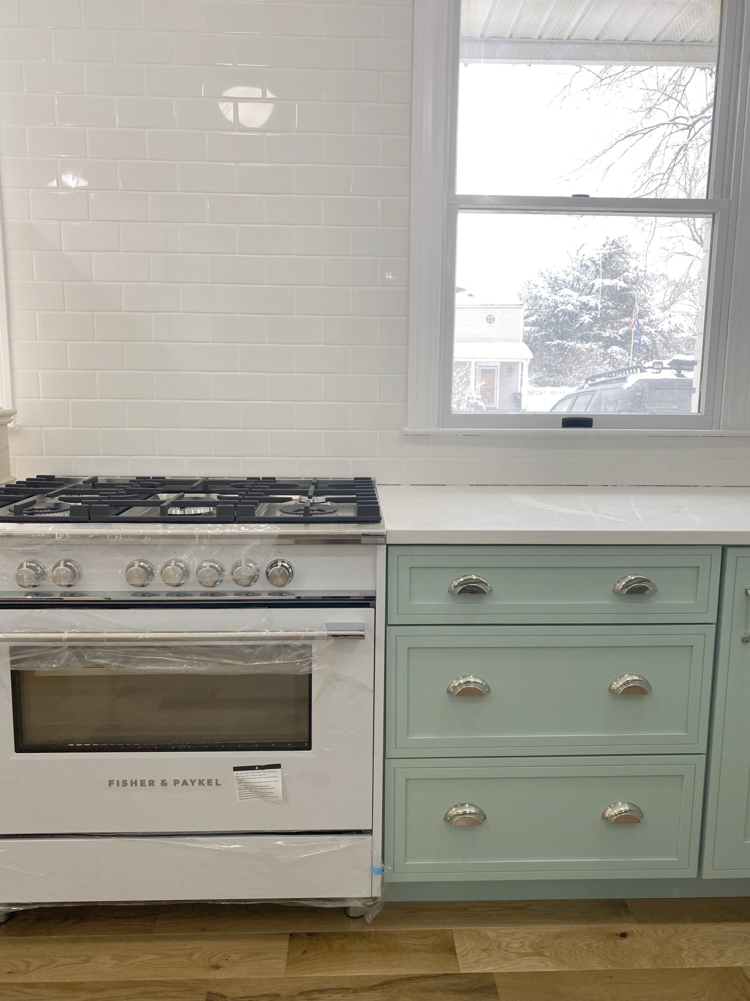
What to look for when it comes to picking out kitchen appliances: Leave room in your budget for appliances. When it comes to kitchen renovations everyone knows that the cabinetry and the labor of demoing and installing cabinetry is going to eat a lot of your budget. However, the second most expensive part of a […]
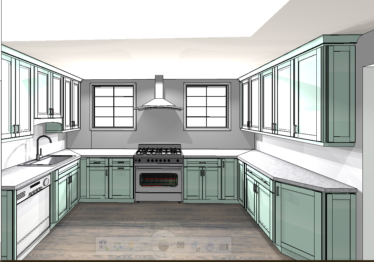
I don’t think I’m alone in thinking that designing a kitchen is an overwhelming undertaking. I’m an interior designer and even I find it stressful to iron out all of those details. So, when it comes time to design a kitchen I always like to partner with a kitchen designer to make sure I’m remembering […]
