Home Tour: Boys Room!
Almost done with the home tour and then we will go back to our normal schedule here. The main reason why we sold our house was to get into a better school district in time for Hudson to start Kindergarten, but an additional reason was lack of bedrooms. Our house was classified as a custom cape and while typically capes seem to have 4 bedrooms our house only had 2! That’s right. You headed up those zebra lined stairs and you were met with a small bathroom and a teeny tiny hallway and just two bedrooms.
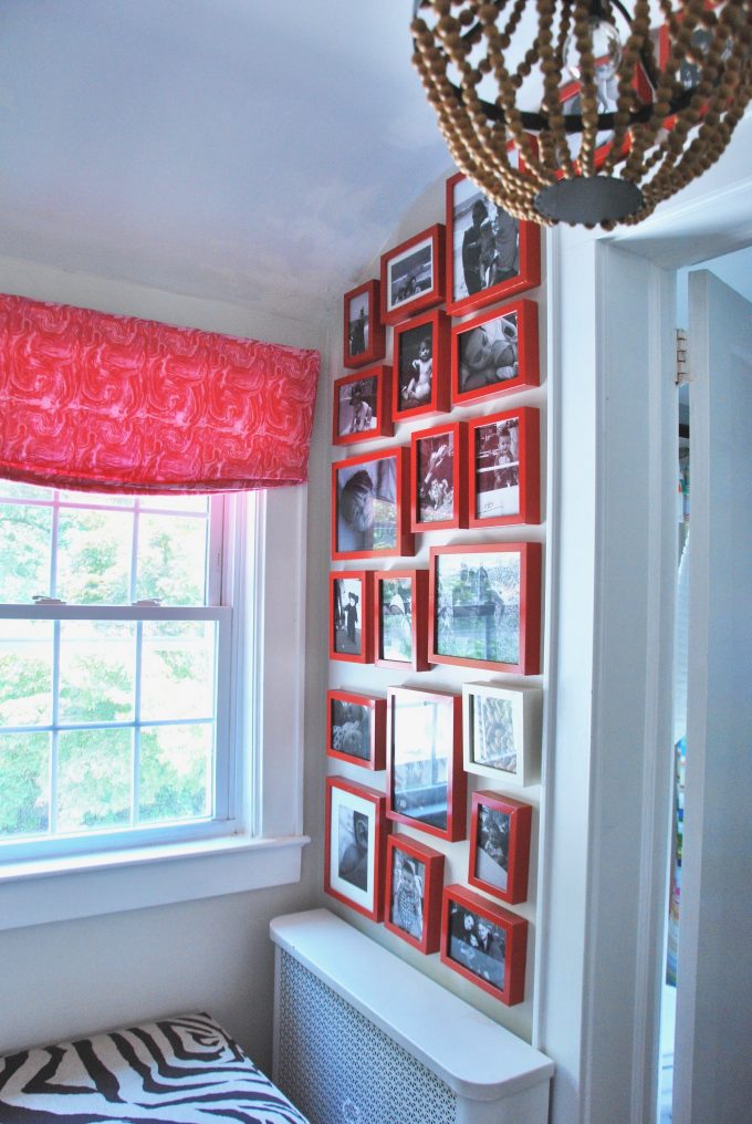
Here is the teeny tiny hallway/landing to our second floor. Of course I couldn’t just leave it alone so I made it a moment in the house. A small space is the perfect place to go a little over the top. Enter floor to ceiling gallery wall of only family photos, a statement chandelier, marbleized fabric roman shade, zebra x bench and a vintage runner.
Here is a peek into the small bathroom:
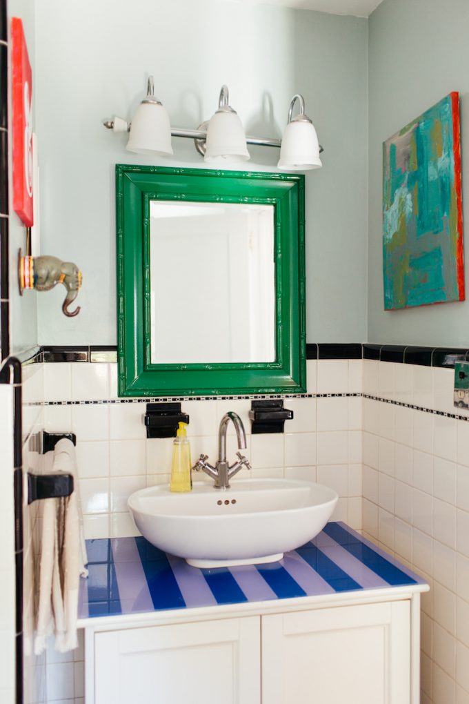
I love a classic white bathroom with black accents so we left our bathroom pretty much as is when we moved in and added color by painting the walls, swapping out the vanity mirror and getting a new sink/cabinet. Eventually the top of that sink vanity looked like it had been loved on too much so, we added an acrylic top to it and painted stripes on the backside of it. Super easy and always made me smile.
To the right of the bathroom was the second bedroom in the house. This meant that both of our boys had to share a room, which they currently love, but the older the get the more likely that they are going to want their own space.
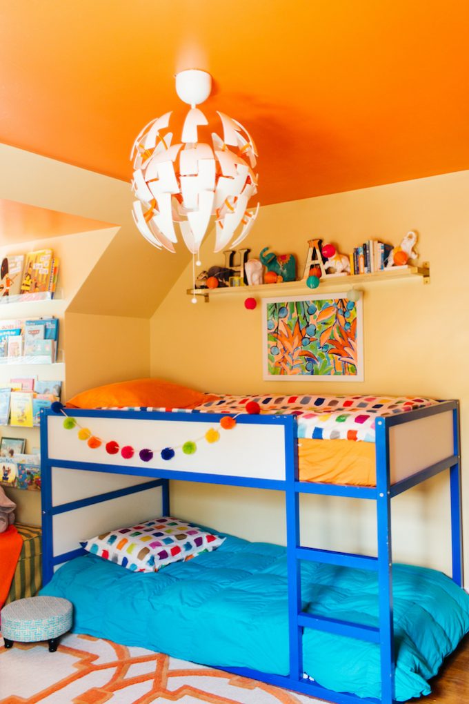
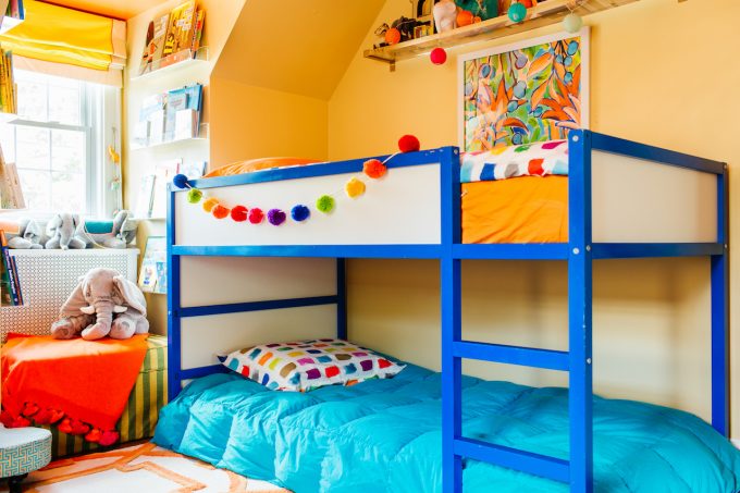
I never shared a full reveal when it was just Hudson’s nursery, but other than swapping out the crib and a settee it pretty much remained as is. We left the paint colors they way we had them, rug, most of the furnishings and just added a bunk bed.
Where the bunk beds are is wear there use to be a settee when it was Hudson’s nursery. We purchased a bunk bed at Ikea and since it was in raw wood we were able to paint it to give it a little customization.
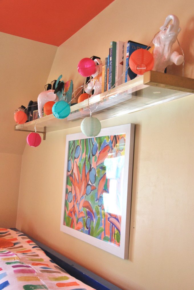
Above we left the lucite shelf that use to be part of the settee/reading nook I had when it was Hudson’s nursery. The lucite shelf was an easy customization job. I ordered lucite at Freckle Face. It’s a random company name for an acrylic company, but they had the best prices and can customize whatever size you like. I think picked up these brackets and gave them a new look with spraypaint. We love it! Acrylic is never going to be cheap so it was more expensive than a floating shelf you could get at Ikea or Home Depot, but I love it and never regretted it.
(Photo taken by me)
Past the bunk beds we had a little cut out where the window is and I utilized that space to it’s fullest by adding some acrylic bookshelves and taking advantage of all of the vertical space and then added a little ottoman and cozy throw for a little reading nook.
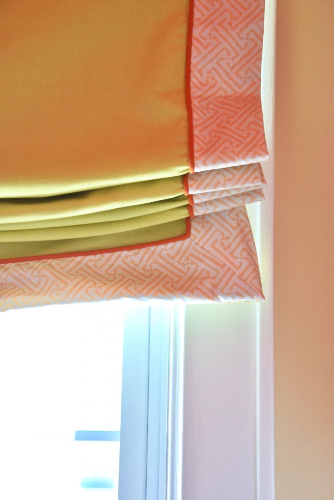
Designer tip for window treatments: Use broadcloth as your base and then a fancy fabric for a border. I love doing a mix of the too. Broadcloth is typically used for quilting so it’s not very thick, but I always line window treatments so it doesn’t bother me. I can typically find it for less than $5 a yard and they have so many colors! For the boys room I used some China Seas fabric and made a border with it and had my workroom add some piping detailing as well. It’s all about the details.
(Photo taken by me)
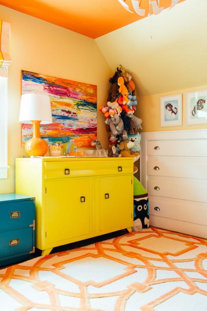
Opposite the bunk beds is the boys clothing storage area. They had so many stuffed animals, but I immediately knew I wanted a toy chain. I remember having one when I was little and I thought it would make the stuffed animals look more like an art display. Since I was tight on space instead of using a traditional dresser I used a sideboard instead. This was an amazing John Stuart find that I painted in citron by Benjamin Moore. Organizing the clothes was made easy with bins.
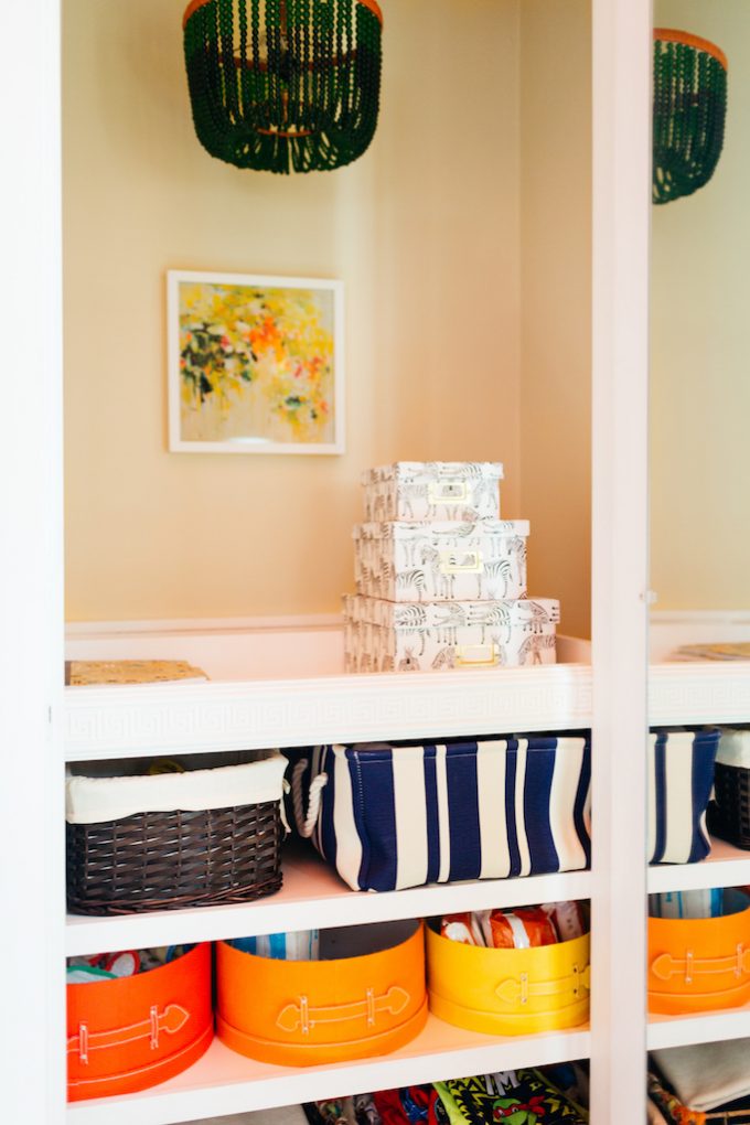
Since kids don’t typically have a lot of hanging clothes we customized their closet and added lighting, shelving and more bins to add clothing, lotion, shampoo, diapers once upon a time.
When we used this room as a nursery the closet area was set up as a changing table, but truthfully I never used it. I always ended up changing my boys on my bed, or the floor or the attachment on the pack and play.
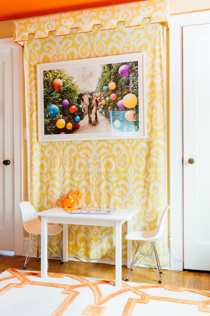
To the left of closet is the area where we use to put the crib, but since both boys were sleeping in the bunk bed I made it a little art table for them.
I had made the cornice/faux canopy for the crib area years prior, but I loved it that I left it up. The detailing on it just made it such a focal point to me. I needed a substantial piece of artwork to fit perfectly in the space and I knew where to look immediately. I have always loved Gray Malin’s work and when I was searching for this space he had launched his second collection at the Parker in Palm Springs and I knew he had a couple of pieces with elephants! Enter Party at the Parker. The elephant, the balloons, the colors. I just had to do it. I have them frame it and it was so nice to just get the box and place it right on the wall. We all love it. I know we will treasure it forever and it’s pretty cool to have it numbered and now that we have #2.
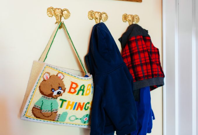
My last little dose of elephant is behind the door. I like putting hooks lower on the walls in kids room so that they can help hang coats, backpacks, etc. I picked up these iron elephant hooks and gave them a dose of glam with gold spray paint. The baby bag has special meaning to me, because it’s something my mom made when she was pregnant with me. My mother is not crafty at all so the fact that she made that for me is just so special. I loved the colors she used in it and it actually inspired the color story for this room.
Amazing photos by Erin Kestenbaum. I’m pretty obsessed with her and can’t say nice enough things about her. If you are in the NY/CT area and need photography I highly recommend her.
Related
Leave a Reply Cancel reply
get inspired with our own home tour
ON THE BLOG
My living room is one of the rooms that evolved drastically from when we first moved one. Originally I painted the walls chocolate brown and did accents of white, blue and orange. That lasted maybe 2 years.
Our dining room sat empty for months. Okay maybe it was empty for just a handful of weeks and then we couldn’t take it anymore and put in a folding table and plastic outdoor chairs, but in my mind that was still empty.
On the main floor of our house we have a Florida room. Being that it’s a Florida room it is a considered a 3 season room, because there is no heat in the room. The previous owners used it as an indoor patio with outdoor furniture and it looked like this when we moved in.
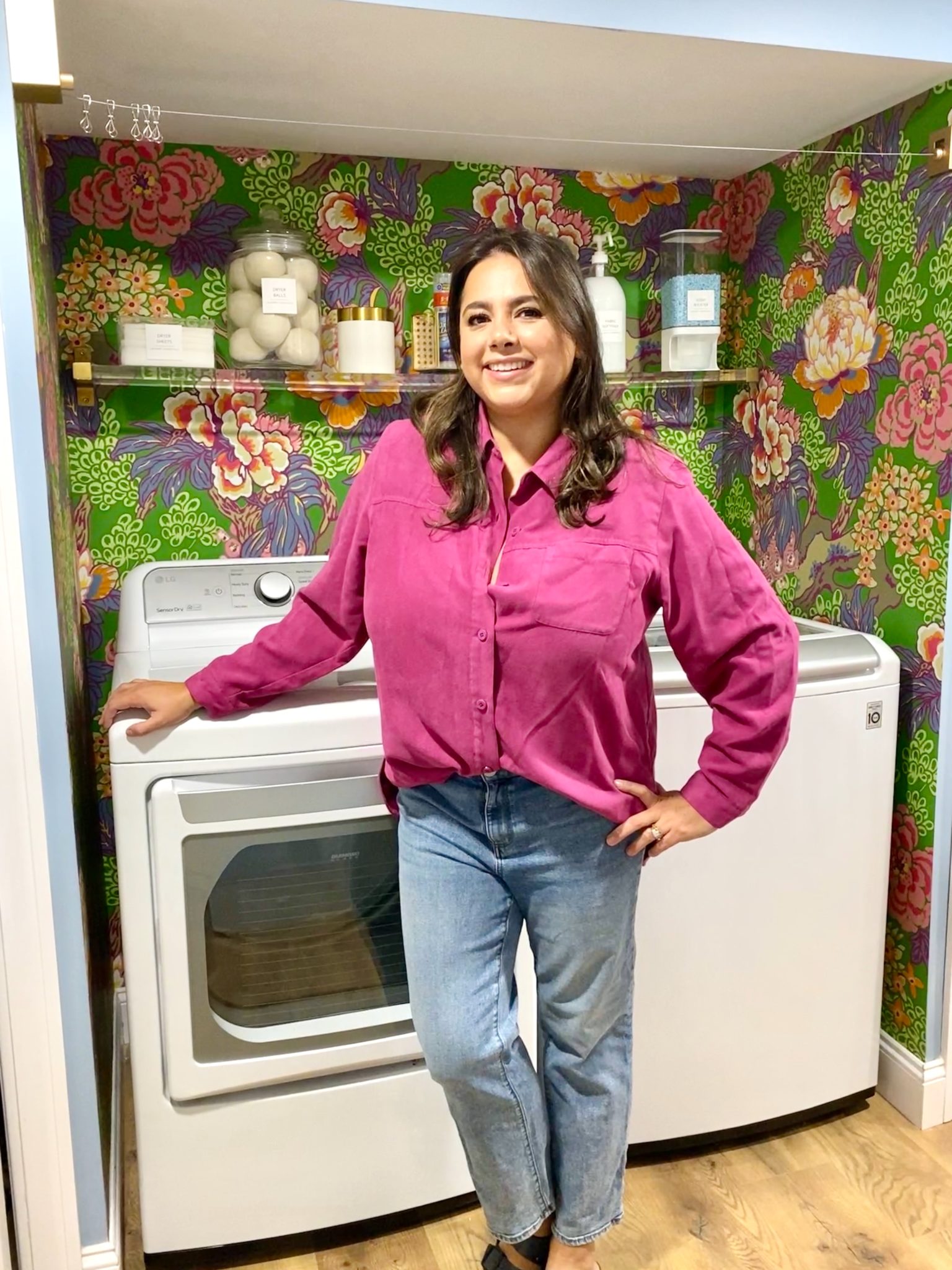
In our new home, the basement was completely unfinished. It was literally one of those dark spaces that you see in horror movies and are terrified of getting locked into. However, with the square footage in this house, I knew I needed to make the basement another workable and liveable floor of the house instead […]
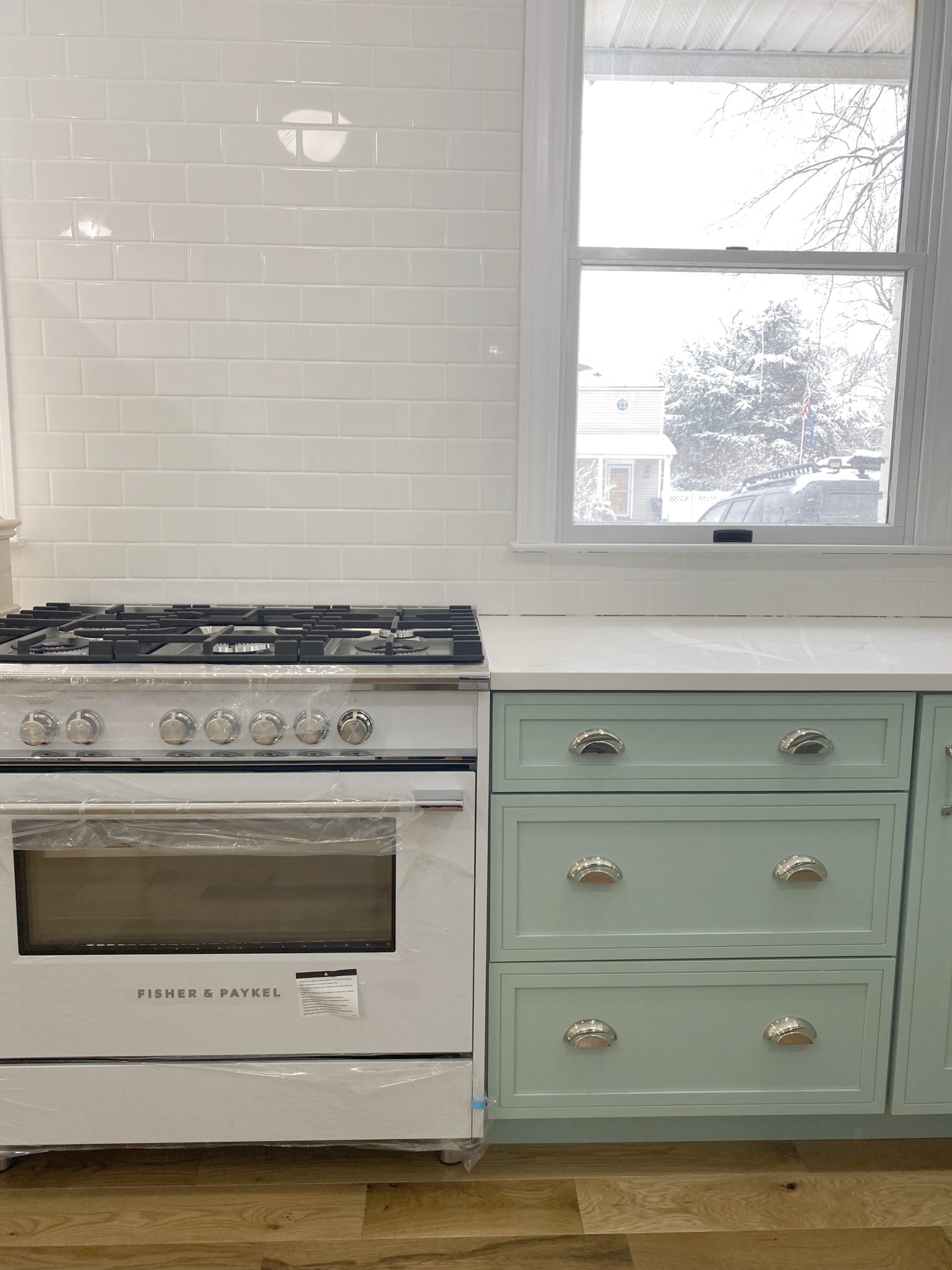
What to look for when it comes to picking out kitchen appliances: Leave room in your budget for appliances. When it comes to kitchen renovations everyone knows that the cabinetry and the labor of demoing and installing cabinetry is going to eat a lot of your budget. However, the second most expensive part of a […]
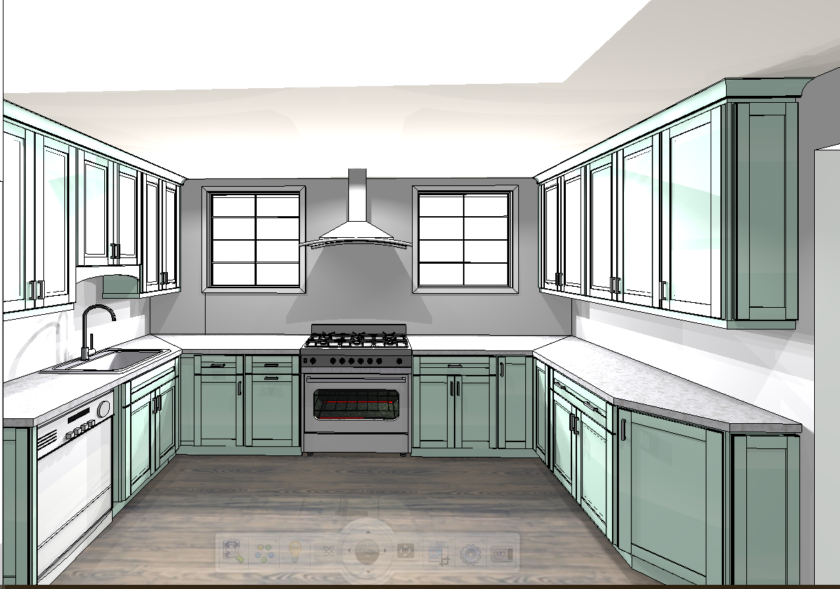
I don’t think I’m alone in thinking that designing a kitchen is an overwhelming undertaking. I’m an interior designer and even I find it stressful to iron out all of those details. So, when it comes time to design a kitchen I always like to partner with a kitchen designer to make sure I’m remembering […]
