
Client Project: NYC Colorful Apartment Tour
A couple of years ago I shared my sister’s apartment. At the time she had moved in with her then boyfriend, now husband. They moved from a studio to a one bedroom and I never shared the reveal of the one bedroom! They just moved again to a two bedroom, which we are currently working on so, it felt crucial to share what we did in the one bedroom before sharing pictures of the two bedroom. I think it’s interesting to see what we kept from the original studio and how we reworked it in the new space.
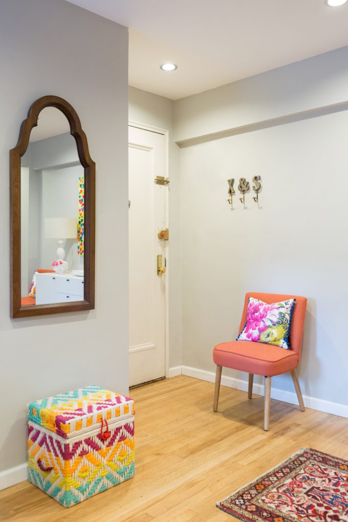
Upon entering the new apartment they have a long walk way where we added hooks for coats/bag, a mirror to check yourself out before you walk out the door and a little seating nook to put your shoes on our off. A mini mudroom of sorts done in a stylish way.
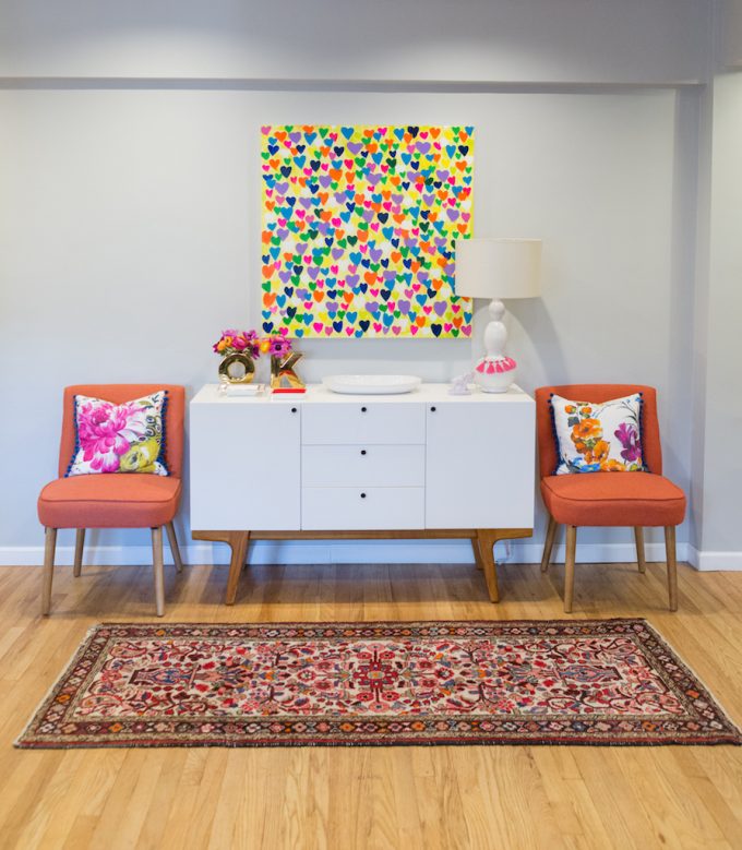
We used a buffet/sideboard as housing piece for office supplies, important papers, etc. Just because it was a buffet/sideboard and meant to house dishes, glassware and flatware doesn’t mean you need to use it for that.
The best part of this area is how multi-purpose it is. It is not only used for storage and mini drop off area for the apartment, but the side chairs can easily be taken into the living room or dining room when you have extra guests. The sideboard top can easily get cleared off and used for appetizers or set up as a bar area when you have guest.
These chairs are no longer available, but here is a similar chair.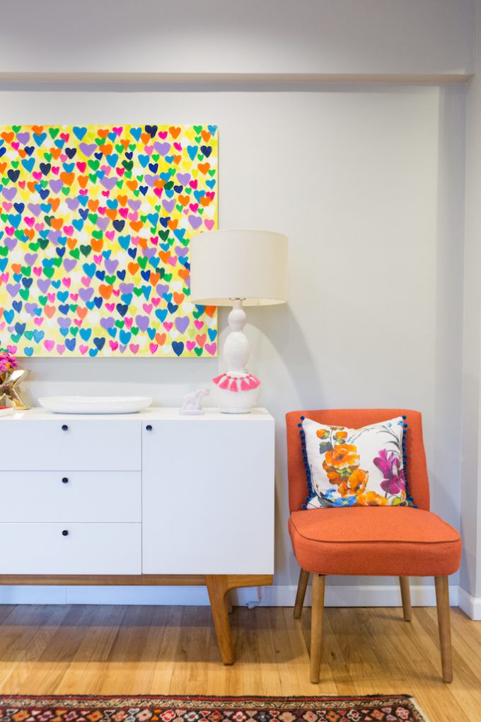
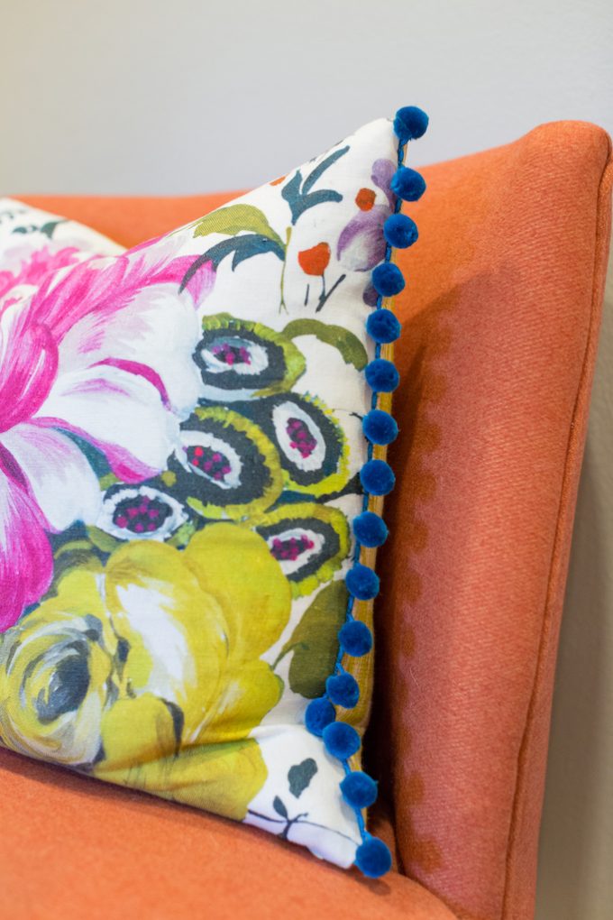
I topped the chairs with some stylish pillows made out of Designers Guild fabric and trimmed with pom poms!
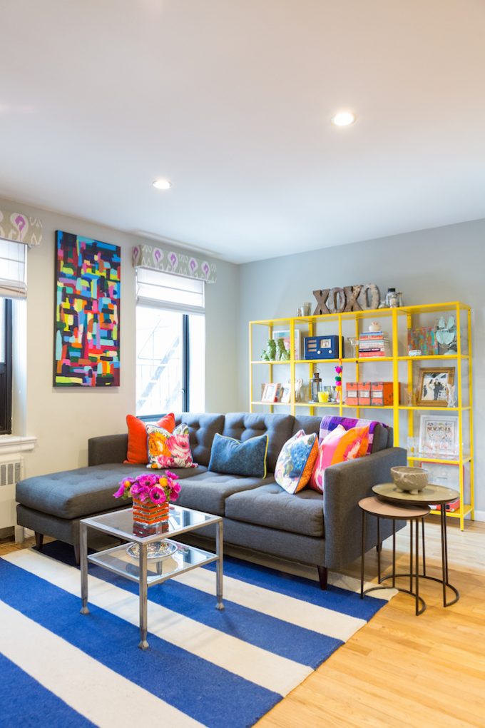
This area opens up to the living room and I used the colors in the pillow fabric to inspire me in the accessories. I just love everything about this space. The striped rug, colorful pillows and artwork and the focal point bookcase full of treasures! I also love the sectional we were able to find. City living is tight and most sectionals are too oversized to fit in them. This sectional is petite and and has a reversible chaise which lets you move the chaise from the left to the right whenever you need to.
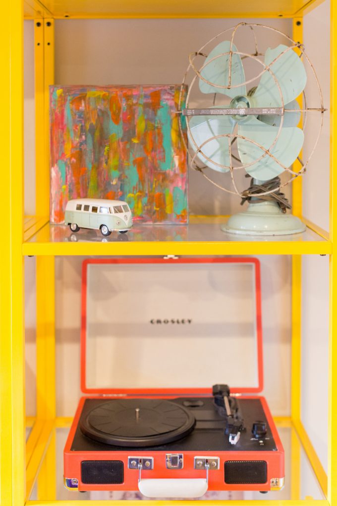
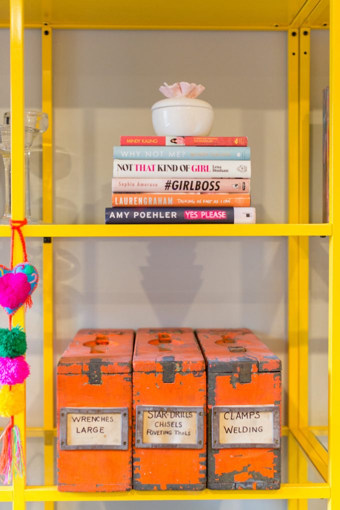
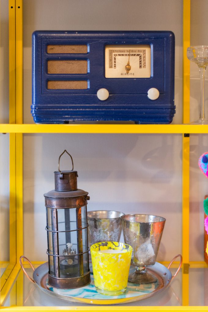
The bookcases were an easy DIY where we took plain jane Ikea bookcases and spraypainted them this happy shade of yellow. Then we filled them with objects from their lives and vintage treasures from thrifting.
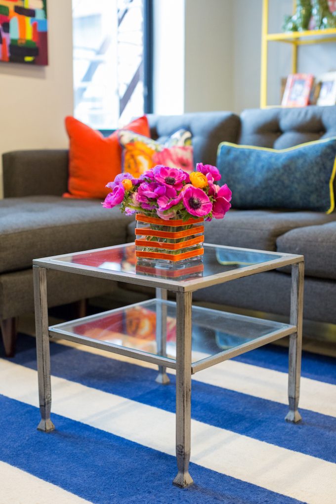
Since the space was on the small side we used a single end table as a coffee table.
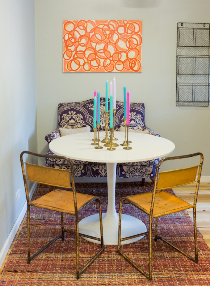
The dining area is at the end of the long walk way and kept things simple here, but did add a little bit of accessories to have it flow with the rest of the space.
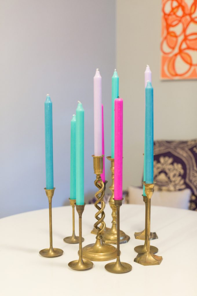
I always love to pick up brass candlestick holders at thrift stores. They are normally $3 or less and when you group them together they make quite an impact.
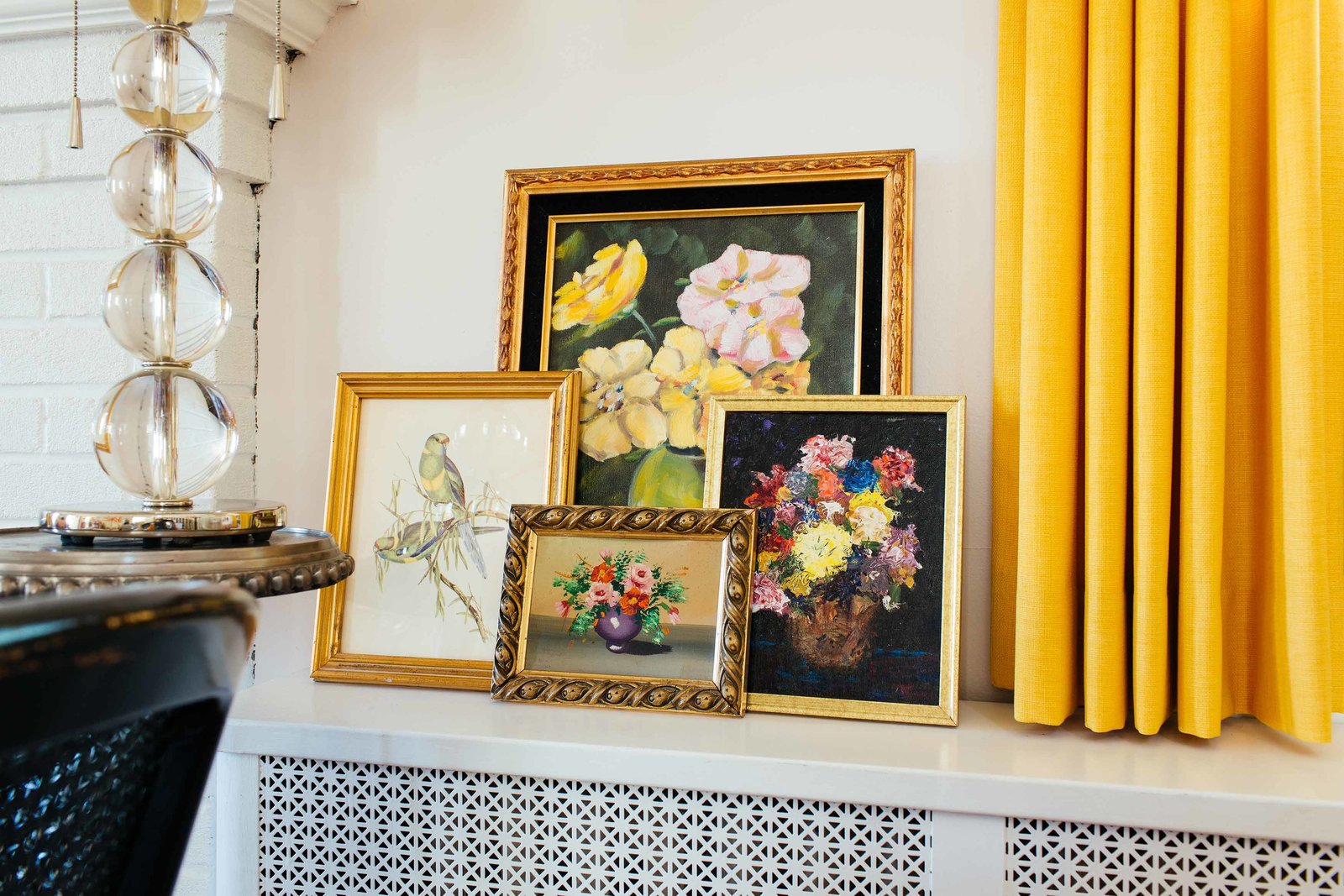
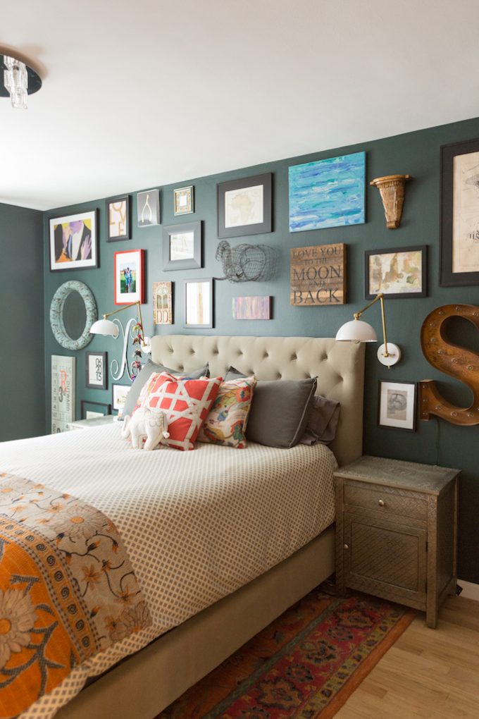
Moving into the bedroom we kept the color, but just subdued it. Nothing bright and bold here. We went with eclectic and muted. They had loved the look in the studio and weren’t ready yet to part with it. So, we kept all of the artwork and even painted the room the same color.
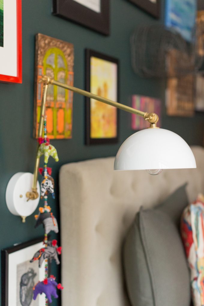
We did add some new pieces to finish up the space like these stunning brass wall sconces:
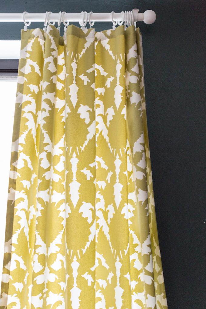
We also dressed up the windows with custom made window panels in Thomas Paul fabric.
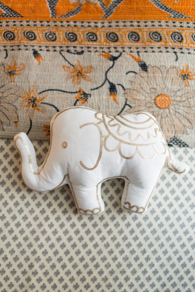
You know I have to throw an elephant or two into any design. Luckily my sister loves them as much as me.
Can’t wait for you to see the new apartment! We picked a pretty exciting paint color for their bedroom and I’m excited to see it all come together.
Amazing photography by CJ of Charles Juliet. She is a Southern who lives in NYC and is just one of the sweetest people I know. From the second I met her we instantly became friends. Not only does she shoot beautiful interiors, but her family photography is out of this world! She has this way of capturing NYC in all of it’s perfect dreaminess!
Related
Leave a Reply Cancel reply
get inspired with our own home tour
ON THE BLOG
My living room is one of the rooms that evolved drastically from when we first moved one. Originally I painted the walls chocolate brown and did accents of white, blue and orange. That lasted maybe 2 years.
Our dining room sat empty for months. Okay maybe it was empty for just a handful of weeks and then we couldn’t take it anymore and put in a folding table and plastic outdoor chairs, but in my mind that was still empty.
On the main floor of our house we have a Florida room. Being that it’s a Florida room it is a considered a 3 season room, because there is no heat in the room. The previous owners used it as an indoor patio with outdoor furniture and it looked like this when we moved in.
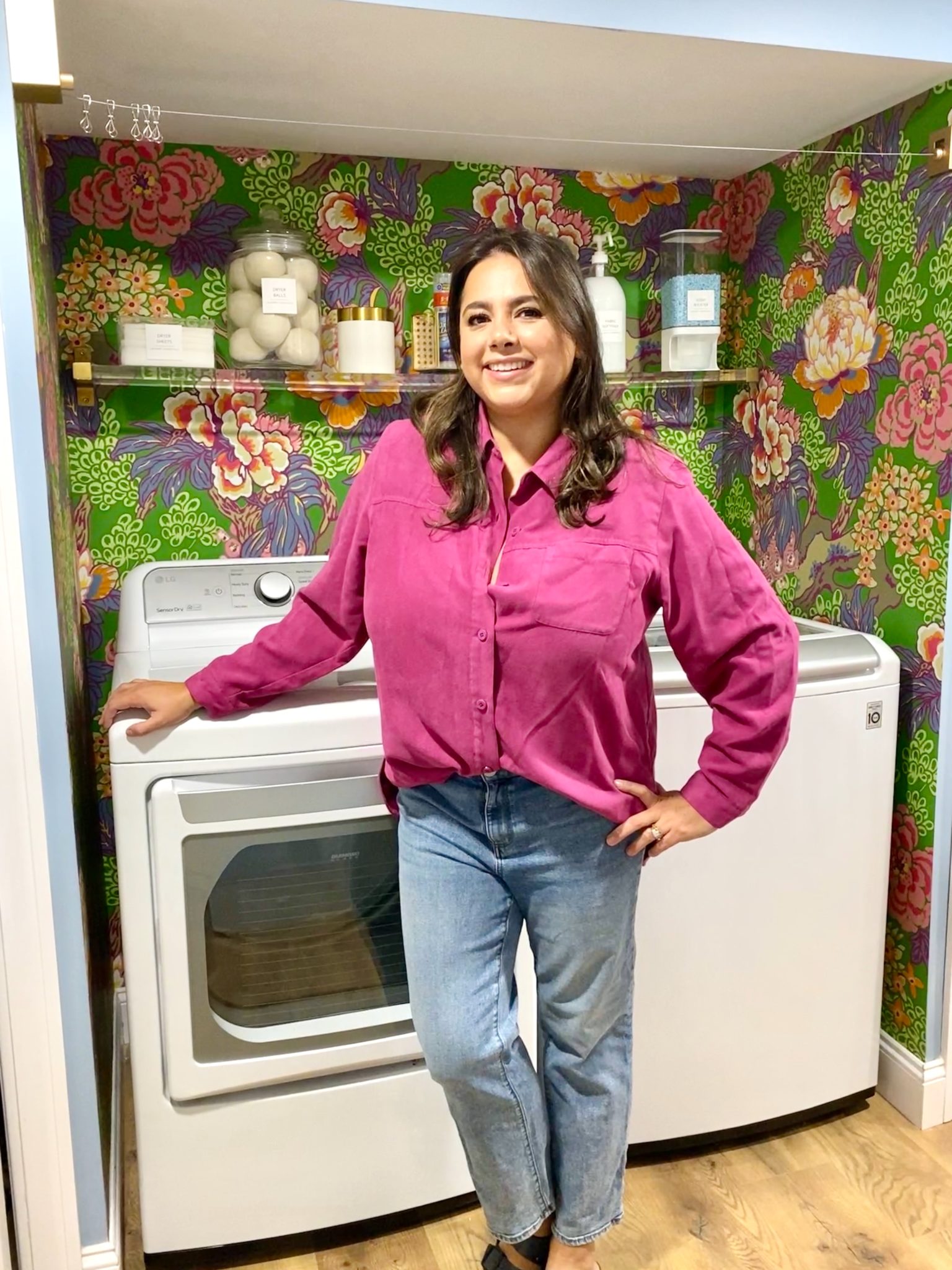
In our new home, the basement was completely unfinished. It was literally one of those dark spaces that you see in horror movies and are terrified of getting locked into. However, with the square footage in this house, I knew I needed to make the basement another workable and liveable floor of the house instead […]
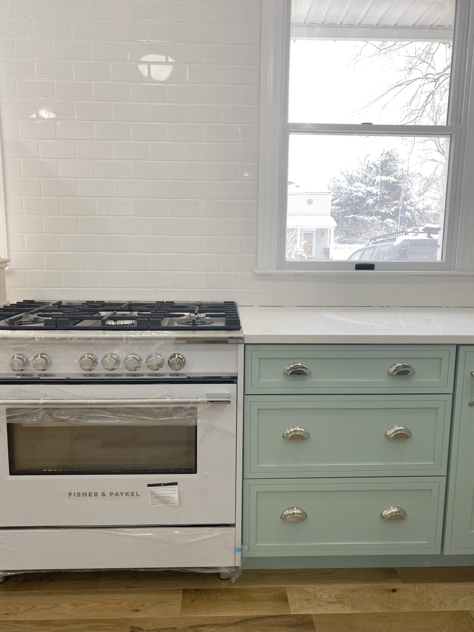
What to look for when it comes to picking out kitchen appliances: Leave room in your budget for appliances. When it comes to kitchen renovations everyone knows that the cabinetry and the labor of demoing and installing cabinetry is going to eat a lot of your budget. However, the second most expensive part of a […]
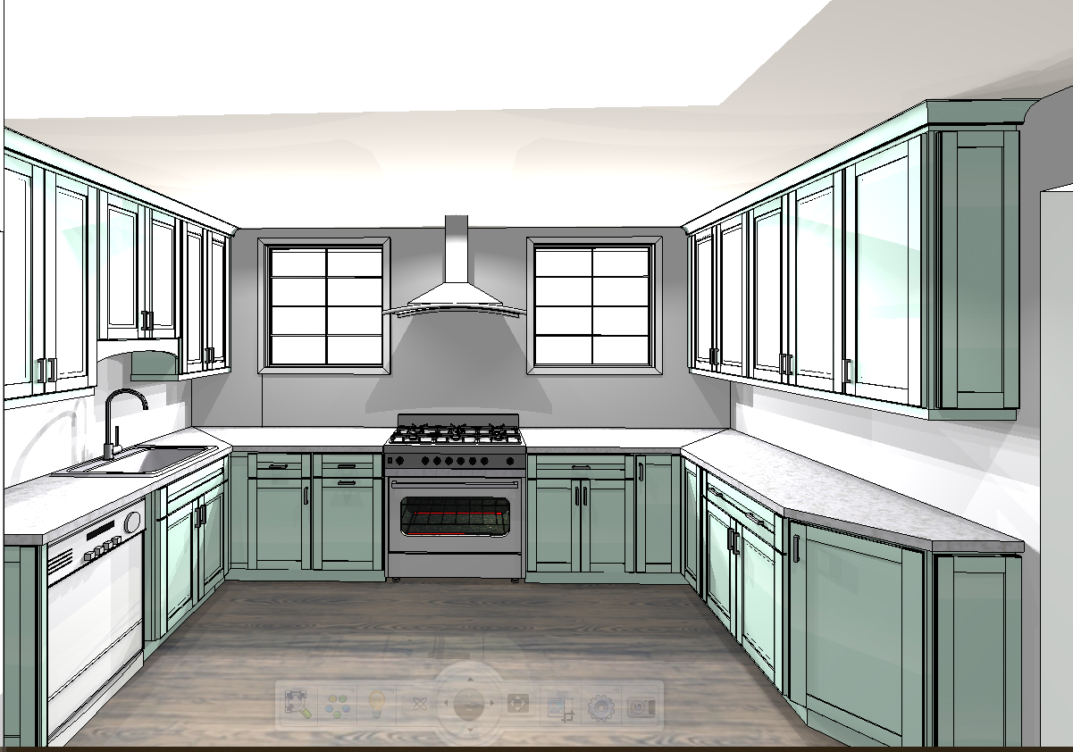
I don’t think I’m alone in thinking that designing a kitchen is an overwhelming undertaking. I’m an interior designer and even I find it stressful to iron out all of those details. So, when it comes time to design a kitchen I always like to partner with a kitchen designer to make sure I’m remembering […]


Even though I have muted my bold color choices as I get older ….every 20 something should beating down your door to get their chic NYC apartments designed. You are simply the best!
Thanks, Debra!
It’s gorgeous!!! I wish I could live there. Any chance you could link up some of the art? I’m looking for something like that heart artwork? It’s so fun!
Thank you! The heart artwork is actually an original piece of art that I did for the space.
Beautiful! I absolutely love the entry area with the sideboard.