
Adventure Refresh: Hallway
A couple of weeks ago Jewel from Jeweled Interiors reached out to me and a couple other bloggers to share an idea she had. She wanted to put together a blogger challenge where we would get to choose our own adventure and refresh a space with our colorful flair! You know I love color so, immediately I was on board! I wasn’t sure what space I was going to design since I’m currently crashing with my parents. For those of you new to my blog we sold our house last year because we weren’t in a great school district. We didn’t find a new house before the beginning of the school year so, we moved in with my parents so, my oldest could start school. We have yet to find our new house so, we are still crashing! I looked around my parents house and found the perfect spot that could use a little love and adventure refresh!
CHOOSE YOUR OWN ADVENTURE BLOG CHALLENGE!
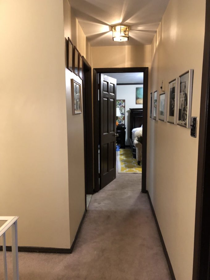
Their upstairs hallway has looked the same since they moved in over 20 years ago. Throughout the years it’s been repainted, but it’s always stayed very neutral. That is all going to change!
THE BEFORE:
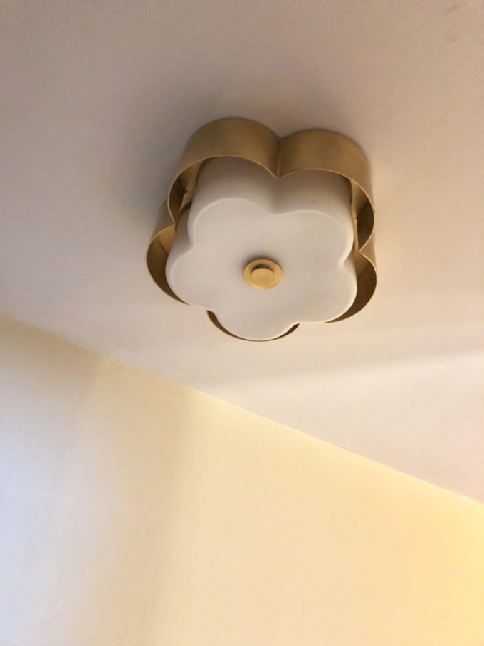
For this design I actually started with lighting.Hudson Valley Lighting Group is one of the official sponsors and it was hard to pick out just a couple of pieces to use. Everything they make is so beautiful and glam, but also totally classic and will stand the test of time. For the main hallway I’m going to be swapping that outdated piece with one of their semi-flush mounts called Allure.
It’s already been installed and I love it! It gives off so much light and reminds me of a Chanel flower.
Stay tuned for the other lighting piece arriving! It’s insanely good!
A hallway is a great place for a gallery wall. My parents currently have family photos of the wall, but since I wanted to add some color and we are lucky enough to have Minted as another sponsor! I got to play around with all of their beautiful art work pieces. I use them a lot in my home and with clients and I love the quality. Their framing is perfection!
DESIGNER TIP: TAKE SCREEN SHOTS OF THE ART PIECES YOU ARE CONSIDERING AND MOCK THEM UP IN PHOTOSHOP, PICMONKEY, CANVA, ETC AND PLAY AROUND WITH SCALE AND LAYOUT TO SEE WHAT YOU LIKE BEFORE ORDERING.
MINTED ARTWORK SELECTION:
PILLOWED RAINBOW
FRAGMENT 3
A NECESSARY LUXURY
MOVE ME
SOMETIMES I WISH BEGINNINGS WERE ENDS
HOT PINK
I decided to go even bolder and see what the artwork looked like on a wallpapered wall. I reached out to my friends at Milton and King and told them all about my vision and they were happy to partner up and donate the paper for this project! Of course I fell in love with two papers!
Which would you choose?
Option 1: Sarah Annie
Option 2: Shoreline
Make sure you check out the rest of the lovely ladies that are joining me on this Adventure Refresh!
Jeweled Interiors | Haneen’s Haven | Dimples and Tangles | PMQ for Two | House Homemade | Rain on a Tin Roof | Pencil Shavings | Our Fifth House | Kaleidoscope Living | The Pink Clutch | At Charlotte’s House | Effortless Style Blog
Related
Leave a Reply Cancel reply
get inspired with our own home tour
ON THE BLOG
My living room is one of the rooms that evolved drastically from when we first moved one. Originally I painted the walls chocolate brown and did accents of white, blue and orange. That lasted maybe 2 years.
Our dining room sat empty for months. Okay maybe it was empty for just a handful of weeks and then we couldn’t take it anymore and put in a folding table and plastic outdoor chairs, but in my mind that was still empty.
On the main floor of our house we have a Florida room. Being that it’s a Florida room it is a considered a 3 season room, because there is no heat in the room. The previous owners used it as an indoor patio with outdoor furniture and it looked like this when we moved in.
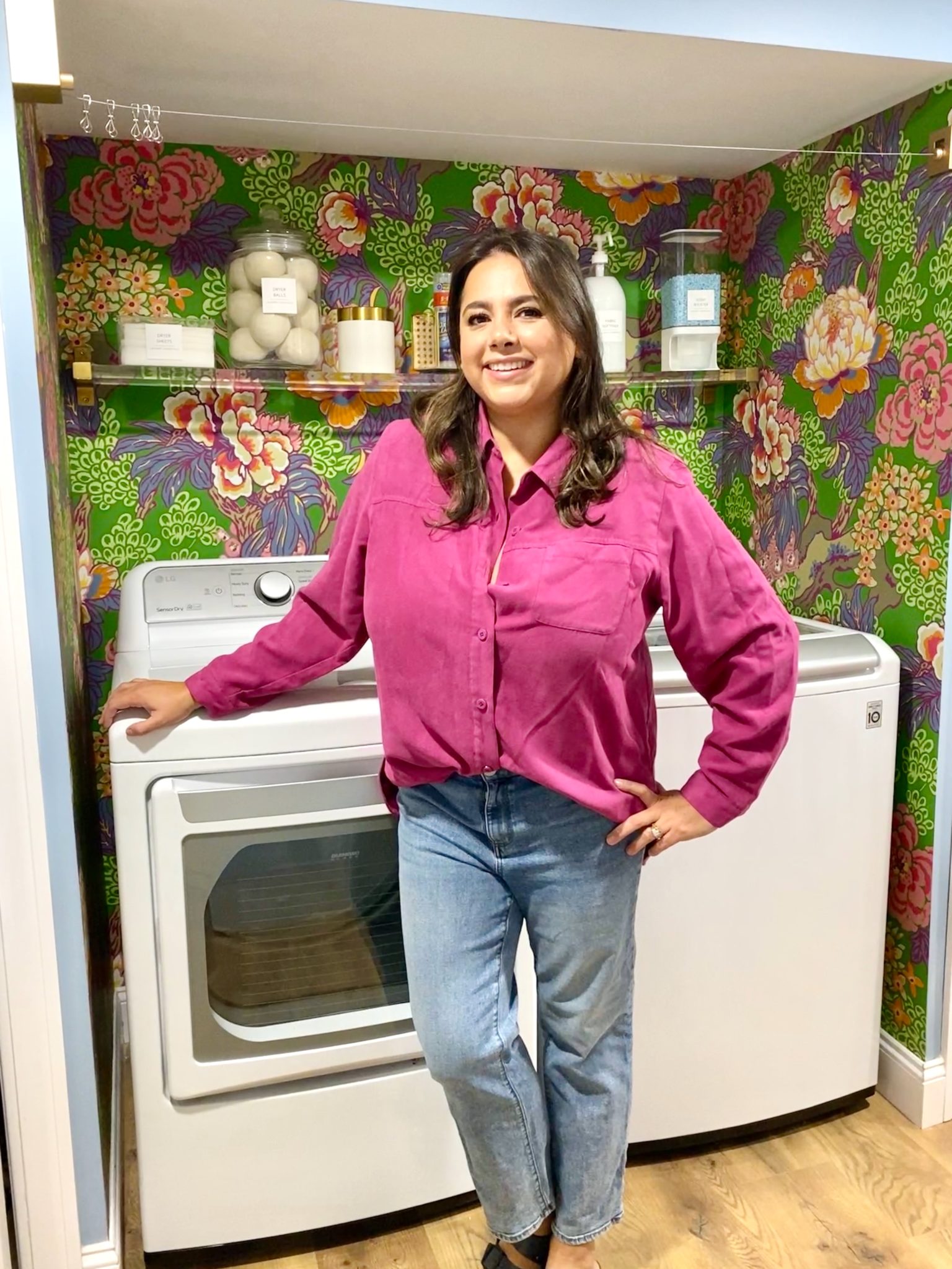
In our new home, the basement was completely unfinished. It was literally one of those dark spaces that you see in horror movies and are terrified of getting locked into. However, with the square footage in this house, I knew I needed to make the basement another workable and liveable floor of the house instead […]
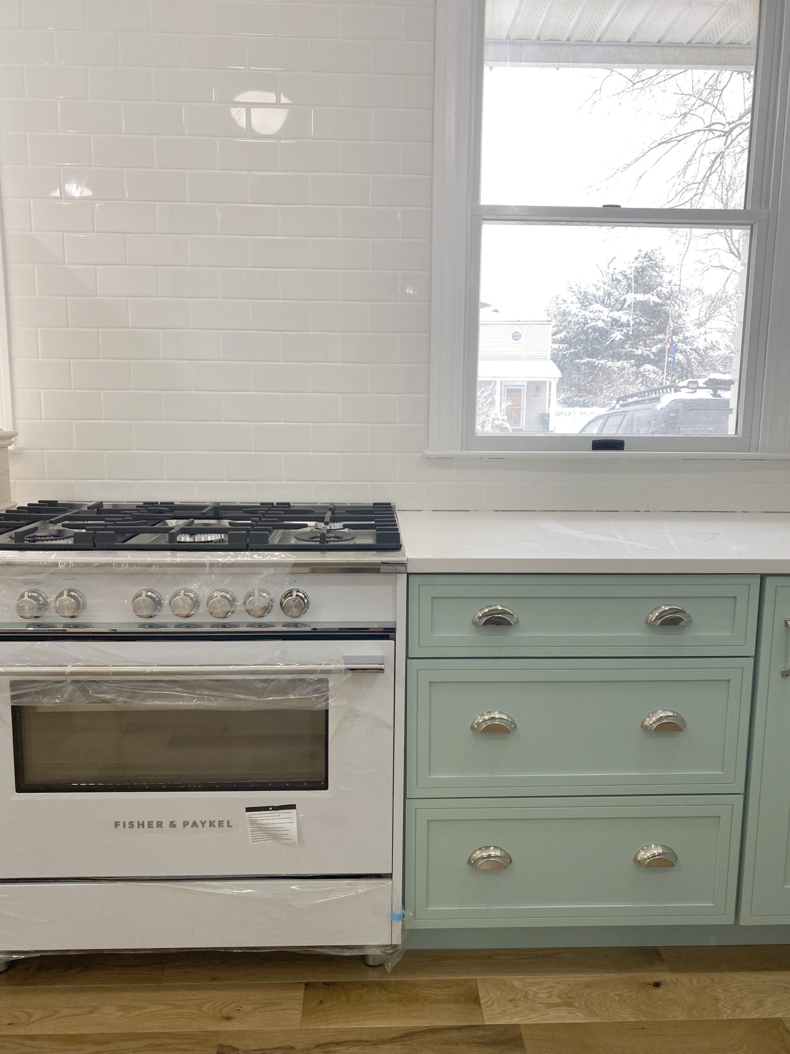
What to look for when it comes to picking out kitchen appliances: Leave room in your budget for appliances. When it comes to kitchen renovations everyone knows that the cabinetry and the labor of demoing and installing cabinetry is going to eat a lot of your budget. However, the second most expensive part of a […]
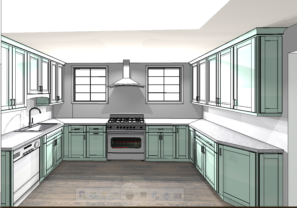
I don’t think I’m alone in thinking that designing a kitchen is an overwhelming undertaking. I’m an interior designer and even I find it stressful to iron out all of those details. So, when it comes time to design a kitchen I always like to partner with a kitchen designer to make sure I’m remembering […]







So beautiful and colorful! So excited to be following along!
Mannn…Thats a super hard choice! I can’t wait to see which wallpaper you pick. PS your parents are lucky to have you as a daughter
I LOVE “Shoreline”!????????????
I couldn’t love that darling light more, what a perfect option for a flush mount! I like the first paper better…. can’t wait to see what you decide! So nice of you to do this for your folks!
I LOVE that marbled paper and have considered it for lots of plans already… so fun! That artwork is perfection and the color is going to make such an impact! xx
This is going to be such a beautiful space – I love both art arrangements – the colors are gorgeous!
I like the first paper better. It looks more traditional and I like that you can go crazy with the art then.
That is what I’m leaning towards!
I would go with the second paper. It’s so perfect with the art work. It’s also softer. Have fun with it!
The second paper was actually my first love, but then the more I thought about it I liked the traditional nature of the 1st paper and how it would be a funky mix with the artwork!
When I first looked in Feedly I clicked over to say #2. However, now that I’m looking at it again I’m loving #1. They are both great! I