
Primp & Pamper Bathroom Blog Series: The Before & Plan
Guys!!!! I’m so excited to be sharing the new blog series I’m a part of! A couple of months ago Jewel from Jeweled Interiors contacted me and asked if I wanted to be part of a bathroom blog hop. I said sure because I’m currently crashing with my parents and their avocado bathroom desperately needed some love. The whole series started out small, but then turned into a much bigger project with many of the bloggers taking on big renovations in their bathroom! I was so excited to be able to do this for my parents and get to work with some amazing sponsors to make it all come to life! A big thank you to Jewel for making this all come together! The main sponsors for this blog series are Build.com, which is an online store that literally has everything and anything you would ever need for a home improvement project. I couldn’t believe the inventory! It was so fun to go thru everything and pick all of the pieces for the project. They have an array of price points and finishes and their customer service and delivery team have been amazing! Signature Hardware is our second amazing sponsor and one that I have used many times with clients. They have beautiful pieces that have all of the bells and whistles and look like a million bucks, but are a bit more affordable. The pieces like their vanities look custom-built, but don’t cost custom prices! I have been a fan for a long time so, it was amazing to get to work with them!
What’s up first? We need to start at the beginning and show you the before photos and then my plan for giving it a whole new look!
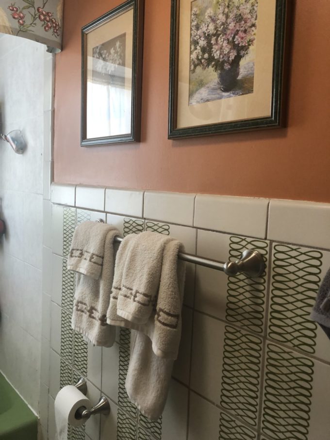
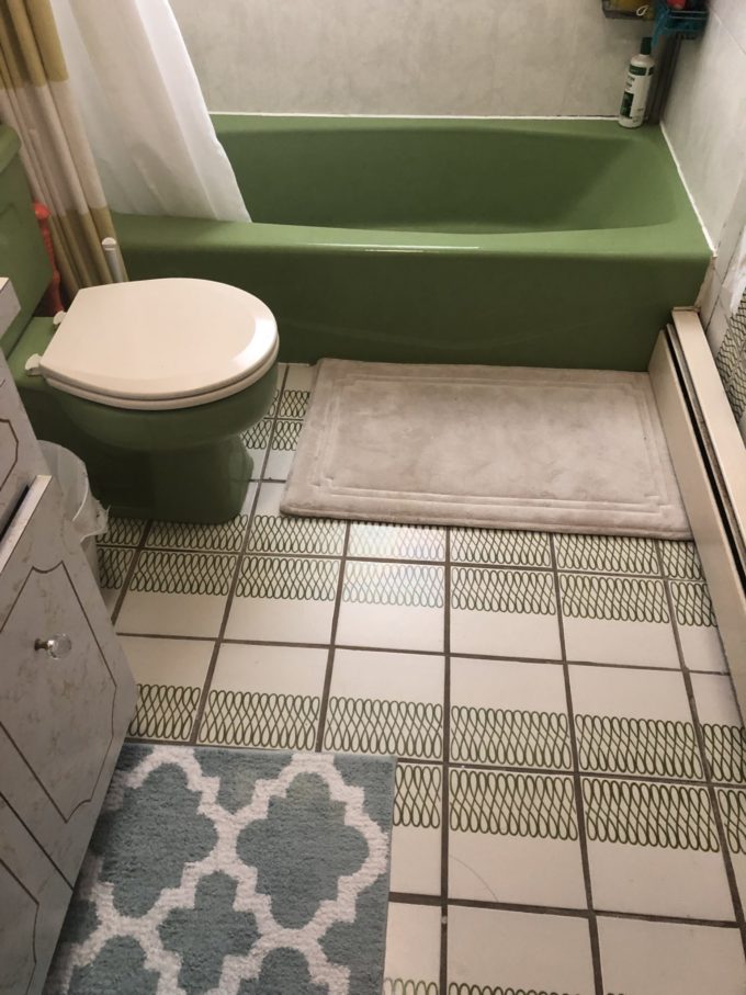
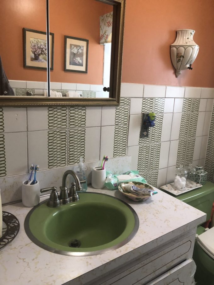
The Before: We tried our best to give the space an updated look a couple of years ago and gave the walls a new coat of a paint and cornice/shower curtain combo. I actually like the pattern on the tile, but the cream background just looked dingy. It basically all needed to go!!!! 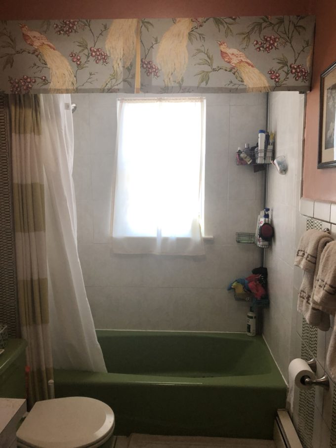
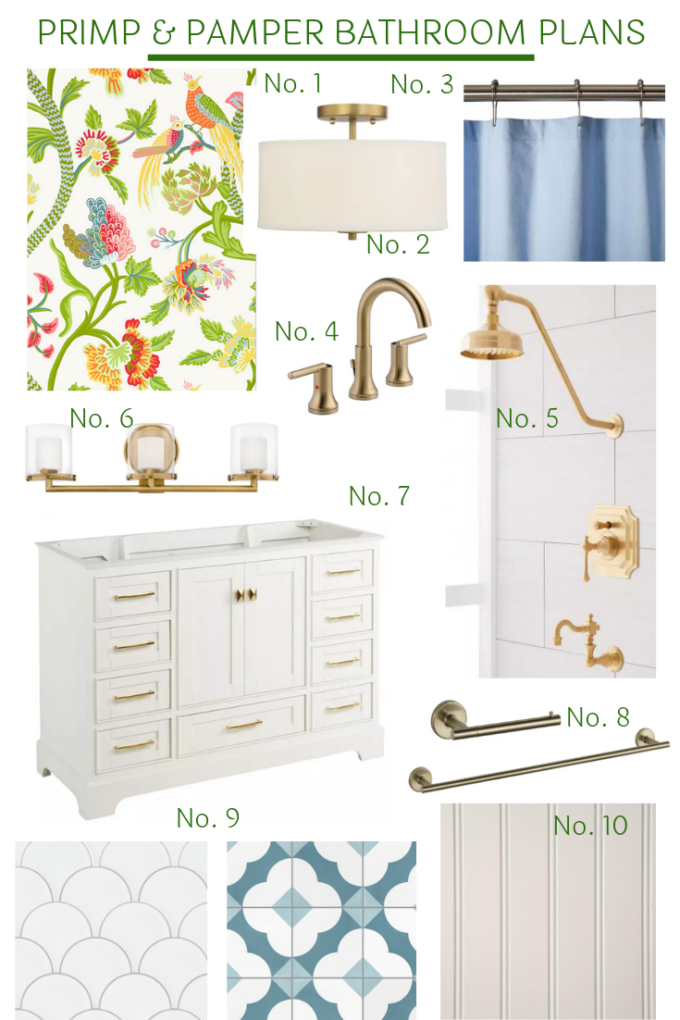
The Plan: My mom has always liked green so, I still wanted to make that color pop in the room in a new way! Here is the plan for the new look!
No. 1 Thibaut makes the best wallpaper and fabrics. I love using their pieces in clients’ home and now I get to use it in my parents’ home. They make beautiful patterns that are full of life and color. Thibaut is the definition of traditional with a twist! In this bathroom, I will be using Janta Bazaar wallpaper. It’s floral, but not overly feminine and has bright happy colors in it!
No. 2 Lighting was key in this space. I have always found it to be a very dark bathroom so, getting to pick out some pieces was very exciting for me. For this blog series, we have partnered up with Build.com and I love their Bellevue drum flush mount in brass. It is classic looking with its clean lines that will work in a variety of styles. Best part? It’s only $112, which is a great price point! No need for builder grade boob lights when you can get something like this.
No. 3 Signature Hardware has also partnered with us on this series and it was a pleasure to go thru all of their amazing options! Along with all of the main pieces you would need for a bathroom remodel they also have accessories like fabric shower curtains. I like this blue on this curtain because it picks up the peaks of a similar blue in the wallpaper.
No. 4 In this whole renovation process I found that it was pretty difficult to find warm brass finishes and not just shiny polished brass. I found that Delta had the best shade called champagne brass which was a really nice gold/brass tone that wasn’t super shiny. I picked out their Trinsic widespread faucet for its simple lines which will work perfectly with the vanity and not take away from its classic style
No. 5 The style in the bathroom is traditional with a twist and I wanted an item that was traditional. I fell in love with this vintage faucet and shower set. It’s so fancy looking and the color is perfection. I think it’s going to look amazing in the all-white shower area!
No. 6 This bathroom currently only has the ceiling fixture so, adding a vanity light was one of my priorities. I loved this piece from Hinkley Lighting. It’s another true traditional element in the space and the color called Heritage brass works perfectly.
No. 7 Say goodbye to the faux gold marbelized sink vanity and hello to this beautiful vanity from Signature Hardware. I love all of the storage it provides!!!! Everything will have a home. I also went with the marble countertop and an under-mount sink. It is at an amazing price point for what you get. It arrived built and is super sturdy!
No. 8 I decided to keep things simple with bathroom accessories and just went with a simple wall-mounted towel bar and single bar toilet paper holder in the same shade of the sink faucet.
No. 9 Tile is always a nice way to add personality to a space. I partnered up with Villa Lagoon Tile to use their beautiful cement tiles in the space. For the shower alcove, we went with their fish scale tile in white. I went with a classic white because I was afraid my parents might get tired of a color after a couple of years. I’m toying with the idea of a colored grout to give it a little pop! For the floor, we are going to have a bit more fun with their patterned tile called Katie. It’s apparently a design that made for Tom Scheerer design team. It’s a mix of a quatrefoil, surrounded by a lattice, with matching squares inside. Talk about pattern play! It’s that little touch of whimsy, which I love including in the design of a space.
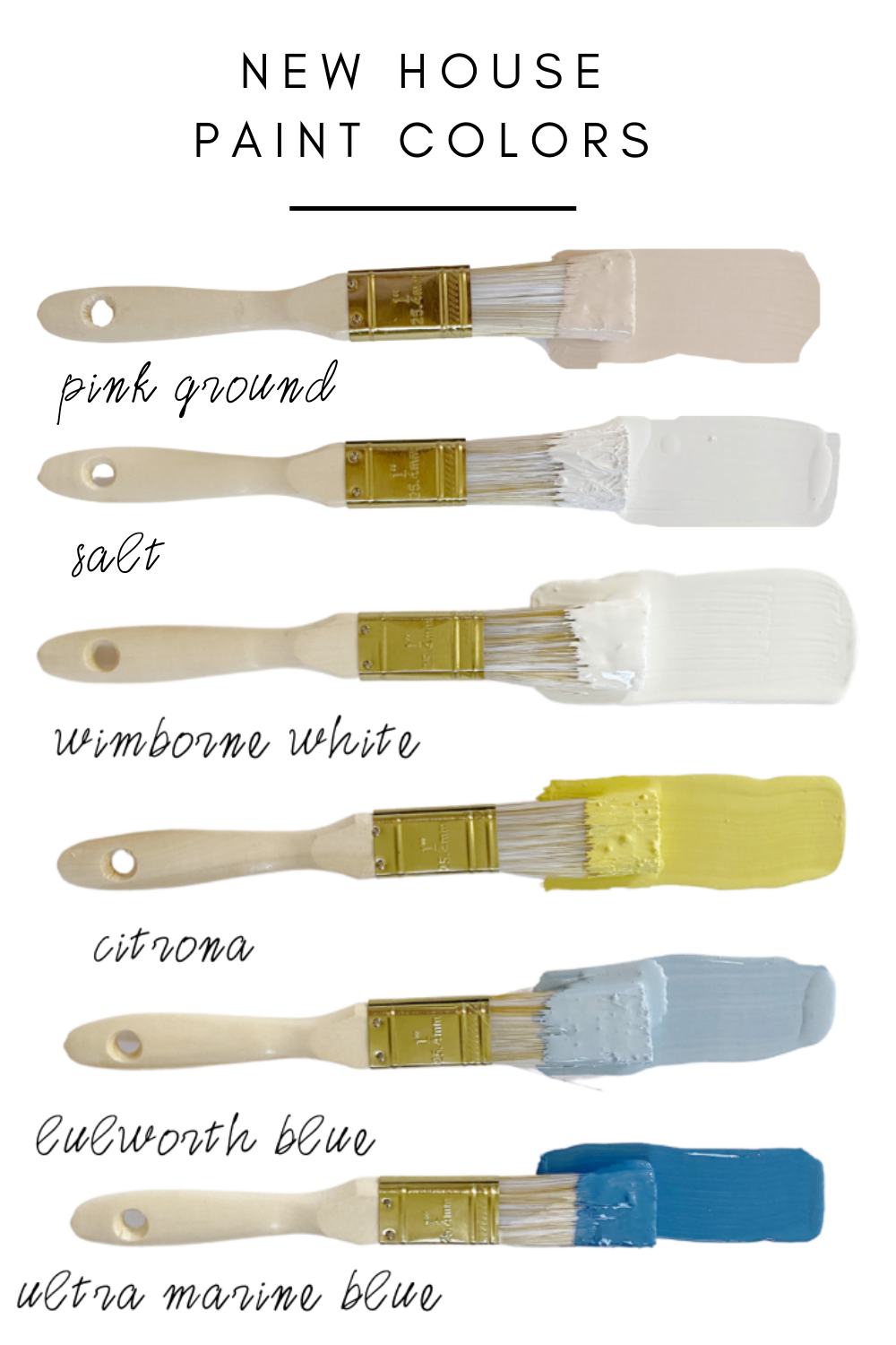
No. 10 There will be no more tiles on the walls. They have had their walls tiled for over 20 years and it’s time for a change. I’m going to be installing beadboard which a chair rail or ledge. Now I need to decide if I will be painting it white or having fun with a little color! Any thoughts? I keep going back and forth on it!
Isn’t this going to be fun? It’s also my first time getting a little outside help with the manual labor. I searched high and low for someone to help me out and found a guy I really liked. Frank started this week and so far everything has been going smoothly. It’s nice to have someone help with all of the heavy lifting. Demo work is no joke! Now, I’m not the only one tackling a bathroom in this series. Make sure to follow everyone else! I have been seeing little sneak peeks and everyone is knocking it out of the park! Such pretty spaces and all of the color!
Jeweled Interiors | PMQ for Two | House Homemade | Rain on a Tin Roof | Effortless Style Blog | Haneen’s Haven | Kaleidoscope Living
Make sure to check back on Thursday to see our progress and the big reveals are Sept 12th!!!
Related
Leave a Reply Cancel reply
get inspired with our own home tour
ON THE BLOG
My living room is one of the rooms that evolved drastically from when we first moved one. Originally I painted the walls chocolate brown and did accents of white, blue and orange. That lasted maybe 2 years.
Our dining room sat empty for months. Okay maybe it was empty for just a handful of weeks and then we couldn’t take it anymore and put in a folding table and plastic outdoor chairs, but in my mind that was still empty.
On the main floor of our house we have a Florida room. Being that it’s a Florida room it is a considered a 3 season room, because there is no heat in the room. The previous owners used it as an indoor patio with outdoor furniture and it looked like this when we moved in.
In our new home, the basement was completely unfinished. It was literally one of those dark spaces that you see in horror movies and are terrified of getting locked into. However, with the square footage in this house, I knew I needed to make the basement another workable and liveable floor of the house instead […]
What to look for when it comes to picking out kitchen appliances: Leave room in your budget for appliances. When it comes to kitchen renovations everyone knows that the cabinetry and the labor of demoing and installing cabinetry is going to eat a lot of your budget. However, the second most expensive part of a […]
I don’t think I’m alone in thinking that designing a kitchen is an overwhelming undertaking. I’m an interior designer and even I find it stressful to iron out all of those details. So, when it comes time to design a kitchen I always like to partner with a kitchen designer to make sure I’m remembering […]


I adore this plan! I love how it’s rooted in whites and golds, but then has the perfect punch of color! Love that wallpaper, girl!
This is going to be an incredible transformation! I’m not sure what I love most–the wallpaper or the tile. Gorgeous!
That wallpaper is so pretty! It will be beautiful and yet I’m wondering if anyone has papered a full bath before? Any concerns with shower humidity? Are the tub and toilet staying? If yes, I say go with white headboard. Either way no doubt the finished bathroom will be lovely!
It has a vinyl like finish to it so, it should be fine in the shower. We also have a fan going into the window to help with humidity. The tub and toilet are leaving!!!!
lol. Part of me loves the before. but the design plan is soooo awesome!!!!!
Haha. I can totally see that, but it was time to see all of that avocado go!
OMG I AM DYING over that green tub and toilet! your selections look lovely! Can’t wait to see them installed.