ORC: The Big Reveal!
I’m so excited to be writing this blog post. I can’t believe I decided to tackle two different spaces for the One Room Challenge! I honestly thought it would be easy! I design rooms for a living! I have the knowledge and the contacts/sources to make it a breeze! Haha! The joke is on me! While everything ended up going smoothly in the end there were some hiccups along the way that made me give all of my blood, sweat, and tears to this project! Truth be told I also gave more bodily fluids after an intense fall outside while painting the bathroom doors in the dark. Thanks to the sun setting at 4:30pm and a wonky deck step I went flying and messed up my knee and peed my pants. Yup, putting it all out there. Hopefully, other fellow mommas will understand my weak bladder. Ah! Fun times!
As a little reminder are all of the previous weeks in one place:
WEEK 1 | WEEK 2| WEEK 3 | WEEK 4 |WEEK 5
For those of you new to my blog, a little background on my housing situation is that I’m currently crashing at my parents’ house with my family (hubby and two boys) while we renovating our new home. The new to us home we purchased was a total gut job and the current state of the world delayed things for a couple of months. We are back up and running and we decided to tackle both of the bathrooms in the home for the One Room Challenge. So, we worked on a teeny tiny powder room on our first floor and the main bathroom on the 2nd floor. We were literally down to the studs in these rooms when we got started!
We were lucky enough to work with some amazing sponsors to help get these projects to life! A big thank you to Signature Hardware, Build with Ferguson, Maxim Lighting, The Tile Shop, Thibaut Design, and LiLi Tile! I reached out to each and every one of them after sourcing their beautiful products and falling in love with them first. So, everything I used is something I truly love and stand behind in design and quality.
Now let’s get to the good stuff! First up is the powder room. Since this was such a small space I knew I wanted to big and bold with it! I wanted it to be special and a space that any guest would truly remember and love.
We started with this:
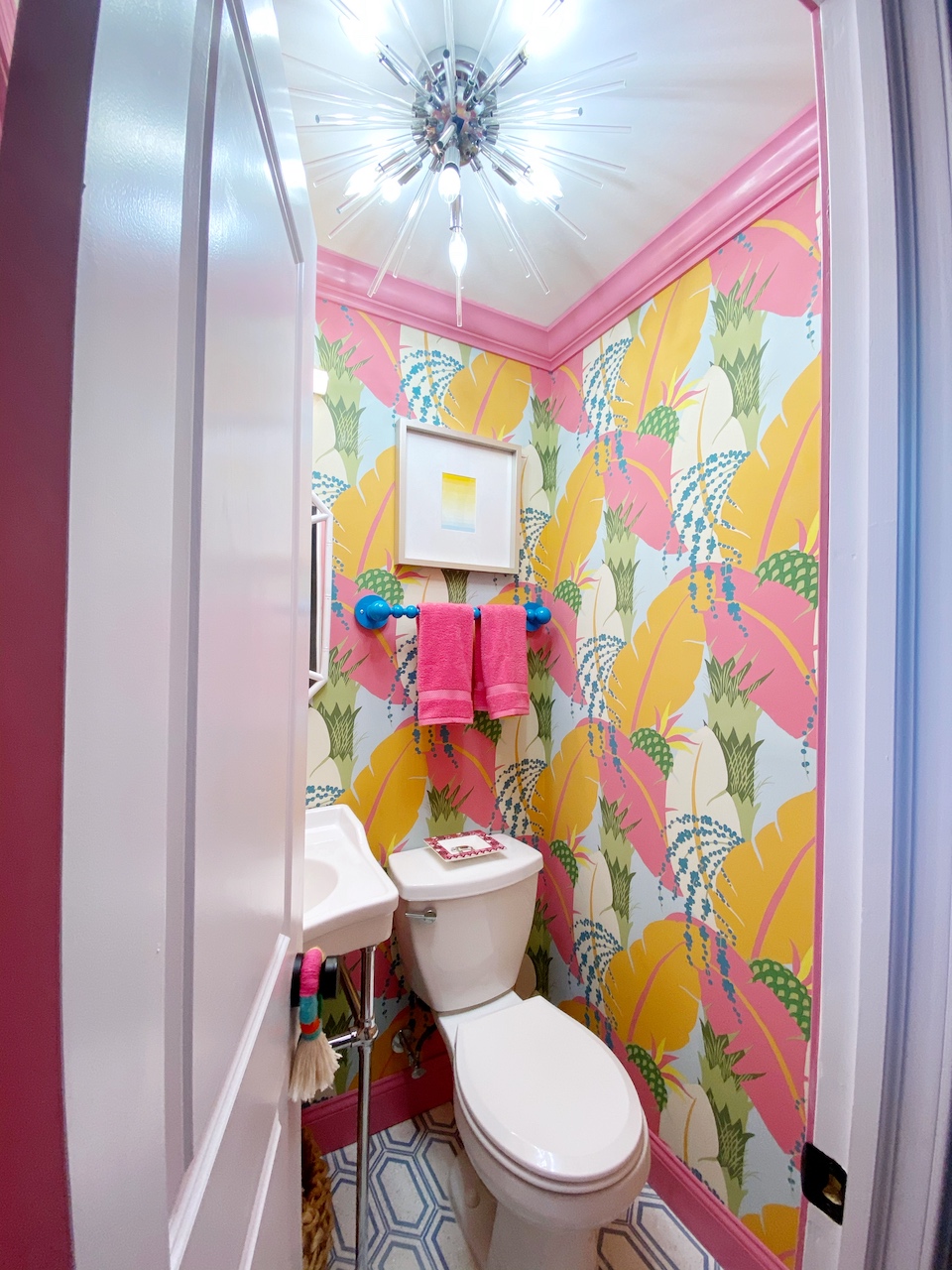
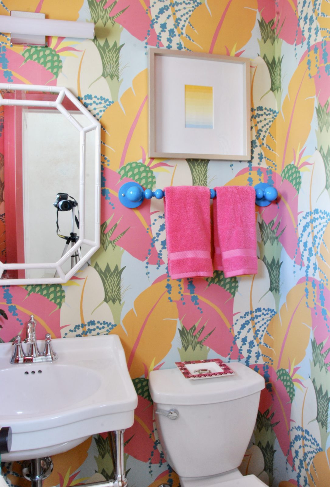
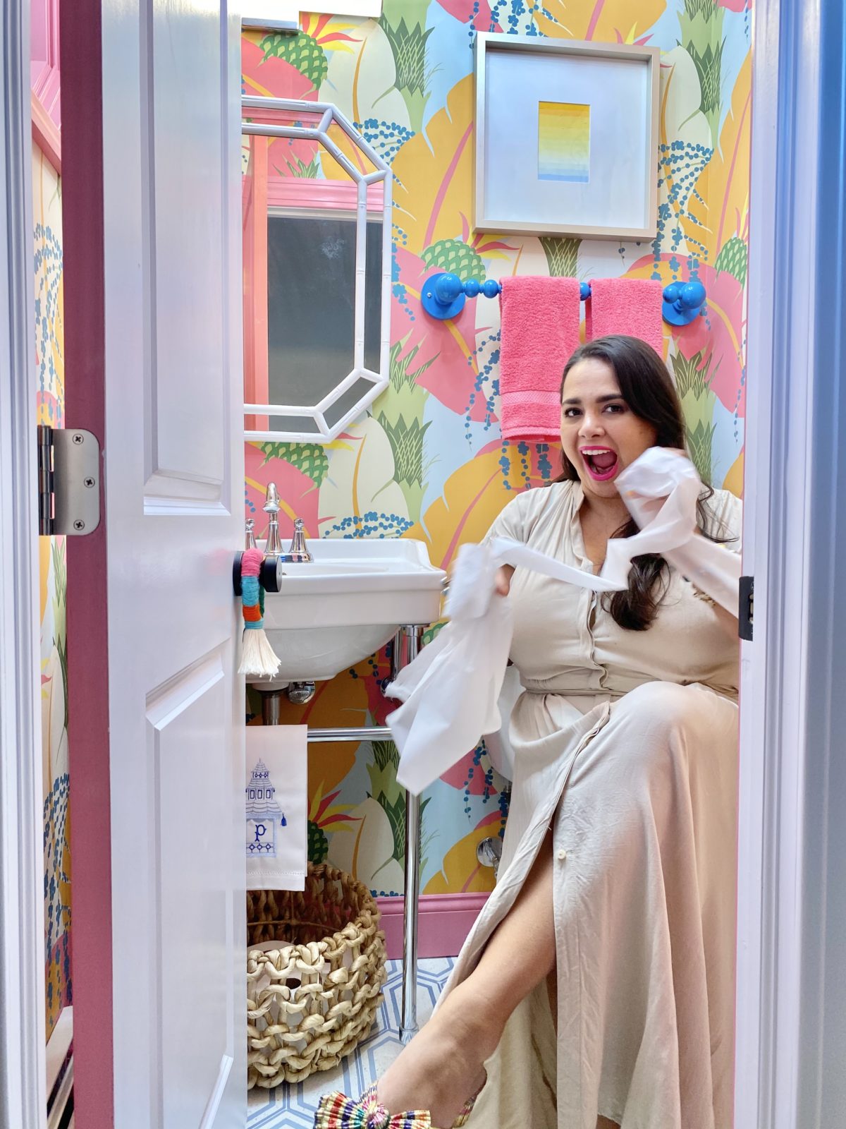
Now we have this:
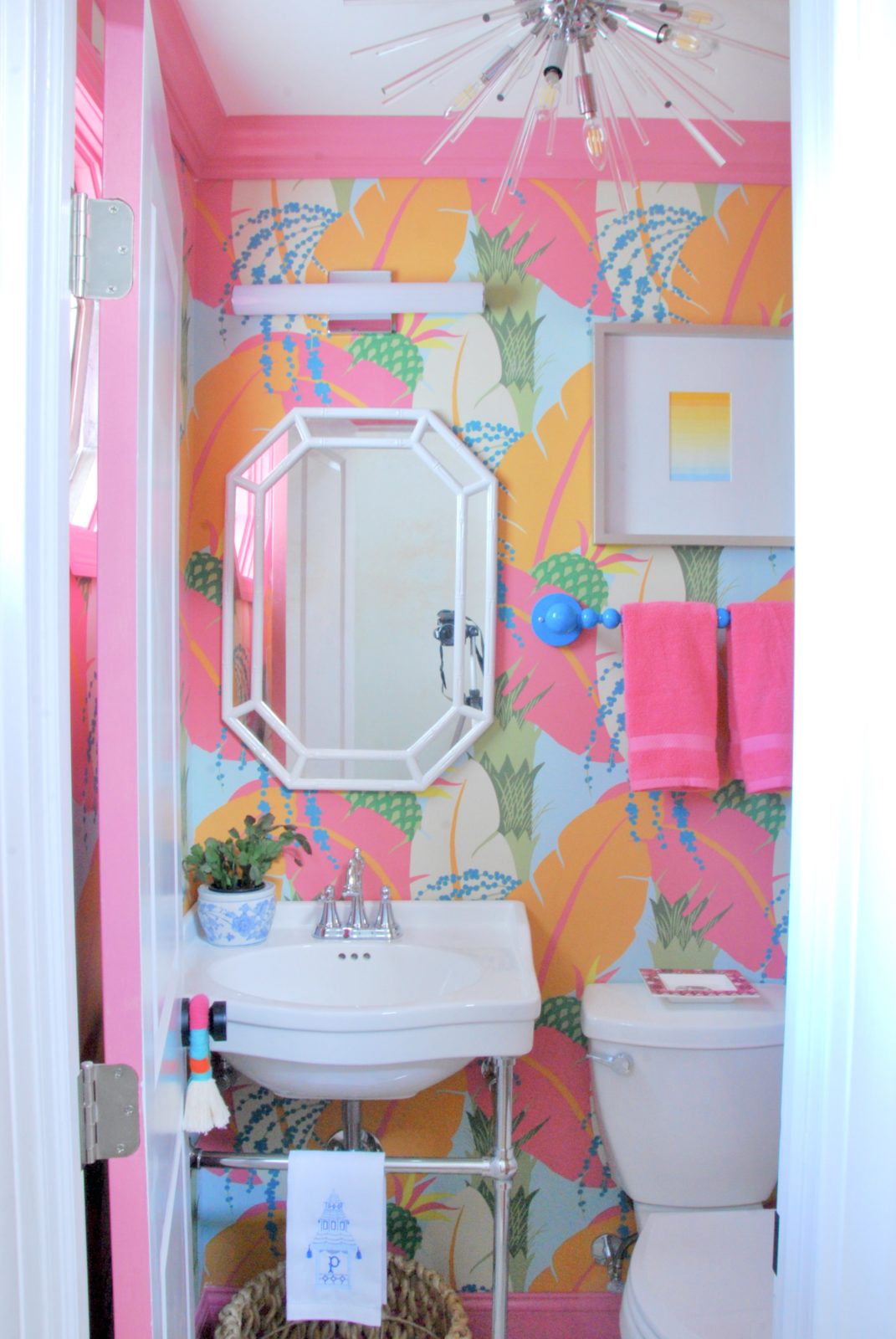
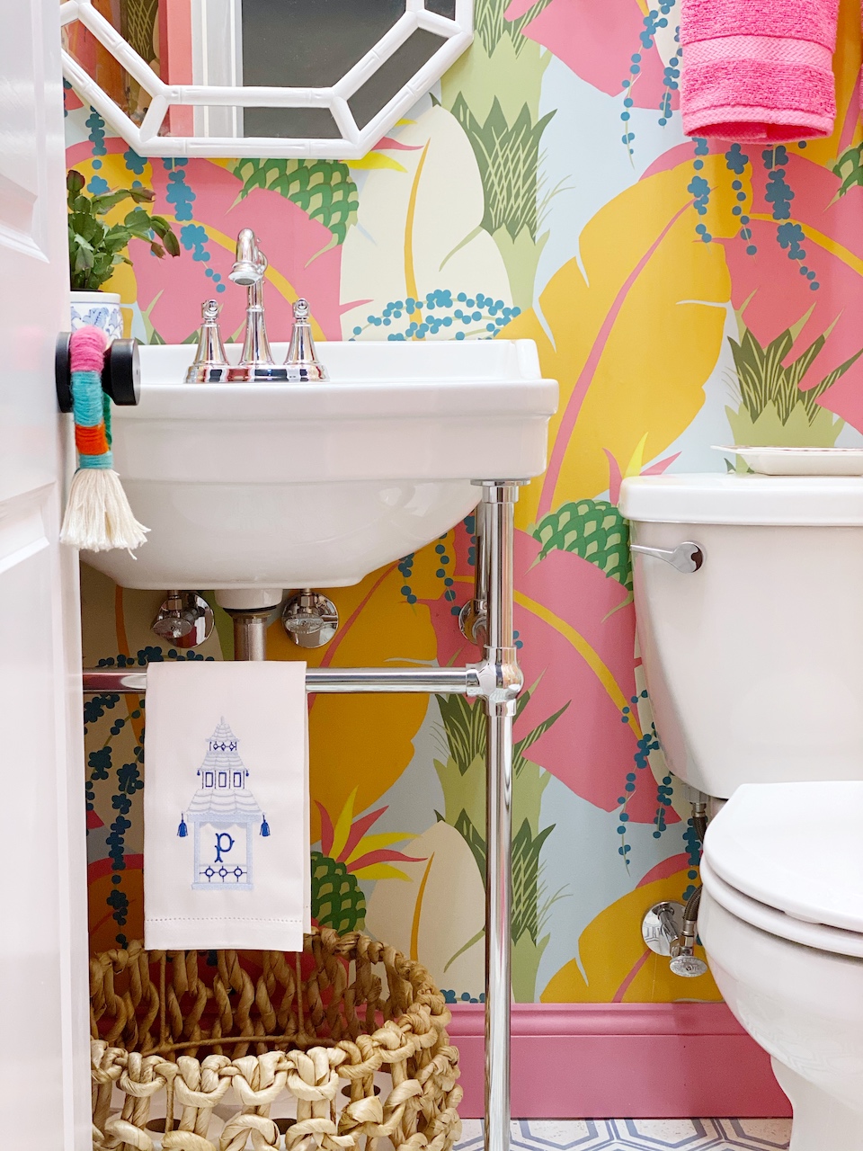
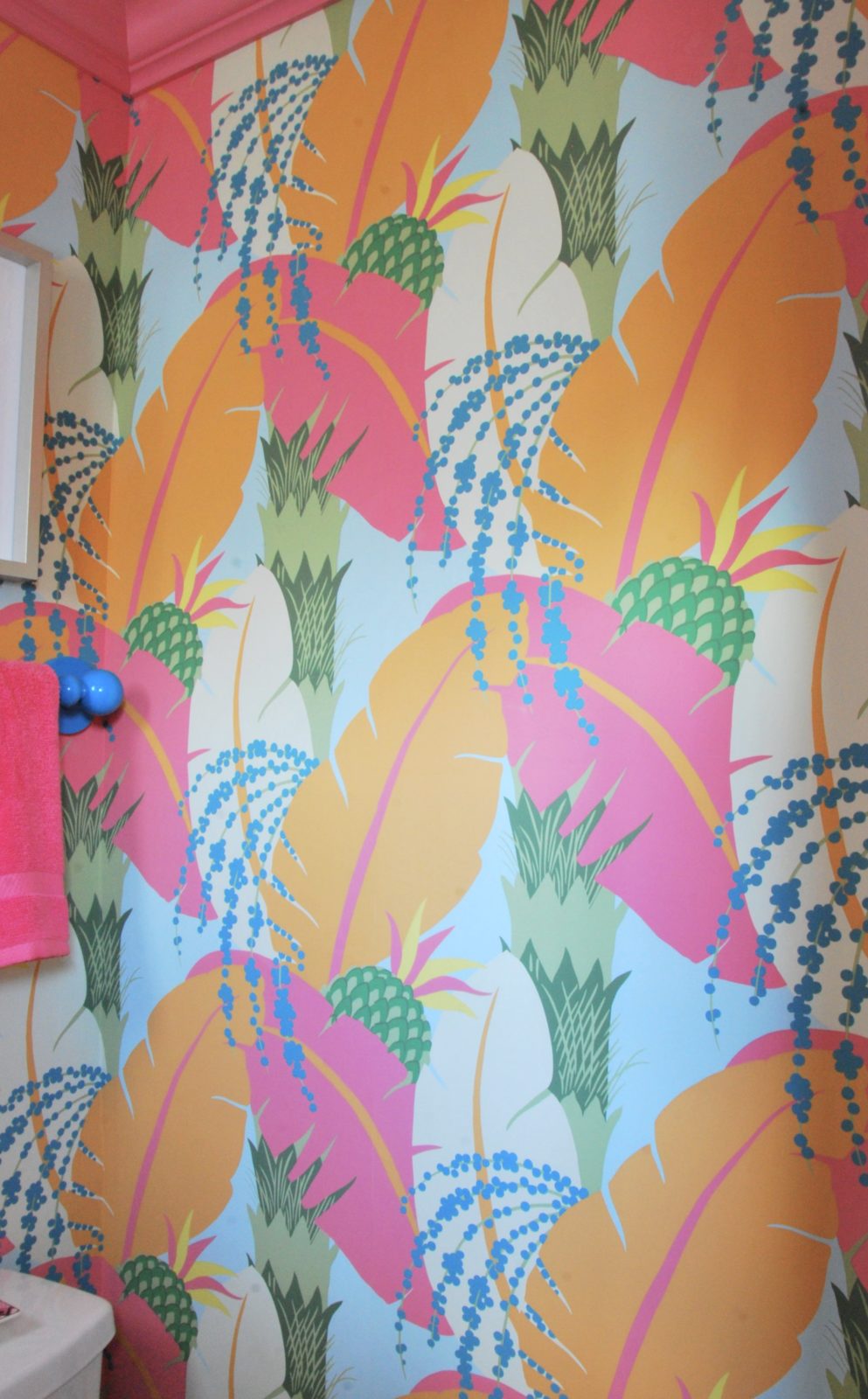
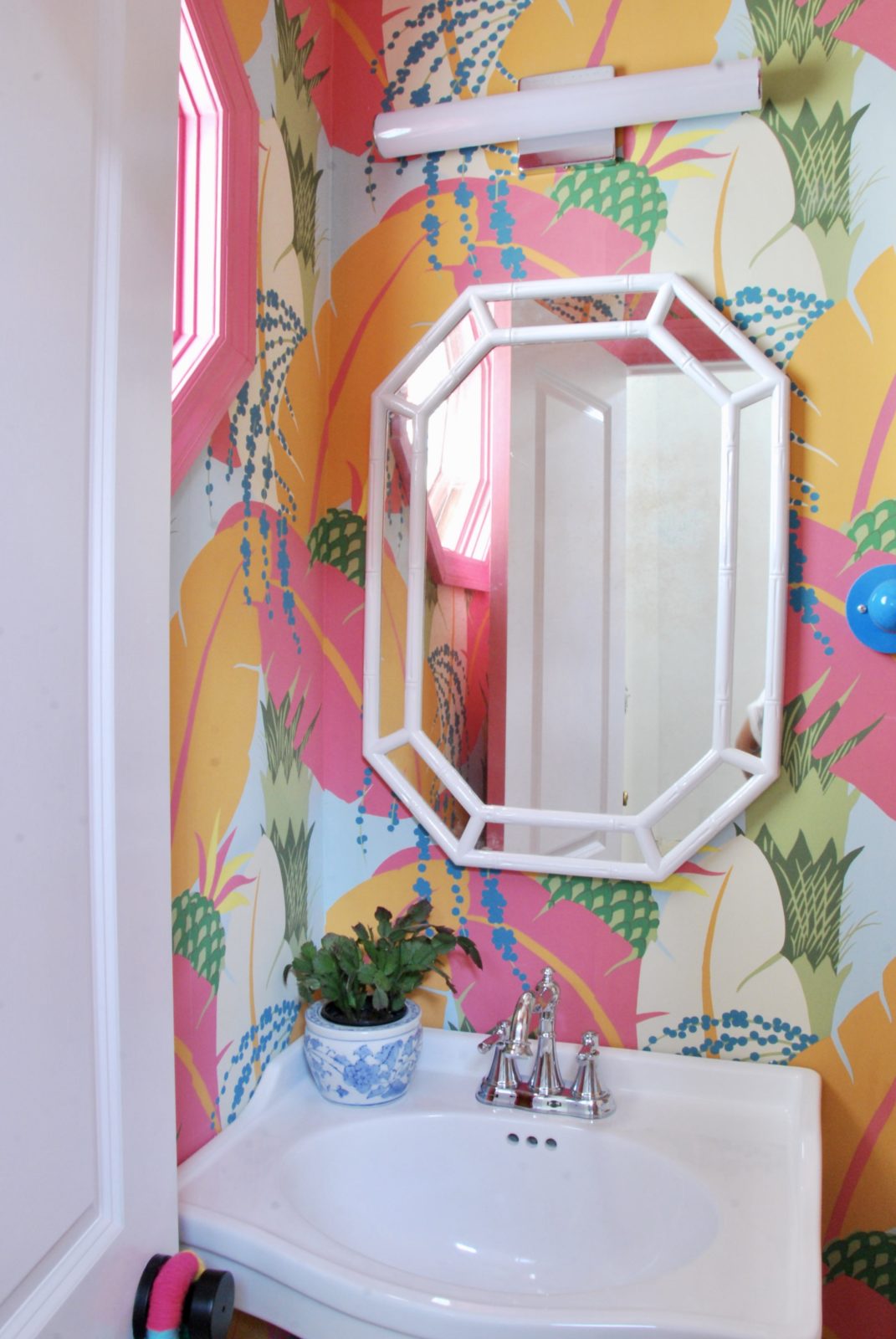
Since it was such a small space I allowed myself to go big when it came to the wallpaper. I splurged on my favorite Schumacher wallpaper called Ananas. I loved all of the colors and the oversized palm leaves and pineapples sprinkled throughout. I made sure to show it to Jon and the boys and they equally loved it! It paired beautifully with the Cierra console sink by Signature Hardware. Look at those legs! It worked perfectly in a teeny tiny powder room.
I paired it with the Miseno santi v center set faucet because I really liked its traditional lines.
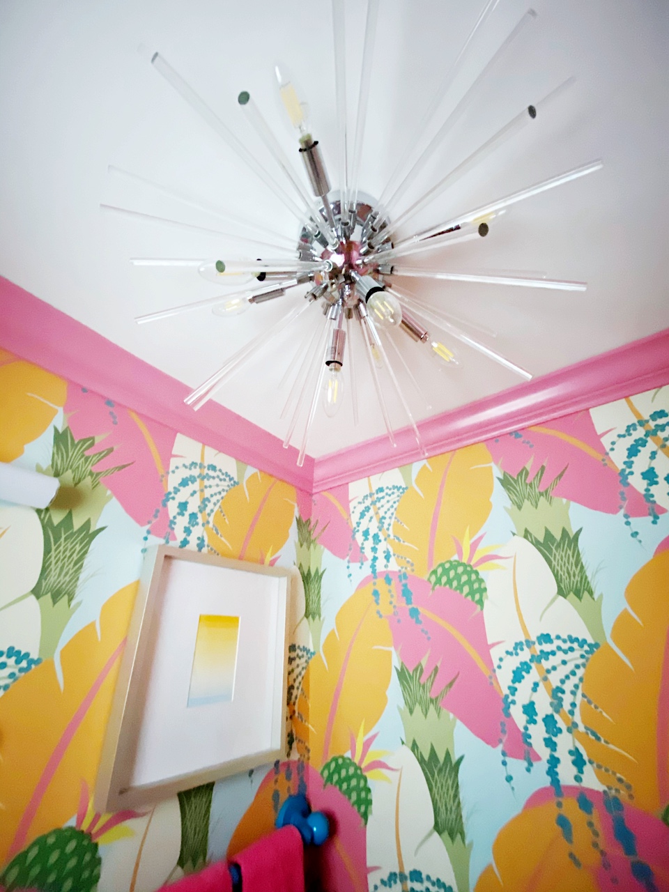
Our wallpaper in all it’s glory! We decided to go pink when it came to trim in the space and used fruit cocktail by Behr.
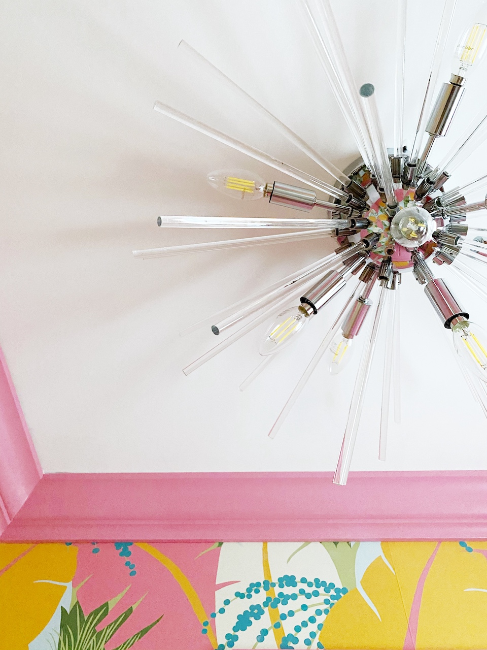
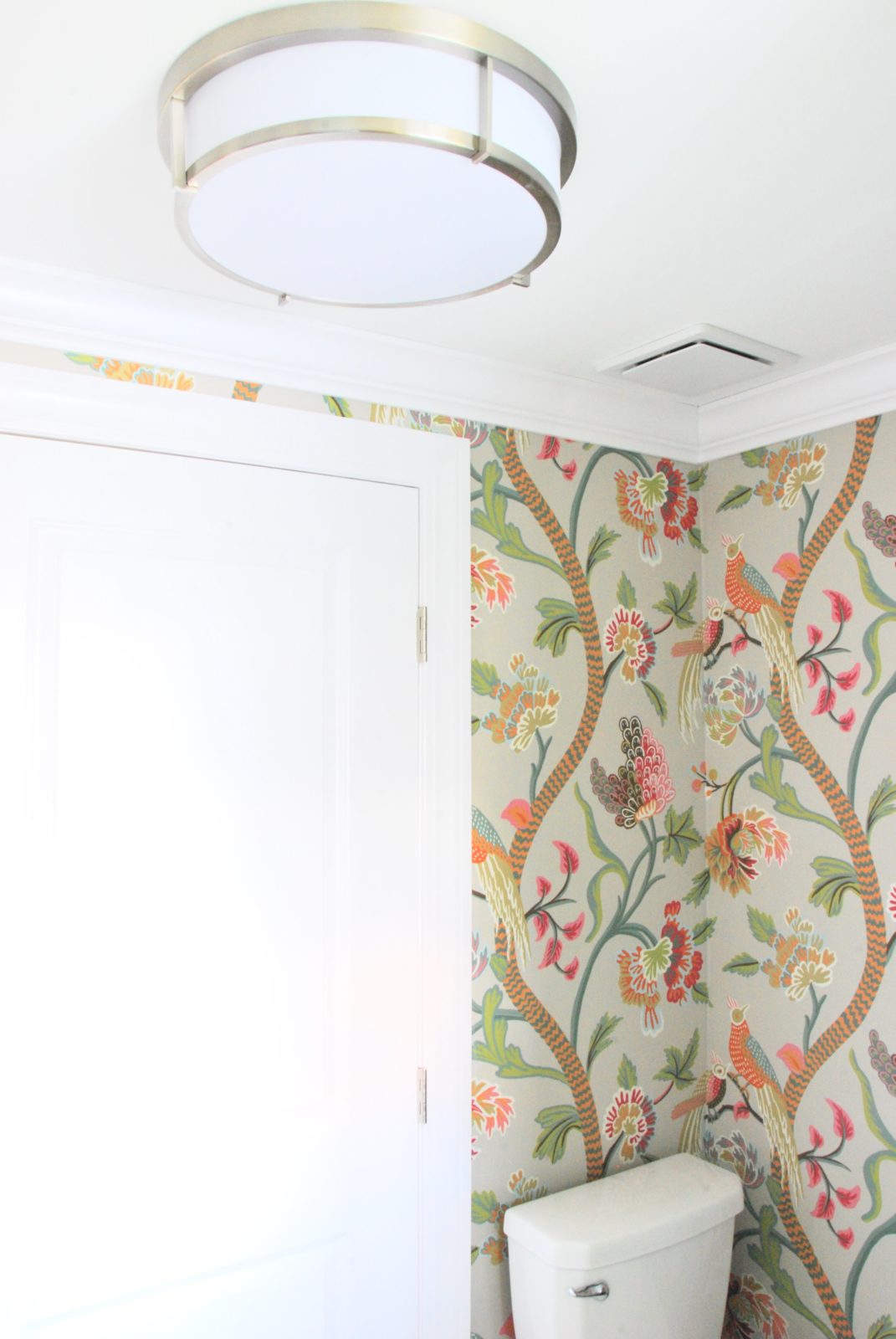
Lighting wise it needed to be special and I think the Polaris flush mount by Maxim Lighting did just that!
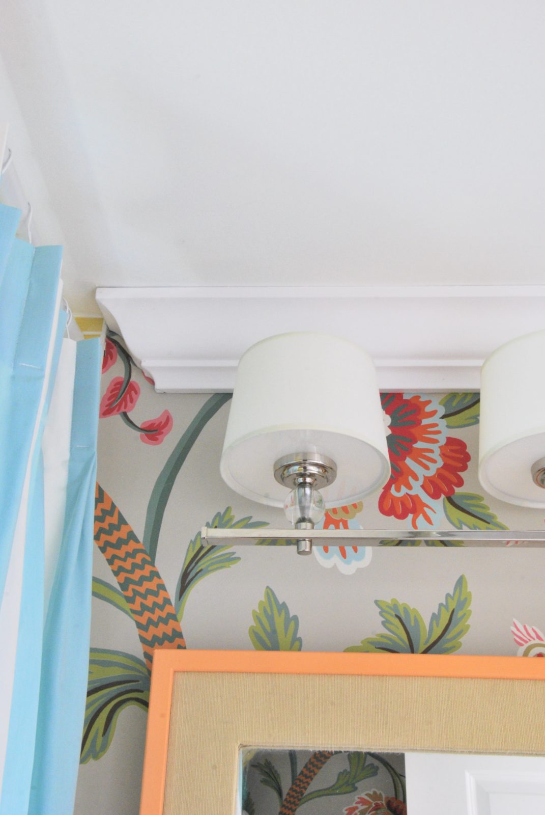
For the mirror, I decided to go the vintage route and gave it a new dose of love with a white lacquered finish. I wanted more light in the space, but with some much already going on in the space, I wanted it to be clean-lined and went with the Rail light by Maxim Lighting. It’s so chic looking and an awesome price point!
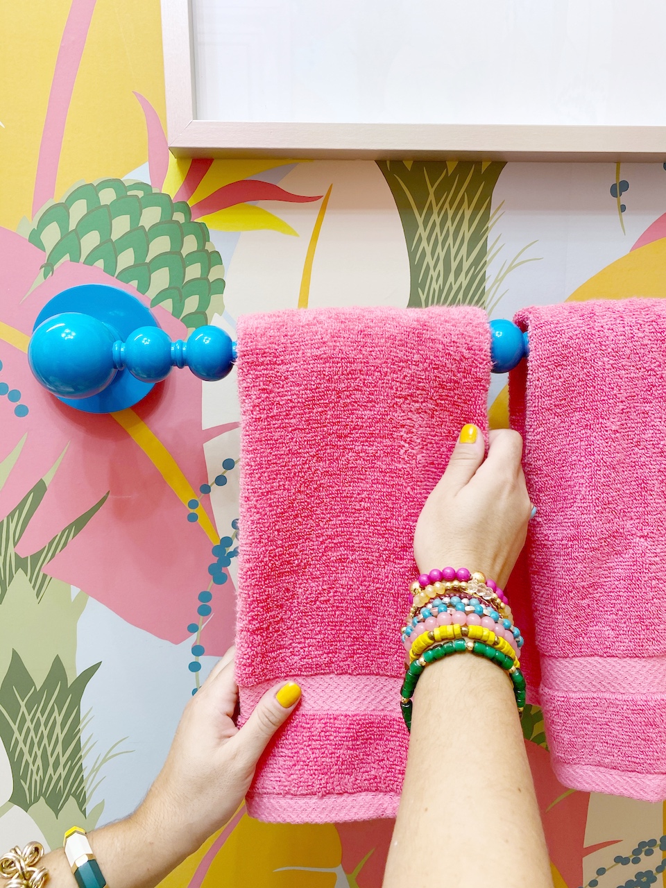
My Dunes & Duchess Poppy towel bar looked perfect in the space! It picked up the darker blue in the wallpaper and tied it all together! Plus it feels like its own mini piece of artwork/sculpture instead of just a towel bar.
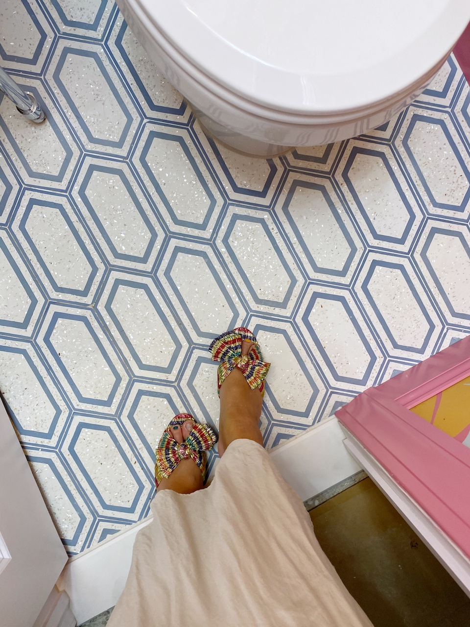
Our cement tile flooring from LiLi Tile was the perfect finishing touch for the powder room. It adds a bit of sparkle with its mother of pearl terrazzo finish. It makes me so happy! It’s another piece that makes me feel like it’s more unique artwork than standard floor tile.
Whew! Now it’s time to check out the main bathroom!
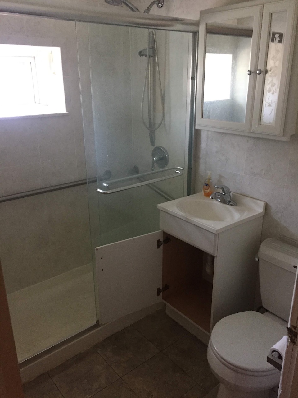
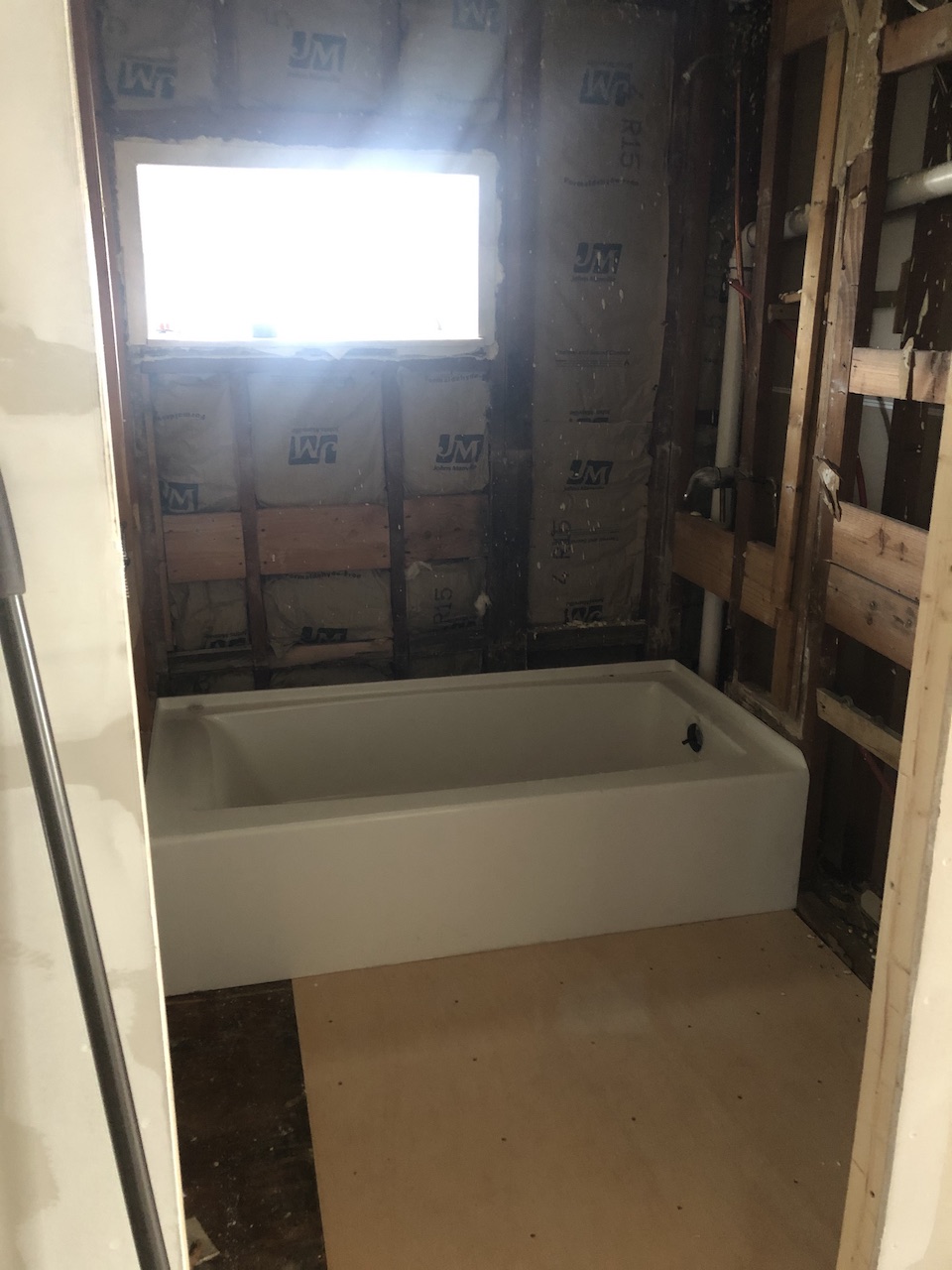
Here is what we started out with:
In order to get a bigger vanity, we needed to move the toilet and doorway! Thank goodness Jon knows how to do all that and we were left with this at the start of the ORC.
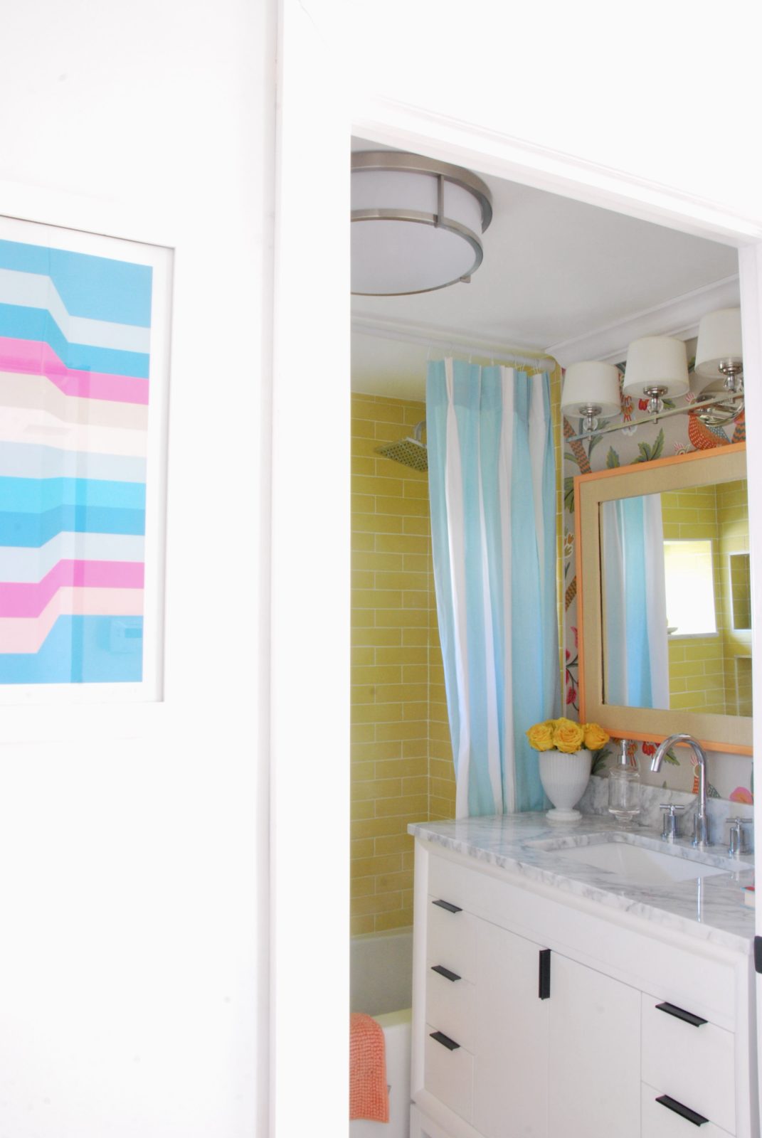
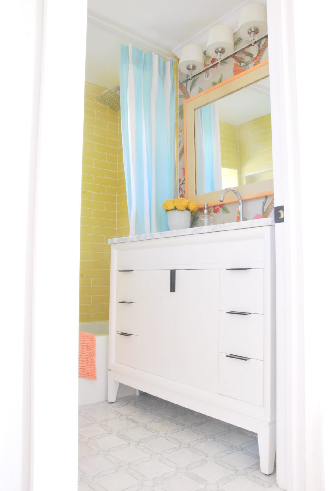
Here is the after in all it’s glory!
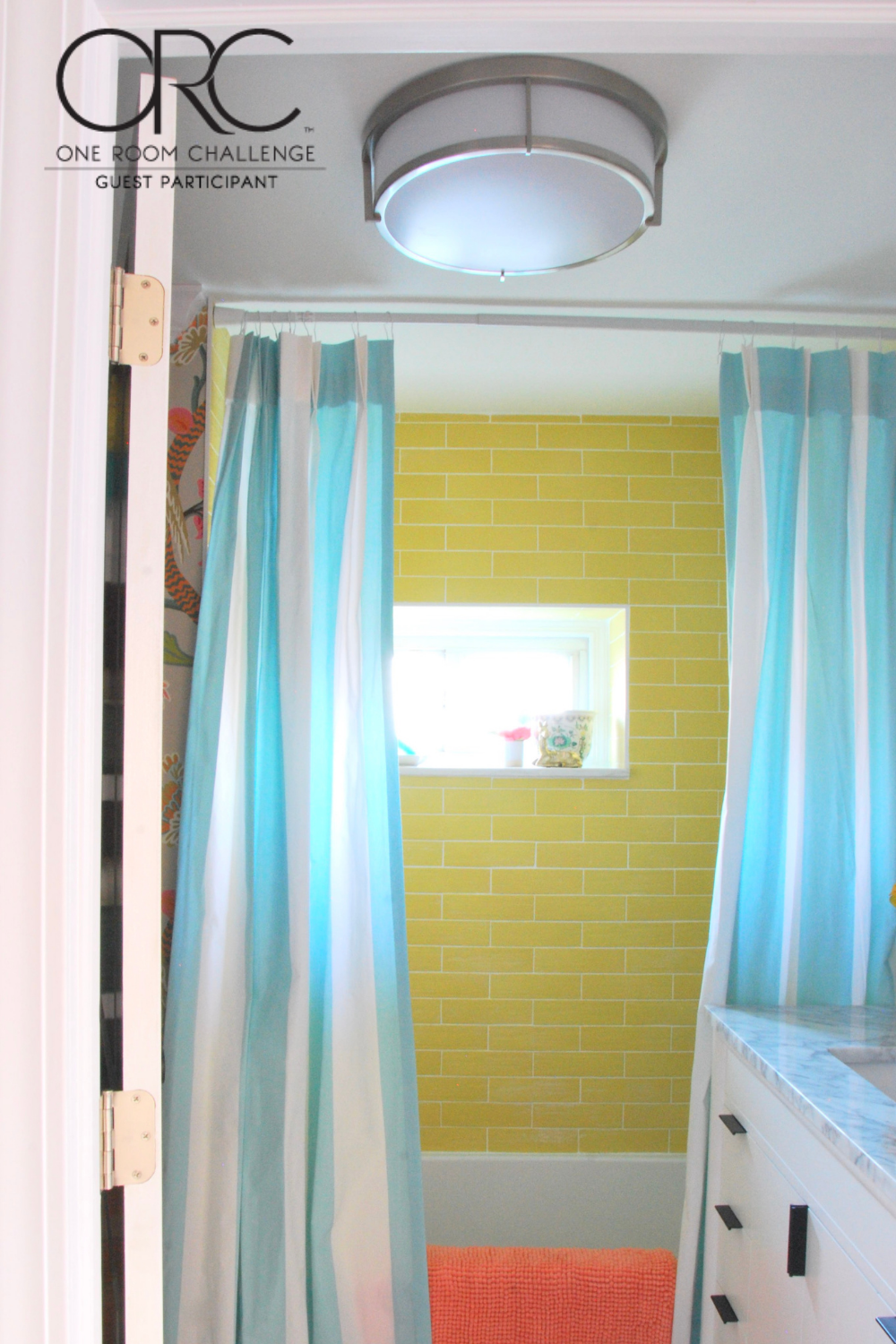
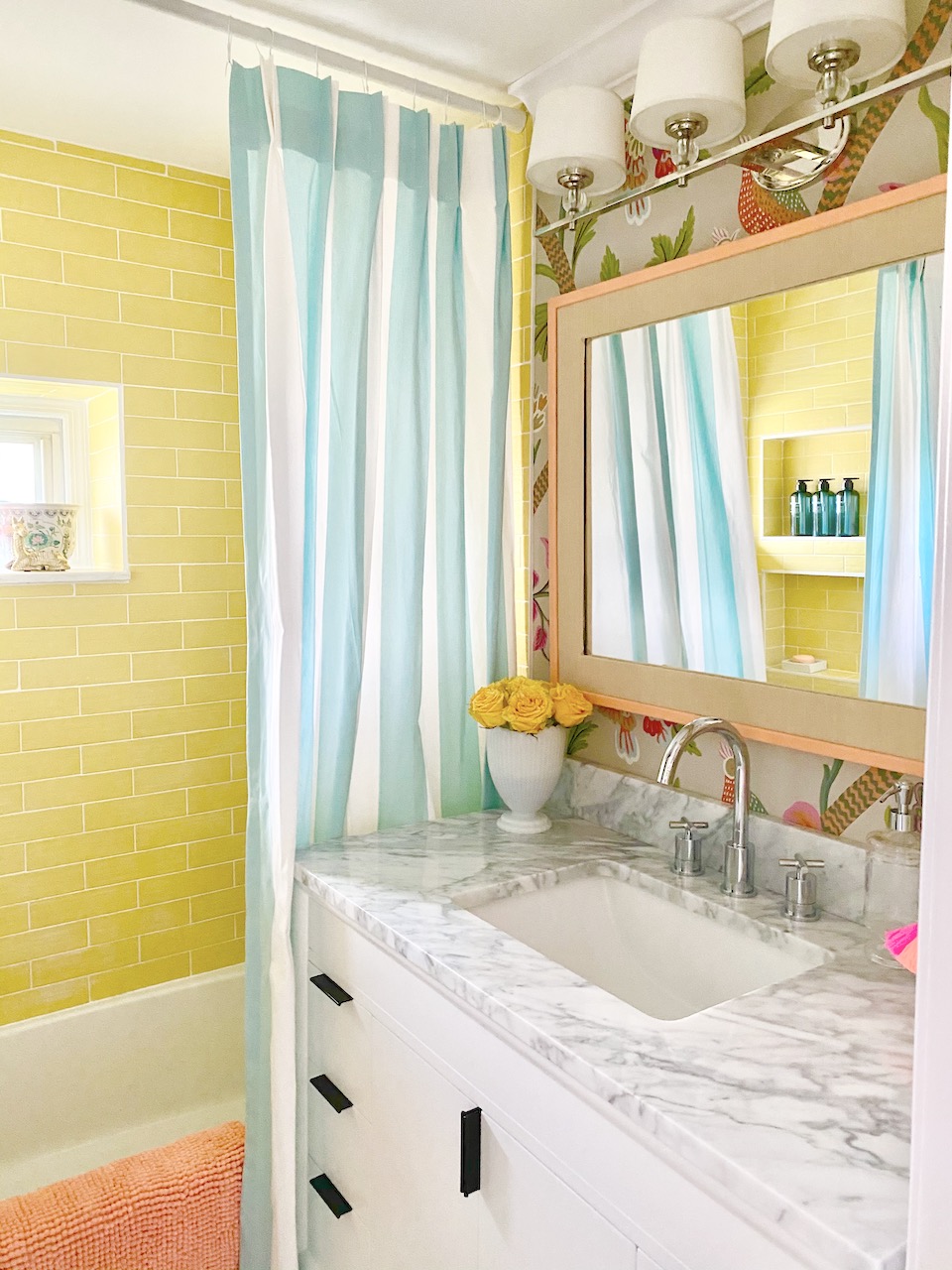
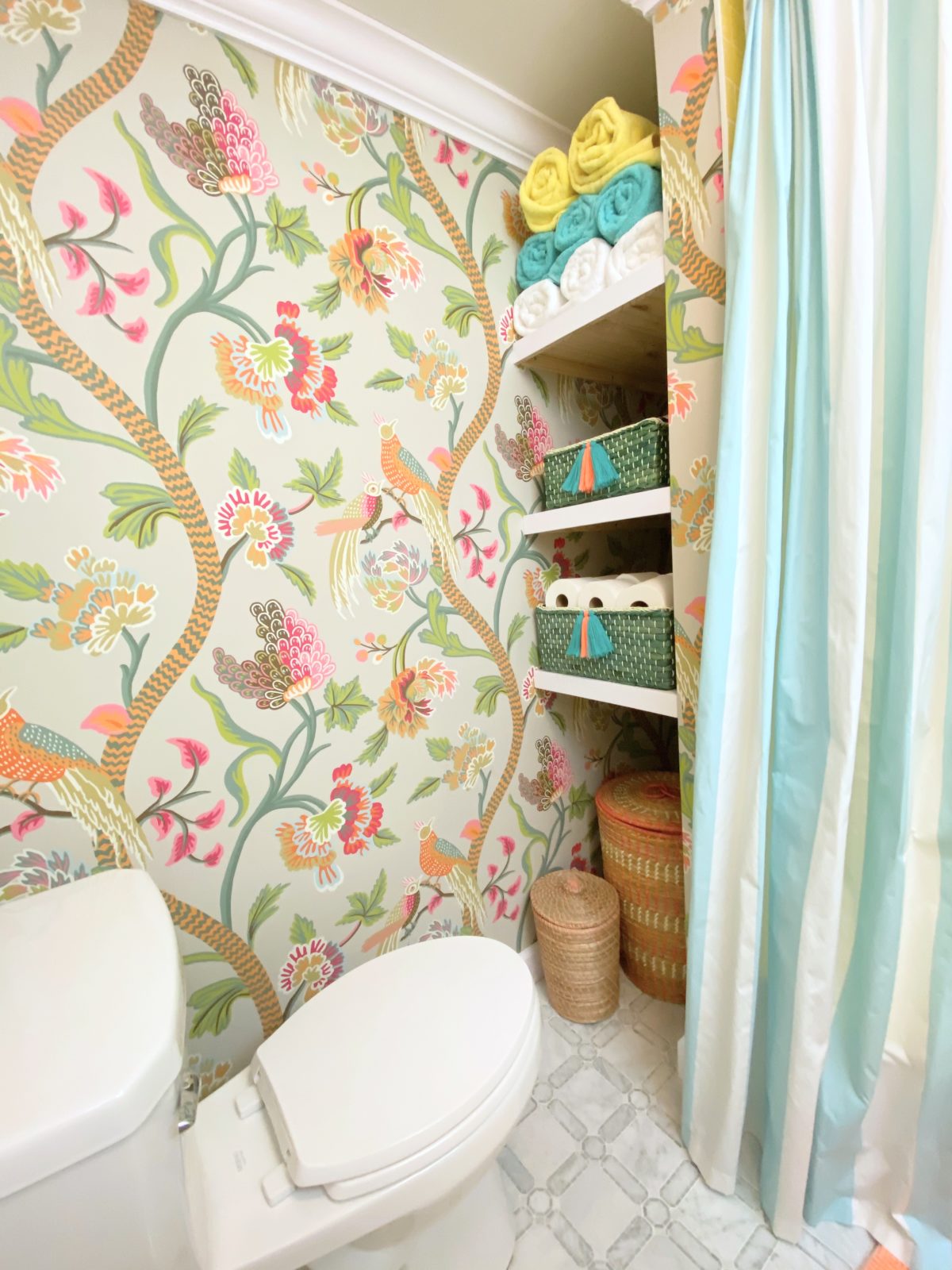
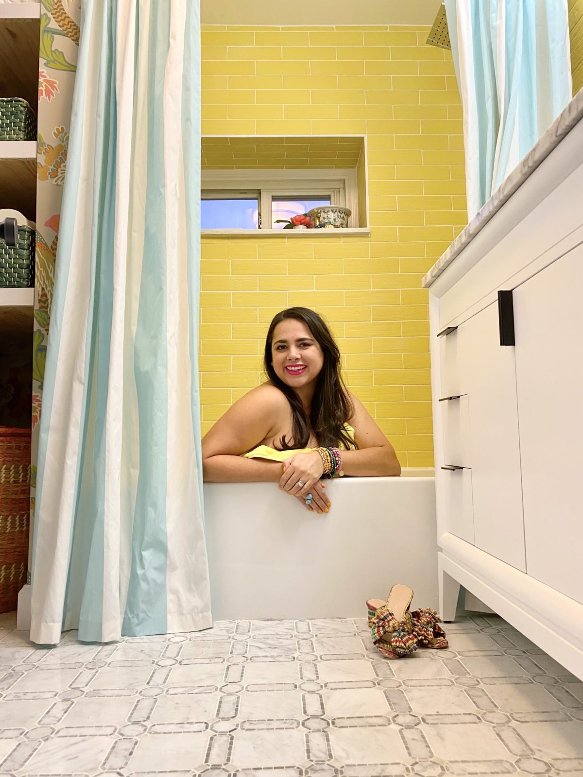
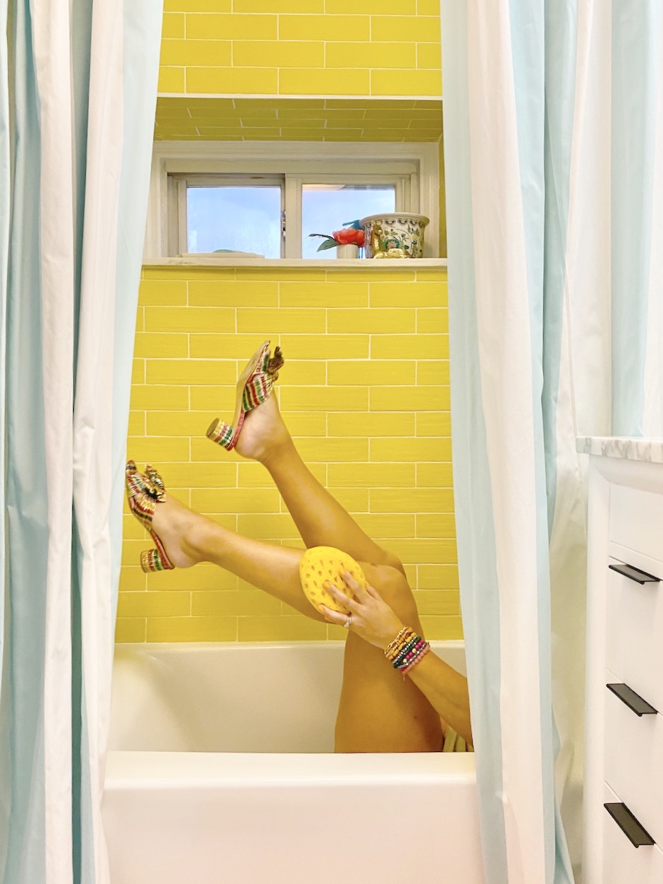
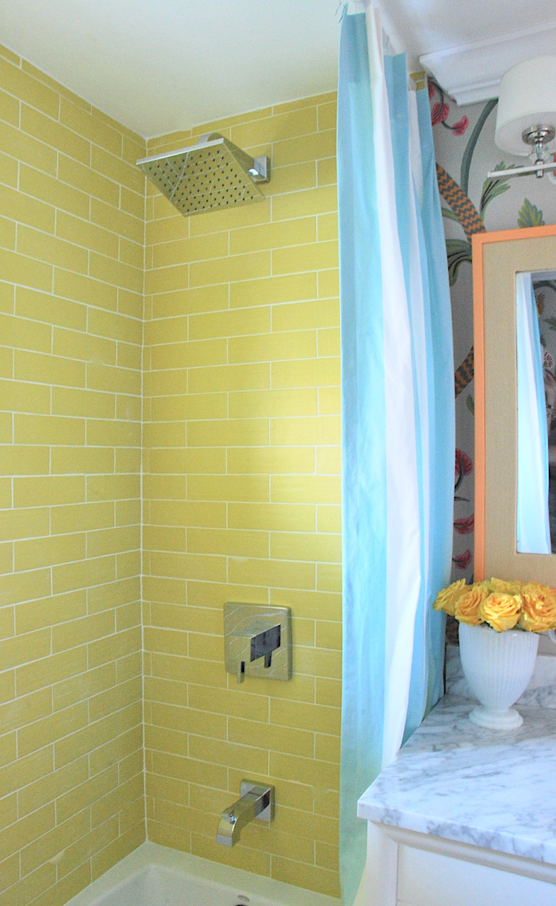
Isn’t she pretty! I’m in love! I have been in love with Janta Bazaar in flax. I actually had it as an option for this bathroom remodel, but my mom went with the bright colorway. I loved it so much I knew I wanted to use it in our new home. However, I wanted it to look completely different and I was able to do that by focusing on bringing in an amazing shade of yellow with the help of The Tile Shop and their Color Market collection. The Lima de Persia colorway is a perfect citron yellow/green and I’m so happy I decided to go for it!
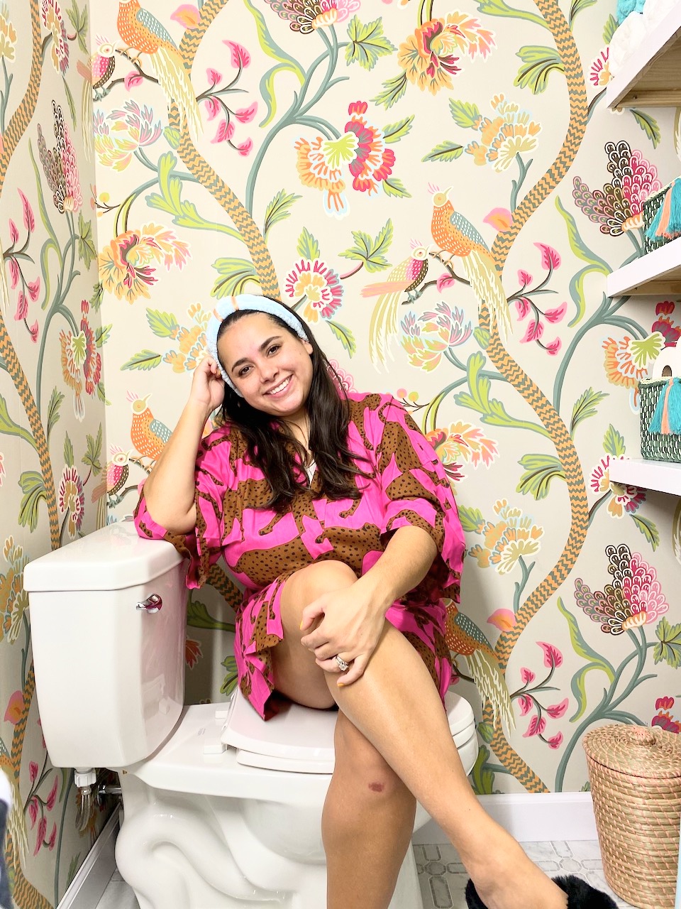
*Please note my sister had a ton of fun art directing me and putting me in all sorts of positions!
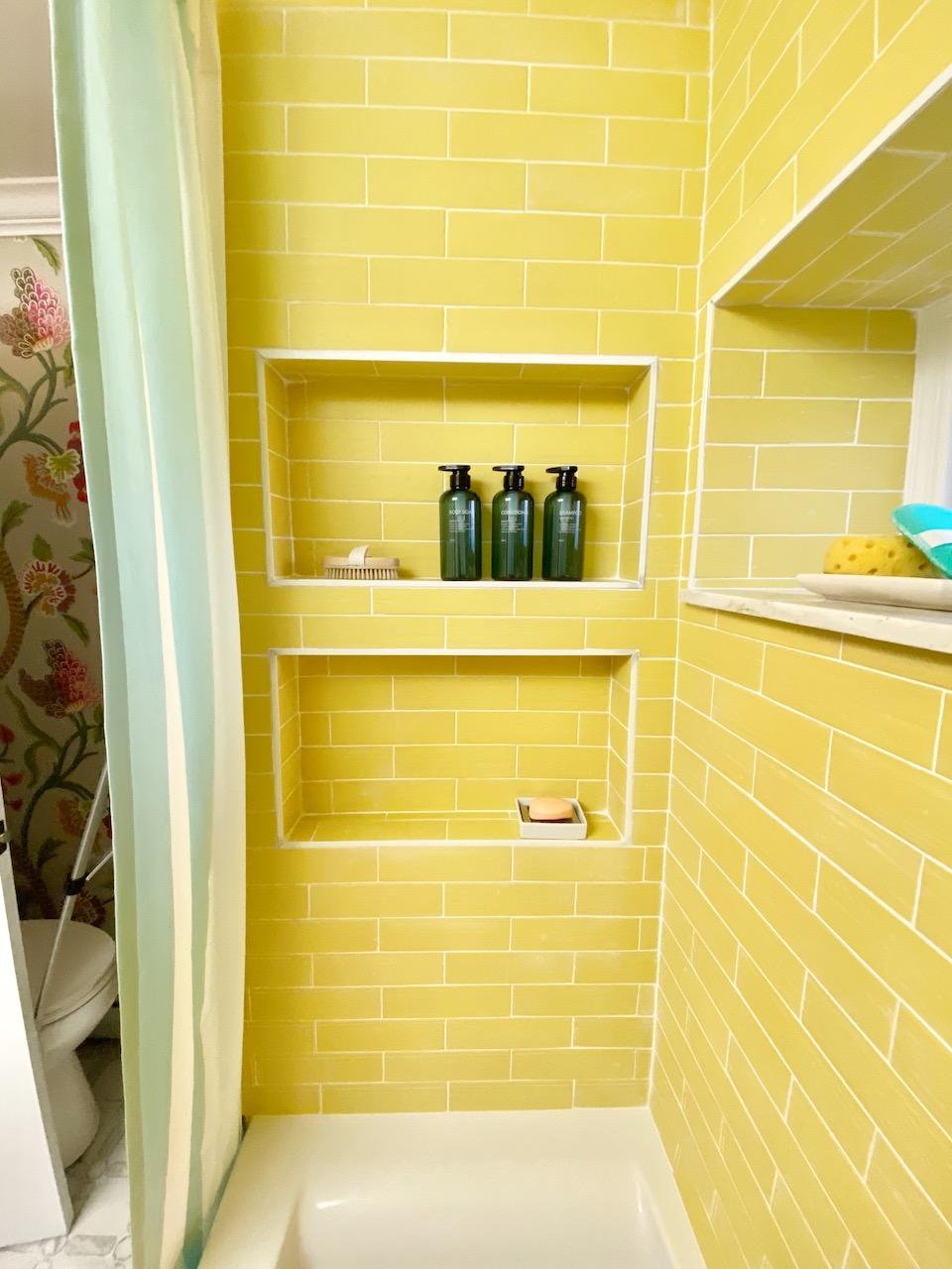
We decided that since we had the walls all opened up it would be nice to include a shower niche and have a home for all of your things. We went with two of them stacked so that Jon and I could have one and the boys could use the bottom.
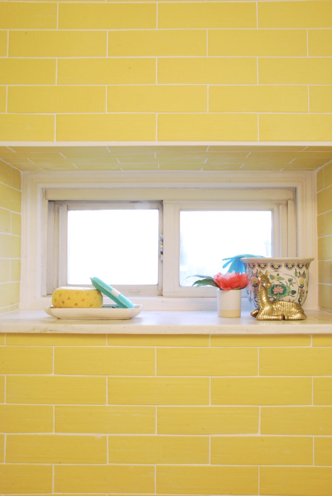
We also have this window area and shelf area that we needed to work with. Tiling it all around really made it pop! I used the area to leave a tray for my jewelry that I take off and sponges plus a bowl filled with my favorite bath bombs! Just some nice little things to make my shower more enjoyable! It was the boys’ favorite part! They were already fighting over the loofa!
I went with all chrome or polished nickel in both bathrooms. I loved the lines on this shower and tub faucet set from Signature Hardware. It has clean lines that are a bit more modern than I’m used to. I like that it mixes things up a little bit.
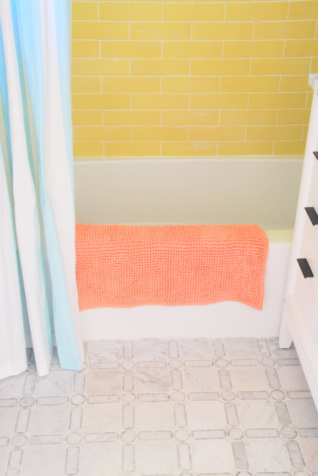
Since my shower tile pick was on the bold side I decided to go more classic with the floor tile option. I think the ava-with-victoria-marble-mosaic tile was the perfect option for this space. It’s a classic pattern, but still really interesting and different. You don’t see it every day, which is what I love about it.
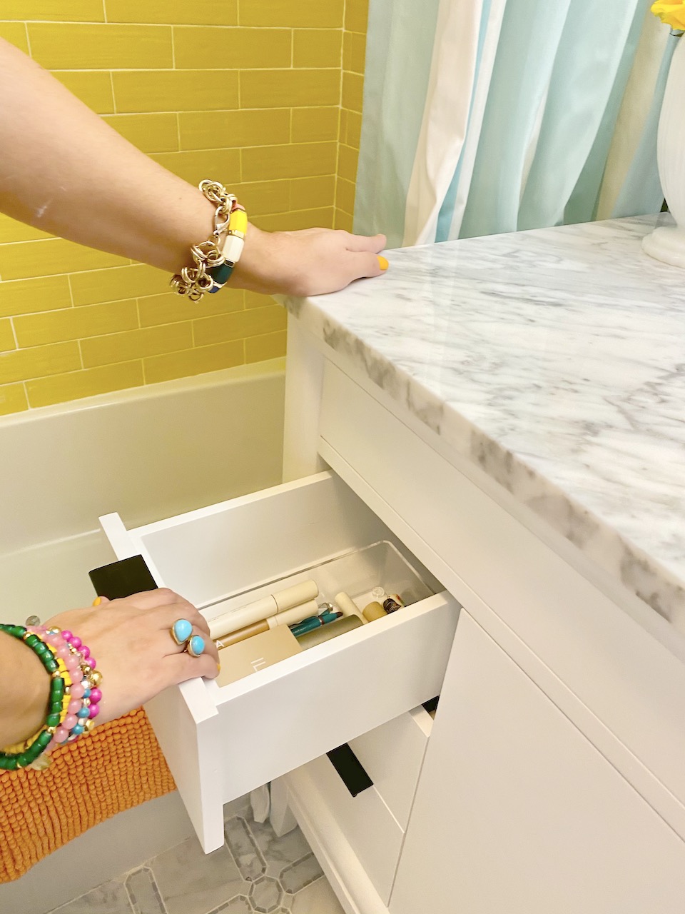
The whole reason we moved things around in the bathroom was to get a larger vanity in. The previous homeowners had something in the 24″ size and that was not going to cut it for a family of 4. Now nothing is easy so of course we had an odd size to work with. A 36″ would be too small and the size up is typically a 48″. We needed something in the 42″-43″. Enter Build.com with their Avanity 43″ vanity called Emma. She was just what we needed!!! She fit perfectly and I like that she had legs so that I can slide under a scale and a stool for Asher to bring out and use when he needs to reach the sink.
I have already started to fill up her smooth close drawers!
Do you love the faucet I went with? I liked the X’s on the handles because it gave the modern piece a little bit of a vintage nod. Hudson loved it!
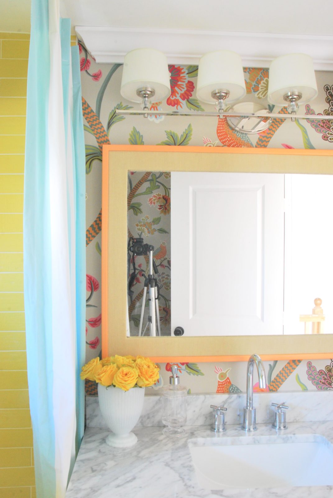
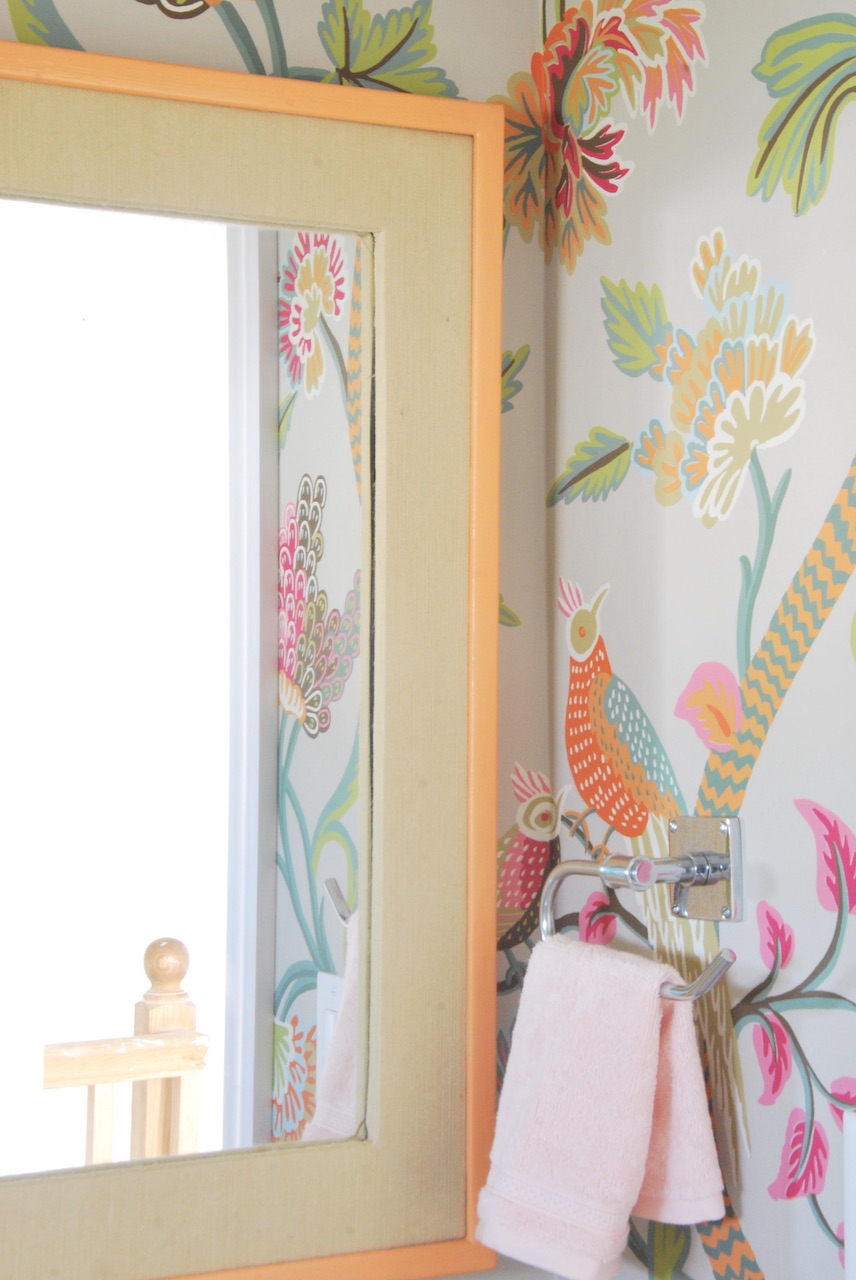
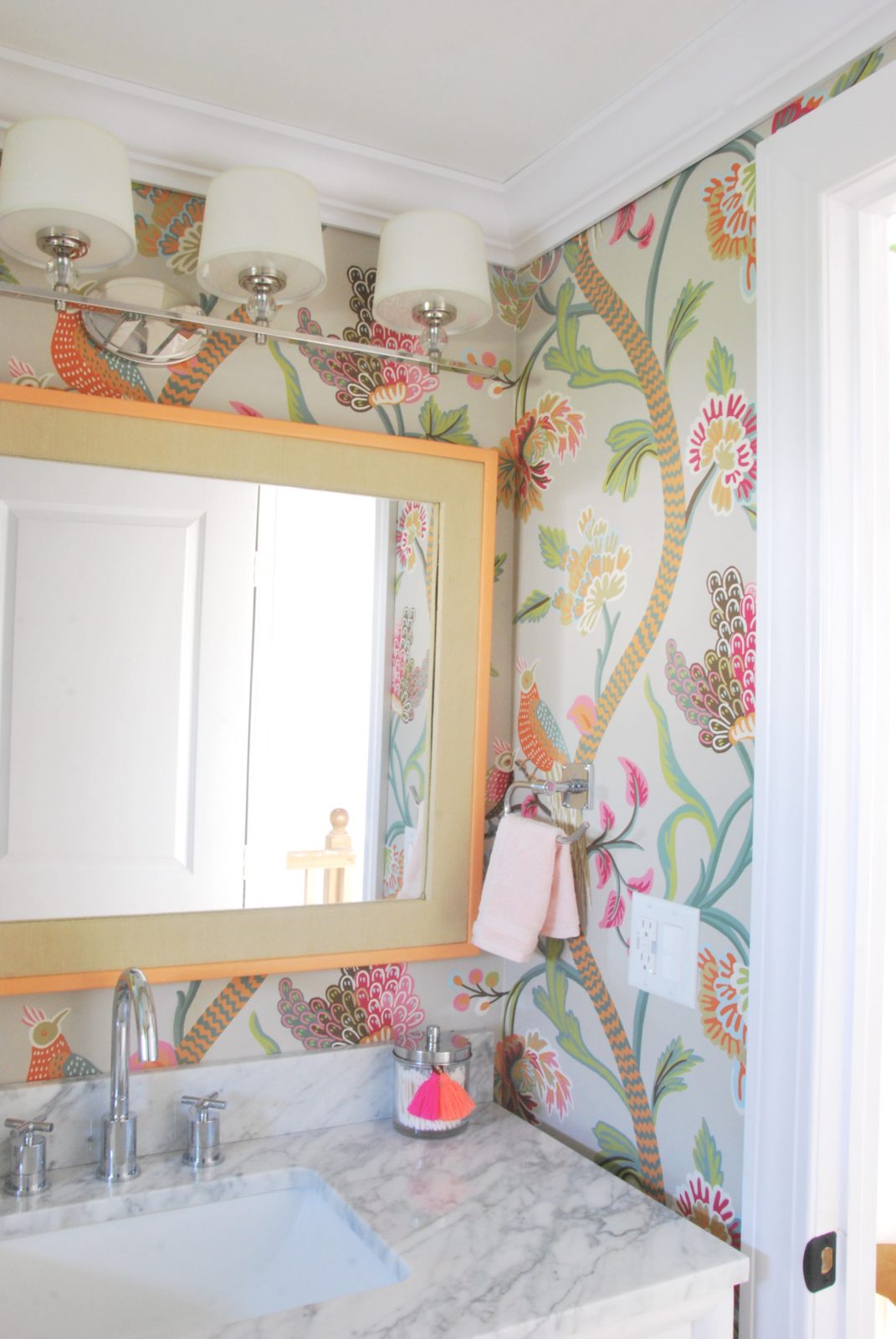
I searched high and low for the bathroom mirror! I knew what I wanted in theory, but I couldn’t find it. Enter a vintage score that was originally wrapped in needlepoint! Off came the needlepoint and on came the grasscloth wallpaper and then I got to paint the border the same orange as the wallpaper!
I loved pairing the stunning faucet with that beautiful piece of lighting from Maxim Lighting. That perfect dose of sparkle that every room needs. Plus you can never have too little lighting in a bathroom. I love that I went with 4 lights!
For the overhead lighting, I went with the Rogue flush mount that finished up space quite nicely.
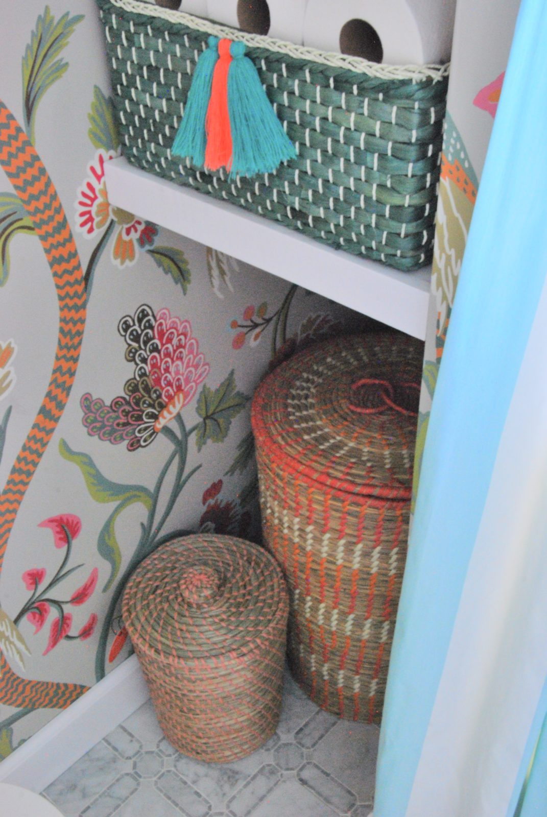
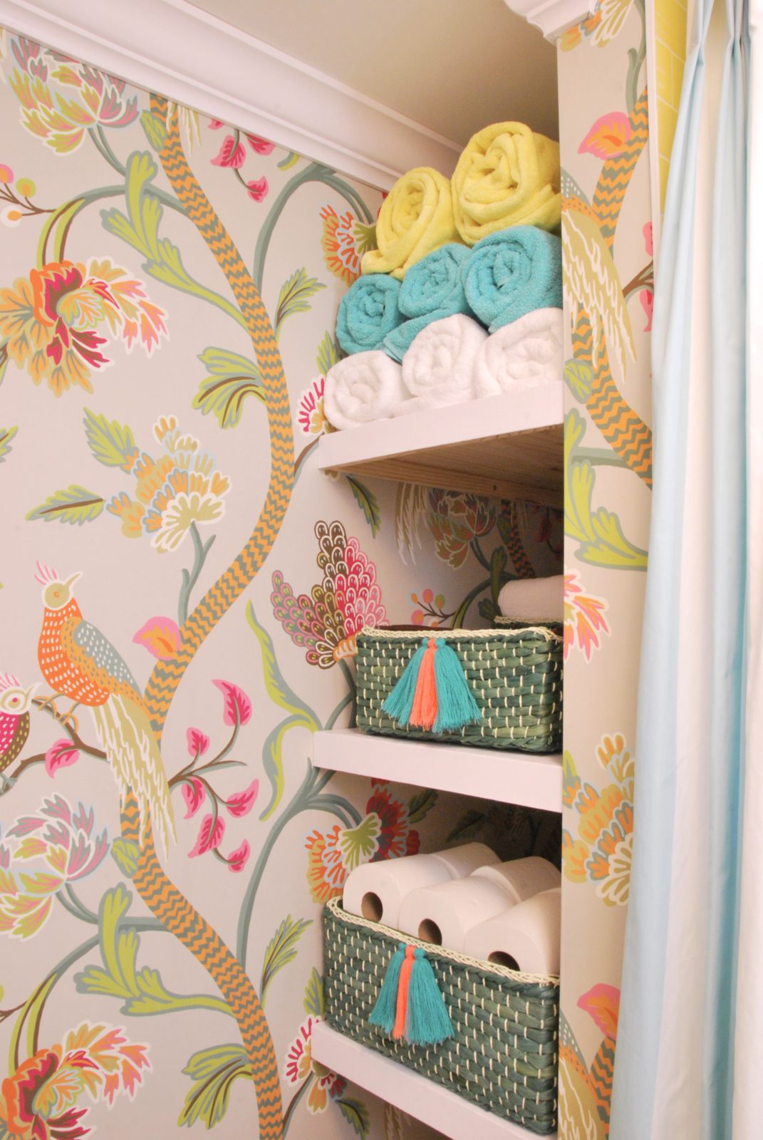
This area use to be a closet, but since we had to move the toilet across from this area I didn’t want to have a swinging closet door banging into your knees. So, off came the door and we finished it off to be a shelving unit. The top 3 shelves can house towels, toilet paper, and backstock aka extra shampoo.
The bottom area was left larger so that I could slide a clothing hamper in there.
Opposite the open shelving area is the toilet area. We are planning to put a towel bar above it, but due to shipping delays, it hasn’t arrived yet. I’m also planning on putting some towel hooks on that big main wall, but alas shipping delays. Lastly, our toilet paper holder is also missing in this area due to shipping delays as well. Thank you, Pottery Barn!
Do you love it? We do it!
A big thank you to my family for making this all happen. I had my parents and my sisters helping me with childcare, cleaning, and photo direction! It was such a big help! I’m not sure how to thank Jon. He is an angel. He worked tirelessly to make this all come to life. I come up with the nutty ideas and he makes them to life. He went on countless visits with me to get supplies, did all sorts of crazy electrical and plumbing work, worked on the bathrooms after his normal job, and many weekends all weekend long! Want to know what he was doing on Thanksgiving? He was working on bathrooms and took an hour break to eat dinner. He also lets me get away with way more pink than a typical man usually likes in his home. He is simply the best.
Thank you to Linda from One Room Challenge. It’s a beast to organize something like this and she is a pro! A big thanks to Better Homes and Garden for being a media partner! I hope you all like what you see!
Related
Leave a Reply Cancel reply
get inspired with our own home tour
ON THE BLOG
My living room is one of the rooms that evolved drastically from when we first moved one. Originally I painted the walls chocolate brown and did accents of white, blue and orange. That lasted maybe 2 years.
Our dining room sat empty for months. Okay maybe it was empty for just a handful of weeks and then we couldn’t take it anymore and put in a folding table and plastic outdoor chairs, but in my mind that was still empty.
On the main floor of our house we have a Florida room. Being that it’s a Florida room it is a considered a 3 season room, because there is no heat in the room. The previous owners used it as an indoor patio with outdoor furniture and it looked like this when we moved in.
In our new home, the basement was completely unfinished. It was literally one of those dark spaces that you see in horror movies and are terrified of getting locked into. However, with the square footage in this house, I knew I needed to make the basement another workable and liveable floor of the house instead […]
What to look for when it comes to picking out kitchen appliances: Leave room in your budget for appliances. When it comes to kitchen renovations everyone knows that the cabinetry and the labor of demoing and installing cabinetry is going to eat a lot of your budget. However, the second most expensive part of a […]
I don’t think I’m alone in thinking that designing a kitchen is an overwhelming undertaking. I’m an interior designer and even I find it stressful to iron out all of those details. So, when it comes time to design a kitchen I always like to partner with a kitchen designer to make sure I’m remembering […]




This is GORGEOUS! I’m so glad you went with the pink trim in the powder room. It was just the perfect touch for that little jewel box!
Both of these bathrooms turned out amazingly! So excited for you and your family finding a home and being able to make it your own.
Congrats!
Congratulations really beautiful you are great and will be hire for our next project
Both bathrooms are gorgeous. I love both wallpapers, but I especially love the paper in the family bathroom. The details in both spaces are fantastic! Kudos to you and Jon! Looking forward to seeing what you do with the rest of the house.
You are so talented! I love all your choices!
It all looks amazing!! I love the wallpapers, the pink trim, the towel bar, everything! Great job!