
Primp & Pamper Bathroom Remodel: The Reveal
It’s reveal day! I have never been so happy to type those words! Like any renovation project there were ups and downs, but add in a tight deadline for a blog series reveal and a super inquisitive Mom that likes to project manage and you have a whole other level of stress because you don’t want to let anyone down. For those new, to the blog, we have been crashing with my parents while we search for a new home. The hunt has been long so when it came time to do this project I decided to take on the challenge and fix up my parents’ dated bathroom as a little thank you. Without our amazing sponsors, Build.com and Signature Hardware this whole project wouldn’t be possible! Their collaboration made it possible for this beautiful updated take on a traditional floral bathroom design.
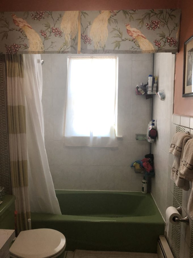
Ok, so if you have been here since the beginning you saw my game plan and all of the scary before photos. You have also followed along with progress where we decided to get a new tub and get rid of the bump-out in the shower alcove. This added a little bit more time to the project, but I’m happy we did.
Let’s go down memory lane and remember what we started with:
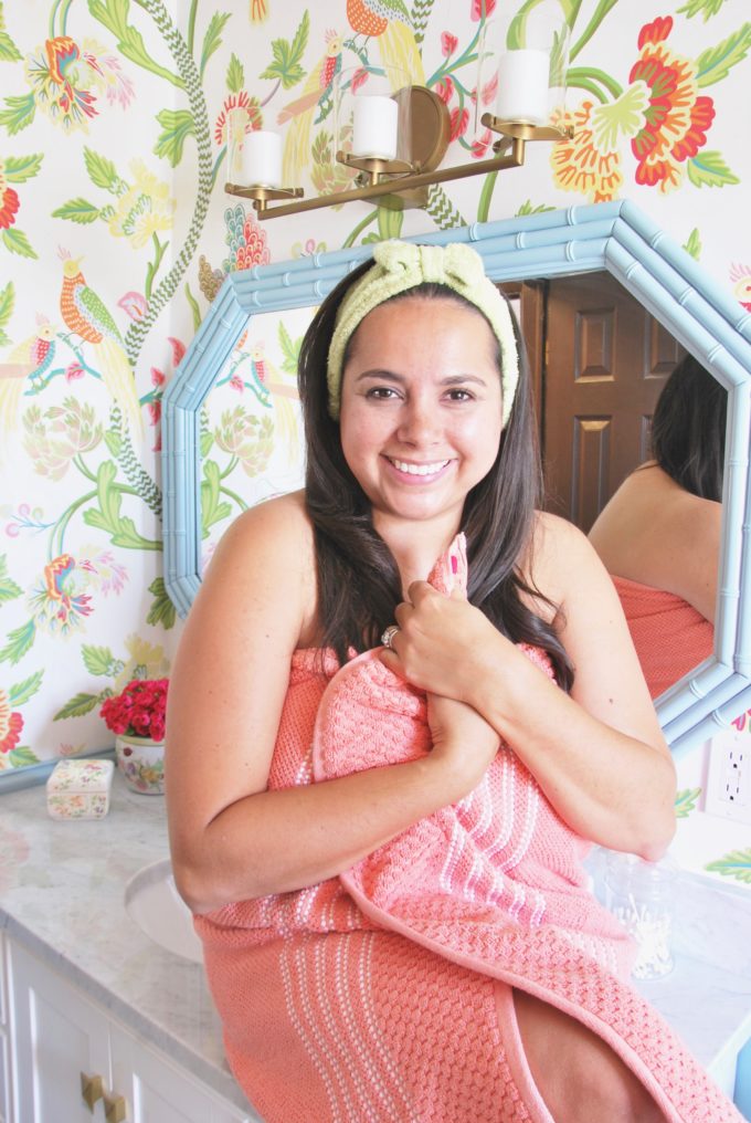
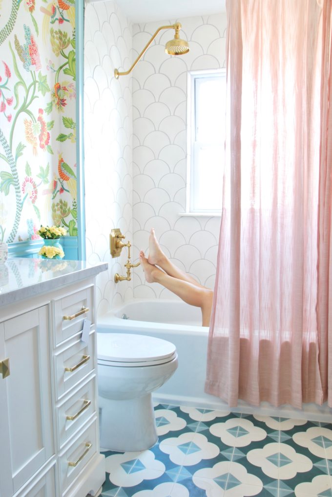
Here is what it looks like today! Can you spy me taking a little break?
An updated take on traditional floral bathroom design!
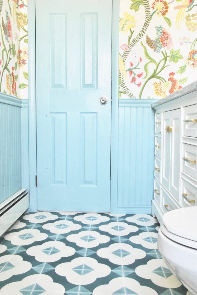
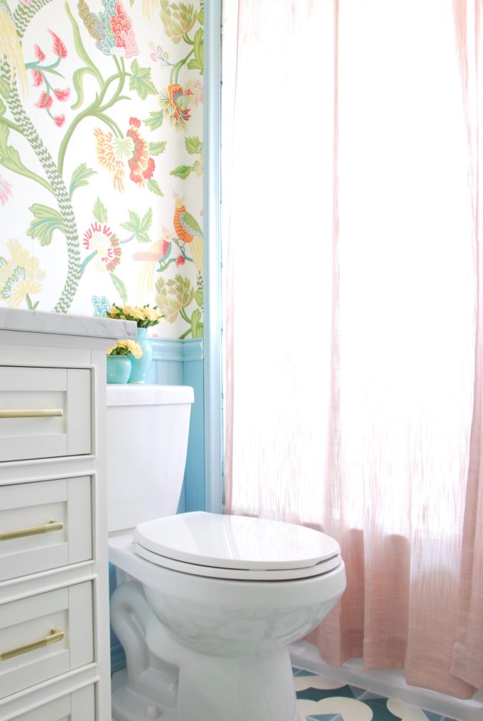
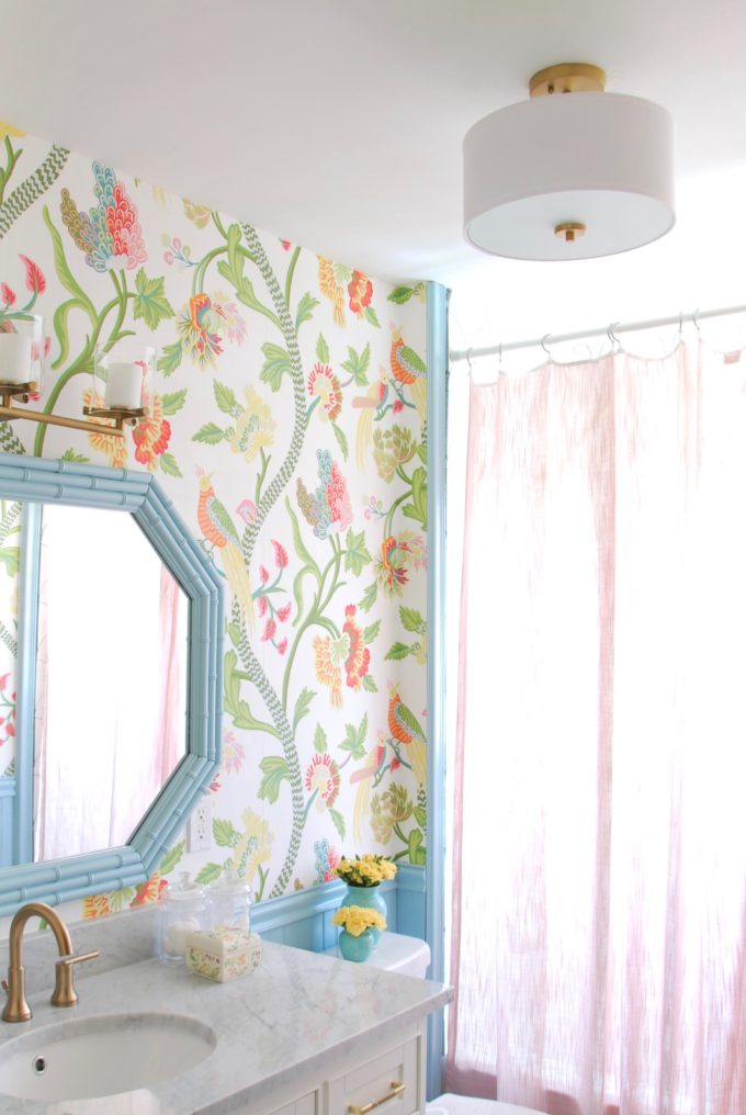
What a difference!!! It’s brighter and feels much bigger! I also love that the overall design is traditional but there are many little twists that make it updated and fun. The wall opposite the bathroom is quite the showstopper with amazing floral wallpaper from Thibaut called Janta Bazaar in brights colorway. I actually liked the patterned tile that was previously in the bathroom and wanted to keep a pattern on the floor. Kate Velvet Sky from Villa Lagoon Tile was the perfect fit. It worked really nicely with the wallpaper but wasn’t too matchy-matchy.
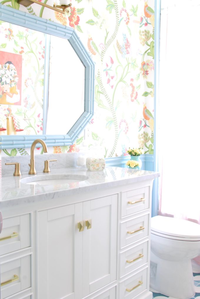
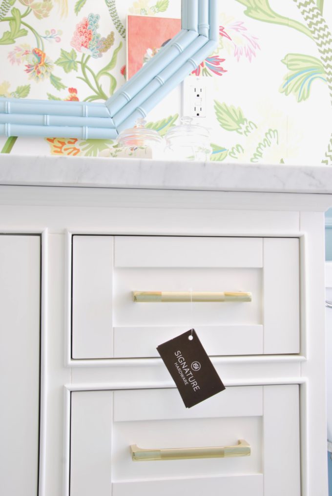
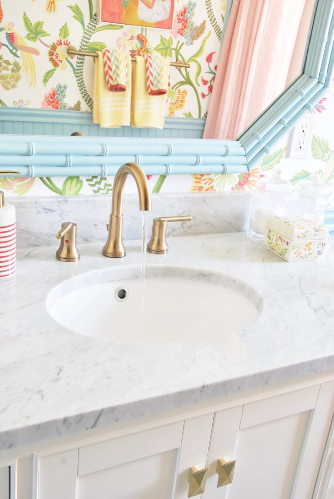
One of my absolute favorite pieces is the vanity!!! I know some people have issues ordering big furniture pieces online sight unseen, but it’s never bothered me. I had fate in Signature Hardware because everything on their site looks so beautiful and their descriptions are very detailed. The Quen vanity looked really sturdy, but still chic and also had a lot of storage space. It also comes in the best shade of emerald green, ruby red, taupe and gray!!! The website is also really cool because you can order your countertop as well as your sink. I went with a marble countertop and a porcelain under-mount sink.
I’m loving the brass hardware and that the drawers are soft close which is perfect for my little guys.
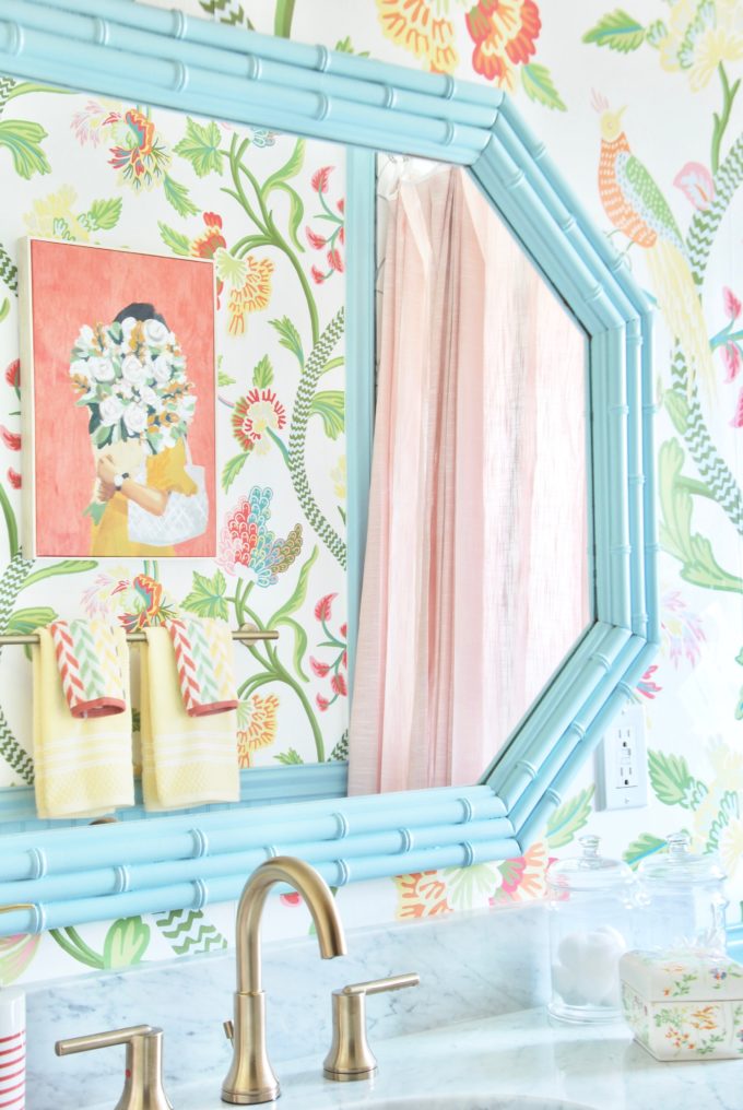
I picked out the prettiest faucet from Delta that worked perfectly with the other brushed gold/brushed brass colors.
We also said goodbye to our avocado and tan toilet and got this white toilet, which was such an affordable price point and worked perfectly with the design.
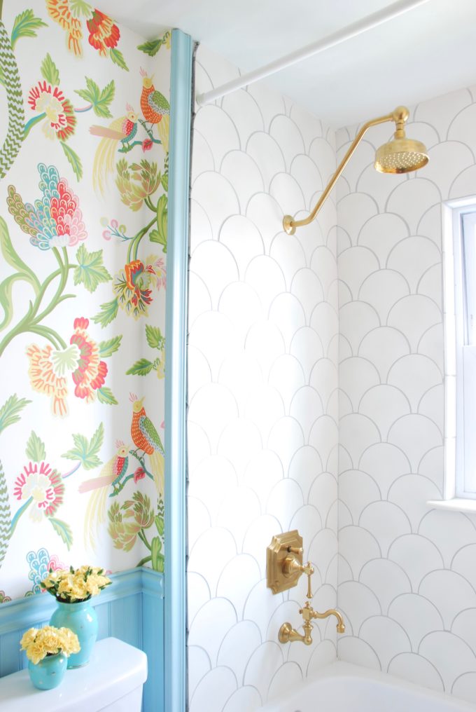
The shower alcove got a whole lot of love when we raised the ceiling in this area, updated all of the beams that were rotting from water damage and then used fish scale cement tiles which were super-sized at 8″ x 8″. It’s nice and classic looking in the white, but a bit different than the traditional subway tile, which is now everywhere. We are still waiting on some bull nosed tiles for the border, but they were a custom order that required 10-14 weeks. In the meantime, we added some trim to finish it up a bit. We simply tacked it on so, it will be easy to remove once the border tiles arrive.
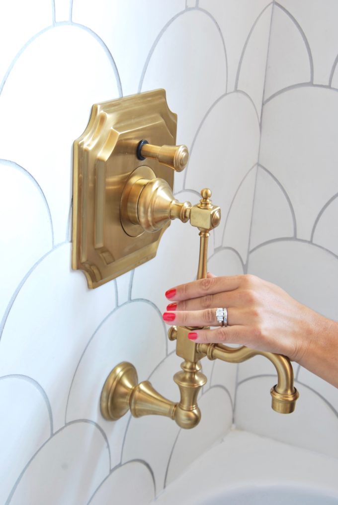
Obsessed with the vintage shower and faucet set from Signature Hardware! We had a little hiccup with it, but the plumber returned and was move everything to the right place.
Lighting wise we went with Bellevue semi-flush mount drum is perfect for so many spaces and design styles. It’s only $112 and currently 25% off with the code: LIGHTING.
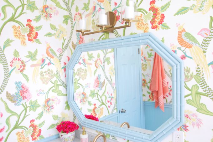
Since we had the walls open once the wall tiles came down Jon was able to go in and wire in a box for a vanity above the mirror. I have always felt like this bathroom was dark and more lighting was amazing. I found the Rixon vanity light by Hinkley Lighting and thought it fit nicely with the other brass tones in the room. It’s a little bit more modern than everything else and I like that it’s a little off to make things more interesting.
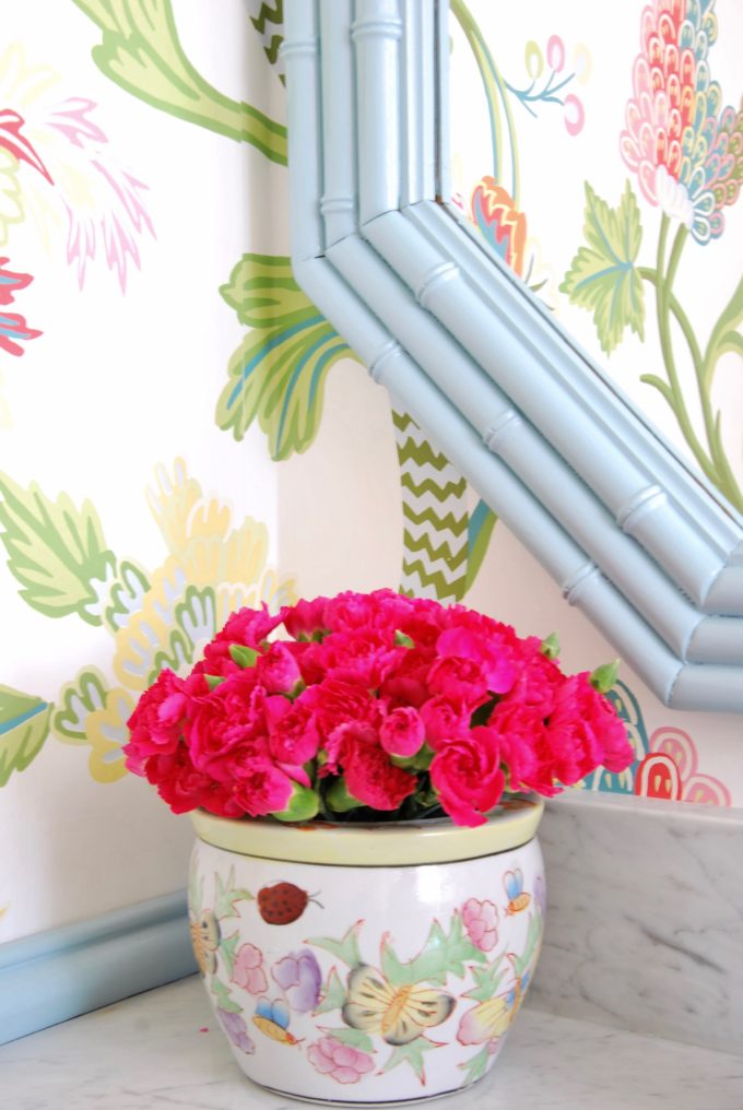
If you know me then you know I love to have vintage touches in a room. This faux bamboo mirror is a vintage find a friend was selling before her cross country move. It was a wood tone when I got it. I liked the idea of moving up some of the blue from the chair rail on this side of the wall, which is why it got painted.
Isn’t the faux bamboo frame pretty?
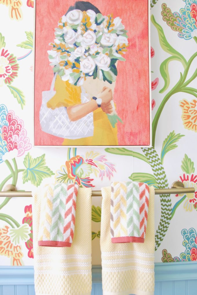
Opposite the vanity area I set up the wall mounted towel bar and a single bar toilet paper holder along with an artwork find from Homegoods that made everything come together!
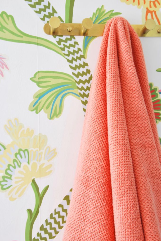
I also added a brass towel hook rack instead of using one of those over the door hangers.
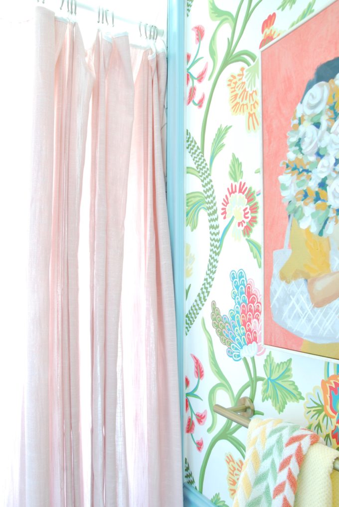
Signature Hardware sent me a shower curtain, but after I painted the beadboard in Oslo Blue by Behr it didn’t work anymore. I made a last minute dash to Target and thought I had come home with a shower curtain. Turns out someone placed a window curtain panel in the wrong area, which meant another trip to Target to pick up an additional panel to make it fit the entire shower alcove. Since there will be a plastic shower liner on the inside of the tub it’s not a big deal to use a curtain panel instead of a shower curtain. It also helped give me additional length, which was nice since we raised the roof in this area.
Alright now, I’m ready to get into the shower to enjoy a bath!
Now head over to see what all of my other blog friends are up with their reveals!
Jeweled Interiors | PMQ for Two | House Homemade | Rain on a Tin Roof | Effortless Style Blog | Haneen’s Haven | Kaleidoscope Living
Related
Leave a Reply Cancel reply
get inspired with our own home tour
ON THE BLOG
My living room is one of the rooms that evolved drastically from when we first moved one. Originally I painted the walls chocolate brown and did accents of white, blue and orange. That lasted maybe 2 years.
Our dining room sat empty for months. Okay maybe it was empty for just a handful of weeks and then we couldn’t take it anymore and put in a folding table and plastic outdoor chairs, but in my mind that was still empty.
On the main floor of our house we have a Florida room. Being that it’s a Florida room it is a considered a 3 season room, because there is no heat in the room. The previous owners used it as an indoor patio with outdoor furniture and it looked like this when we moved in.
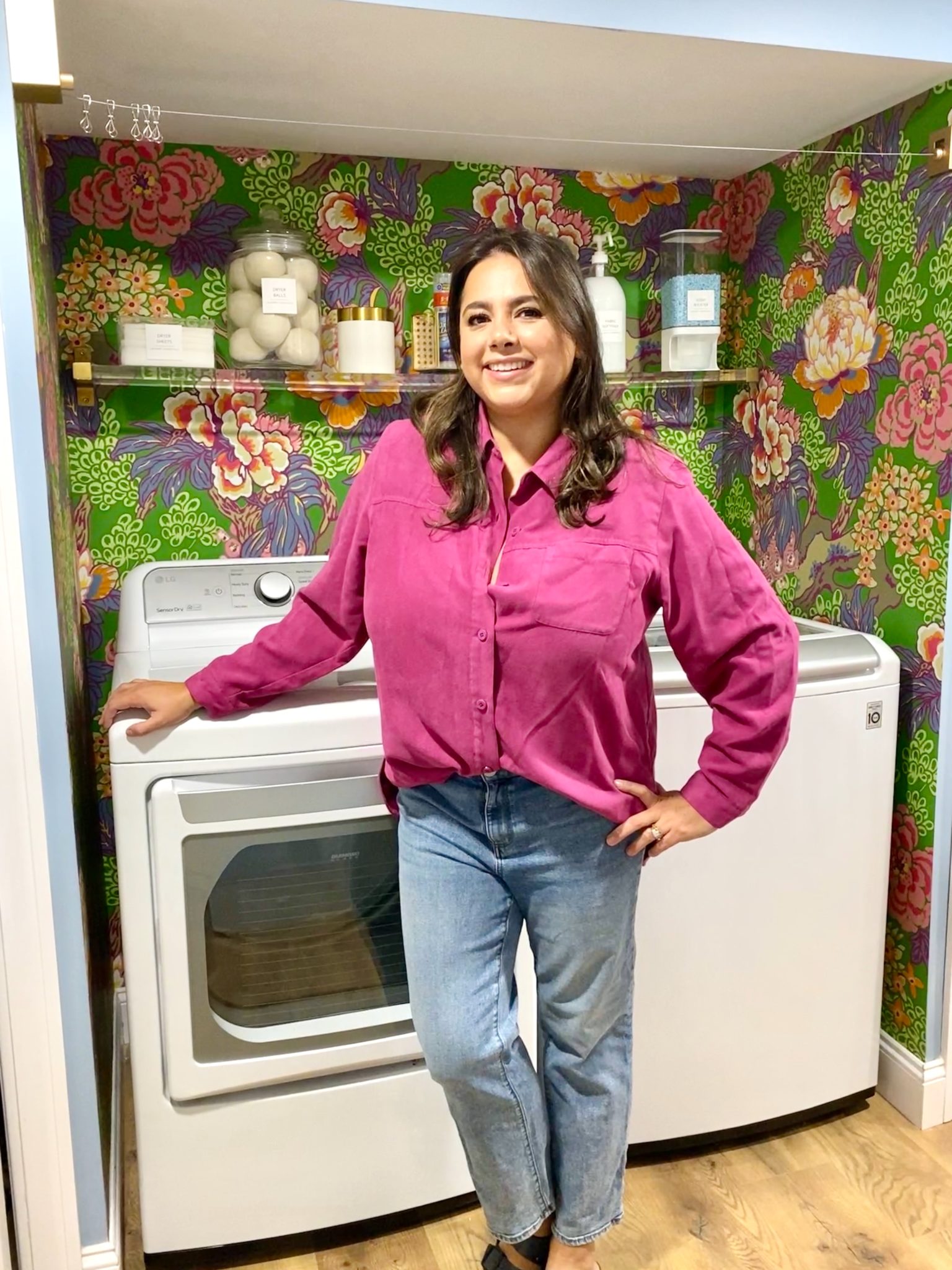
In our new home, the basement was completely unfinished. It was literally one of those dark spaces that you see in horror movies and are terrified of getting locked into. However, with the square footage in this house, I knew I needed to make the basement another workable and liveable floor of the house instead […]
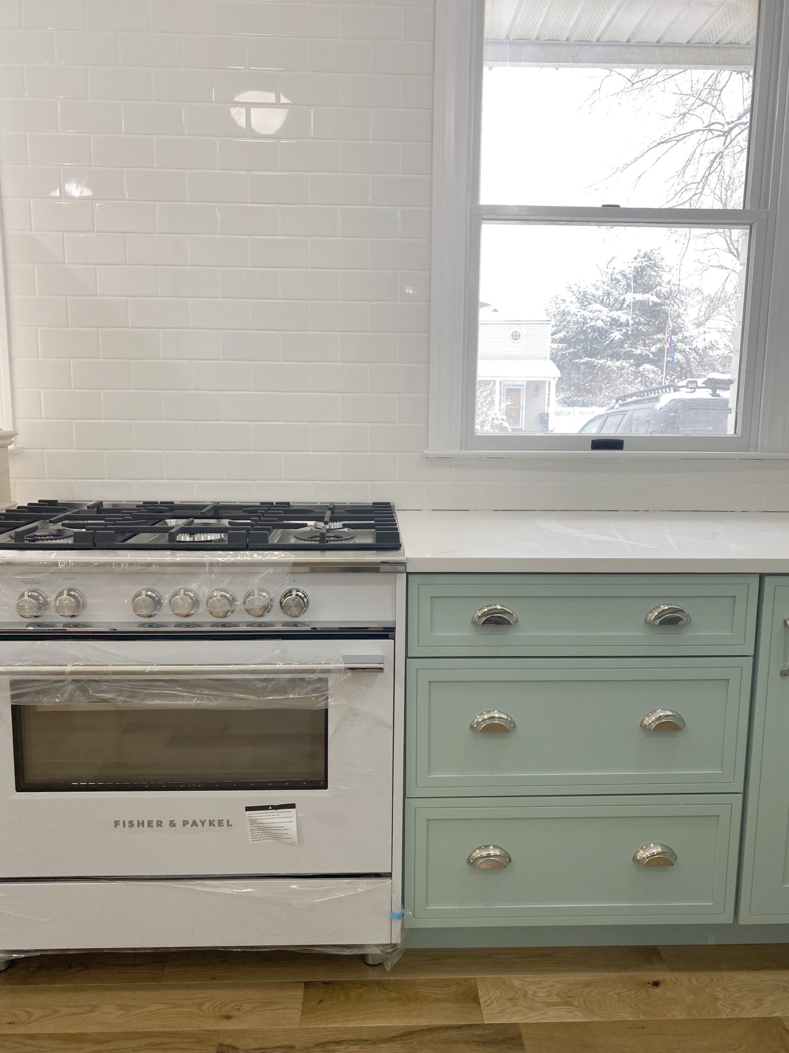
What to look for when it comes to picking out kitchen appliances: Leave room in your budget for appliances. When it comes to kitchen renovations everyone knows that the cabinetry and the labor of demoing and installing cabinetry is going to eat a lot of your budget. However, the second most expensive part of a […]
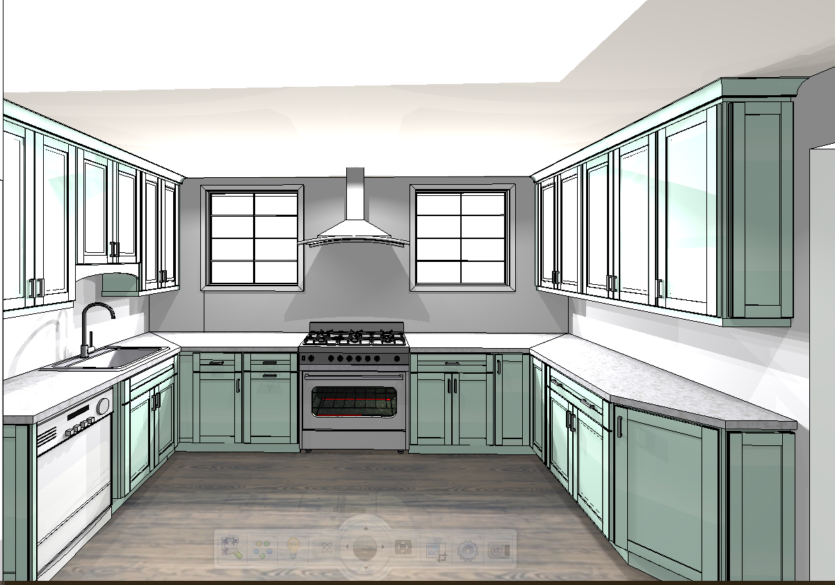
I don’t think I’m alone in thinking that designing a kitchen is an overwhelming undertaking. I’m an interior designer and even I find it stressful to iron out all of those details. So, when it comes time to design a kitchen I always like to partner with a kitchen designer to make sure I’m remembering […]

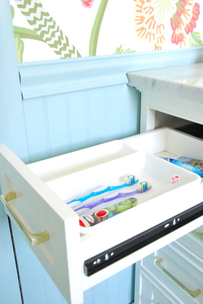

Almost as impressive as this incredibly beautiful bath…is the clean toothbrush drawer! Lol. Seriously, I love your make over.
The bathroom is gorgeous Camilla. I love the color palette you selected and the pattern mixing is perfection. Such an beautiful and personality packed space.
Camila, the colors in this space are everything! They pair so perfectly with the brass fixtures! You killed it here- I adore it!
What a lovely space! I see you painted the door trim blue. Assuming the hall trim is not blue, how do you handle the blue door trim versus the outside (hall) door trim? (I hope this question makes sense)
Wait, are you for REAL with this before and after????? This is incredible! What a bright, BEAUTIFUL space, girl! I love it all! The wallpaper, the tile, the vanity, the colors! Way to go!
Beautiful space
It’s such a happy space and so much brighter and lighter than before. Looks great!
It’s so bright and cheery. Love it. Cute pics of you!!
This is gorgeous! I love the cement tile and the wallpaper the most, but all of it is fabulous!
Beautiful bathroom. When I follow the link from Jeweled Interiors; it seems to be broken. Just a quick heads up; I want everyone to see your beautiful bathroom!
Thank you! I’m not sure what happened. I sent them the link a bunch of times and it keeps messing up!
It actually looks like none of the links are working to your page from the other sites.
I can’t pick a favorite detail! The wallpaper, the floor, the cabinet, the faucets, the lighting….. Way to go!!!
That’s a great tip about using curtain panels instead of shower curtains to get extra height. Very clever!
Thank you! It was a happy accident that ended up being really helpful!