ORC Week 2: Design Plans for Bathrooms
It is week 2 of the One Room Challenge and things are moving along! If you are new to the blog then you catch up on Week 1 here and see all of the before photos in its glory! Jon finished installing the tub in the main bathroom and now we wait for the shower/tub faucet set to arrive in order to finish up the walls. While all that has been happening I took the time to make some final decisions for the design plans and placing orders! I was lucky enough to partner up with Signature Hardware and Build to get the main components of the bathrooms, which is a dream come true. I use them both for many of client projects. I have found that their prices are the best and the ability to be able to have everything shipped directly to a client with free shipping is amazing! They literally have everything you would need for a home improvement project! I was able to easily shop for everything from my cozy bed.
ONE ROOM CHALLENGE: WEEK 2
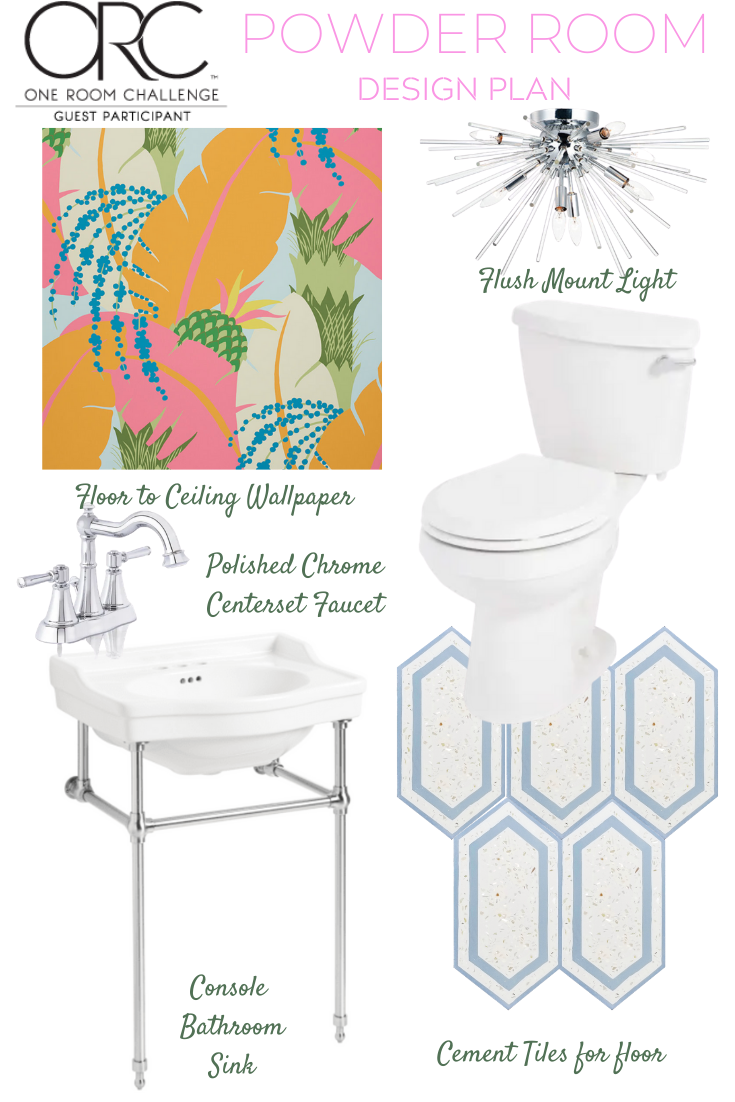
For the powder bathroom here is the plan we are working off of:
I splurged and picked up this stunning wallpaper from Schumacher. I was on the fence about getting it because it was costly, but it’s a small space and it deserved something special. I was also outvoted by Jon and the boys. They looked at my other option and told me I was boring and we needed the pineapple wallpaper! So I did it!!! We are going to go floor to ceiling with it and get the full view of the wallpaper instead of breaking it up with wainscotting.
For lighting, I knew I needed something special and I reached out to Maxim Lighting and they were lovely enough to partner with me on lighting for my bathrooms. I love their pieces and I was able to find so many options! Typically I have been going with brass in bathroom renovations, but I’m starting to tire of it and I think a polished chrome or nickel is a classic. So, for these two spaces, I decided to lean into the polished chrome and step away from my safety net of brass or aged gold. Now, back to the lighting, this jewel of a powder room needed a bit of glam and sparkle which lead me to find the Polaris flush mount in a classic sputnik design. Isn’t she a beauty?
Since this bathroom is a teeny tiny space I knew I couldn’t have a full vanity. I needed something with less bulky space physically and visually. I fell in love with the Cierra console sink by Signature Hardware. It had the perfect measurements and came with chrome legs!!! I love that it has legs so you will still be able to see the wallpaper through it and I can get a cute basket to fill with toilet paper underneath it. Now, I don’t have a problem with mixing metals so if you are re-doing your bathroom don’t feel old about mixing brass and chrome in a space. Think about what you do with jewelry. I have pieces that are a mix of silver and gold and it looks fab. The same goes for your hardware and lighting. I have found though that it can be harder to find options in brushed brass or brushed gold so I went with a classic chrome centerset faucet by Miseno. I loved the curves that the fixture had to it. It gave me a vintage/classic feel to it.
Toilet wise we also needed something that was the perfect size in order for it to fit the space and still give us some breathing room. I picked out the Signature Hardware Bradenton toilet. I loved the lines on it and the gloss enamel finish!
You can’t forget about the floor and when it came to this space I wanted it to be special. I sourced high and low and found the perfect tile by Lili Tile. I loved the shape of the Tiffany 52 tile with mother of pearl terrazzo. I love that it sparkles a bit. I reached out to Lili Tile and they were excited to partner up with me and supply the tile! Cue the confetti!!!! I can’t wait to get them and share them all with you!!!! I know it can be hard to order things online without seeing them in person but that has never scared me. I’m always happy to test things out and share my reviews with you!
Now on to the main bathroom in the house! I still can’t believe I’m tackling both spaces and fingers and toes crossed that everything arrives on time and goes off without a hitch.
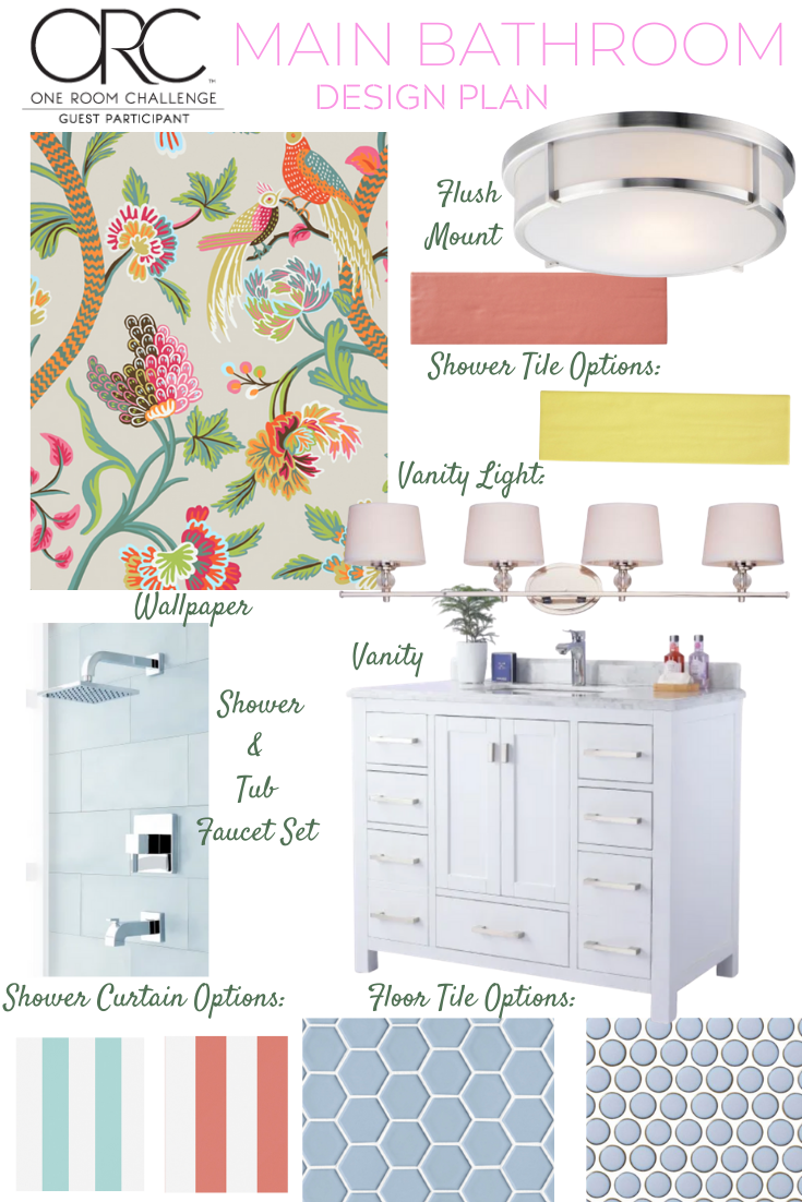
This space took a bit longer to finalize. Every wallpaper that I mentioned to Jon and the boys was met with a no. Of course, Jon said if I loved that they would be okay with it, but I wanted them to love it too. So, we decided to go with Janta Bazaar in flax. I actually used the brights colorway in my parents’ bathroom. We all love the paper and since we won’t be crashing with my parents once we move into your new house we wanted some of the paper for ourselves. I actually wanted the flax colorway when I was doing my parents’ bathroom, but my mom voted for the brights colorway so, now is my time to get to use it! Thibaut also has a coordinating stripe which I am considering for a shower curtain, but I’m not sure yet. I might want to do a cornice here along with panels and it might get too busy with stripes. I will make that call later down the line.
We did some reshuffling in the bathroom to get a bigger vanity, which is amazing, but then we were left with an odd size. The standard for bathroom vanities is a 36″ or a 48″. We didn’t have enough space for a 48″, but going with a 36″ felt too small when we could go bigger! So, I did a little digging and with the help of my friends at Build found me the perfect 42″ vanity by Miseno! It has the main cabinet doors which I really wanted to have ample drawers. It also has a marble top with lots of countertop space. I’m in heaven and so happy that they had a variety of sizes available. I’m going to pair it with this clean-lined bathroom faucet for an overall classic look that I will not tire of.
For the shower area, I found this stunning shower and tub faucet set in my classic polished chrome. It looks like jewelry to me and I’m excited to see all of that sparkle. When it comes to the tile for the bathroom I’m looking into tile options from The Tile Shop. They have this collection called Color Market which is a color lovers’ dream. I can’t decide if I want to go with a pink version called flamingo or go wild and get Lima De Persia!!!! Ah! What to do. I know pink is probably the safer choice, but I love citron/yellow and I don’t think will tire of it, but who knows!
For the floor area, I’m looking into picking up some blue tones and leaning between imperial sky hex tiles or a penny round in sky blue. I would actually love to get some versions of the tile in white as well and do a sort of pattern in the floor tile, but Jon gave me that crazy look when I mentioned it to him, but we are on a time crunch and that would add more time/stress, etc to the project. We shall see!
For the lighting in this space I headed back to Maxim Lighting and found this bathroom vanity light. It was the perfect length and I’m excited to do something fun with the lampshades! Good design is all about the details and layering!!!!
The flush mount I picked out is going to be the perfect piece to complete the space and pairs so nicely with everything else going on.
As for the toilet I needed something slim here and I found this Miseno toilet in the perfect measurements with an elongated bowl, which I am a fan of.
Ah! It’s nice to have that all down. A road map of sorts with all of the progress on the plans and my list of all of the items I’m waiting to arrive! Let the shipping gods be in my favor!!!
You can check out the rest of the One Room Challenge guest participants here.
Related
Leave a Reply Cancel reply
get inspired with our own home tour
ON THE BLOG
My living room is one of the rooms that evolved drastically from when we first moved one. Originally I painted the walls chocolate brown and did accents of white, blue and orange. That lasted maybe 2 years.
Our dining room sat empty for months. Okay maybe it was empty for just a handful of weeks and then we couldn’t take it anymore and put in a folding table and plastic outdoor chairs, but in my mind that was still empty.
On the main floor of our house we have a Florida room. Being that it’s a Florida room it is a considered a 3 season room, because there is no heat in the room. The previous owners used it as an indoor patio with outdoor furniture and it looked like this when we moved in.
In our new home, the basement was completely unfinished. It was literally one of those dark spaces that you see in horror movies and are terrified of getting locked into. However, with the square footage in this house, I knew I needed to make the basement another workable and liveable floor of the house instead […]
What to look for when it comes to picking out kitchen appliances: Leave room in your budget for appliances. When it comes to kitchen renovations everyone knows that the cabinetry and the labor of demoing and installing cabinetry is going to eat a lot of your budget. However, the second most expensive part of a […]
I don’t think I’m alone in thinking that designing a kitchen is an overwhelming undertaking. I’m an interior designer and even I find it stressful to iron out all of those details. So, when it comes time to design a kitchen I always like to partner with a kitchen designer to make sure I’m remembering […]

I LOVE all of your choices. It’s so much fun to see you bring so much color to your designs but still keep them sophisticated and polished. Can’t wait to see BOTH of these bathrooms come together 🙂
So pretty. Fun the guys go with your more feminine choices