
Adventure Refresh: Hallway Reveal
Can you believe it! Our Choose Your Own Adventure blogging challenge is coming to an end! In three short weeks we picked a space, came up with a design plan and then got to work installing it all! Let me tell you, all of the ladies taking part in this group have a group message going on where we having being share all of our highs and lows. Let me tell you we have given this challenge our blood, sweat and tears! I feel bad because my adventure refresh is just hallway and others went with a full room design in the same short time frame!
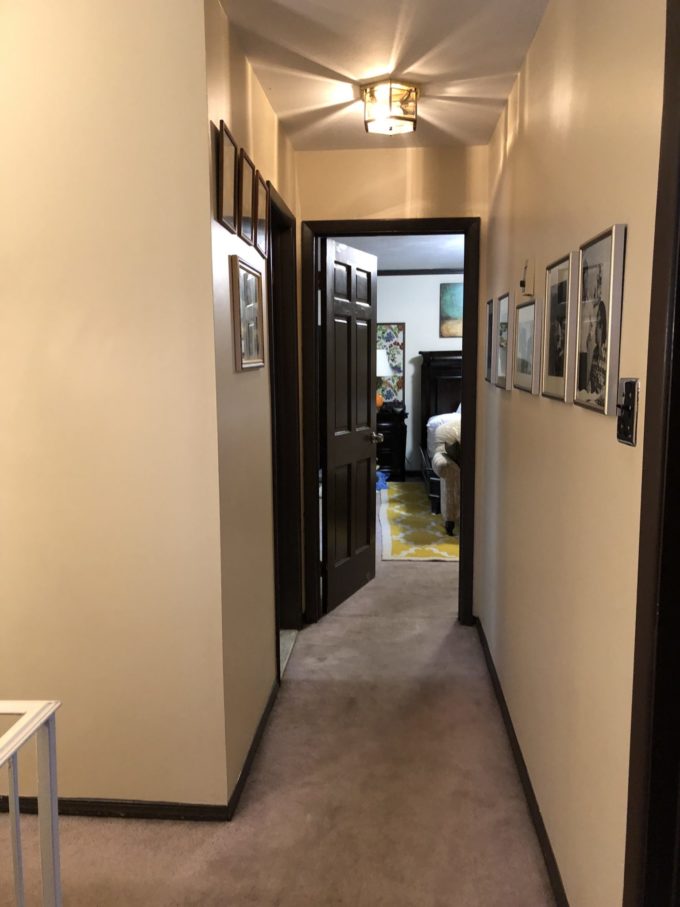
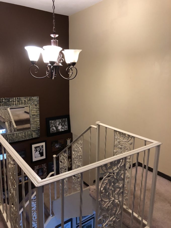
Now lets go back to the beginning! Here is my parents upstairs hallway. There was nothing wrong with it, but the lighting fixture was dated and the walls had some artwork, but they are pretty blah. My parents are currently on vacation so, I thought it would be fun to tackle this space and surprise them!
Adventure Refresh: Hallway Reveal
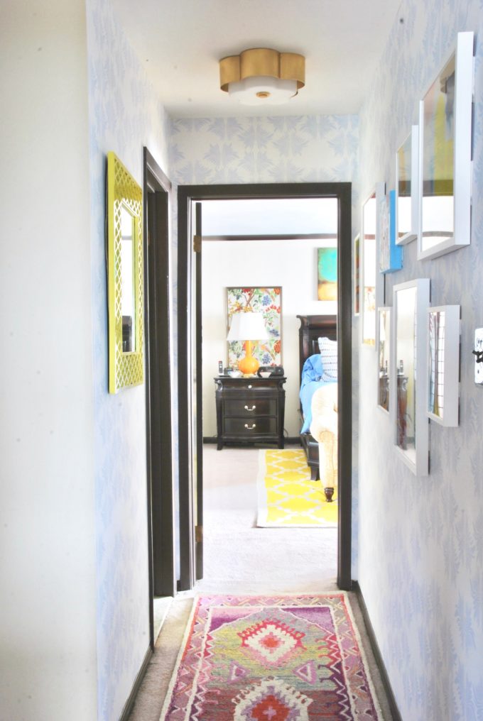
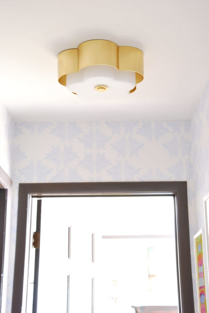
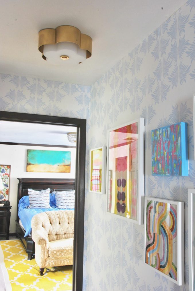
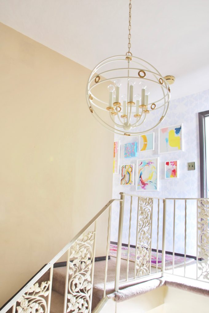
Isn’t it amazing that a couple of changes can make such a big difference in the space! One of my first items I sourced was the allure flush mount from Troy lighting that is part of Hudson Valley Lighting. It was the perfect amount of sparkle that the space needed. The brass finish is a beautiful warm gold and it gives off an amazing amount of light! We had no idea how bright the space could be with a new light fixture.
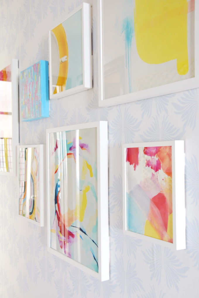
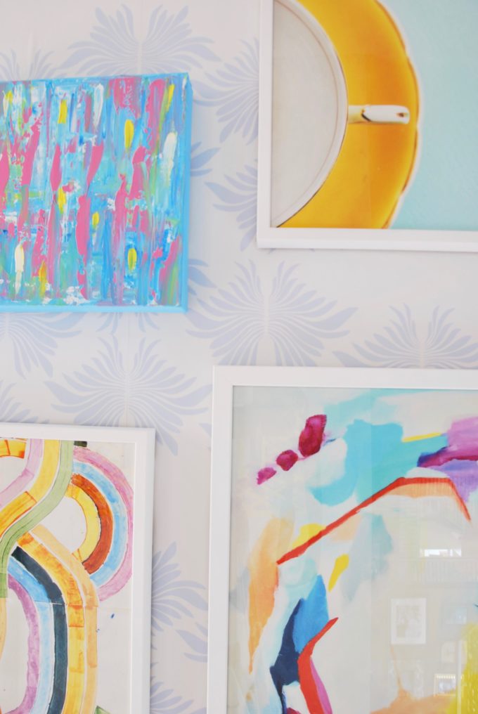
Another easy change that made a big difference was adding wallpaper into the space. I wanted something with a pattern and interest, but not too drastic. It needed to be something that would allow the artwork to still shine. This Sarah Annie pattern from Milton & King fit the bill perfectly and they were nice enough to send it over to me. I liked that the blue was slightly off because I didn’t want the space to be matchy/matchy. Since I was doing this without telling my parents I decided to go with Milton & King’s removable wallpaper option in case they hated it. After seeing it all come together I know they are going to love it, but if they ever tire of it, it will easily come off.
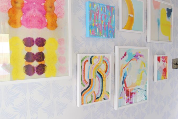
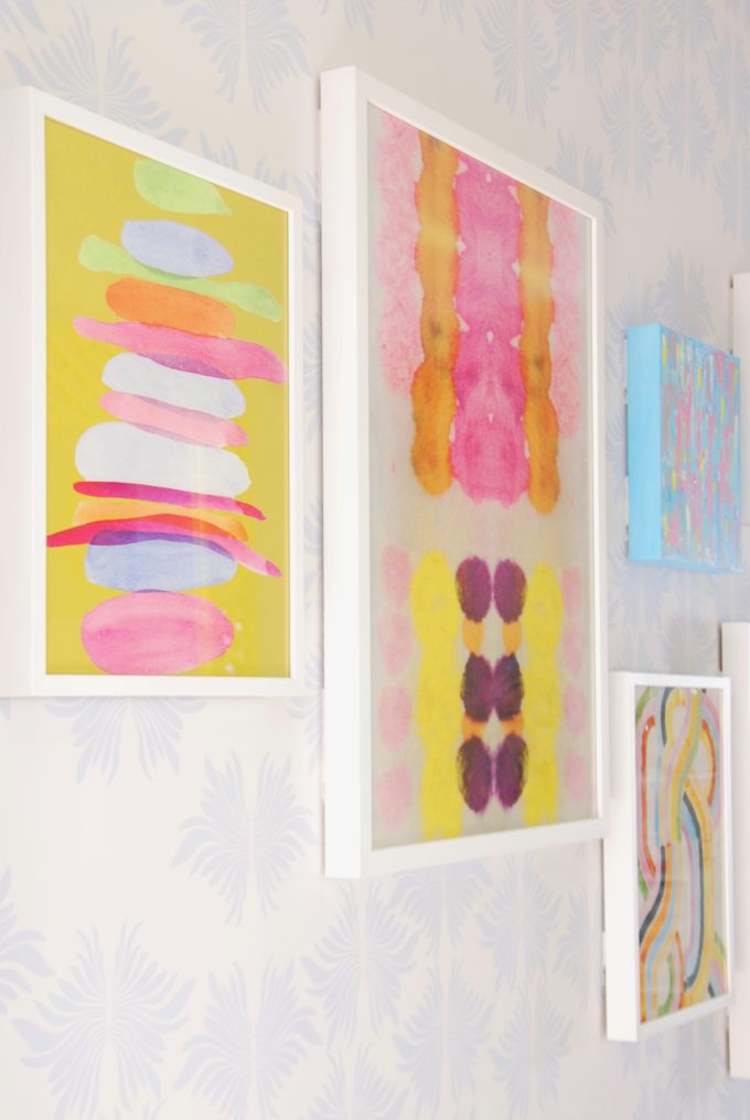
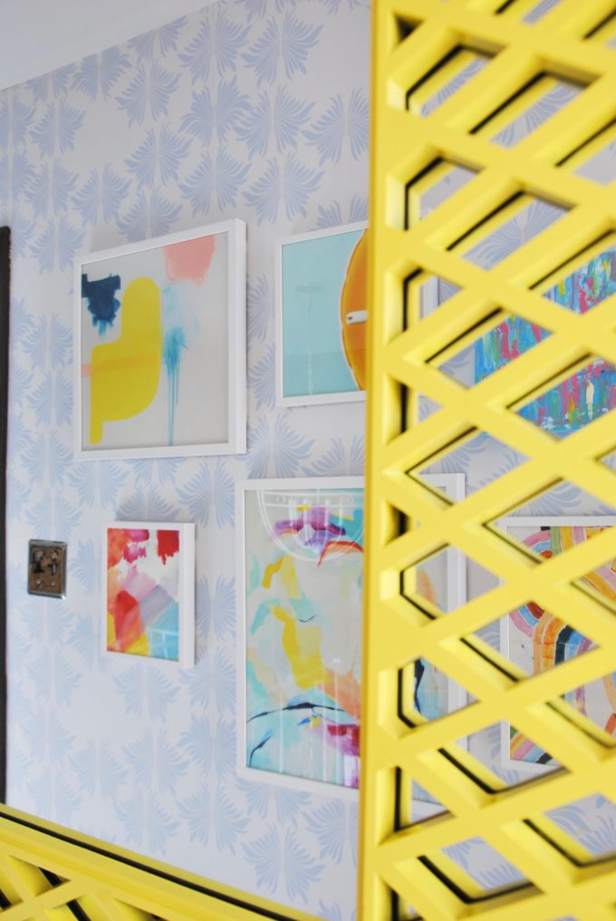
Artwork also played a crucial part in the new look! Minted is one of our gracious sponsors, which was perfect, because they are one of my to sources for artwork. I love their variety! You can find abstracts, photography, illustrations, typography! They have a variety of sizes that the pieces can be printed in and you can pick from a variety of frames as well. Since the space was busy I decided to go with the same classic white border frame to make it a bit easier on the eyes.
It was so nice to scroll thru their fine art selections and mix and match all of my favorites! So many of the pieces work nicely together. Before I knew it I had some up with my color scheme without even trying.
MINTED ARTWORK SELECTION:
PILLOWED RAINBOW
FRAGMENT 3
A NECESSARY LUXURY
MOVE ME
SOMETIMES I WISH BEGINNINGS WERE ENDS
HOT PINK
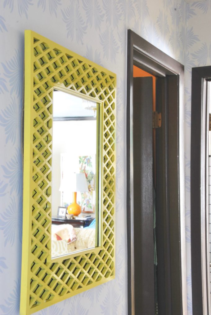
The wall opposite all of the artwork needed a little love! I knew I wanted a mirror and really wanted to find something vintage for this space. I wasn’t finding any luck at my normal thrift store haunts and was just frustrated. I went into our shed that houses all of my vintage treasures and found this pretty mirror! I forgot I had picked up a set of 2 of these mirrors a while back because I loved the lattice pattern on them. A quick clean up and spray painting job and we were in business!
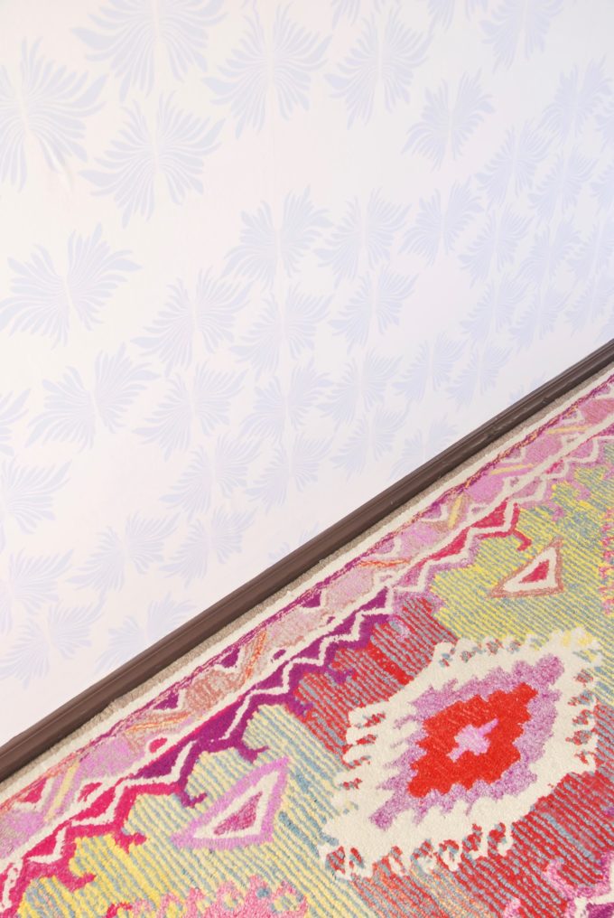
With all of the fun happening on the ceiling with lighting and the walls with stunning artwork we couldn’t forget the floor! Laying down new wall to wall carpeting wasn’t in the budget. I still wanted to zhush up the space and I see nothing wrong with layering a patterned rug over carpeting. It’s a little trick I do all of time. Doesn’t this runner work perfectly with all of the pink shades in the artwork?
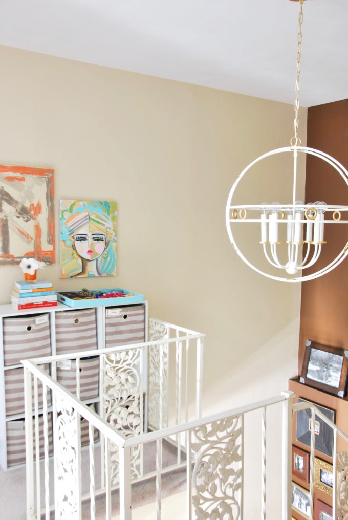
Now you would think we were finish, but opposite the gallery wall there was a space that needed a little love.
Remember this view:
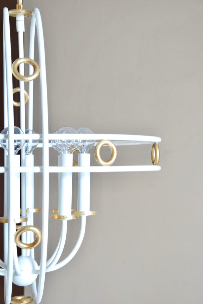
Hudson Valley Lighting is another one of our generous sponsors and along with providing me with the allure mount I also selected the Jade chandelier in gold leaf and cream. This piece is a stunning work of art! It is on the large side, but I needed something substantial to fill the space. It’s classic looking with a twist and totally glam. It has become my favorite lighting fixture from Mitzi and I’m already dreaming up ways to take it with me whenever we find our forever home. Haha. Don’t worry I’m kidding. Mom and Dad are getting to keep this beauty.
Close up details including these chic round bulbs for a more updated look.
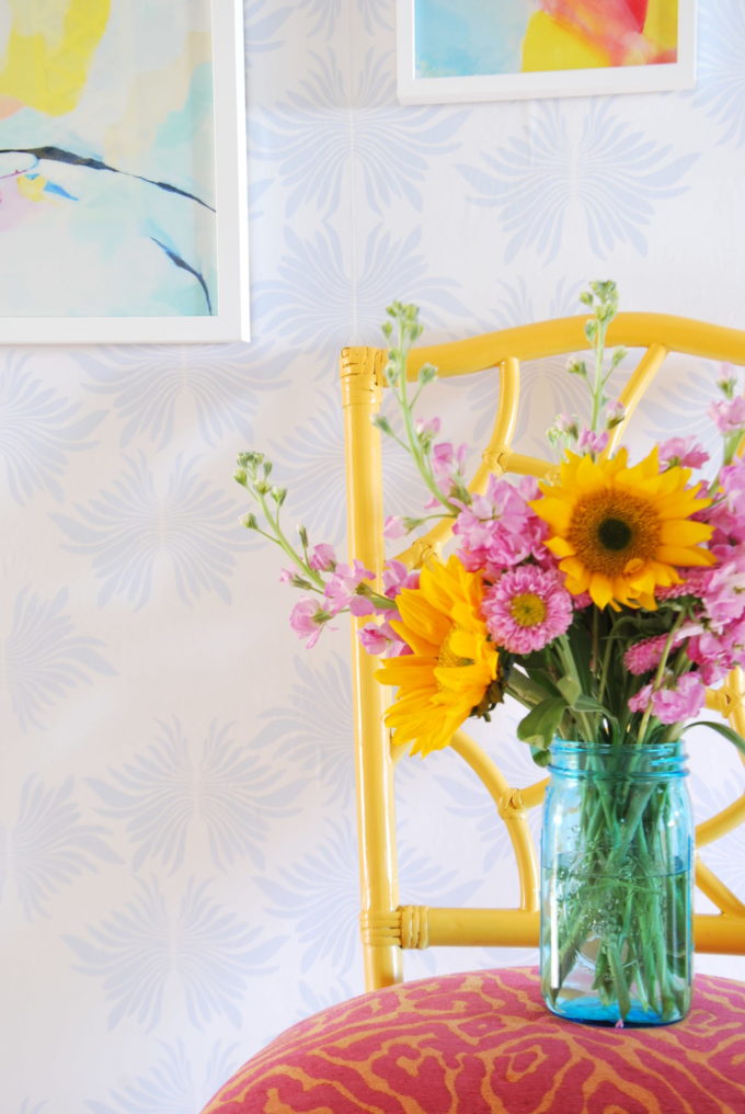
All of that hard work meant I got to treat myself to flowers to celebrate my adventure refresh being complete!
I will be spending a good chunk of my morning drinking my tea and looking thru all of the reveal from the lovely ladies below! I know it’s going to be full of eye candy and I will be sharing it all over social media!!!! A big thank you to Jewel from Jeweled Interiors for putting this all together! I know how much hard work it was to put it all together and keep all of us going! It was truly an honor being part of this group and I can’t wait to see what else we collaborate on!
Jeweled Interiors | Haneen’s Haven | Dimples & Tangles | PMQ for Two | House Homemade | Rain on a Tin Roof | Pencil Shavings | Our Fifth House | Kaleidoscope Living | The Pink Clutch | At Charlotte’s House | Effortless Style Blog
Related
Leave a Reply Cancel reply
get inspired with our own home tour
ON THE BLOG
My living room is one of the rooms that evolved drastically from when we first moved one. Originally I painted the walls chocolate brown and did accents of white, blue and orange. That lasted maybe 2 years.
Our dining room sat empty for months. Okay maybe it was empty for just a handful of weeks and then we couldn’t take it anymore and put in a folding table and plastic outdoor chairs, but in my mind that was still empty.
On the main floor of our house we have a Florida room. Being that it’s a Florida room it is a considered a 3 season room, because there is no heat in the room. The previous owners used it as an indoor patio with outdoor furniture and it looked like this when we moved in.
In our new home, the basement was completely unfinished. It was literally one of those dark spaces that you see in horror movies and are terrified of getting locked into. However, with the square footage in this house, I knew I needed to make the basement another workable and liveable floor of the house instead […]
What to look for when it comes to picking out kitchen appliances: Leave room in your budget for appliances. When it comes to kitchen renovations everyone knows that the cabinetry and the labor of demoing and installing cabinetry is going to eat a lot of your budget. However, the second most expensive part of a […]
I don’t think I’m alone in thinking that designing a kitchen is an overwhelming undertaking. I’m an interior designer and even I find it stressful to iron out all of those details. So, when it comes time to design a kitchen I always like to partner with a kitchen designer to make sure I’m remembering […]





Camila, I absolutely love how you do color!! This hallway is gorgeous – so happy and full of beautiful colors! Love all the artwork you went with and that light fixture is gorgeous!
That runner is to die for!! And the artwork has me swooning!!
I bet your mom is soooo happy!!!! Come do my hallway this happy :).
I’ve already spec’d that chandelier for a couple client projects – it’s SO chic. Also, if you come home and discover that your rug is MIA, it’s because I stole it. Kthx.
Love love love the Minted artwork! You did a great job (so did John!)
I have to tell you, about 18 months ago i put up a new chandelier in my dinning room and wanted round bulbs. I went hunting for them at Home Depot and needed some help, so i told a nearby sales person what i was looking for… She gave me SO MUCH shade. “you’re going to put what in what? that wont look good..”
I just smiled and nodded and did it anyway, and it LOOKS GREAT!
It looks so good!!!!!!! I love all the colorful art you chose and that wallpaper… to die for. Well done, friend! xx
It may be the happiest hallway I’ve ever seen!! Good job! Love it.
I LOVE everything about this hallway ! Especially the light fixture.
I am working on a home that l am inheriting from my mother in Jupiter, FL. I’m looking for something to go with my Palm Beach meets Mad Men decor and l think this might be perfect! Your colors are fabulous too.
Such a youthful, happy design. Thanks for the great ideas.
This turned out so wonderful! That wallpaper, the light fixtures, the art….it’s all so great! LOVE!
Amazing! not even the same hallway. Love what color and your style can do!
Absolutely loving all these hallway transformations! I’ve got a big one to do, but I’m gonna have to take all my pointers from you! Great wallpaper and art choices, and I love the pops of colour!